10,000 search results
(0.029 seconds)
- Miranda Pro by Tim Rolands,
$29.00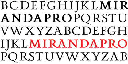 An elegant display face influenced by Aldine oldstyle letterforms, Miranda Pro brings the early successful Tim Rolands font Miranda into the OpenType era. Miranda Pro now includes numerous extended ligatures, alternate forms, small capitals and support for a wider range of languages. Use it as a companion display for classic text fonts or on its own as a refined but stylish messenger for all sorts of projects.
 - South East by Girinesia,
$17.00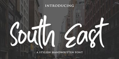 South East is stylish handwritten font. South East looks original and can be used for all your project needs. South East would perfect for Youtube Cover or Thumbnails, sports flyers, mockup , tote bags, kids books, scrapbooks, logos, icons, phrases or quotes for winter greeting cards (Halloween, Christmas or New Year holidays), photo overlay, short phrases, gift shops tags, presentation in social media Pinterest, Instagram, Facebook and more.
 - Averago by Gassstype,
$22.00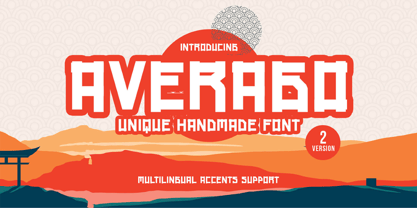 Introducing of our new product Averago it is a Unique Handmade Font and also that will make your designs look modern, display font. Can make it easier to convey the message in your design. Use for awesome display, labeling, movie sceen, poster, movie title,quotes, posters, DIY projects, branding, packaging, greeting cards, websites, photos, photography overlays, signs, window art, tags and so much more!
 - Cabarga Cursiva by ITC,
$29.00Cabarga Cursiva is the work of the father and son team of Demetrio E. Cabarga and Leslie Cabarga, both New York designers. The details of the sharp strokes almost give the impression of a knife blade, whether straight or curved like a scimitar. The capitals should be used only as initials and are complemented by a robust lower case alphabet as well as alternate forms and ligatures. - Overbyte by Comicraft,
$19.00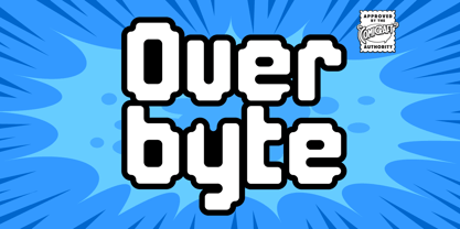 This digitally remastered high density lettering has been bitmapped out for you by Comicraft's Eric Eng Wong. Those of you harddriving through cyberspace on the information superhighway had better zap your prams and reboot your hard disk before you're dragged into your system folder while OVERBYTE makes a major withdrawal from your atm. Do not be fooled by the name, there's nothing goofy about this typeface.
 - Urban Daily by Mvmet,
$12.00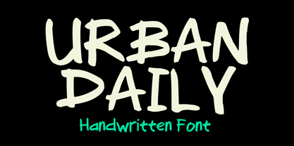 Urban Daily is a playful daily handwritten font, inspired by graffiti-style tags. It will elevate a wide range of design projects to the highest level. You can use this font for many design ideas such as stickers, t-shirt designs, amazing logo designs, magazine or book covers, comics, cartoon drawings, and many more. This font will add a super cool touch to your designs!
 - Nina by Microsoft Corporation,
$49.00Nina™ Family is a new condensed sans serif typeface designed to be as readable as possible at small sizes, whilst squeezing in as many characters per inch as feasibly possible. Nina Family typeface was designed for Microsoft by world renowned type designer Matthew Carter, and hand-instructed by leading hinting expert, Tom Rickner. Character Set: Latin-1, WGL Pan-European (Eastern Europe, Cyrillic, Greek and Turkish). - Black Blocker by Sign Studio,
$10.00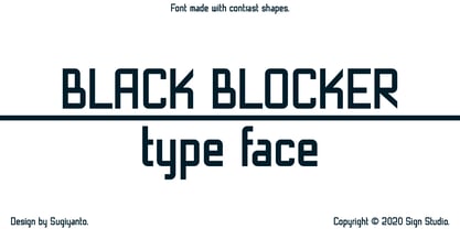 This is Black Blocker, a font that can make contrast to the text. Having a corner of the box on the inside that becomes unique. It is suitable for posters, titles,banding, tags, quotes and more. Developed from the sans-syerif family makes it easy to apply to designs. Reach many languages with Adobe CE standards (over 331 characters). Take it to make your design be different.
 - Hacky Sack NF by Nick's Fonts,
$10.00Ross George in his numerous Speedball chapbooks called the pattern for this typeface Stunt Roman. A studious observer may discern that many of the wackier letterforms were tamed to produce the popular font University Roman; however, this version remains unapoligetically true to the original. All versions of this font include the Unicode 1250 Central European character set in addition to the standard Unicode 1252 Latin set. - HGB Info by HGB fonts,
$21.00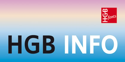 HGB Info is a display typeface for my Linotype Nautilus Monoline. This came about while working on the corporate design for the municipality of Weissach im Tal. Shorter ascenders and descenders and a broader letter shape result in more compact word images. The ups and downs are cut vertically. This works particularly well in large degrees. This is the area of application on signage and information systems.
 - PR Swirlies 01 Frames by PR Fonts,
$10.15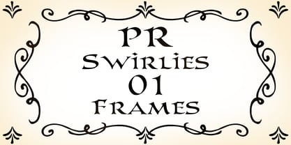 This font is a collection of simple calligraphic ornaments suitable for invitations, gift tags, and anything that can benifit from a "spoonful of sugar" visually. The frames font uses the same calligraphic elements as PR-Swirlies-01, but has them combines in ways which form an elliptical cartouche. Many of the elements can be used in a modular way to create frames of varying length.
 - Schism One by Alias,
$55.00 Schism is a modulated sans-serif, originally developed from our Alias Didot typeface, as a serif-less version of the same design. It was expanded to three sub-families, with the thin stroke getting progressively heavier from Schism One to Schism Three. The different versions explore how this change in contrast between thick and thin strokes changes the character of the letterforms. The shape is maintained, but the emphasis shifts from rounded to angular, elegant to incised. Schism One has high contrast, and the same weight of thin stroke from Light to Black. Letter endings are at horizontal or vertical, giving a pinched, constricted shape for characters such as a, c, e and s. The h, m, n and u have a sharp connection between curve and vertical, and are high shouldered, giving a slightly square shape. The r and y have a thick stress at their horizontal endings, which makes them impactful and striking at bolder weights. Though derived from an elegant, classic form, Schism feels austere rather than flowery. It doesn’t have the flourishes of other modulated sans typefaces, its aesthetic more a kind of graphic-tinged utility. While in Schism Two and Three the thin stroke gets progressively heavier, the connections between vertical and curves — in a, b, n etc — remain cut to an incised point throughout. The effect is that Schism looks chiselled and textural across all weights. Forms maintain a clear, defined shape even in Bold and Black, and don’t have the bloated, wide and heavy appearance heavy weights can have. The change in the thickness of the thin stroke in different versions of the same weight of a typeface is called grading. This is often used when the types are to used in problematic print surfaces such as newsprint, or at small sizes — where thin strokes might bleed, and counters fill in and lose clarity, or detail might be lost or be too thin to register. The different gradings are incremental and can be quite subtle. In Schism it is extreme, and used as a design device, giving three connected but separate styles, from Sans-Didot to almost-Grotesk. The name Schism suggests the differences in shape and style in Schism One, Two and Three. Three styles with distinct differences, from the same start point.
 - Schism Two by Alias,
$55.00 Schism is a modulated sans-serif, originally developed from our Alias Didot typeface, as a serif-less version of the same design. It was expanded to three sub-families, with the thin stroke getting progressively heavier from Schism One to Schism Three. The different versions explore how this change in contrast between thick and thin strokes changes the character of the letterforms. The shape is maintained, but the emphasis shifts from rounded to angular, elegant to incised. Schism One has high contrast, and the same weight of thin stroke from Light to Black. Letter endings are at horizontal or vertical, giving a pinched, constricted shape for characters such as a, c, e and s. The h, m, n and u have a sharp connection between curve and vertical, and are high shouldered, giving a slightly square shape. The r and y have a thick stress at their horizontal endings, which makes them impactful and striking at bolder weights. Though derived from an elegant, classic form, Schism feels austere rather than flowery. It doesn’t have the flourishes of other modulated sans typefaces, its aesthetic more a kind of graphic-tinged utility. While in Schism Two and Three the thin stroke gets progressively heavier, the connections between vertical and curves — in a, b, n etc — remain cut to an incised point throughout. The effect is that Schism looks chiselled and textural across all weights. Forms maintain a clear, defined shape even in Bold and Black, and don’t have the bloated, wide and heavy appearance heavy weights can have. The change in the thickness of the thin stroke in different versions of the same weight of a typeface is called grading. This is often used when the types are to used in problematic print surfaces such as newsprint, or at small sizes — where thin strokes might bleed, and counters fill in and lose clarity, or detail might be lost or be too thin to register. The different gradings are incremental and can be quite subtle. In Schism it is extreme, and used as a design device, giving three connected but separate styles, from Sans-Didot to almost-Grotesk. The name Schism suggests the differences in shape and style in Schism One, Two and Three. Three styles with distinct differences, from the same start point.
 - JAVATA - Personal use only

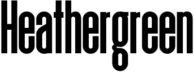
- Heathergreen - Personal use only

- Patron - Personal Use - Personal use only

- Cardo - Personal use only

- Disoluta - Personal use only

- LT Staircase - 100% free

- Droid Sans - 100% free

- Lido STF - Personal use only

- Bellerose - Unknown license

- DejaVu Sans Condensed - Unknown license

- monofur - Unknown license

- Beroga Fettig - 100% free

- Cranberry Cyr - Unknown license

- Mager - Unknown license

- Mops - 100% free

- Improvisation - Unknown license

- Eau - 100% free

- Bertolt Brecht - Unknown license

- PTF NORDIC Rnd - Unknown license

- Clip - Unknown license

- Lamini EQ - Personal use only

- id-asobi_LightOT - Personal use only

- Retriga - Unknown license

- 20th Century Font - Unknown license

- BodinSmall - Unknown license

- New Cicle - Unknown license

- CarawayBold - Unknown license