10,000 search results (0.027 seconds)
  1. Maple Street by Okaycat, $29.00
    Maple Street is a great looking traditional serif font composed by the Okaycat design team, Luke Turvey & Natsuko Hayashida, in 2014. Bold didone forms with structural seriffed detail combine at Maple Street to offer a cozy familiar style, without looking dated. This nicely balanced serif is designed to look outstanding for display or printed publication.
  2. Kaylar by Letterhend, $14.00
    Kaylar Script & Serif is a pair of elegant typeface consist of script and serif font. The beauty script and the condensed serif perfectly matched and bring a luxury and classy feel. What makes it even more special is its unique opentype feature which allows you to enable the swash ornament in a very simple way.
  3. Alchemila by Heyfonts, $18.00
    Alchemila "UNIQUE serif modern font" likely refers to a typeface that combines elements of traditional serif design with contemporary and distinctive features. Serif fonts have small lines or strokes attached to the ends of characters, which can contribute to a more formal or traditional appearance. The term "modern" in this context typically implies a contemporary or updated style. Here's an explanation of the characteristics and significance of a UNIQUE serif modern font: -Serif Elements: Serifs are the small lines or strokes at the ends of characters, and they are a hallmark of traditional typography. In a UNIQUE serif modern font, these serif elements are likely to be present but may have a distinctive shape or style that sets them apart from more conventional serif fonts. -Contemporary Design: The "modern" aspect of the font suggests a contemporary or updated design. This may involve a departure from the more classical serif styles seen in traditional typefaces, incorporating modern design principles, cleaner lines, and a more minimalist aesthetic. -Distinctive Characters: A UNIQUE serif modern font is likely to feature characters with unique and individual design elements. This could include unconventional serifs, letter shapes, or other stylistic details that make the font stand out and contribute to its uniqueness. -Versatility: While serif fonts are often associated with formality and readability, a UNIQUE serif modern font may offer versatility suitable for a range of design applications. It could be used in both traditional and modern contexts, providing flexibility for various design projects. -Applicability to Branding: Fonts play a crucial role in branding, and a UNIQUE serif modern font could be an excellent choice for businesses or projects that want to convey a sense of tradition and reliability while maintaining a contemporary and innovative image. -Digital and Print Design: Modern serif fonts are often designed with both digital and print applications in mind. The clarity of the typeface, even at smaller sizes, and its aesthetic appeal make it suitable for a variety of design projects, from websites and apps to print materials like brochures and posters. -Attention to Detail: The uniqueness of the font may be reflected in the careful attention to detail in each character. This could include refined curves, balanced proportions, and other design elements that contribute to the overall visual appeal and readability of the font. -Available Features: Unique serif modern fonts may come with additional features, such as alternative characters, ligatures, or stylistic sets, allowing designers to customize the appearance of the text for specific design needs. When selecting or working with a UNIQUE serif modern font, designers should consider the overall design goals, the intended audience, and the context in which the font will be used
  4. Optima Cyrillic by Linotype, $65.00
    Many typefaces are distinctive or attractive at the expense of legibility and versatility. Not so the Optima® family. Simultaneously standing out and fitting in, there are few projects or imaging environments outside of its range. Although Optima is almost always grouped with sans serif typefaces, it should be considered a serifless roman. True to its Roman heritage, Optima has wide, full-bodied characters – especially in the capitals. Only the E, F and L deviate with narrow forms. Consistent with other Zapf designs, the cap S in Optima appears slightly top-heavy with a slight tilt to the right. The M is splayed, and the N, like a serif design, has light vertical strokes. The lowercase a and g in Optima are high-legibility two-storied designs. Optima can be set within a wide choice of line spacing values – from very tight to very open. In fact, there are few limits to the amount of white space that can be added between lines of text. Optima also benefits from a wide range of letter spacing capability. It can be set quite tight, or even slightly open – especially the capitals. If there are any guidelines, Optima should be set more open than tight. It’s not that readability is affected that much when Optima is set on the snug side; it’s just that the unhurried elegance and light gray typographic color created by the face are disrupted when letters are set too tight. Optima is also about as gregarious as a typeface can be. It mixes well with virtually any serif design and a surprisingly large number of sans serif faces. The Optima family is available in six weights, from roman to extra black, each with an italic counterpart. In addition, the family is available as a suite of OpenType® Pro fonts, providing for the automatic insertion of small caps, ligatures and alternate characters, in addition to offering an extended character set supporting most Central European and many Eastern European languages. When you’re ready to find its perfect pairing, browse these fantastic matches: Monotype Century Old Style™, Dante®, Frutiger® Serif, Joanna® Nova, Malabar™, and Soho®.
  5. Optima by Linotype, $45.99
    Many typefaces are distinctive or attractive at the expense of legibility and versatility. Not so the Optima® family. Simultaneously standing out and fitting in, there are few projects or imaging environments outside of its range. Although Optima is almost always grouped with sans serif typefaces, it should be considered a serifless roman. True to its Roman heritage, Optima has wide, full-bodied characters – especially in the capitals. Only the E, F and L deviate with narrow forms. Consistent with other Zapf designs, the cap S in Optima appears slightly top-heavy with a slight tilt to the right. The M is splayed, and the N, like a serif design, has light vertical strokes. The lowercase a and g in Optima are high-legibility two-storied designs. Optima can be set within a wide choice of line spacing values – from very tight to very open. In fact, there are few limits to the amount of white space that can be added between lines of text. Optima also benefits from a wide range of letter spacing capability. It can be set quite tight, or even slightly open – especially the capitals. If there are any guidelines, Optima should be set more open than tight. It’s not that readability is affected that much when Optima is set on the snug side; it’s just that the unhurried elegance and light gray typographic color created by the face are disrupted when letters are set too tight. Optima is also about as gregarious as a typeface can be. It mixes well with virtually any serif design and a surprisingly large number of sans serif faces. The Optima family is available in six weights, from roman to extra black, each with an italic counterpart. In addition, the family is available as a suite of OpenType® Pro fonts, providing for the automatic insertion of small caps, ligatures and alternate characters, in addition to offering an extended character set supporting most Central European and many Eastern European languages. When you’re ready to find its perfect pairing, browse these fantastic matches: Monotype Century Old Style™, Dante®, Frutiger® Serif, Joanna® Nova, Malabar™ and Soho®.
  6. Kalela Slab by Afkari Studio, $10.00
    Kalela Slab is Condensed Slab Serif Font a Modern Condensed Slab serif with solid font files. Suitable for branding, name card, stationary, design title, blog header, Logo, greeting cards, quotes, posters, art quote, typography. Kalela Slab Condensed Slab Serif Font also suitable for your any projects. Iclude: Kalela Slab With 4 Weight; Thin, Light, Regular and Bold Features : – Upper Case & Lowercase (All Caps) – Numerals & Punctuations (OpenType Standard) – Accents (Multilingual characters) No special software is required to use Kalela Slab Condensed Slab Serif Font
  7. Amazónica - Personal use only
  8. Chekhovskoy - 100% free
  9. Vineyard - 100% free
  10. Caslon Initials - Unknown license
  11. Typography times - 100% free
  12. Sucker Font - Personal use only
  13. Narnfont - Personal use only
  14. AddCityboy - Unknown license
  15. DIVERGENT - Personal use only
  16. CANDY INC. - Personal use only
  17. Bistecca - Personal use only
  18. 1543HumaneJenson - Personal use only
  19. Juvelo - 100% free
  20. Intruder Alert - Unknown license
  21. Prussian Brew Offset - Unknown license
  22. Covington Cond - Unknown license
  23. Renaiss-Italic - 100% free
  24. NotMaryKate - 100% free
  25. Idolwild - Unknown license
  26. Covington - Unknown license
  27. Penelope - Unknown license
  28. DancingSuperserif - 100% free
  29. Barber shop - Unknown license
  30. BJF Hunnybee - Unknown license
  31. Grunge Serifia - Unknown license
  32. Corrodated J - Unknown license
  33. Patient Paige - Personal use only
  34. CoventryGarden - Unknown license
  35. Amature Circus - Unknown license
  36. FancyPants - Unknown license
  37. Bigplace Caps ExtBd ExtCond - Personal use only
  38. Sainted Extra Bold by Wooden Type Fonts, $15.00
    Extra Bold Serif
  39. Mementor Bold by Wooden Type Fonts, $15.00
    Slab serif, bold
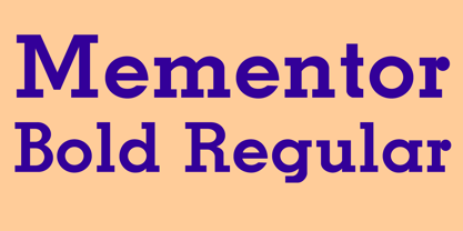
  40. Mementor Medium Regular by Wooden Type Fonts, $15.00
    Medium slab serif
Looking for more fonts? Check out our New, Sans, Script, Handwriting fonts or Categories
abstract fontscontact usprivacy policyweb font generator
Processing