10,000 search results (0.027 seconds)
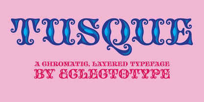
  1. Tusque by Eclectotype, $40.00
    Tusque is a layered chromatic type family with a Tuscan flavor. Regular, Circus and Tooled can stand alone, while Highlight and Deco are purely for layering up multicolored gorgeousness. Tusque lends itself to fairy tales, wine labels and boutique logos, and makes some particularly delectable drop caps. Although it’s all caps, the lower case slots are all different from the upper case so you can mix and match to your heart’s content. There are also a bevy of swash alternates and ligatures at your disposal. The contextual alternates feature cleverly substitutes alternate versions of more triangular glyphs like A and V to give a better fit. The ordinal feature changes ‘a’ and ‘o’ to the feminine and masculine ordinals for Spanish etc. but also changes ‘c’ and ‘ac’ to superscript lowercase versions for names like McBride and MacDonald.
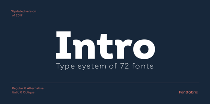
  2. Intro by Fontfabric, $47.00
    Let us introduce you the official big update of Intro type family with essential upgrades to this contemporary sans serif. The weight distributions completely revised has brought 8 new weights and matching italics resulting in 72-fonts family with 22 fonts extra. Intro’s refined playfulness is further emphasized with additions of multiple ingredients, such as carefully adjusted Oblique alternatives next to the existing upright alternatives. All these styles are now available as a Condensed version. On top of that, there are 3 inline fonts. The glyph case was expanded to cover Extended Latin and Cyrillic with adequate language localization. The OpenType features rewritten and improved now allow case-sensitive forms and contextual alternates, and plenty of stylistic alternates. The standard numerals set includes as well tabular figures and symbols, superiors and inferiors, numerators and denominators, plus fractions.
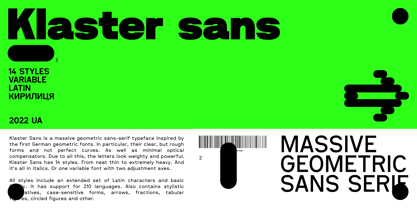
  3. Klaster Sans by Kobuzan, $29.99
    Klaster Sans is a massive geometric sans-serif typeface inspired by the first German geometric fonts. In particular, their clear, but rough forms and not perfect curves. As well as minimal optical compensators. Due to all this, the letters look weighty and powerful. Klaster Sans has 14 styles. From neat thin to extremely heavy. And it's all in italics. Or one variable font with two adjustment axes. All styles include an extended set of Latin characters and basic Cyrillic. It has support for 210 languages. Also contains stylistic alternatives, case-sensitive forms, arrows, fractions, tabular figures, circled figures and other. Features: – Total glyph set: 657 glyphs; – 14 styles (7 weights x italic) + variable; – Support 210+ languages; – Latin Extended; – Cyrillic Basic; OpenType features: – Uppercase, lowercase; – Proportional, circled, tabular numerals, superiors, inferiors, fractions; – Punctuations and symbols; – Arrows; – Stylistic sets (ss01); – Ligatures; – Case-sensitive forms.
  4. Rondalia by Scholtz Fonts, $21.00
    Rondalia is a timeless yet modern font in which the strokes vary in thickness. It is highly readable yet has an informality combined with a quiet elegance. Above all else, Rondalia is well-behaved, ladylike, and can be expected to behave correctly and make the right impression in a wide range of situations. Rondalia is clean and rounded with a slightly Byzantine flavor. It is extremely versatile, equally effective for magazine design, movie posters and cosmetic ads, and for invitations, greeting cards and company profiles. The fact that there is very little difference in height between upper and lower case letters creates a calm, peaceful impression. The font is letterspaced and kerned and has a complete character set (all upper and lower case, numerals and mathematical symbols and a complete set of accented and special characters).
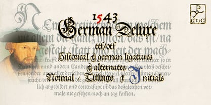
  5. 1543 German Deluxe by GLC, $38.00
    This family was inspired by the sets of fonts used in 1543 by Michael Isengrin, printer in Basel (Germany) to print the splendid New Kreüterbuch...(New herbal...), with numerous nice pictures, the masterpiece of Leonhart Fuchs, father of the modern botany. It is a Schwabacher pattern, with three different sets of fonts, small (± 4mm for the upper case) in the main text, larger for titles (± 8mm for the upper case) and large Initials or lettrines (five lines of main text). This font contains standard ligatures and German historical ligatures (German double s, long s, tz, ch,...) and diacritics (special umlaut "e superscript" and "∞" unstead of dieresis with letters a, o and u,) naturally, we have added numerous letters lacking in the original to permit a contemporary use of the font. It can be used in complement with 1538 Schwabacher or/and 1534 Fraktur.
  6. Lethal Fake by Brush Art Design Office, $39.80
    My name is Teruyoshi Matsui. I am a Brush Art Designer. My foundry ‘Brush Art Design Office’ is situated at the foot of an active volcano ‘ Mt. Aso ’ in the Kumamoto Prefecture, the southern part of Japan. I design the letters of the alphabet with a Japanese brush. I have created the brush font named ‘ Lethal Fake ’ in my unique brush style. At the beginning of making the font I was going to name it ‘BrushType Lethal’ and tell you, “ Be careful using it. That’s because it ’s Lethal ”. But actually I was very disappointed when it was finished. I tried to make it lethal, but it was not. So I changed the font name into ‘ Lethal Fake ’. This time I have to say to you, “ Be careful using it. That’s because it’s not Lethal ”. Thank you.
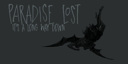
  7. Paradise Lost by Hanoded, $15.00
    Paradise Lost is a 1667 poem by John Milton which mostly concerns the Biblical story of the Fall of Man, Eve's temptation by the devil and the expulsion of Adam and Eve from Eden. It's quite a hefty read, as the poem consists of ten books with over 10.000 lines of verse. Needless to say, I didn't read it all. But, it did give me inspiration for a font, which I called Paradise Lost. It's a good name, even though there is nothing Biblical about this font. Paradise Lost was created (pun intended) using a broken bamboo satay skewer and Chinese ink. It is all caps, but upper and lower case differ and like to mingle. I also included several ligatures for double lower case letters (aa, ee, jj, kk, etc.). Paradise Lost comes with an eternity of diacritics.
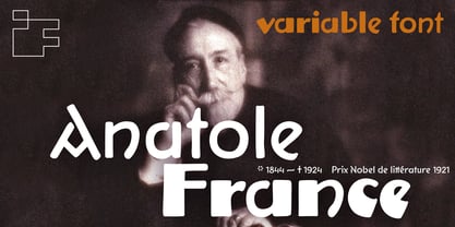
  8. Anatole France by Ingo, $36.00
    handwritten decorative variable font A few fonts already exist which have been drawn in accordance with the exact same principles. But these are just drawn - only drawn. The ANATOLE FRANCE retains the hand script character in spite of its stringent composition. An old portfolio of script patterns from the 1920s or 1930s, which appeared in the Georg D. W. Callwey Publishing House in Munich, includes among its pages one with a handwritten poster script, as was very typical for the 1920s. To begin with, there is the emphasized decorative character, which stands out due to stressing the stems. Next, the attempt to portray the character forms with the help of a few but always recurring basic elements is driven to the limits. Theoretically speaking, that which should have led to a contrived, geometrically determined type, obtains a likeable and pleasant look through the ductus of the manually guided brush. The classic version of ANATOLE FRANCE includes 5 fonts: Light, SemiLight, Normal, SemiBold, Bold. The variable font allows seamless font weights from 300 (Light) to 700 (Bold). Alternate letterforms are available through the appropriate OpenType features: style set 1 (O Q V) style set 2 (v w)
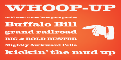
  9. King Tut by Canada Type, $24.95
    King Tut is a restoration and expansion of the original Egyptian Expanded, a single bold face cut in 1850 by Miller & Richard, the famous Edinburgh founders. This aesthetic, though originally issued to help drive simple print advertising of those days, is perhaps the longest lasting genre of typeface. This aesthetic flourished in the later part of the 19th century, helped by the surge of similar faces from England (such as Figgins' Antique 6 and Expanded Antique), and became the defining index of the old American wild west that continues to this very day. King Tut serves up its impact through a balance between the wide, compact letterforms and elegant curvature that manages to come through even in confined areas. The family's weight variety allows for more options in counterspace use as well as precision in the amount of curve definition and contrast needed by the typographer. The lighter weights completely oppose that 19th century boldness and expose the alphabet's skeleton in a strive for simplicity that fits modern applications. With generous language support to boot, King Tut's diverse offerings make it an essential addition to today's designer repertoire.
  10. Aron Grotesque - Personal use only
  11. SF Espresso Shack - Unknown license
  12. Action Man - Unknown license
  13. SF Planetary Orbiter - Unknown license
  14. SF Burlington Script - Unknown license
  15. SF Groove Machine - Unknown license
  16. SF Port McKenzie - Unknown license
  17. SF Zero Gravity - Unknown license
  18. SF Synthonic Pop - Unknown license
  19. SF Willamette Extended - Unknown license
  20. TypographerGotisch Schmuck - Unknown license
  21. SF Wasabi Condensed - Unknown license
  22. SF Chromium 24 - Unknown license
  23. SF Cosmic Age - Unknown license
  24. Engebrechtre Expanded - Unknown license
  25. Elektronik - Personal use only
  26. Oldbrothers - Personal Use - Personal use only
  27. Megalito Slab ExtCond - Personal use only
  28. Space Age - Unknown license
  29. JUSTICE LEAGUE - Personal use only
  30. BjorkFont - Unknown license
  31. Barbarian - 100% free
  32. ‘DragonForcE’ - 100% free
  33. The Black Box - Personal use only
  34. Candy Pop! - Personal use only
  35. STR - 100% free
  36. FellFel - Personal use only
  37. Tabarra Black - Personal use only
  38. Future Earth - 100% free
  39. Toony Black - Personal use only
  40. Konstruktor - Personal use only
Looking for more fonts? Check out our New, Sans, Script, Handwriting fonts or Categories
abstract fontscontact usprivacy policyweb font generator
Processing