10,000 search results
(0.046 seconds)
- Disruptor's Script by Piñata,
$15.00Disruptor's Script is the alter ego of our previous project Gentlemen's Script. Unlike the Gentlemen's Script, the new font is an elegant rebel and defies traditions. The font is painted with a brush pen, which is especially noticeable in the characteristic shabbiness and different thicknesses of the strokes. While the Gentlemen's Script is an embodiment of a classic costume, dress shoes and an expensive watch, Disruptor's Script is a fashionable suit, sneakers, an iWatch and a tattoo that peeks from under the shirt. The font retained the incline, speed and overall sense of dynamics inherent in Gentlemen's Script, but got a bit more chaotic and unpredictable. This is especially noticeable in the newly added shabbiness, elongated extenders, a large number of contextual alternates and different ligatures. For some high-frequency letters (10 for the Latin alphabet and 10 for the Cyrillic alphabet), we painted alternative versions that are substituted in the word instead of the standard characters when following our preceding certain groups of letters. In addition, in the Disruptor's Script you can find functional ligatures, including some of the frequently occurring two- and three-letter combinations. All these solutions dilute the monotonous line of the set, add a bit of unpredictability to the font and a touch of chaos to inscriptions. To fully enjoy usage of the font, we recommend that you always keep the features contextual alternates (calt) and standard ligatures (liga) turned on. If you do not have access to applications that support OpenType features, it does not matter—even without these features you can use and enjoy our font! - TELETYPE 1945-1985 - Unknown license
- Bloem by Eurotypo,
$24.00Bloem, two new fonts with oodles of character designed by Carine de Wandeleer. Its slight bounce and intentional irregularity gives your words a wonderful flow. The thick and thin strokes in this typeface combine balance and harmony. This new font family includes a sans regular and a script font. The script has OpenType features such as Stylistics and Contextual alternates, Swashes, Ligatures, up to nine Stylistic sets by letter that allow you to mix and match pairs of letters and a Central European language support to fit your design. This will help your creativity and make it easier to make the impressive and elegant typographic work. All OpenType features may only be accessible via OpenType-aware applications, or the Character Map to view and copy any of the extra characters to paste into your favorite text editor/app. Bloem Sans is a complementary handmade font, that works in harmony with Bloem script to create accurate typographic designs quickly! Bloem looks lovely on wedding invitations, greeting cards, logos, business-cards, fashion, magazines, food packaging and menus, book covers and whatever your imagination holds! - Resistance Is by Comicraft,
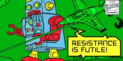
$19.00You will not move. You will not breathe. You will not think. You WILL buy this font. You are our prisoner. There is no escape... RESISTANCE IS FUTILE! Also Useless. RESISTANCE IS… was created for the voice of the evil robot Sentinels in X-MEN: AGE OF APOCALYPSE, and later used for the friendly robot in BATTLE CHASERS and robot police in ELEPHANTMEN. A font for all your robot needs! See the families related to Resistance Is Futile and Useless: Resistance is Lowered - Tsubu by Takehiko Ono,
$5.00“Tsubu” (つぶ) means something small and round, like a fruit seed or a grain of rice in Japanese. All characters are completely geometric, consisting of no more than 5 x 12 dots, with a few exceptions. And proportional and monospace styles are available. It is recommended that letter spacing be set to 0 to maintain dot pitch. When the line height is set to 100%, the dot pitch is aligned horizontally and vertically, resulting in a beautiful geometric display. - Earwig Factory by Typodermic,
$11.95Picture this: a wild and zany world filled with popping colors, energetic beats, and a touch of surrealism. That’s the world of Earwig Factory, a font that’s as vibrant and playful as it is versatile. With its jumbled cut-outs and scattered letters and numerals, Earwig Factory is a font that defies convention. But that’s not all: when you use it in OpenType-savvy programs, the letters and numerals become even more dynamic, pseudorandomized to create a more realistic and unpredictable feel. It’s like every time you use the font, you’re getting a new and unique experience. But why stop there? With Earwig Factory, you can also create your own color and texture layers using the “letters” and “cards” styles. Want to make your font even more eye-catching? Simply add an additional “cards” layer and offset it slightly to create a drop shadow effect. The possibilities are endless, and the results are always electric. So why settle for a boring, predictable font when you can unleash the zany power of Earwig Factory? Whether you’re designing a poster, a logo, or anything in between, this font will add a touch of irreverence and excitement that’s impossible to ignore. So go ahead, let your creativity run wild, and see what Earwig Factory can do for you! Most Latin-based European writing systems are supported, including the following languages. Afaan Oromo, Afar, Afrikaans, Albanian, Alsatian, Aromanian, Aymara, Bashkir (Latin), Basque, Belarusian (Latin), Bemba, Bikol, Bosnian, Breton, Cape Verdean, Creole, Catalan, Cebuano, Chamorro, Chavacano, Chichewa, Crimean Tatar (Latin), Croatian, Czech, Danish, Dawan, Dholuo, Dutch, English, Estonian, Faroese, Fijian, Filipino, Finnish, French, Frisian, Friulian, Gagauz (Latin), Galician, Ganda, Genoese, German, Greenlandic, Guadeloupean Creole, Haitian Creole, Hawaiian, Hiligaynon, Hungarian, Icelandic, Ilocano, Indonesian, Irish, Italian, Jamaican, Kaqchikel, Karakalpak (Latin), Kashubian, Kikongo, Kinyarwanda, Kirundi, Kurdish (Latin), Latvian, Lithuanian, Lombard, Low Saxon, Luxembourgish, Maasai, Makhuwa, Malay, Maltese, Māori, Moldovan, Montenegrin, Ndebele, Neapolitan, Norwegian, Novial, Occitan, Ossetian (Latin), Papiamento, Piedmontese, Polish, Portuguese, Quechua, Rarotongan, Romanian, Romansh, Sami, Sango, Saramaccan, Sardinian, Scottish Gaelic, Serbian (Latin), Shona, Sicilian, Silesian, Slovak, Slovenian, Somali, Sorbian, Sotho, Spanish, Swahili, Swazi, Swedish, Tagalog, Tahitian, Tetum, Tongan, Tshiluba, Tsonga, Tswana, Tumbuka, Turkish, Turkmen (Latin), Tuvaluan, Uzbek (Latin), Venetian, Vepsian, Võro, Walloon, Waray-Waray, Wayuu, Welsh, Wolof, Xhosa, Yapese, Zapotec Zulu and Zuni. - Adigiana 2 - Unknown license
- CAC Lasko Even Weight - Unknown license
- Spork - 100% free
- Walk Da Walk Two - Personal use only
- Hello Pirates - Personal Use - Personal use only
- Brewsky - 100% free
- October Crow - 100% free
- Hitalica - Personal use only
- Savia Outline - Personal use only
- PR Agamemnon - Unknown license
- !Basket of Hammers - Unknown license
- Szorakatenusz - 100% free
- Brushed - Unknown license
- Clementine Sketch - Unknown license
- Angryblue - Unknown license
- CrawfishPopsicle - Unknown license
- delizioso - Personal use only
- Aswell - Unknown license
- Talvez assim - Personal use only
- Monogram kk sc - Personal use only
- monogram kk - Personal use only
- FZ JAZZY 12 CRACKED - Unknown license
- Twitty Bird NF by Nick's Fonts,
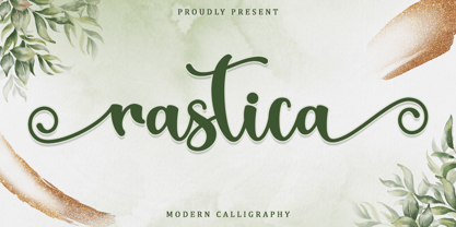
$10.00Dan X. Solo's book of Showcard Alphabets featured the pattern for this devil-may-care face under the name "Conway". Not too pretty, not too proud, but a whole lotta fun. Both versions of the font include 1252 Latin, 1250 CE (with localization for Romanian and Moldovan). - Rastica by Sakha Design,
$14.00 - Sachiko - Personal use only
- Trace by Linecreative,
$16.00Introducing "Trace," a captivating display font that seamlessly marries the ancient mystique of Nordic symbols with a bold, futuristic modernity. This unique typeface transcends traditional boundaries, emerging as a striking fusion of historical symbolism and cutting-edge design. "Trace" is not merely a font; it's a visual journey that bridges the past and the future, offering a distinctive and versatile aesthetic. Inspired by Nordic symbols, "Trace" breathes new life into these ancient motifs, infusing them with a sleek and contemporary vibe. Each character carries the rich storytelling heritage of Nordic culture, interpreted through a lens of modern sophistication. The result is a font that is both timeless and forward-thinking, making it an ideal choice for those seeking a balance between tradition and innovation. As a display font, "Trace" commands attention with its bold and commanding presence. Its carefully crafted letterforms embody a sense of strength and purpose, while the subtle Nordic influences add an air of mystery and intrigue. Beyond its role as a traditional typeface, "Trace" transcends expectations by doubling as a symbol font. Unlock a treasure trove of symbolic possibilities, allowing you to weave intricate narratives or create visually stunning patterns that go beyond the constraints of traditional alphabets. Whether you're designing for futuristic branding, creating a visual language for a tech-forward project, or simply seeking a font that tells a story of cultural richness, "Trace" is your creative companion. Versatile and impactful, this font opens doors to a realm where ancient symbols and modern design converge, allowing you to explore uncharted territories in your creative endeavors. Embark on a design journey that spans centuries with "Trace. What you get, you will get: 1. Trace - Clean San serif font including Uppercase & Lowercase (ALL CAPS) characters, 2. Numbers and Punctuation 3. Support Multi language (Western Europe Latin) - Fan Script by Sudtipos,
$99.00A friend of mine says that sports are the ultimate popular drug. One of his favorite things to say is, “The sun’s always shining on a game somewhere.” It’s hard to argue with that. But that perspective is now the privilege of a society where technology is so high and mighty that it all but shapes such perspectives. These days I can, if I so choose, subscribe to nothing but sports on over a hundred TV channels and a thousand browser bookmarks. But it wasn't always like that. When I was growing up, long before the super-commercialization of the sport, I and other kids spent more than every spare minute of our time memorizing the names and positions of players, collecting team shirts and paraphernalia, making up game scenarios, and just being our generation’s entirely devoted fans. Argentina is one of the nations most obsessed with sports, especially "fútbol" (or soccer to North Americans). The running American joke was that we're all born with a football. When the national team is playing a game, stores actually close their doors, and Buenos Aires looks like a ghost town. Even on the local level, River Plate, my favorite team where I grew up, didn't normally have to worry about empty seats in its home stadium, even though attendance is charged at a high premium. There are things our senses absorb when we are children, yet we don't notice them until much later on in life. A sport’s collage of aesthetics is one of those things. When I was a kid I loved the teams and players that I loved, but I never really stopped to think what solidified them in my memory and made them instantly recognizable to me. Now, thirty-some years later, and after having had the fortune to experience many cultures other than my own, I can safely deduce that a sport’s aesthetic depends on the local or national culture as much as it depends on the sport itself. And the way all that gets molded in a single team’s identity becomes so intricate it is difficult to see where each part comes from to shape the whole. Although “futbol” is still in my blood as an Argentinean, I'm old enough to afford a little cynicism about how extremely corporate most popular sports are. Of course, nothing can now take away the joy I got from football in my childhood and early teens. But over the past few years I've been trying to perceive the sport itself in a global context, even alongside other popular sports in different areas of the world. Being a type designer, I naturally focus in my comparisons on the alphabets used in designing different sports experiences. And from that I've come to a few conclusions about my own taste in sports aesthetic, some of which surprised me. I think I like the baseball and basketball aesthetic better than football, hockey, volleyball, tennis, golf, cricket, rugby, and other sports. This of course is a biased opinion. I'm a lettering guy, and hand lettering is seen much more in baseball and basketball. But there’s a bit more to it than that. Even though all sports can be reduced to a bare-bones series of purposes and goals to reach, the rules and arrangements of baseball and basketball, in spite of their obvious tempo differences, are more suited for overall artistic motion than other sports. So when an application of swashed handlettering is used as part of a team’s identity in baseball or basketball, it becomes a natural fit. The swashes can almost be visual representation of a basketball curving in the air on its way to the hoop, or a baseball on its way out of the park. This expression is invariably backed by and connected to bold, sleak lettering, representing the driving force and precision (arms, bat) behind the artistic motion. It’s a simple and natural connective analysis to a designer, but the normal naked eye still marvels inexplicably at the beauty of such logos and wordmarks. That analytical simplicity was the divining rod behind Fan Script. My own ambitious brief was to build a readable yet very artistic sports script that can be a perfect fit for baseball or basketball identities, but which can also be implemented for other sports. The result turned out to be quite beautiful to my eyes, and I hope you find it satisfactory in your own work. Sports scripts like this one are rooted in showcard lettering models from the late 19th and early 20th century, like Detroit’s lettering teacher C. Strong’s — the same models that continue to influence book designers and sign painters for more than a century now. So as you can see, American turn-of-the-century calligraphy and its long-term influences still remain a subject of fascination to me. This fascination has been the engine of most of my work, and it shows clearly in Fan Script. Fan Script is a lively heavy brush face suitable for sports identities. It includes a variety of swashes of different shapes, both connective and non-connective, and contains a whole range of letter alternates. Users of this font will find a lot of casual freedom in playing with different combinations - a freedom backed by a solid technological undercurrent, where OpenType features provide immediate and logical solutions to problems common to this kind of script. One final thing bears mentioning: After the font design and production were completed, it was surprisingly delightful for me to notice, in the testing stage, that my background as a packaging designer seems to have left a mark on the way the font works overall. The modern improvements I applied to the letter forms have managed to induce a somewhat retro packaging appearance to the totality of the typeface. So I expect Fan Script will be just as useful in packaging as it would be in sports identity, logotype and merchandizing. Ale Paul - Antagonist - Personal Use - Personal use only
- Signika - 100% free
- Comfortaa - 100% free
- ENYO Serif Light - Personal use only
- Telegrafico - Unknown license
- Datura - Unknown license
- fresh - Personal use only


