The font Sofachrome, crafted by the renowned typeface designer Ray Larabie, is a glimpse into the future through the lens of the past. It's a font that embodies the spirit of the high-speed, technolo...
The font named Black Metal G encapsulates the raw energy and unbridled aggression found in the black metal music genre. Designed to echo the visual aesthetics commonly associated with this style of m...
WMLeaves1, though not recognized universally in the realm of typography, seems to evoke a niche but artistic attraction presumably based on its name. In a world abundant with fonts, each brings its u...
The font named SAVE THE HONEYBEE, created by SpideRaY, is a distinctive and purpose-driven typeface, conceived with the intention of raising awareness about the critical issue of honeybee conservatio...
The essence of the Graffiti font mirrors the vibrant, expressive, and sometimes rebellious spirit of street art from which it draws inspiration. This type of font captures the raw energy and boldness...

The idea of Limes emerged at the seashore last year in late summer. Getting ready in advance for a dark winter, we've decided to design a special fontfamily which would bring a bit of vitamins and summer sun into the rough everyday routine and help us survive the cold winter. Limes is both a dream of the sun while it’s gone and a refreshing breeze for the time when it finally gets warm! Limes is a completely handwritten fontfamily and consists of 23 typefaces. To create Limes Sans and Limes Slab families, we've used regular watercolor brushes, and to create monolinear Limes Script, as well as for Catchwords and Dingbats, we've used a felt-tip pen with circular section. Limes Sans and Limes Slabs fonts work perfectly together with Limes Script due to the general handwritten idea, as well as due to the widths contrast – despite its width, Limes Script mixes well with narrower opponents and adds a bit of human spontaneity into the general handwritten concept. The Limes collection includes: Limes Sans (Thin, Light, Regular, Bold, Black & italics), Limes Slab (Thin, Light, Regular, Bold, Black & italics), Limes Script, Catchwords and Dingbats. Limes Sans and Limes Slab widely support OT features: tnum, ordn, frac, case, numr, dnom, subs, sups, and Limes Script uses a large number of context alternatives.
As of my last update in April 2023, there isn't a widely recognized or commercially available font specifically known as "Annon." However, the task of imagining or describing a font by this name prov...
The "Haunt AOE" font, developed by the creative minds at Astigmatic One Eye Typographic Institute, is a unique typeface that truly captures the essence of its namesake. Designed to evoke feelings of ...
Reactor A1 by Yautja is a font that embodies a futuristic, dynamic essence tailor-made for projects that aim to stand out with a bold, innovative aesthetic. Imagine letters that have been sculpted fr...
Ah, LT Chickenhawk! Such a name evokes images of brave, intrepid fowls, doesn't it? Crafted by the creative minds at Nymphont, this font strides into your design projects with the confidence of a chi...
Ah, Patron - Personal Use by Shaped Fonts: the font equivalent of that friend who can rock both a tuxedo and a pair of sneakers with equal flair. Imagine a font that has decided to gallantly step out...
Foobar Pro by CheapProFonts is a versatile and elegantly designed font that finds its origins in a creative pursuit towards balancing functionality with style. This font family embodies a modern aest...
As of my last update in 2023, "Blue Jeans" by Bradford Cox is not widely recognized as a specific font in mainstream typographic resources or font directories. It's essential to clarify that Bradford...
Sure, I'd be delighted to paint you a vivid picture of the font named "Felt" crafted by Pat Snyder. Imagine diving into the cozy world of crafting, where textures, warmth, and a touch of homemade cha...
The font Komika Title, created by Apostrophic Labs, is a distinctive and vibrant typeface that falls within the display category due to its unique characteristics and visual appeal. This font is part...
Gentium, a typeface family created by SIL International, is distinguished by its comprehensive approach to typographic representation. Designed by Victor Gaultney, Gentium (which means "of the nation...
As of my last update, there isn't a specific font named "CNN" officially created or endorsed by Ray Larabie that is widely recognized in the type design industry. Ray Larabie is a prolific Canadian t...
Ah, COM (sRB) by sRB-Powers, a true enigma wrapped in a digital font file. Imagine if a group of pixels woke up one day, decided to become fonts, and then went on a wild, adventurous spree guided by ...
SchulVokalDotless is a distinctive typeface designed by Manfred Klein, a reputable figure in the realm of typography known for his eclectic and wide-ranging font designs. As its name suggests, “Schul...
The unique font "Broken 15" by Misprinted Type, also known as Eduardo Recife, is an evocative and highly characteristic typeface that dives into the artistic realms of the unconventional. Nestled wit...
As a virtual being without real-time access, I can weave a narrative around what the font named Noisebaby, created by Otoko Aie, might encapsulate, based on its evocative name and potential design et...
Imagine a font that embodies the sleekness of modern design and the openness of futuristic concepts, all while maintaining an ease of readability that makes it perfect for a wide range of application...
Negro by Storm Type Foundry, $32.00 Dark, spicy & distinctive display typefaces from the nineteenth century I had in mind when creating this font family. Extreme contrasts and sharp endings may remotely remind some blackletters, especially in narrowed styles. The range of interpolated widths is useful for designing a provoking poster, magazine, music or book cover.
Eilis by Agnieszka Ewa Olszewska, $25.00 Another modern, fun, and experimental display font in my library. Looks like made with a strong gesture. A bit constructive with cursive elements. Contains 2 uppercase sets, and some extra characters. You can play with them and mix them at your will. Contains European languages diacritics and punctuation signs.
Rapazola is a new geometrical typeface, it was inspired by the moments of childhood and it's play. This typeface contains five different weights, Extra Light, Light, Regular, Bold and Extra Bold, all with the completed alphabet A to Z, upper and lower case, all numbers and some symbols.
Rachee Display is a modern serif typeface. Inspired by late Renaissance-era type and intended for display font, perfect for logotype, logogram, title, caption, and more. Rachee comes with 6 weights with some opentype features (Linnning figure, full 'ff' ligature, luballin avantgarde ligature, stylistic set, fraction, and more).
Fatty Fatty Boombalatty PW is suitable for display use for titles, as well as short paragraphs of text. This font contains some alternates and ligatures for your creative pleasure. Fatty Fatty Boombalatty PW is available in OpenType and TrueType format which are both included in the same package.
PiS Penny Serenade is an elegant all caps high-contrast sans with some serif-y elements in the caps, inspired by the handwritten titles of the 1941 melodrama movie of the same name. Be sure to use the art deco style alternate glyph set for more 1920s vintageness!
The graffiti style that is favored by young people. Comes in 2 styles (Regular & Outline). Can be applied to clothing design, crafts, posters, hip hop music, children's book covers, comics, cartoons etc. See some of the previews above for reference. Features: -Uppercase -Numeral -Punctuation -Multilingual -PUA Encoded -Opentype Features
Decano is a modern sans serif, ALL-CAPS, display font. Using a ten-sided polygon, or decagon for the usually circular characters and employing similar angles for the rest of the character set gives us some strong and interesting word forms. It’s great for branding, headlines, and signage.
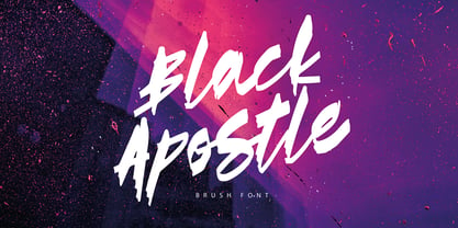
Black Apostle is a hand drawn brush font. It comes with uppercase and lowercase characters, set of punctuation glyphs, numerals, Cyrillic characters, some Cyrillic ligatures and multilingual support. Perfect for logos, quotes, posters, branding projects, product packaging, t-shirt, book cover, greeting cards and applicable for any graphic design.
The idea for Gummed Letters JNL came from an online auction of some foil-embossed gummed letters from the 1940s and 1950s. One particular set was of a sans serif face that hadn't been produced in decades, and Jeff Levine felt it was worthy of a digital treatment.
Enviro is the work of American graphic designer F. Scott Garland. A lighthearted sans serif, Enviro evokes the style of the movie industry from the 1920s and 30s. Some forms are mildly abstract, but they remain legible nonetheless. Enviro attracts attention and gives any headline a unique look.
Chamber of Commerce JNL is loosely based on a type style used for some rubber stamp letters and numbers from a vintage child's printing set. Originally a cast shadow design, Jeff Levine felt the lettering merited a direct treatment in both regular and oblique styles without the shadow effect.
The Fontazia Chateaux series features a unique assortment of characters inspired by some of the great castles and chateaus of Europe and beyond. These simple yet elegant symbols are delivered to you in both silhouette and outline format. For more in the Chateaux series, see also Fontazia Chateaux Deux.
James Black, a signature milli pen font with classy handwriting style. This is a perfect font for business, for your personal feels, for everything about you smart people! You will get a casual handwritten font with some ligatures that will give you more taste of high class personality.
This calligraphic type is based on a free-styled blackletter with an ink-stained spirit. By having several stylistic alternates (on both U&lc.) plus some non standard ligatures, your text may look like it’s written or handmade! You should combine this font with Agony, also available on MyFonts.
A hard-headed brush font with strong strokes and attitude! Comes with contextual alternates, and in this case you have 4 different versions of each letter - they cycle automatically as you type for nice randomness! Of course there is multilingual support as well! Enjoy and crash some designs!
A 1930s kids' premium booklet from Post cereals called "Inspector Post's Junior Detective Corps Manual #2" offered up some great hand lettering in an Art Deco sans serif style. Bold, authoritative and perfect for headlines or titling, Junior Detective JNL now recreates this hand lettering in digital form.
Reso is an experimental geometric typeface built from a pointed arch module. Its minimal and contemporary letter shapes makes it well suited for logo design, headers and short texts. Five weights are available in OpenType format. The fonts include some standard OpenType features and support for most European languages.