10,000 search results (0.035 seconds)
  1. NFL Falcons - Unknown license
  2. the EV$NT - Personal use only
  3. I Want My TTR! (Condensed) - Unknown license
  4. LC Bagira - Unknown license
  5. Warzone97 - Unknown license
  6. XXII ARMY - Unknown license
  7. PassCaps - Unknown license
  8. Qbicle 2 BRK - Unknown license
  9. Oneworldonefuture - Unknown license
  10. The Aeroplane Flies High - Unknown license
  11. Vipertuism - Unknown license
  12. West point - Unknown license
  13. Broad - Unknown license
  14. Omega Sentry - Unknown license
  15. Faktos - Unknown license
  16. Plasmatica Outline - Unknown license
  17. Chain_Reaction - Unknown license
  18. Alecto Demo - Unknown license
  19. WalrusGumbo - Unknown license
  20. ShampooSW - Unknown license
  21. BASEHEAD - Unknown license
  22. Querencia Army DEMO VERSION - Unknown license
  23. Heavy Heap - Unknown license
  24. Iron Lounge Smart - Unknown license
  25. Walk Da Walk Two - Personal use only
  26. Valerius - Personal use only
  27. Laughing Kids by Putracetol, $24.00
    Junior Schoolboy - Bold Fun Display Font. Junior Schoolboy a bold, quirky display font with a fun and trendy cute characters. With a childish style, it will be very suitable for your project, which is related to children. Such as story books, illustrations, comic books, t-shirts, posters, greeting cards, logos, branding, stickers, svg, crafting. The alternative characters were divided into several Open Type features such as Swash, Stylistic Sets, Stylistic Alternates, Contextual Alternates, and Ligature. The Open Type features can be accessed by using Open Type savvy programs such as Adobe Illustrator, Adobe InDesign, Adobe Photoshop Corel Draw X version, And Microsoft Word. This font is also support multi language.
  28. Legator by Putracetol, $25.00
    Legator - Super Bold Display Font. Legator a super bold, quirky display font with a fun and trendy characters. With a sporty style, it will be very suitable for your project, which is related to sport display. Such as story books, illustrations, comic books, t-shirts, posters, greeting cards, logos, branding, stickers, svg, crafting. The alternative characters were divided into several Open Type features such as Swash, Stylistic Sets, Stylistic Alternates, Contextual Alternates, and Ligature. The Open Type features can be accessed by using Open Type savvy programs such as Adobe Illustrator, Adobe InDesign, Adobe Photoshop Corel Draw X version, And Microsoft Word. Legator is also support multi language.
  29. Tailor Craft by Putracetol, $24.00
    Tailor Craft - Bold Quirky Display Font. Tailor Craft a bold, quirky display font with a fun and trendy cute characters. With a childish style, it will be very suitable for your project, which is related to children. Such as story books, illustrations, comic books, t-shirts, posters, greeting cards, logos, branding, stickers, svg, crafting. The alternative characters were divided into several Open Type features such as Swash, Stylistic Sets, Stylistic Alternates, Contextual Alternates, and Ligature. The Open Type features can be accessed by using Open Type savvy programs such as Adobe Illustrator, Adobe InDesign, Adobe Photoshop Corel Draw X version, And Microsoft Word. This font is also support multi language.
  30. Junior Schoolboy by Putracetol, $16.00
    Junior Schoolboy - Bold Fun Display Font. Junior Schoolboy a bold, quirky display font with a fun and trendy cute characters. With a childish style, it will be very suitable for your project, which is related to children. Such as story books, illustrations, comic books, t-shirts, posters, greeting cards, logos, branding, stickers, svg, crafting. The alternative characters were divided into several Open Type features such as Swash, Stylistic Sets, Stylistic Alternates, Contextual Alternates, and Ligature. The Open Type features can be accessed by using Open Type savvy programs such as Adobe Illustrator, Adobe InDesign, Adobe Photoshop Corel Draw X version, And Microsoft Word. This font is also support multi language.
  31. Story Fresh by Artisan Studio, $10.00
    Story Fresh is a family script font, with 5 styles: brush, bold, medium, normal and light. Story Fresh a work that is purely handmade, has its own characteristics with the style of monoline. this is perfect for invitations, signatures, blogs, social media, business cards, product brands. FILE INCLUDE - Story Fresh Brush (OpenType,PUA) - Story Fresh Bold (OpenType,PUA) - Story Fresh Medium ( OpenType,PUA) - Story Fresh Normal ( OpenType,PUA) - Story Fresh Light ( OpenType,PUA) OpenType features can be accessed by using OpenType smart programs such as Adobe Photo Shop, Adobe Illustrator, Adobe Indesign, Corel Draw and Microsoft Office. special greetings for all, all of us all smoothly in running the routin
  32. Taylor Julianne by Grezline Studio, $15.00
    Taylor Julianne is a bold display font with vintage charm. This font was created to give your headlines and logotype projects a strong and confident touch. Taylor Julianne font is also usable in a wide range of works such as logos, covers, posters, quotes, product packaging, merchandise, social media and much more! Feature : - Accompanied by aesthetic ornaments - Multilingual Language - Works on PC & Mac - Simple installations - Accessible in the Adobe Illustrator, Adobe Photoshop, Adobe InDesign, even works on Microsoft Word.
  33. Thalib by Omotu, $18.00
    Thalib is an elegant bold script font with retro look. Comes with 2 styles, clean and textured. Suitable for logotype, branding, packaging design, poster design, website/display, editorial, headline, advertising, and more. Whats Include? Opentype support Multilingual support PUA encoded Features: Uppercase, lowercase, numerals, punctuations, alternates, contextual alternates, and stylistic sets Accessible in the Adobe Illustrator Glyphs panel, or under Stylistic Alternates in the Adobe Photoshop OpenType menu, Adobe InDesign, Corel Draw, even work on Microsoft Word
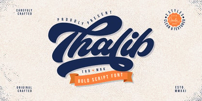
  34. Laughter JNL by Jeff Levine, $29.00
    Laughter JNL is a deconstruction of the vintage sign painter's design Brushmark JNL. By flattening most of the curved lines and making other minor adjustments to the original font, the end result was a fun and playful sanserif that is great for lighthearted ads, party invitations, special events, point-of-sale signage and many other applications where a less-than-formal type style is required.
  35. 2 Quadro by Apostrof, $50.00
    This big family summarizes and develops the tradition of boldface squared-off 45° shear sanserifs. Known from the middle of 19th century and actively used in different times (1920s, 1970s) is still usable now, thanks to its brutal expression, monumentality and possibility to fully maximize the flatness without loss of readability. This font is especially good for filling letters with photos or to create geometrical “constructivist” compositions.
  36. Serifa by Bitstream, $29.99
    Developed by Adrian Frutiger for Bauer in 1966, Serifa is a slabserif based on the principles that led to the success of Frutiger’s 1956 sanserif, Univers. Glypha, designed by Frutiger for Stempel in 1979, is a version of Serifa with a moderately larger x-height; Stempel has paid royalties on Glypha to Neufville since 1984. Serifa® font field guide including best practices, font pairings and alternatives.
  37. Rhode by Font Bureau, $40.00
    Generous curves above and below the straight-sided Railroad Gothic parallel those of Figgins’s elephantine Grotesques, lending to both British and American series their monumental qualities. Shrinking the center strokes and counters to emphasize a massive periphery, David Berlow has used this curious similarity to suspend a complete family of sanserifs between the two forms, a manly series of great dignity and presence; FB 1997
  38. Prosaic Std by Typofonderie, $59.00
    A Postmodern vernacular sanserif in 8 fonts Prosaic designed by Aurélien Vret is a Postmodern typographic tribute to the french vernacular signs created by local producers in order to directly market their products visible along the roads. These signs drawn with a brush on artisanal billboards do not respect any typographic rules. The construction of these letterforms is hybrid and does not respect any ductus. Nevertheless the use of certain tools provokes a certain mechanism in the development of letter shapes. It’s after many experiments with a flat brush, that’s these letterforms have been reconstructed and perfected by Aurélien Vret. This is the starting point for the development of an easily reproducible sanserif with different contemporary writing tools. From non-typographical references of Prosaic towards readability innovation The influence of the tool is revealed in the letterforms: angular counterforms contrasting to the smoothed external shapes. This formal contrast gives to Prosaic a good legibility in small sizes. These internal angles indirectly influenced by the tool, open the counterforms. In the past, to deal with phototype limitations in typeface production, some foundries modified the final design by adding ink traps. In our high resolution digital world, these ink traps — now fashionable among some designers — have little or no effect when literally added to any design. Should one see in it a tribute to the previous limitations? Difficult to say. Meanwhile, there are typeface designers such as Ladislas Mandel, Roger Excoffon, and Gerard Unger who have long tried to push the limits of readability by opening the counters of their typefaces. Whatever the technology, such design research for a large counters have a positive impact on visual perception of typefaces in a small body text. The innovative design of counter-forms of the Prosaic appears in this second approach. Itself reinforced by an exaggerated x-height as if attempting to go beyond the formal limits of the Latin typography. It is interesting to note how the analysis of a non-typographical letters process has led to the development of a new typographic concept by improving legibility in small sizes. Disconnected to typical typographic roots in its elaboration, Prosaic is somewhat unclassifiable. The formal result could easily be described as a sturdy Postmodern humanistic sanserif! Humanistic sanserif because of its open endings. Sturdy because of its monumental x-height, featuring a “finish” mixing structured endings details. The visual interplay of angles and roundness produces a design without concessions. Finally, Prosaic is Postmodern in the sense it is a skeptical interpretation of vernacular sign paintings. Starting from a reconstruction of them in order to re-structure new forms with the objective of designing a new typeface. Referring to typographic analogy, the Prosaic Black is comparable to the Antique Olive Nord, while the thinner versions can refer to Frutiger or some versions of the Ladislas Mandel typefaces intended for telephone directories. Prosaic, a Postmodern vernacular sanserif Prosaic is radical, because it comes from a long artistic reflection of its designer, Aurélien Vret, as well a multidisciplinary artist. The Prosaic is also a dual tone typeface because it helps to serve the readability in very small sizes and brings a sturdy typographic power to large sizes. Prosaic, a Postmodern vernacular sanserif
  39. Kremlin Alexander - Unknown license
  40. Astigma - Unknown license
Looking for more fonts? Check out our New, Sans, Script, Handwriting fonts or Categories
abstract fontscontact usprivacy policyweb font generator
Processing