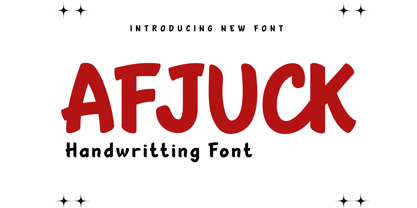
Introducing AFJUCK Font – a captivating display typeface that effortlessly captures the essence of authentic handwriting! Elevate your projects with the artistic touch of AFJUCK, a perfect blend of style and individuality. Explore AFJUCK now to see your creations spring to life! What’s Included : File font All glyphs Iso Latin 1 Alternate, Ligature Simple installations PUA Encoded Characters – Fully accessible without additional design software. Fonts include Multilingual support
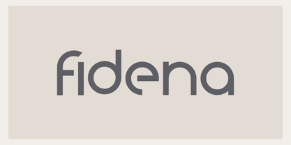
idena is an elegant sans serif font. Suitable for a variety of designs because of its neat and simple style, Fidena has the potential to become your favorite font of choice, whatever the occasion! Fidena includes four extraordinary weights - ordinary, hollow, thick and thin! They all work perfectly with each other and are an ideal companion for scripts and serifs. Download this and see for yourself!
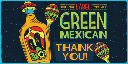
Introducing a vintage look label font named "Green Mexican". You can see all available characters in the posters. This font has 4 styles. This font will look good on any retro design like poster, t-shirt, label, logo etc.
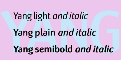
Yang by Wiescher Design, $39.50 Yang is a new Sans typeface that has a little bit of Ying in it. This combination makes it a very versatile font. Just give it a try and you will see. Yours working on the "Ying", Gert Wiescher

The current trend is social media, friendship connection applications and personal web portfolios. This media is used to tell about existence, most people like to upload photos on social media networks, even for personal web portfolios, sometimes people prefer to see the side of daily activities rather than products which are offered. Photos are visual responses, and there are many stories that can be told from a photo. But it will look more interesting if it is added with captions. The very appropriate caption is a text in handwriting. This is what inspired us to create attractive handwriting for social media and networking. We started to do a little research to see the trends of this type of font. Here are some of our notes; 1. Texts are usually in the form of relaxed, non-connected handwriting. 2. There are several connected glyphs, usually by the letters 'o', 'i' and 'y'. And double letters like ‘ll’ and ‘tt’. We anticipate this by making ligature for common texts written concatenated. 3. For personal web portfolio needs, provide affirmation as a characteristic. So the first letter is usually in the form of uppercase which is more prominent than the lowercase rhythm. Prominent but still in proportion. So this is "Brotherhood", a handwritten font that you can use for personal brands, captions and even paragraph writing. Expand your friendship and make your business more closely to your customers as a "Brotherhood" with this font.

Halloween lends itself to graphic images: witches, ghosts, bats, jack-o'lanterns and haunted houses. When we think of a haunted house, we generally think of a large, abandoned, derelict Victorian wood-frame house. The style is usually Second Empire or Queen Anne. There tends to be a lot of decoration. There is usually a porch or two with decorative spindle work. There is probably a tower, either square with a mansard roof such as one might see in Paris or round with a conical roof borrowed from a Loire Valley chateau. These houses were generally built in the United States between 1860 and 1900, products of the exuberance of a time before income tax. It took at least three servants to maintain such a house and was very expensive. Few can afford them today. That is why so many were converted to professional offices, multi-family dwellings or simply abandoned. HAUNTED HOUSE is our typographical contribution to Halloween. Based on our font PETRARKA ML, it features decorative capitol letters that utilize the silhouette of a Second Empire style house complete with a dead tree and a full moon. The font includes 8 ornaments suitable for flyers and party invitations. Revision 2.000 eliminates dual encoding, harmonizes metrics, adds new glyphs, and adds open type features. The zip package includes two versions of the font at no extra charge. There is an OTF version which is in Open PS (Post Script Type 1) format and a TTF version which is in Open TT (True Type)format. Use whichever works best for your applications.
KR Wiccan Symbols by Kat Rakos is like the mystic cousin in the font family who turned the attic into a spell-casting room. Imagine if your keyboard was imbued with magic, and each keypress invoked a...

An exquisite Didot font in 18 series Ambroise is a contemporary interpretation of various typefaces belonging to Didot’s late style, conceived circa 1830, including the original forms of g, y, &; and to a lesser extent, k. These unique glyphs are found in Gras Vibert, cut by Michel Vibert. Vibert was the appointed punchcutter of the Didot family during this period. It is the Heavy, whom sources were surest that Jean François Porchez has been used as the basis for the design of the typeface family. In the second half of the 19th century, it was usual to find fat Didots in several widths in the catalogs of French type foundries. These same typefaces continued to be offered until the demise of the big French foundries in the 1960s. Ambroise attempts to reproduce more of what we see printed on paper in the 19th century; a more accurate representation of Didot punches. So, the unbracketed serifs are not truly square straight-line forms but use tiny transitional curves instead. The result on the page appears softer and less straight, particularly in larger sizes. The illustrious Didot family of type founders and printers Every variation of the typeface carries a name in homage to a member of the illustrious Didot family of type founders and printers. The condensed variant is called Ambroise Firmin. The extra-condensed is called Ambroise François. Ambroise Pro brought back to life: fifteen years in the making! Club des directeurs artistiques, 48e palmarès Bukva:raz 2001

Multicolored Fonts Many years ago, when Xerox Corporation still had its own font department, I came to Los Angeles in 1985 to train the IKARUS program. One day Bill Kienzel, head of the Xerox font department at the time, said we should go to the Hollywood Hills together; he knew people there who were experimenting with multicolored fonts. After a little wandering through the winding streets of the many hills, we reached a somewhat overgrown, simple family house standing under trees. A group of very inspired designers were waiting for us there. They immediately showed us the works they created using photomechanical tricks. They were fascinating. The American colors and the whole look seemed noble and enchanting. The problem was that this process was very difficult to implement and required a lot of effort on individual letters. They dreamed of a colored font that could be used for normal typesetting. We thought back and forth about how to save the individually colored letters in a common font, but soon gave up because we didn't see a technical option. So this idea and the memory of the time in Hollywood lay dormant in the back of my mind for many years, until at the beginning of this year 2023 I received an order to produce an outline typeface and the story came back to me. Suddenly I knew how to solve the problem from back then: if only the areas that should have the same color in all letters were saved in their own separate fonts, they could be colored independently of each other and later placed on top of each other. I implemented this in the 5 fonts that are now available with the 3 variants “Outside”, “Middle” and “Inside”. Together with the background, 4 colors can be combined with each other. This method works in text programs such as Word or InDesign. In Photoshop or Illustrator, the individual surfaces can also be colored by converting them into paths if the additional “Complete” variants (which contain all 3 contours) are used. There is also a “Basic” variant that can be used to achieve special effects such as overlay, bleed, etc. The first 5 fonts in this series are all based on the principle of contouring. Anyone who claims that you don't need any special fonts because they can be created automatically from any font using common programs is wrong or is only telling only half the truth. Anyone who has ever dealt with this knows that many individual adjustments to the design are necessary after contouring. This has happened in the 5 fonts that are now available and have very different styles. The dream from back then has come true. The user can set any text, long or short, in multiple colors, freely design the color scheme and apply all the usual typographic settings. Volker Schnebel, November 2023
Ah, the whimsical world of fonts, where the personality of a text comes to live, breathe, and sometimes do a little dance. Enter the scene: Digital Tech by Phuxer Designs. Imagine if the circuits of ...
Ah, diving into the world of fonts, are we? Necros isn't just another name in the vast sea of typography; it holds its ground with a distinctive aura and personality. Picture this: The essence of got...
Ah, the ever-so-futuristic and slightly otherworldly font known as Nasalization, crafted by the visionary Ray Larabie, is like the Vespa scooter of typography: quirky, stylish, and with a hint of ret...
ImperiumSerif is an intriguing font crafted by the accomplished type designer Manfred Klein. Klein, known for his prolific work in the field of typography, has developed a diverse array of fonts, and...
Ah, Savia Outline, the font that decided it was too cool for school and then became the school everyone wanted to attend. Crafted with the delicate touch of a love-stricken poet and the precision of ...
The font named Blaster, crafted by dustBUSt Fonts, embodies a distinctive flair that transports its audience to the realms of science fiction and fantasy. It's not just a font; it's an experience tha...
The CosmosCaps font is a distinctive typeface that was developed by Altsys Metamorphosis, a name that evokes the transformative and innovative spirit in font design. Altsys Metamorphosis, known for i...
As of my last update in early 2023, Rosetta Tones isn't recognized as a widely known or established font, but let’s imagine what it could be, drawing from its evocative name that hints at a blend of ...
The Flying Saucer font by Vladimir Nikolic is an intriguing and captivating typeface, which seems to draw its inspiration from the retro-futuristic aesthetics associated with the mid-20th-century fas...
The Bionic Type Shadow, crafted by Iconian Fonts, stands as a remarkable testament to the playful yet functional nature of modern typography. This font is characterized by its unique blend of futuris...
Alecto Demo, as conceptualized by The Scriptorium, embodies a distinctive character that is a blend of vintage charm and contemporary flair. This font is named after Alecto, one of the Furies in anci...
E by De Nada Industries is a distinctive and innovative typeface that has garnered the attention of designers and typographers for its unique characteristics and versatile application possibilities. ...
As of my last update, there isn't a commercially recognized or widely distributed font specifically known as "Jonny Quest Classic" within standard typographic repositories or among the major font fou...
Aircruiser, designed by the prolific type foundry Iconian Fonts, exudes a sleek and futuristic aura, reminiscent of designs and technology from a science fiction universe. Known for its versatility a...
Nadia Serif, crafted by the talented Nadia Knechtle, is an eloquent testament to the harmony between traditional typeface design and modern aesthetic sensibilities. At its core, Nadia Serif embodies ...
Taller Evolution, designed by Studio Kmzero, is a contemporary font that reflects innovation, versatility, and creativity. This typeface is a forward-thinking creation, embracing modern aesthetics wh...
Elektrogothik is a typeface that encapsulates the spirit of two seemingly disparate worlds: the dark allure of gothic culture and the energized pulse of electronic music. This font is designed to bri...
As an optimistic and helpful guide on your creative journey, let me paint you a vivid picture of the font: Resurrectio Hydro.Seven.Four, a masterpiece that instantly captivates the eye and inspires t...
Sure, diving into the vibrant and playful world of font design, let's take a look at Rickles, a creation that springs from the imaginative minds at Font Diner. Picture this: a font that captures the ...
The Eighty-Eight font crafted by Woodcutter Manero bursts with a distinct character that makes it stand out in the expansive universe of typography. Woodcutter Manero has a reputation for creating fo...
"Kleptocracy" is an intriguing font crafted by the talented type designer Ray Larabie, known for his distinct and diverse font creations. This font embodies a unique blend of stylized elements that c...
Ah, the enigmatic DomoAregato font by Dieter Schumacher, a typographic creation that looks like it belongs in a neon-lit cyberpunk cityscape as much as in a cozy, retro computer lab. Picture this: th...
The Gunship Italic font, created by Iconian Fonts, a noted type foundry known for its diverse and expansive portfolio of type designs, is a marvel in the realm of typographic artistry. Embodied with ...
Bionic Type Expanded Italic, crafted by the renowned Iconian Fonts, is a font that leaps off the page with its futuristic dynamism and sleek contours, embodying the perfect blend of technology and ar...
The Weaponeer font by Iconian Fonts stands as a captivating choice for those desiring to inject a strong, impactful character into their projects. Crafted with a keen eye for detail, this font manage...
Superfly, a creation of Fontalicious, embodies the essence of a design era that is simultaneously nostalgic and forward-looking. With its playful yet structured appearance, Superfly is not just a fon...
Edmunds, a captivating font crafted by the renowned Canadian type designer, Ray Larabie, stands as a vivid testament to the harmonious blend of tradition and innovation in typography. Larabie, known ...
"Yukon Tech Italic," a distinctive font by Iconian Fonts, embodies a modern and adventuresome spirit, aptly resonating with technology and innovation themes. Created by Iconian Fonts, a foundry renow...
Omega Sentry is a typeface that stands as a remarkable creation by Neale Davidson, an esteemed font designer known for his ability to craft letters that tell stories beyond their mere appearance. The...

To Rafaella, a menina dos cachos. We, designers, have grown accustomed to seeing that lowercase letters—not only in calligraphy but also in typography (1)—may be very playful and decorative. Almost every part of them can become a potential swash, ligature or decorative accolade (2) if the designer has some expertise regarding this matter. However, since we are living in an era that elevates the status of handcrafts, lettering has gained a lot of ground in different kinds of mediums, and with it there’s a sort of overuse of capitals. This may be due to the reason that lettering pieces need a high impact to convey their messages and many times why big capitals are the only solution. With this in mind, I started Rafaella: A font consisting entirely of capitals which go from unadorned to very decorative. Rafaella has ductus and forms vaguely based on the 1970s Bookman-like styled fonts. The presence and behaviour of serifs and ball terminals in this style were the perfect excuse to make really attractive aternates which the user can choose from the glyphs panel. The result is a font full of life. Able to be both very playful and formal due to its roman style which can be combined with (and between) a wide range of other styles of expressive scripts or geometric fonts with nice results (3). Also try Rafaella Shade Solo combined with Rafaella or Rafaella Bold for a layer effect to emphasize any given word or phrase. NOTES (1) See my fonts Erotica from 2013 or Dream from 2014. (2) Accolades is a wonderful word that refers to the ornaments made around the words in the spencerian style of calligraphy (3) Combinations often seen in different pieces of lettering were usually a contrast of style is wanted.
The Wild West meets Russia and India in this heavy duty display face. Although it's uppercase only, most of the characters vary between the uppercase and lowercase alphabets, so it's easy to give your text a hand-made feel by mixing up your cases. OpenType savvy applications can really exploit the extra features of this font. Engage contextual alternates, and G, C, L and alternate form of E will change when placed before a letter with a crossbar to create some cool effects (see the CK and LE combinations in the poster). There are standard ligatures for ff and FF combinations, and discretionary ligatures for 'and', 'the', 'No', 'Mc' and 'Co'. Engage stylistic alternates for a reversed 3 version of E, and the obligatory backwards R for that faux-Russian effect. Also included in the font is a host of ornaments. This font is perfect for wanted posters, heavy metal band logos, Communist propaganda leaflets and no doubt a load of other things too.


