10,000 search results (0.068 seconds)
  1. Fibel Nord - Unknown license
  2. Albertino - Personal use only
  3. KG Payphone - Personal use only
  4. Europe Underground - Personal use only
  5. Gilgongo - Unknown license
  6. BN-67.9010-03 - Unknown license
  7. Drogowskaz - 100% free
  8. Korneuburg Slab Regular - Personal use only
  9. SelznickNormal - 100% free
  10. cibreo - Personal use only
  11. Lousitania - Unknown license
  12. COM4t Sans Medium - Unknown license
  13. PKP - Unknown license
  14. 404error - Unknown license
  15. Grandesign Roman - Unknown license
  16. winob - Unknown license
  17. Concielian Break - Unknown license
  18. Brassiere - Unknown license
  19. Tasmin Ref - Unknown license
  20. Jumbo - 100% free
  21. 11.20 - Unknown license
  22. Ubahn - 100% free
  23. Venus Rising - Unknown license
  24. Clearblock circular - Unknown license
  25. Dreamspeak - Unknown license
  26. Holitter Forge - 100% free
  27. Albatross - Unknown license
  28. Desphalia Pro by Ingo, $42.00
    A classic “American” sans serif with a kink Desphalia belongs to the kind of sans serif fonts that were created in the 19th century. You could also name it “American Gothic”, a sans serif in the style of fonts like Franklin Gothic, News Gothic and similar. Above all, the high x-height characterizes this typeface style, as do the identical heights of uppercase and ascenders. However, I allowed myself a few peculiarities ;-) On the one hand, there is the gently sloping horizontal middle line on letters such as H, E, F, A and e. The M also got gently slanted sides. Some of the lower-case letters have an up- or down-stroke: a d m n p u. This "kink" on the shaft also serves to better distinguish the small l from the capital I — as can be seen clearly with the term »Illinois«. In keeping with the tradition of American typefaces, Desphalia does not have a true italic. Rather, the letters of the “Italic” have the same character forms as the normal upright variant, but in oblique — and so it is not called “Italic” but “Oblique”. Style Set 01: Another American peculiarity is the capital I with dashes above and below. It is included in the Desphalia as an alternate character form. An alternative small l with the “kink” in the ascender is also included — as is a y with the “kink” in the descender. Style Set 02: The corresponding “straight” forms a d l m n p u without the break are included as alternatives in a separate style set. Small caps are uppercase letters that are optically the same size as lowercase letters. They offer a very classy way of emphasis. Desphalia is available in the widths Condensed, Normal and Expanded, the weights include Thin, Light, Book, Bold, Black. Using the variable font, all intermediate levels can be freely selected. The figures are optionally available as tabular figures, proportional lining figures or old style figures.
  29. Tolkien Certar by Deniart Systems, $10.00
    Based on the more usual pen stroke form of 'runes', (translation of Elvish Certar and Cirth). The richest form was also known as the Alphabet of Daeron. NOTE: this font comes with an interpretation guide in pdf format.
  30. Losta Bonita by Creativemedialab, $20.00
    Introducing Losta Bonita A modern, vintage, and retro serif family. Consists of 9 weights from thin to black and variable format. The stylistic alternates allow many different unique shapes that give your lettering idea a well-looking look.
  31. Arkais by Logitype, $25.00
    Introducing Arkais, a glyphic serif typeface inspired by the rhythmic construction of Gothic architecture. This unique typeface is characterized by slightly broken shoulder and bowl shapes, offering a fresh and classic feel. With contrasting brackets, consistent barb, and beak shapes, Arkais brings a touch of elegance to any project. Arkais features five weight variants—light, regular, medium, bold, and extra—as well as three width options: condensed, normal, and expanded. Each font family also includes italic styles, providing even greater versatility. Equipped with OpenType features, Arkais offers multiple character alternatives, ligatures, small caps, and more, ensuring a tailored look for your designs. Designed as an alternative to current trends, Arkais is perfect for creating strong headers or captivating display text. The typeface supports over 500 basic Latin glyphs, making it suitable for a wide range of projects.
  32. Zin Display by CarnokyType, $46.00
    Zin Display is a contemporary typeface designed for various situations of typographic usage. Characteristic feature is a large x-height and balance between neutral construction of letters (strictly vertical axis), dynamic open forms (opened terminals) and sharp instrokes, outstrokes and serifs. Another typical feature is a visually narrower connection between stems and strokes. The complete font family consist of three width proportions (Normal, Condensed and Extended). Every sub-family has 5 weights, ranging from Light to Black with matching Italics. Zin Display can be effectively used especially for display typesetting but works for longer text as well. It can be used especialy in magazine layouts and editorial design, as well in advertising typography, orientation systems, corporate identities and many other situations. Zin Display is a member of the Zin super family, which also includes Zin Sans, Zin Slab and Zin Serif fonts.
  33. Geon Soft by cretype, $20.00
    Geon Soft is the rounded version of Geon. Geon Soft Family is a modern sans-serif typeface that is clean, simple, soft and highly readable. Letters in this type family are designed with geometric shapes without any decorative distractions. The spaces between individual letter forms are precisely adjusted to create the perfect typesetting. Geon Soft is a versatile type family of 54 fonts. Geon Soft family consists of 9 weights (Thin, ExtraLight, Light, Regular, Medium, Bold, ExtraBold, Heavy & Black) & 3 widths (Condensed, Normal & Expanded)with their corresponding italics. The Open Type fonts contain complete Latin 1252, Cyrillic, Central European 1250, Turkish 1254 character sets. Each font includes proportional figures, tabular figures, numerators, denominators, superscript, scientific inferiors, subscript, fractions and case features. We highly recommend it for use in books, web pages, screen displays, and so on.
  34. Block Capitals by K-Type, $20.00
    BLOCK CAPITALS is a square, geometric, small caps display face that avoids fashionable foibles and exudes the neutral, unpretentious functionality of time-honoured block lettering. The family has three widths (Narrow, Normal and Wide), and the Bold weights are loosely based on well-used squared nets – 3x5, 4x5 and 5x5. However, the typeface escapes its grid origins whenever necessary with slightly modulated stroke weights, sensitive spacing and careful kerning. The aim is to retain the strength and simplicity of strictly geometric characters while introducing barely perceptible refinements that add elegance and usability. That said, letters and numbers line up horizontally without overlapping the capline or baseline, even the tail of the Q does not descend below the Baseline. Diacritics are modesty proportioned, accented characters extending no farther than necessary, allowing the leading on multiple lines of text to be kept to a minimum.
  35. Quick Letter by Almarkha Type, $35.00
    Introducing Quick Letter - Authentic Handwritten Ligature Script is a Quality script that is written casually and quickly has many alternative letters, with a front and back tail that adds to a more attractive appearance. Quick Letter is perfect for homeware designs,branding projects, Logo, design, Quotes, Product packaging, Photography, Watermark.
  36. Wakel by NamelaType, $29.00
    Wakel is a Bold display font that consisting on bilingual scripts, Latin and Arabic. The Arabic script was built based on the Naskh style. Wakel has approachable, fashionable and humanist look with low contrast and attractive curvature terminal. Wakel is great for large display projects, branding, package designs & much more!
  37. MV Boli by Microsoft Corporation, $49.00
    MV Boli™ was first introduced with Windows XP to support Thaana script, which is used for the Dhivehi language of the Maldives. Thaana font is similar to the Arabic script and is written right to left. Thaana font uses vowel signs and spaces between words. Character Set: Latin-1, Thaana
  38. Stepira by Gatype, $12.00
    Stepira Script is a modern calligraphy font, with characters dancing along the baseline and an elegant touch. OpenType features such stylistic alternates, ligatures and multilingual support. Stepira Script can be used for various purposes such as logos, wedding invitations, headings, t-shirts, letterhead, signage, labels, news, posters, badges and more.
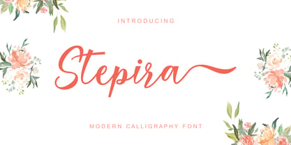
  39. American Wonders by Sarid Ezra, $17.00
    Introducing, American Wonders - Font Duo! American Wonders is a package of two fonts containing signature script and bold serif. This versatile fonts that you can use for any project. This bold serif is strong and powerful while the signature script is soft and authentic hand writing. This font also support language!
  40. Pepito by Fenotype, $20.00
    Pepito is a nonconnected version of Pepita Script. Pepito has a nice set of special features, including a set of ornaments and Swash, Stylistic and Contextual Alternates that you can easily access in any OpenType-savvy program. For the best price, purchase Pepito with Pepita Script or other Fenotype fonts.
Looking for more fonts? Check out our New, Sans, Script, Handwriting fonts or Categories
abstract fontscontact usprivacy policyweb font generator
Processing