10,000 search results (0.024 seconds)
  1. Hacjiuza Dirty - Personal use only
  2. Tonky - 100% free
  3. DecadentaFrax - 100% free
  4. Durer Gothic - Unknown license
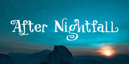
  5. After Nightfall by Hanoded, $10.00
    After Nightfall is a handmade fairytale font. It was called Bunting Nook first (after a spooky story of a black dog that haunts a town in Britain), but I figured it was a bit of a weird name, so I settled for After Nightfall. This font comes with some lovely swashes, which should be used sparingly. But that, of course, is entirely up to you.
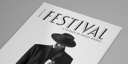
  6. Festival by Monotype, $29.99
    The Festival Titling font was cut by Monotype in 1950 as the official display face for the Festival of Britain which was staged in 1951. Used for all official Festival announcements, Festival Titling was made available for general use in 1952. The festive feel of this design together with the clean glitter and novelty make it a useful face for display and advertising use.
  7. Petrarka by HiH, $12.00
    Petrarka may be described as a Condensed, Sans-Serif, Semi-Fatface Roman. Huh? Bear with me on this. The Fatface is a name given to the popular nineteenth-century romans that where characterized by an extremity of contrast between the thick and thin stroke. The earliest example that is generally familiar is Thorowgood, believed to have been designed by Robert Thorne and released by Thorowgood Foundry in 1820 as "Five-line Pica No. 5." Copied by many foundries, it became one of the more popular advertising types of the day. Later, in the period from about 1890 to 1950, you find a number of typeface designs with the thin stroke beefed up a bit, not quite so extreme. What you might call Semi-Fatfaced Romans begin to replace the extreme Fatfaces. Serifed designs like Bauer’s Bernard Roman Extra Bold and ATF’s Bold Antique appear. In addition, we see the development of semi-fatface lineals or Sans-Serif Semi-Fatfaces. Examples include Britannic (Stephenson Blake), Chambord Bold (Olive), Koloss (Ludwig & Mayer), Matthews (ATF) and Radiant Heavy (Ludlow). Petrarka has much in common with this latter group, but is distinguished by two salient features: it is condensed and it shows a strong blackletter influence, as seen in the ‘H’ particularly. Petrark was released about 1900 by the German foundry of Schelter & Giesecke of Leipzig and is one of the designs of the period that attempts to reconcile roman and blackletter traditions. Making a cameo appearance in this Multi-Lingual font is the Anglo-Saxon letter yogh (#729), which, along with the thorn and the eth, is always useful for preparing flyers in Old English. There are still pockets of resistance to the Norman French influence that washed up on England’s shores in 1066. This font stands with King Canute, seeking to hold back the tide (ignoring the fact that Canute was a Dane). Support the fight to preserve Anglo-Saxon culture. Buy Petrarka ML today. Petrarka Initials brings together the Petrarka upper case letters with a very sympatico Art Nouveau rendering of a female face.
  8. EuroMachina BT by Bitstream, $50.99
    The boss of extended typefaces, Brian Bonislawsky, has belted out this ultra wide design, EuroMachina, that looks like an odd meld of OCR-A, Microgramma and Bank Gothic. And if that wasn't enough, Brian then felt the need to distort it in various ways, creating Broken, Eroded and OverGreased. A little something for everyone.
  9. Niner - Unknown license
  10. Cursivo Saxonio by Intellecta Design, $21.90
    Cursivo Saxonio is a typeface inspired in the famous book The Case of Charles Dexter Ward, by H P Lovecraft. It shows better than I get with my studies the authentic "Insularis" or "Cursivo Saxonio" handlettering of the VIII and XI centuries used by some people in Britain. The text on the accompanying poster reads: “Corwinus necandus est. Cadaver aq(ua) forti dissolvendum, nec aliq(ui)d retinendum. Tace ut potes”
  11. Tresdias - Unknown license
  12. Camden by Geoffrey Lee, $18.00
    Camden is based on the types used in Camden's 'Remaines concerning Britaine' published in London in 1638. The object was to avoid the contradiction inherent in most 'distressed' typefaces made to give the effect of the imperfections in old print. This means that apparently worn characters are perfectly repeated throughout a setting. The makeup of the Camden fonts means that, with a little extra keying time, alternate characters may be brought in which overcome this. Also many characters are provided which have 'period identities' such as the long s with ligatures, tied sorts ct, sp and st, swash characters in the italic and the double vv, all of which can add a specific age identity.
  13. Ekorre PERSONAL USE ONLY Black - Personal use only
  14. Potrzebie - Unknown license
  15. Genghis Khan - Personal use only
  16. LetterOMatic! - Personal use only
  17. Designosaur - 100% free
  18. NFL Falcons - Unknown license
  19. the EV$NT - Personal use only
  20. I Want My TTR! (Condensed) - Unknown license
  21. LC Bagira - Unknown license
  22. Warzone97 - Unknown license
  23. XXII ARMY - Unknown license
  24. PassCaps - Unknown license
  25. Qbicle 2 BRK - Unknown license
  26. Oneworldonefuture - Unknown license
  27. The Aeroplane Flies High - Unknown license
  28. Vipertuism - Unknown license
  29. West point - Unknown license
  30. Broad - Unknown license
  31. Omega Sentry - Unknown license
  32. Faktos - Unknown license
  33. Plasmatica Outline - Unknown license
  34. Chain_Reaction - Unknown license
  35. Alecto Demo - Unknown license
  36. WalrusGumbo - Unknown license
  37. BASEHEAD - Unknown license
  38. ShampooSW - Unknown license
  39. Querencia Army DEMO VERSION - Unknown license
  40. Heavy Heap - Unknown license
Looking for more fonts? Check out our New, Sans, Script, Handwriting fonts or Categories
abstract fontscontact usprivacy policyweb font generator
Processing