10,000 search results
(0.035 seconds)
- Broken Console by Arterfak Project,
$14.00 Proudly present "Broken Console", the geometric pixel font inspired by the old school game console which displaying pixel art in the game view. Broken Console created in 3 styles: Regular (one pixel), Bold (double pixels), and Shadow. This font is an all-caps font that is suitable for the contemporary era of graphic design nowadays. This font has a distinctive look in letterforms that makes it so unique, and suitable for specific themes like Techno, Digital, Retro, New Wave, Cyberpunk, Night, Gaming, Sporty, and much more! Font featured : All-caps alphabet Numbers Symbols & punctuation Multilingual support Thank you for visiting. Hope you like it!
 - Cooper Black by Linotype,
$40.99 Oswald Bruce Cooper designed Cooper Black, an extra bold roman face, based on the forms of his earlier typeface Cooper Old Style, which appeared with Barnhart Brothers & Spindler Type Founders in Chicago. Copper Black was produced by Barnhart in 1922 and acquired in 1924 by the Schriftguß AG in Dresden, where it was later completed with a matching italic. Although Cooper Black appeared in the first third of the 20th century, it still looks contemporary and it can be found on storefronts in almost any city scene. The flowing outer contours create forms that are both strong and soft, making Cooper Black an extremely flexible font.
 - Bonedigger by Hanoded,
$15.00 For some reason I had Paul Simon’s song ‘You Can Call Me All’ in my head when I was busy working on this font, so I just had to call it Bonedigger. Bonedigger does not dig bones, but it does have ‘heavy bones’, as it is quite big. Bonedigger is seriously eroded and would look great on book covers and product packaging. It comes in a lovely regular and italic style and a seriously twisted inline style (with, of course, its own italic). As the song goes: With a knick-knack paddywhack, give the dog a bone, this old font came rolling home.
 - Wimp Stars by Letterhend,
$19.00 Introducing, Wimp Stars - A nostalgic display typeface. The sharp edges make this font looks great and standout for tittle, headline, logo, etc especially for old and retro style theme. Perfectly to be applied to the other various formal forms such as invitations, labels, logos, magazines, books, greeting / wedding cards, packaging, fashion, make up, stationery, novels, labels or any type of advertising purpose. Features : uppercase & lowercase numbers and punctuation multilingual alternates & ligatures PUA encoded We highly recommend using a program that supports OpenType features and Glyphs panels like many of Adobe apps and Corel Draw, so you can see and access all Glyph variations.
 - Bannock Brae Gothic by Red Rooster Collection,
$45.00 Bannock Brae Gothic is a sans serif typeface. It is an original creation of Steve Jackaman (ITF) and was created for the Red Rooster Collection in 1999. The typeface was loosely inspired by a typeface from an old obscure wood type specimen book from the turn of the 20th century. Due to its turn-of-the-century roots, Bannock Brae Gothic has an informal 1920’s art deco look. It finds an ideal home in lighthearted projects concerning crafts, food, festivals, and music, but its alternates still give it the flexibility to showcase a classic and timeless feel in any project.
 - Azalleia Ornaments by Intellecta Design,
$24.90 Azalleia Ornaments is a new flourished ornaments typeface. Well elaborated and unusual design, inspired by old cross-stitch and craft books and entirely designed by hand, without use of auto-tracing and available in two different designs.
 - Floralissimo by Wiescher Design,
$39.50 Floralissimo are flowery embellishments that I found in several old publishing books dating back over a hundred years. I thought they might be useful for some of you, so I digitized them. Your digitizing typedesigner, Gert Wiescher
 - Sintesi Serif by FSdesign-Salmina,
$- Sans meets serif. Would you like to express tradition by using a contemporary font? Sintesi might be exactly what you are looking for. Sintesi stands for synthesis: the unification of serif and sans-serif into a contemporary font, which surprises with different facets depending on its application. In copy size Sintesi performs like a sans-serif. It is a compact and well readable font that fulfills all requirements of modern digital media. In larger sizes, Sintesi unfolds its traditional character. Now, its strong contrast and the perceptible feather-ductus stand out clearly, as we appreciate it in a historical old style face. Sintesi is completed by a suitable italic. Its cursive character has more to do with writing-speed than to moderate inclination. Therefore Sintesi may be well-suited for many other purposes, not only for emphasis. The whole font family consists of 20 styles and offers a wide range of Western and Eastern European special characters, typographical ligatures, uppercase, oldstyle and fraction figures. Sintesi (Serif) builds together with Sintesi Semi and Sintesi Sans an extended family. Start combining antiquity with modernity! Download a free trial version of Sintesi with a reduced character set. Check it out!
 - Kyotce by Soerat Company,
$24.00 Kyotce is inspired by the Egyptian serif which has a strong and bold typeface. This family of 8 weights from Light to Bold along with italics and is perfect for advertising, packaging, logo, editorial and publishing, branding and other creative industries. Each style includes 700+ glyphs, Kyoto supports around 200 languages in the Latin and Cyrillic. This font provides advanced typographic support with features such as ligatures, alternate characters, old-style figures, fractions, numerator/denominator, superior/inferior, and various symbols.
 - Dolly Pro by Underware,
$50.00 Dolly Pro is a book typeface with a flourishing flavour. She’s suitable for classical book type setting as well as for more contemporary magazine designs. The family consists of four fonts: Dolly Regular is neutral and useful for long texts. Dolly Italic is narrower and lighter in colour than the Regular, and so it can be used to emphasize words within Regular text. Dolly Bold is also useful in emphasizing words within Regular text. It also works well as a display type. Dolly Small Caps is intended for setting whole words or strings of characters. With its relatively low contrast, Dolly is perfectly legible in really small sizes. When Dolly is applied in bigger sizes, such as book covers, more crispy details will show up. These four fonts provide a good basis for most of the problems of book typography. Dolly Pro fonts have Underware’s Latin Plus character set, supporting a total of 219 languages.
 - NS Blackbooks Victorian by Novi Souldado,
$35.00 Reminiscing the old era of historical books (seriously, that old), circa 19th century. We crafted the letters by connecting the dots from the past with research for every flow, ornaments, look, and feel, to precisely aim for that perfect shape. Ephemera Blackbooks are born with a dark and robust personality. Feel the European historical mood right away, even with just typing it with your keyboard. You don't even realize when the design is done cause we make it so easy as a one-click-time-machine to your works using Ephemera Blackbooks font. It will be a perfect armory for a vintage headline, old book cover concept, sign, posters, playing cards deck design, vintage labels, beer labels, bar decoration, apparel, merchandising, you name it. OTF Features : Stylistic Set 01 to 07 and Ligature Glyph Count : 355 glyphs Language support : Afrikaans, Albanian, AsuBasque, Bemba, Bena, Breton, Catalan, Chiga, Cornish, Danish, Dutch, English, Estonian, Faroese, Filipino, Finnish, French, Friulian, Galician, German, Gusii, Indonesian, Irish, Italian, Kabuverdianu, Kalenjin, Kinyarwanda, Luo, Luxembourgish, Luyia, Machame, Makhuwa-Meetto, Makonde, Malagasy, Manx, Morisyen, North Ndebele, Norwegian, Bokmål, Norwegian Nynorsk, Nyankole, Oromo, Portuguese, Quechua, Romansh, Rombo, Rundi, Rwa, Samburu, Sango, Sangu, Scottish Gaelic, Sena, Shambala, Shona, Soga, Somali, Spanish, Swahili, Swedish, Swiss German, Taita, Teso, Uzbek (Latin), Volapük, VunjoZulu
 - Teimer Std by Suitcase Type Foundry,
$75.00Typographer and graphic designer Pavel Teimer (1935-1970) designed a modern serif roman with italics in 1967. For the drawing of Teimer he found inspiration in the types of Walbaum and Didot, rather than Bodoni. He re-evaluated these archetypes in an individual way, adjusting both height and width proportions and modifying details in the strokes, thus effectively breaking away from the historical models he used as a starting point. Teimer's antiqua has less contrast; the overall construction of the characters is softer and more lively. The proportions of the italics are rather wide, making them stand out by their calm and measured rhythm. This was defined by the purpose of the typeface, as it was to be utilised for two-character matrices. The long serifs are a typical feature noticeable throughout the complete family of fonts. In 1967, a full set of basic glyphs, numerals and diacritics of Teimer's antiqua was submitted to the Czechoslovak Grafotechna type foundry. However, the face was never cast. At the beginning of 2005 we decided to rehabilitate this hidden gem of Czech typography. We used the booklet "Teimer's antiqua - a design of modern type roman and italics", written by Jan Solpera and Kl‡ra Kv’zov‡ in 1992, as a template for digitisation. The specimen contains an elementary set of roman and italics, including numerals and ampersands. After studying the specimen, we decided to make certain adjustments to the construction of the character shapes. We slightly corrected the proportions of the typeface, cut and broadened the serifs, and slightly strengthened the hair strokes. In the upper case we made some significant changes in the end serifs of round strokes in C, G and S, and the J was redrawn from the scratch. The top diagonal arm of the K was made to connect with the vertical stem, while the tail of Q has received a more expressive tail. The stronger hairlines are yet more apparent in the lower case, which is why we needed to further intervene in the construction of the actual character shapes. The drawing of the f is new, with more tension at the top of the character, and the overall shape of the g is better balanced. We also added an ear to the j, and curves in the r have become more fluent. To emphasise the compact character of the family, the lining numerals were thoroughly redrawn, with the finials being replaced by vertical serifs. The original character of the numerals was preserved in the new set of old-style figures. To make the uppercase italics as compact as possible, they were based on the roman cut rather than on the original design. The slope of lowercase italics needed to be harmonised. The actual letter forms are still broader than the characters in the original design, and the changes in construction are more noticeable. The lower case b gained a bottom serif, the f has a more traditional shape as it is no longer constricted by the demands of two-matrice casting, the g was redrawn and is a single storey design now. The serifs on one side of the descenders of the p and q were removed, the r is broader and more open. The construction of s, v, w, x, y, and z is now more compact and better balanced. Because Teimer was designed to make optimal use of the OpenType format, it was deemed necessary to add a significant amount of new glyphs. The present character set of one font comprisess over 780 glyphs, including accented characters for typesetting of common Latin script languages, small caps and a set of ligatures, tabular, proportional, old style and lining, superscript and fraction numerals. It also contains a number of special characters, such as arrows, circles, squares, boxed numerals, and ornaments. Because of its fine and light construction, the original digitised design remained the lightest of the family. Several heavier weights were added, with the family now comprising Light, Light Italic, Medium, Medium Italic, Semibold, Semibold Italic, Bold, and Bold Italic. - Hand Scribble Sketch Rock by TypoGraphicDesign,
$19.00 U-P-D-A-T-E (more glyphs, bug fixed, MAC (Desktop) + WIN (Office) Version) CHARACTERISTICS An own interpretation of a classic egyptienne/slab serif typeface with modern and fancy handmade haptics/hatching. The 3 styles/weights fits perfectly in each font size. From light till bold. All 3 styles are handemade sketched for diverse display size. APPLICATION AREA This heavy, sketched, scribbled, handmade slab serif font “Hand Scribble Sketch Rock” with many language support would look good in headlines. Magazines or websites, party flyer, movie posters, music Poster, music covers or webbanner. TECHNICAL SPECIFICATIONS ■ Font Name: Hand Scribble Sketch Rock ■ Font Weights: Regular, Bold, Light ■ Fonts Category: Display for Headline Size ■ Font Format: OpenType OTF + Windows TrueType TTF ■ Glyph Set: 361 glyphs ■ Language Support: Basic Latin/English letters, Central Europe, Baltic, Romanian ■ Specials: alternative letters and ligatures (with accents & €) ■ Design Date: 2013 ■ Type Designer: Manuel Viergutz ■ Font License: Desktop license, Web license, App license, eBook license, Server license
 - Mauritius by Canada Type,
$29.95 Ten years or so after his unique treatment of Garalde design with Trump Mediaeval, Georg Trump took on the transitional genre with Mauritius, which was to be his last typeface. He started working on it in 1965. The Stuttgart-based Weber foundry published a pamphlet previewing it under the name Barock-Antiqua in 1967, then announced the availability of the metal types (a roman, a bold and an italic) a year later. The global printing industry was already in third gear with cold type technology, so there weren't that many takers, and Weber closed its doors after more than 140 years in business. Subsequently, Trump’s swan song was unfairly overlooked by typography historians and practitioners. It never made it to film technology or scalable fonts. Thus, one of the most original text faces ever made, done by one of the most influential German type designers of the 20th century, was buried under decades of multiple technology shifts and fading records. The metal cuts of Mauritius seem to have been rushed in Weber’s desperation to stay afloat. So the only impressions left of the metal type, the sole records remaining of this design, show substantial problems. Some can be attributed to technological limitations, but some issues in colour, precision and fitting are also quite apparent, particularly in Mauritius Kursiv, the italic metal cut. This digital version is the result of obsessing over a great designer’s final type design effort, and trying to understand the reasons behind its vanishing from typography’s collective mind. While that understanding remains for the most part elusive, the creative and technical work done on these fonts produced very concrete results. All the apparent issues in the metal types were resolved, the design was expanded into a larger family of three weights and two widths, and plenty of 21st century bells and whistles were added. For the full background story, design analysis, details, features, specimens and print tests, consult the PDF available in the Gallery section of this page.
 - Callejera - Unknown license

- Starless Shutters by PizzaDude.dk,
$16.00 Starless Shutters is my slightly rough handmade all-caps headline font. With its crunchy outline, the font is suitable for most things that needs an organic look. That could be organic products, children's books or toys, book covers or poster. I have added 4 slightly different versions of each letter, and they automatically cycles as you type - or you can manually choose the ones that suits you the best.
 - Dinomik by Mightyfire,
$10.00 Hello! Meet Dinomik, one of our best seller fonts! With a cute, playful and modern looks, Dinomik can bring happiness for both of writers and readers. If you want to write something fun, happy and cheerful, we suggest you to use Dinomik. We have four styles that can boost the appearance your text. Enjoy this font in your children book, birthday card, fun poster, comic book, and any other arts. :)
 - Duper Hamburges by Mightyfire,
$15.00 Duper Hamburges is here! With a funny, playful and modern looks, Duper Hamburges can bring happiness for both of writers and readers. If you want to write something fun, happy and cheerful, try to use Duper Hamburges. Enjoy this font in your children book, birthday card, fun poster, comic book, and any other arts. We're honored and proud if Duper Hamburges can be the part of your special works. Thank you :)
 - Pentathlon Pro by DBSV,
$80.00 Strait passages second part… I tried in this fifth (that's why she took the name "Pentathlon Pro”) consecutive font family to give her a character style with again a strait way of writing. Walking on the same considerations as the previous series (Khamai, Aeolus, Corset & Artios) I tried to give some sense of diversity for the strait passages of character: those fourteen style are the result. And in this family, the “Bold” with "Inlier" and “Bold Italic” with "Inlier Italic” engage in the same way as did the “Layered font families” in the previous series. Also I added a design statement for the twelve zodiac signs, only presented in the Bold, Inlier, Bold Italic and Inlier Italic style. This series is composed of fourteen styles with 628 glyphs each, with true italics and supports Latin, Greek and Cyrillic.
 - Gromy by Eurotypo,
$28.00 Gromy is a casual, informal and friendly calligraphic font. It come with 561 glyphs, with OpenType features, swashes for all glyphs, stylistics sets, stylistics alternates and a lot of ligatures to play with your texts. Gromy can be used in works that require an informal and original feel, children's books, wedding invitations, greeting cards, posters, labels, t-shirt design, in ink or watercolour based designs, fashion, magazines, food packaging and menus, book covers and whatever your imagination holds!
 - Adriane Lux by Typefolio,
$49.00 Adriane Lux is the decorative, "inline" or "openface" titling companion to Marconi Lima's acclaimed Adriane Text family. This single weight offering is modeled after the Regular weight of the primary family. While Adriane Text is intended for thoroughly classical book design, Adriane Lux enters the fold as an equally traditional display face. Have it foil-stamped on your next faux-leather book cover design or embossed on your personal calling card for a touch of well-behaved, regal formalism.
 - Relic Island 2 by Jehansyah,
$9.00 This is a font with a pretty vintage look You can express your design looks old-fashioned but has a modern feel, with several options that you can use and develop your work perfectly
 - Sheet Music JNL by Jeff Levine,
$29.00 Sheet Music JNL was based on lettering found on an old piece of 1930s-era sheet music being sold at a local rummage sale.
 - Gaela by Letterena Studios,
$17.00 Gaela is a modern and classic serif typeface with a unique style and modern look. This typeface is perfect for an elegant & luxury logo, book or movie title design, fashion brand, magazine, clothes, lettering, quotes, and so much more.
 - Wargika by Letterena Studios,
$17.00 Wargika is a modern and classic serif font with a unique style and modern look. This typeface is perfect for an elegant & luxury logo, book or movie title design, fashion brand, magazine, clothes, lettering, quotes, and so much more.
 - Lordranga by Letterena Studios,
$10.00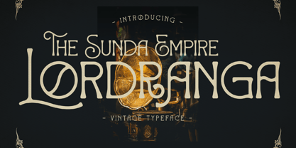 Lordranga is a distinct and vintage styled serif font, with a unique style & modern look. This typeface is perfect for an elegant & luxury logo, book or movie title design, fashion brand, magazine, clothes, lettering, quotes, and so much more.
 - Megistica Dreams by Letterena Studios,
$9.00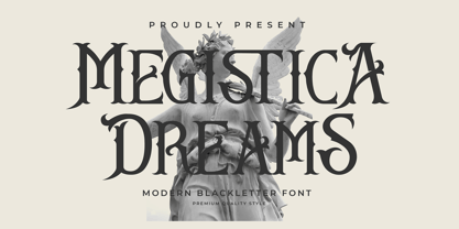 Megistica Dreams is a serif modern blackletter typeface that has its unique style & modern look. This typeface is perfect for an elegant & luxury logo, book or movie title design, fashion brand, magazine, clothes, lettering, quotes, and so much more.
 - Mackenzin by Letterena Studios,
$17.00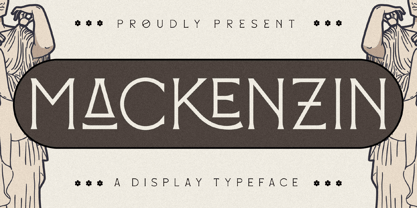 Mackenzin is a modern and classic serif font with a unique style and fancy look! This typeface is perfect for an elegant & luxury logo, book or movie title design, fashion brand, magazine, clothes, lettering, quotes, and so much more.
 - Gorthe by Letterena Studios,
$17.00 A serif modern and classic typeface that has its own unique style & modern look. This typeface is perfect for an elegant & luxury logo, book or movie title design, fashion brand, magazine, clothes, lettering, quotes, and so much more. **Uppercase
 - Megila by Letterena Studios,
$17.00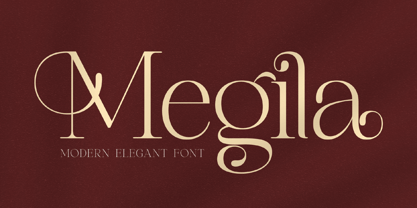 Megila is a modern and classy serif font with a unique style and modern look. This typeface is perfect for an elegant & luxury logo, book or movie title design, fashion brand, magazine, clothes, lettering, quotes, and so much more.
 - Gods Must by Letterena Studios,
$17.00 A serif modern and classic typeface that has its own unique style & modern look. This typeface is perfect for an elegant & luxury logo, book or movie title design, fashion brand, magazine, clothes, lettering, quotes, and so much more. **Uppercase
 - Montells by Olexstudio,
$16.00 MONTELLS - Display Font will look gorgeous on all your designs, invitation, poster design, book design, branding materials, logo's and all project design other. MONTELLS - Display Font contains standard characters, character is Uppercase, Lowercase, numbers, punctuation, ligatures and international glyphs.
 - Bagias by Letterena Studios,
$9.00 Bagias is a modern and classic sans serif font that features its own unique look. This typeface is perfect for elegant & luxurious logos, book or movie title designs, fashion brands, magazine covers, clothes, lettering, quotes, and so much more.
 - Flat10 Art Deco by Dharma Type,
$14.99 This 8-bit pixel font is designed with respect for 80s game designers and the pixel font pioneers in middle 90s. Use at size 10 pixels or multiples of 10 and anti-alias off is recommended. List of our Pixel Font Project. ·Flat10 Antique ·Flat10 Artdeco ·Flat10 Arts&Crafts ·Flat10 fraktur ·Flat10 Holy ·Flat10 Holly ·Flat10 Segments ·Flat10 Stencil ·Flat20 Gothic ·Flat20 Headline ·Flat20 Hippies ·Flat20 Streamer ·Behrensmeyer Vigesimals ·Civilite Vigesimals
 - Flat20 Streamer by Dharma Type,
$1.00 This 8-bit pixel font is designed with respect for 80s game designers and the pixel font pioneers in middle 90s. Use at size 10 pixels or multiples of 10 and anti-alias off is recommended. List of our Pixel Font Project. ·Flat10 Antique ·Flat10 Artdeco ·Flat10 Arts&Crafts ·Flat10 fraktur ·Flat10 Holy ·Flat10 Holly ·Flat10 Segments ·Flat10 Stencil ·Flat20 Gothic ·Flat20 Headline ·Flat20 Hippies ·Flat20 Streamer ·Behrensmeyer Vigesimals ·Civilite Vigesimals
 - Flat20 Hippies by Dharma Type,
$14.99 This 8-bit pixel font is designed with respect for 80’s game designers and the pixel font pioneers in middle 90’s. Recommended use at 20 pixels or multiples of 20 and anti-alias off. List of our Pixel Font Project. ·Flat10 Antique ·Flat10 Artdeco ·Flat10 Arts&Crafts ·Flat10 fraktur ·Flat10 Holy ·Flat10 Holly ·Flat10 Segments ·Flat10 Stencil ·Flat20 Gothic ·Flat20 Headline ·Flat20 Hippies ·Flat20 Streamer ·Behrensmeyer Vigesimals ·Civilite Vigesimals
 - Flat10 Arts And Crafts by Dharma Type,
$9.99 This 8-bit pixel font is designed with respect for 80s game designers and the pixel font pioneers in middle 90s. Use at size 10 pixels or multiples of 10 and anti-alias off is recommended. List of our Pixel Font Project. ·Flat10 Antique ·Flat10 Artdeco ·Flat10 Arts&Crafts ·Flat10 fraktur ·Flat10 Holy ·Flat10 Holly ·Flat10 Segments ·Flat10 Stencil ·Flat20 Gothic ·Flat20 Headline ·Flat20 Hippies ·Flat20 Streamer ·Behrensmeyer Vigesimals ·Civilite Vigesimals
 - Alternate Gothic Pro EF by Elsner+Flake,
$35.00 In 1903, the typeface family Alternate Gothic was developed for ATF (American Type Foundry) by Morris Fuller Benton. It was Benton’s intent to solve many diverse layout problems with the development of a narrow Sans with different width values. The Alternate Gothic enjoys great popularity to this day. Therefore, Elsner+Flake re-worked the typeface family, added all European fixed accents and complemented it with an Antique version.
 - Cocaine by Chank,
$39.95Chank worked with Josh Eshbach, an intern from Minneapolis College of Art and Design, to create Cocaine as the Chank Font of the Month for November 2000. Inspired by Speedball type designs of the ’20s and ’30s, Cocaine has been redrawn and streamlined for use in the digital age. Curvy and round and relishing in its idiosyncrasies, Cocaine recalls vintage French wine posters and antique sheet music covers. - Flat20 Headline by Dharma Type,
$1.00 This 8-bit pixel font is designed with respect for 80’s game designers and the pixel font pioneers in middle 90’s. Recommended use at 20 pixels or multiples of 20 and anti-alias off. List of our Pixel Font Project. ·Flat10 Antique ·Flat10 Artdeco ·Flat10 Arts&Crafts ·Flat10 fraktur ·Flat10 Holy ·Flat10 Holly ·Flat10 Segments ·Flat10 Stencil ·Flat20 Gothic ·Flat20 Headline ·Flat20 Hippies ·Flat20 Streamer ·Behrensmeyer Vigesimals ·Civilite Vigesimals
