7,521 search results (0.029 seconds)
  1. Aukim ExtraBold - Personal use only
  2. Indulta SemiSerif - Personal use only
  3. LT Carpet Text - 100% free
  4. Media Gothic - Unknown license
  5. Ingleby Regular - Personal use only
  6. DNNR - Personal use only
  7. Brimborion - 100% free
  8. MAWNS' Serif - Personal use only
  9. Doris PP - 100% free
  10. Fibel Nord - Unknown license
  11. Albertino - Personal use only
  12. KG Payphone - Personal use only
  13. Europe Underground - Personal use only
  14. Gilgongo - Unknown license
  15. BN-67.9010-03 - Unknown license
  16. Drogowskaz - 100% free
  17. Chopin-Bold - Unknown license
  18. Korneuburg Slab Regular - Personal use only
  19. SelznickNormal - 100% free
  20. cibreo - Personal use only
  21. Lousitania - Unknown license
  22. COM4t Sans Medium - Unknown license
  23. PKP - Unknown license
  24. Berolina - 100% free
  25. 404error - Unknown license
  26. Grandesign Roman - Unknown license
  27. River Avenue - Unknown license
  28. winob - Unknown license
  29. Concielian Break - Unknown license
  30. Brassiere - Unknown license
  31. Tasmin Ref - Unknown license
  32. Jumbo - 100% free
  33. 11.20 - Unknown license
  34. Ubahn - 100% free
  35. Venus Rising - Unknown license
  36. Clearblock circular - Unknown license
  37. Dreamspeak - Unknown license
  38. Holitter Forge - 100% free
  39. Albatross - Unknown license
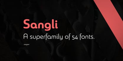
  40. Sangli by insigne, $-
    It started in 2007 with Chennai, the first of a three-part series of sans that I envisioned with slab serif counterparts. Each font would differ from the others in how the stem terminals were expressed. The initial font was extremely well received, and a revitalized and remastered Chennai made its appearance two years later, complete with new weights and new, novel OpenType features. Then came Madurai, a variation of Chennai based on the same core, only without the rounded stems. Chennai’s rounded stems made it distinctive and great for headlines but left it lacking appeal as copy--a problem that Madurai easily solved. And now comes Sangli, the final iteration of my original 2007 vision. Sangli is a happy medium. Like Chennai, it’s great for headlines--but not too distinct for copy. Sangli keeps the same core structure as the other two, but new less sharp forms give this latest font a friendlier look that’s more versatile than the original Chennai and less formal than Madurai. The font includes a whole range of six weights from light to black, along with condensed and extended options as well for a total of 54 fonts. There are plenty of OpenType features, including small caps. Alternates include normalized capitals and lowercase letters that include stems for when you want a more traditional look or when you’re writing copy. Sangli also supports over 70 languages that use the extended Latin script. Use Chennai, Madurai, and their slab serif variants interchangeably with Sangli, too, for even more options in your work. All three complement one another well. So when you need a balanced font that stands boldly on the page and commands your reader’s attention, look within and find your Sangli.
Looking for more fonts? Check out our New, Sans, Script, Handwriting fonts or Categories
abstract fontscontact usprivacy policyweb font generator
Processing