10,000 search results (0.035 seconds)
  1. SCRIPT 9 - Unknown license
  2. Borg 9 - Unknown license
  3. 9 Months by Tkachev, $25.00
    9 months is a decorative face with two font styles. It would look nice on candy and food package, in children's books and magazines. This work is devoted to the period in my wife's life when she was pregnant during 9 months with our daughter.
  4. The Serif Hand by S&C Type, $8.00
    The Serif Hand is a handwritten font designed by Fanny Coulez and Julien Saurin in Paris. We wanted to create the most generic, readable and balanced serif handwritten font, to work well in every kind of design. It’s an all-caps font with 5 finely balanced weights with alternates: all the uppercase letters are a bit different from the lowercase letters. We also designed a playful dotted weight, to add a fancy touch if needed. We hope you will enjoy our work. Merci beaucoup!
  5. I Shot The Serif - Unknown license
  6. Grotesque No. 9 by URW Type Foundry, $35.99
  7. Gothic Tuscan 9 by Wooden Type Fonts, $15.00
    A revival of one of the popular wooden type fonts of the 19th century, a very useful design for display, lowercase missing, very narrow, unusual splayed serifs at top and bottom of strokes.
  8. Edgar No 9 by Type Innovations, $39.00
    Edgar No. 9 is an original design by Alex Kaczun. Edgar No. 9 is a derivative work based on his Big Boy typeface series. It was designed specifically for display headlines, logotype, branding and similar applications. Primarily a display, this extremely versatile font has generous proportions, large counters and loose fitting which also allow the font to work well across a wide range of text sizes. Edgar No. 9 is a heavy baroque slab serif and although it shares the underling skeleton of 'Big Boy', it is a much more compact in overall proportions and spacing. A handsome bold headline font that works well in text as well as display sizes—ideally suited for publications and advertising. Alex plans to expand the font series to include a large range of weights along with corresponding italics numbering 1 thru 9, as well as, true small capitals and old style figures. Distressed version(s) will also be available in upcoming releases. Stay tuned, more to come soon. The large Pro font character set supports most Central European and many Eastern European languages.variations to expand this 'hip' new font series. Groovin' baby.
  9. 3 of 9 Barcode - Unknown license
  10. Grotesque No. 9 SB by Scangraphic Digital Type Collection, $26.00
    Since the release of these fonts most typefaces in the Scangraphic Type Collection appear in two versions. One is designed specifically for headline typesetting (SH: Scangraphic Headline Types) and one specifically for text typesetting (SB Scangraphic Bodytypes). The most obvious differentiation can be found in the spacing. That of the Bodytypes is adjusted for readability. That of the Headline Types is decidedly more narrow in order to do justice to the requirements of headline typesetting. The kerning tables, as well, have been individualized for each of these type varieties. In addition to the adjustment of spacing, there are also adjustments in the design. For the Bodytypes, fine spaces were created which prevented the smear effect on acute angles in small typesizes. For a number of Bodytypes, hairlines and serifs were thickened or the whole typeface was adjusted to meet the optical requirements for setting type in small sizes. For the German lower-case diacritical marks, all Headline Types complements contain alternative integrated accents which allow the compact setting of lower-case headlines.
  11. Grotesque No. 9 SH by Scangraphic Digital Type Collection, $26.00
    Since the release of these fonts most typefaces in the Scangraphic Type Collection appear in two versions. One is designed specifically for headline typesetting (SH: Scangraphic Headline Types) and one specifically for text typesetting (SB Scangraphic Bodytypes). The most obvious differentiation can be found in the spacing. That of the Bodytypes is adjusted for readability. That of the Headline Types is decidedly more narrow in order to do justice to the requirements of headline typesetting. The kerning tables, as well, have been individualized for each of these type varieties. In addition to the adjustment of spacing, there are also adjustments in the design. For the Bodytypes, fine spaces were created which prevented the smear effect on acute angles in small typesizes. For a number of Bodytypes, hairlines and serifs were thickened or the whole typeface was adjusted to meet the optical requirements for setting type in small sizes. For the German lower-case diacritical marks, all Headline Types complements contain alternative integrated accents which allow the compact setting of lower-case headlines.
  12. Border PI 1515-9 by Monotype, $29.00
    This font consists of individual pieces that can be combined to make a wide variety of borders. For each border design, the pieces generally include four corners, a vertical section, and a horizontal section.
  13. Nimbus Roman No. 9 by URW Type Foundry, $35.00
  14. Base 9 and 12 by Emigre, $49.00
  15. Antique Tuscan No 9 by HiH, $8.00
    Antique Tuscan No.9 was one of the earlier wood-type designs by William Hamilton Page. It was first shown among the specimens produced in 1859, shortly after Page entered into a new partnership with Samuel Mowry, owner of the Mowry Axle Company. The new company was named Page and Company and was located at the Mowry facility in the Greenville section of Norwich, Connecticut. Antique Tuscan No.9 is an extra-condensed version of the tuscan style that had been released in moveable type by Vincent Figgins of London in 1817 and had become so popular for advertising in the intervening years. Because of the extreme compression in the design, we might be tempted to describe it as "Triple-X," but that might be misleading. The analogy would, of course, be to clothing sizes, not movie ratings. Because of the compression, this typeface reads best when set extra-extra-extra large. For printing, we recommend 36 points or larger. For the screen, we suggest at least 72 points. An unusual and distinctive design, it is best used with discretion. If I were doing a term paper for school or submitting an article to a magazine for publication, I might use it for the title page, to grab someone’s attention. I would certainly not use it for the main body of text - not if I expected anyone to read what I wrote. If you wonder why we make this recommendation, take the Ten-Point challenge. Print this paragraph using Antique Tuscan No.9 and set the font size at 10 points. If you are young and blessed with good eyesight, you will probably be able to read it - with effort. So, here is the challenge: hand it to your Grandmother and ask HER to read it.
  16. HWT Antique Tuscan 9 by Hamilton Wood Type Collection, $24.95
    A very condensed 19th century Tuscan style wood type design with a full character set with ligatures. This design was first shown by Wm H Page Co in 1859 and this is the first digital version of this font to include a lowercase and extended European character set. This is a font best used at large sizes.
  17. Serid by Samuel Vicente Types, $22.00
    SERID is a display font condensed and regular designed for editorial applications. Inverted contrast, features a serif hybrid that gives a decorative character and personality to the font. Being a display type, intended for use in titles or in small blocks of text, from 24pt. The name SERID comes from the combination of words “SERif” and “hybrID”, resulting SERID.
  18. Seriffity by MotionTail, $12.00
    Give your designs an authentic handcrafted feel. "Seriffity" is perfectly suited to signature, stationery, logo, typography quotes, magazine or book cover, website header, clothing, branding, packaging design and more. Files included: - uppercase letters - multilingual symbols - numerals - punctuation Thanks for use this font
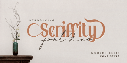
  19. Serifa by Bitstream, $29.99
    Developed by Adrian Frutiger for Bauer in 1966, Serifa is a slabserif based on the principles that led to the success of Frutiger’s 1956 sanserif, Univers. Glypha, designed by Frutiger for Stempel in 1979, is a version of Serifa with a moderately larger x-height; Stempel has paid royalties on Glypha to Neufville since 1984. Serifa® font field guide including best practices, font pairings and alternatives.
  20. Serifa by Linotype, $29.99
    This slab serif font of Adrian Frutiger is extremely legible and robust, making it suitable for most any use. Based on the forms of Univers, Serifa makes a harmonious and timeless impression.
  21. Serifa by URW Type Foundry, $35.99
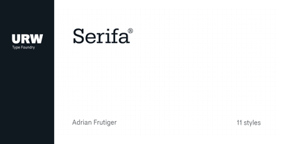
  22. Is This The End by Intellecta Design, $19.90
    Is This the End has three different ornamental endpieces ready to use in end chapters, final pages in books, magazines and several artistic representations. Each endpiece may be used in different languages like German, Bulgarian, Croatian, Danish, Spanish, Finnish, French, Dutch, Italian, Norwegian, Polish, English and Portuguese. Intellecta Design researched these endpieces from the very rare Richard Gans type catalogue from 1882.
  23. Magnificent Serif - Personal use only
  24. Victoria Serif - Personal use only
  25. Dust Serif - Personal use only
  26. Royal Serif - Personal use only
  27. Averia Serif - 100% free
  28. Droid Serif - 100% free
  29. Obcecada Serif - Personal use only
  30. Shadowed Serif - Unknown license
  31. Romanesque Serif - 100% free
  32. Happy Serif - Personal use only
  33. MAWNS' Serif - Personal use only
  34. Serif Medium - Unknown license
  35. Liberation Serif - 100% free
  36. Nadia Serif - 100% free
  37. Geefium Serif - Personal use only
  38. Veru Serif - Unknown license
  39. blackout serif - Unknown license
  40. DejaVu Serif - Unknown license
Looking for more fonts? Check out our New, Sans, Script, Handwriting fonts or Categories
abstract fontscontact usprivacy policyweb font generator
Processing