10,000 search results (0.033 seconds)
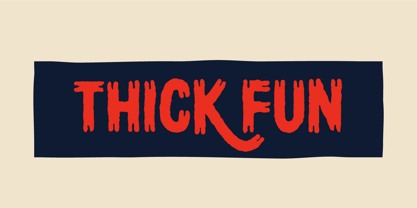
  1. Thick Fun by PizzaDude.dk, $17.00
    This is not a brush font! This is an imitation of brushstrokes, done by pen. But I guess you've already noticed that - the brushstrokes are way too obvious, to have been made by brush. Although being a "fake", the letters leaves you with quite a good impression. Letters were inspired by an old horror movie poster, but is very useful for something less terrifying!
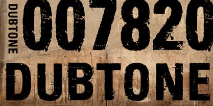
  2. Dub Tone by Seb Dub, $10.00
    DubTone is simple sans serif font with a halftone texture from an old newspaper scan on an old flatbed scanner. This font was created for a movie poster in 2003 and then finally converted to a font in 2012. Each of the characters were individually designed with care to make sure that in small or large sizes it remained readable with a unique texture.
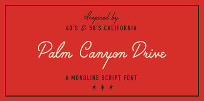
  3. Palm Canyon Drive by RetroSupply Co., $19.00
    Mid-century California was a magical place. Post-war optimism fueled the popularity of everything from Hollywood to roadside diners. Palm Canyon Drive is a monoline script inspired by retro matchbook covers, travel postcards, Tiki bars and Hollywood. With a classy yet unpretentious tone Palm Canyon Drive is as comfortable on a Tiki bar matchbook cover as it is on a Hollywood movie poster.
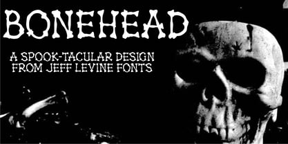
  4. Bonehead JNL by Jeff Levine, $29.00
    Thematic fonts aren't always big sellers, but they do serve a purpose for specialty projects and applications. Bonehead JNL is a novelty typeface that is constructed out of bones. Whether the need is for a pirate theme, Halloween, horror movies or for things that go bump in the night, this font will fill the bill – no bones about it. Oh, wait! Yes there are!
  5. Ongunkan Greek Hollow Script by Runic World Tamgacı, $75.00
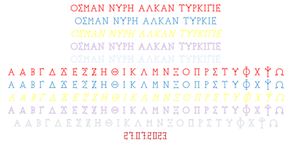
    I added the hollow model of the font he developed by taking an example from the ancient Greek inscriptions found in Turkey to my fonts. Use it in good works.
  6. Countless Blessings by Epiclinez, $14.00
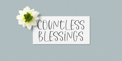
    Countless Blessings is a fun and casual handwritten font. Defined by all-round characters and a flexible style, this font will make each of your designs look readable and trend
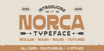
  7. Norca by Holis.Mjd, $10.00
    Norca is a typeface available in 4 types of styles, regular/clean, round, rough and textured. Available in all caps mode, suitable for designs with classic, vintage, and retro styles.
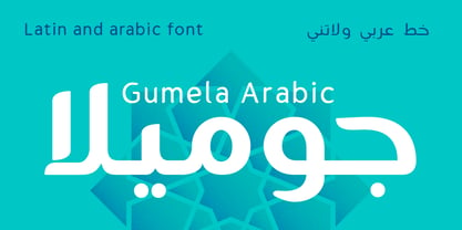
  8. Gumela Arabic by NamelaType, $25.00
    Arabic font version of Gumela, still with Gumela latin style, based on rounded sans serif whose edges end with unique shapes, to line up in harmony between Latin and Arabic.
  9. ATF Headline Gothic by ATF Collection, $59.00
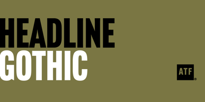
    ATF Headline Gothic cries out to be used in headlines, and that is exactly how it was used after it was first created by American Type Founders in 1936 with newspapers in mind. It would be hard to imagine a better typeface for a shocking, front-page headline in a scene from an old black-and-white movie. With its all-caps character set, and its big, bold, condensed design, ATF Headline Gothic is the epitome of its name. “Extra! Extra!” The style of ATF Headline Gothic recalls the bold, condensed gothic display faces of the 19th century, but with more refinement in its details than many large types of the time (typically wood type). Its most recognizable trait is the restrained, high-waisted M, with short diagonal strokes that end with their point well above the baseline; this avoids the sometimes cramped look of a bold condensed M with a deep “V” in the middle, common in many similar headline faces. The digital ATF Headline Gothic comes in a single weight, all caps, like its predecessor, but offers two styles: one crisply drawn, and a “Round” version with softer corners, to suggest a more “printed” feel, reminiscent of wood type. Of course, in either style it includes a full modern character set, including symbols such as the Euro, Ruble, and Rupee, that didn’t exist in 1936.
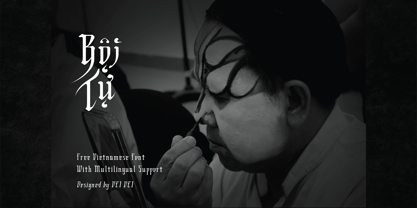
  10. BoiTu by Vei Vei, $16.00
    BoiTu is a typeface in the BoiTu project designed by Vei Vei. BoiTu has a strong contrast between bold bars and long sharp hook strokes inspired by pheasant feathers on the hat in Hat Boi costume. "Tuong or Hat Boi is a form of Vietnamese classic opera, combining various elements of arts such as stage, music, fine art, literature, dancing, and martial arts. Older Tuong plays are usually about historical events or tales. Allegories, melodramas, soliloquies, modes of expression, forms of performance, repartee singing and recitative conventions, etc., are constantly updated and elevated, and are quintessential elements in the art of Tuong." Boi Tu is a classic design to bring traditional art and culture closer to everyone. Boi Tu is a Vietnamese font that supports multiple languages.
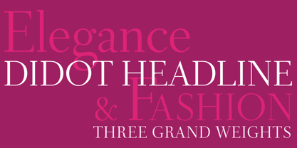
  11. Didot Headline by Canada Type, $24.95
    In spite of its name, this font family embodies the ultimate classic modern advertising typeface, rather than concern itself with revivalism or Didone authenticity. Naturally the spirit of the original Didot faces still exists in this family, but over twelve years of work on it have made it more fitting to the luxurious expression of our day and age, rather than nineteenth century Europe. Upscale and stylish, Didot Headline is an essential tool for any designer involved in magazines, books, tasteful music, or overall luxury packaging that requires clean and large classic typography with an unmistakable modern spin. We recommend the use of Didot Headline between 12 and 48 points. For larger display use, check out its sister family, Didot Display.
  12. ITC Coconino by ITC, $29.99
    ITC Coconino is the work of Serbian designer Slobodan Miladinov. His original inspiration for this monostroked typeface was the idea of translating certain auditory impressions into type, in this case, the surprising and confusing music of the Serbian hip hop musician Voodoo Popeye." Miladinov is an art director in Belgrade and created Coconino using a "freemouse" technique with Adobe Illustrator and sees his work as "computer calligraphy which allows for a specific directness and immediacy in notation." The strokes of this font are simple and abrupt with a studied irregularity. The forms can look either cheerful and lighthearted or chaotic and subtly disturbing. Coconino was named for the home of hte Krazy KAt comics and even includes a few additional characters from the strip."
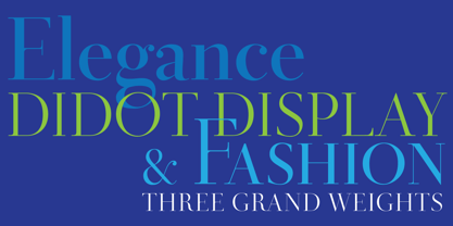
  13. Didot Display by Canada Type, $24.95
    In spite of its name, this font family embodies the ultimate classic modern advertising typeface, rather than concern itself with revivalism or Didone authenticity. Naturally the spirit of the original Didot faces still exists in this family, but over twelve years of work on it have made it more fitting to the luxurious expression of our day and age, rather than nineteenth century Europe. Upscale and stylish, Didot Display is an essential tool for any designer involved in magazines, books, tasteful music, or overall luxury packaging that requires clean and large classic typography with an unmistakable modern spin. We recommend the use of Didot Display at 48 points and over. For 12-48 pt. use, check out its sister family, Didot Headline.
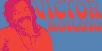
  14. Victor Moscoso by K-Type, $20.00
    The Victor Moscoso font is based on the 1960s psychedelic poster lettering of the artist Victor Moscoso. The letterforms are derived from some of his most celebrated Neon Rose posters of the late sixties, in particular the archetypical Moby Grape ‘Neptune’s Notion’ of 1967.
  15. GoudyTwenty - Unknown license
  16. Rolloglide - Personal use only
  17. Anja Eliane - Unknown license
  18. Feedback BB - Personal use only
  19. Set Fire to the Rain - Personal use only
  20. Nuku Nuku - Unknown license
  21. Pouttu - Unknown license
  22. Mathmos Original - Unknown license
  23. Sagan - Unknown license
  24. Fontin - Unknown license
  25. You're Gone - Unknown license
  26. amable - Personal use only
  27. Kimberley - Unknown license
  28. Linear Curve Fatty - Unknown license
  29. GiantTigers - Unknown license
  30. Yukarimobile - Unknown license
  31. Family Guy - Unknown license
  32. whatever - 100% free
  33. Stoutface - Personal use only
  34. Gold Year Personal Use - Personal use only
  35. BIG UltraWide - Personal use only
  36. BIG Slant Black UltExp - Personal use only

  37. Maketa IT - Personal use only
  38. Statos - Personal use only
  39. Spheris - Personal use only
  40. Dime Museum by Solotype, $19.95
    This idea of "wrong way weights" was originally called French Clarendon by the Americans, Italienne by the French, and American by the Italians. Sounds like nobody wanted to own up to it. When it was revived by ATF in 1933, it was given the name P. T. Barnum. Many variations have appeared. Dime Museum is an old wood type.
Looking for more fonts? Check out our New, Sans, Script, Handwriting fonts or Categories
abstract fontscontact usprivacy policyweb font generator
Processing