10,000 search results (0.034 seconds)
  1. Squid - Unknown license
  2. PiratesBonney - Unknown license
  3. Rammstein Remix - Unknown license
  4. Squealer - Unknown license
  5. Squid - Unknown license
  6. Bezar - Personal use only
  7. Brock Script - Personal use only
  8. Walter - Unknown license
  9. Walshes - Unknown license
  10. Delirium - Unknown license
  11. Anfalas - 100% free
  12. Snowshoe - Unknown license
  13. flower_font - Unknown license
  14. KR Floral Color Me - Unknown license
  15. Bottix - Personal use only
  16. LetterOMatic! - Personal use only
  17. KR Crayons - Unknown license
  18. Moby - Unknown license
  19. Moby - Unknown license
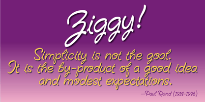
  20. Ziggy by Jonahfonts, $35.00
    A free-spirited hand-script font. Very similar to pre-computer hand-written letttering with a ruling pen.
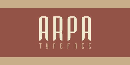
  21. Arpa by Özhan Yurtseven, $20.00
    Arpa is a display sans and condensed font family. The source of inspiration of this typeface is “wheat-barley”. This typeface has three styles. Extensive Latin language support and features multiple weights.
  22. Exquisite Corpse - 100% free
  23. Zenzai Itacha - Personal use only
  24. Deloise - Unknown license
  25. Vanilla Boys - Unknown license
  26. Letters - Unknown license
  27. SF Wonder Comic - Unknown license
  28. JF Flamingo - Unknown license
  29. Cock Boat - Unknown license
  30. Locked Window - Unknown license
  31. herrliches script - Unknown license
  32. Easter Parade - Unknown license
  33. marked fool - Unknown license
  34. Shifty Chica 2 - Unknown license
  35. Tristan - Unknown license
  36. FD Crusted - Unknown license
  37. Anime Ace - Personal use only
  38. KR Batty - Unknown license
  39. Sunspots AOE - Unknown license
  40. Edelgotisch by HiH, $10.00
    Edelgotisch is a bold Jugendstil design that shows its strong blackletter roots. This typeface, along with a set of initial letters, was released by Schelter & Giesecke of Leipzig, Germany about 1898 and is very similar to Eckmann-Schrift released by Rudhard'schen Giesserie (later Klingspor) during the same period. One suspects they may have been in direct competition. The decorative devises of the initial letters for Edelgotisch have a simpler, bolder line than for Eckmann. In the initial letter set, the ligatures aesc (AE) and ethel (OE) were generated by embedding the ‘A’ and ‘O’ respectively inside the upper left corner of the ‘E.’ The accented caps were given similar treatment, with the exception of the cedilla. Regarding the I-diaeresis, we considered rotating the accent ninety degrees to avoid and possible misconstruction. On further reflection however, we realized it was silly and unnecessary. No one would look at the accented letterform and see anything but what it is. We have also included four decorative ornaments and a frame with each font.
Looking for more fonts? Check out our New, Sans, Script, Handwriting fonts or Categories
abstract fontscontact usprivacy policyweb font generator
Processing