10,000 search results
(0.033 seconds)
- Waterhole - 100% free

- Lost and Foundry by Fontsmith,
$15.00 Breaking the cycle of homelessness We are partnered with The House of St. Barnabas, a private members club in Soho Square, whose work as a not for profit charity aims to break the cycle of homelessness in London. Each purchase (of the family pack) comes with a one month membership to The House and 100% of the proceeds from sales of fonts go directly to the charity to help their essential work. This unique collection of 7 typefaces is based on the disappearing signs of Soho, at risk of being lost forever due to the ever changing landscape of the area. By re-imaging the signage as complete fonts, we have rescued this rich visual history from the streets and present the typefaces into a contemporary context for a bright optimistic future. FS Berwick Thanks to its humble tiled origins, this Egyptian serif type maintains a uniform character width, creating the irregular letter proportions found in the final alphabet. Broad-shouldered, the bracketed serifs firmly ground the font, whilst its extreme hairlines become a necessity due to the uniform width. Of note is the upside down ‘S’, to be found on the original sign on Berwick Street. Perhaps due to its ceramic origins, there is a surprising ‘slippiness’ to its final appearance. FS Cattle Cattle & Son is best described as a wide, but not overly extended, grotesque-style sans serif, showing a uniform width and carrying a robust strength to its form. Whilst lightly functional overall, the purposeful diagonal legs of the ‘K’, ‘R’ and the tail of the ‘Q’ add an urgency to its appearance. The reduced size of the ampersand gives away Cattle & Son’s hand-painted origins, and the oblique compacted ‘LTD’ found on the original sign is also included in the final set. This beautiful sign is tucked away under an arch in Portland Mews, sheltering from the weather. Perhaps this is why it has lasted so long. FS Century This somewhat elongated set of Roman capitals was originally rendered in paint circa 1940, but its roots trace back to the Trajan Column in Rome. Witness the slightly unbalanced ‘W’ and the painter’s hand is revealed. Century’s flared serif style is extremely short, sharp and bracketed. The ‘M’ is splayed and has no top serifs. Century has a uniform appearance of width, probably due to its sign-written origins. Yet is elegant, classic and exudes sophistication. FS Charity A true Tuscan letterform, the original is located on The House of St. Barnabas in ceramic tiles and was revealed in all its broken glory in 2014. FS Charity retains the option of using these incorrect characters (try typing lowercase in the test drive above and compare with the more uniform uppercase characters). FS Charity features fishtailed terminals on its strokes, a curious branched ‘T’ and the ‘S’ displays tear-drop ends to its serifs. Almost uniform in width, the ‘A’, ‘M’ and ‘W’ are the widest characters in this set. FS Marlborough The elongated Marlborough features diagonal terminals to some characters and numerals. Also retained is the space-saving contracted ‘T’ glyph from the original sign, while the ‘R’ features a distinctive wedge-shaped leg. Highly individual in this form, similar signage appears around Soho, but featuring a variety of widths in their design. FS Portland The sister type to Cattle & Son, Portland is oblique rather than italic. The serifs are not overly long, yet still enhance its rather rigid cap height and baseline appearance. Its ‘A’ has a top serif, the ‘M’ is square and the ‘G’ foregoes any spur. Particularly delightful is the open ampersand. Numerals align to encourage the horizontal flavour of the oblique style. Overall, Portland is both confident and graceful. FS St James A lineal Continental style, St James also displays a true sense of ‘Londoness’ in its titling form, perhaps influenced by early Underground signage. Irregular letterforms display a continental flavour, particularly evident in its Deco style ‘W’, ampersand and numerals. The rather high cross bar in the ‘A’ is also reflected in the raised middle strokes of the ‘M’. Noteworthy are the distinctive unions found on all of the characters and the additional small caps. The original lettering is still located on Greek St.
 - Tinga - 100% free

- Danza Macabra by 2D Typo,
$36.00 That's a special horrific font with an intricate pattern of bones. All letters are put together of nonrecurring elements drawn individually by hand. The classical forms as we see it sound afresh with the bones attire.
 - Quick Poster JNL by Jeff Levine,
$29.00 A vintage poster from the British Columbia Forest Service on the subject of forest fire prevention provided the hand lettering that was the design model for Quick Poster JNL; available in both regular and oblique versions.
 - Kimberly Christmas by Yoga Letter,
$20.00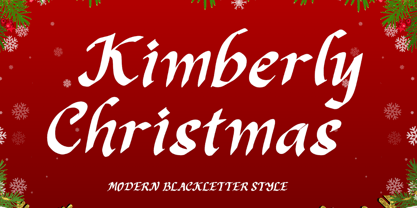 "Kimberly Christmas" is a unique and elegant blakcletter font. This font is equipped with uppercase, lowercase, numerals, punctuation, and multilingual support. Very suitable for Christmas, weddings, Valentine's, winter, engagement, invitations, certificates, stickers, branding, logos, and others.
 - As of my last update in April 2023, without direct information on a specific typeface designated as "13_Fletcher," I can fabricate a creative description based around the intriguing elements the name...
- Winslow Title by Kimmy Design,
$25.00 Winslow Title is a high contrast modern type family comes in two styles and a monolinear script family. The traditional proportions of Winslow Title are historical in nature and follow the design and style of Winslow Book as a high contrast variant. The Winslow Title Mod family is a contemporary take on the style, with tapering terminals and less pronounced finials. Each family includes both styles, to be accessed through the opentype panel as a stylistic alternate. If preferable, you can purchase the entire family collection to have easier access to both styles, but it's not necessary. The typeface family comprises of roman and italic styles in six weights from Thin to Black and two widths in the roman style: Regular and Narrow. The accompanying script family has a single weight but offers five tracking widths, from Narrow to Wide. The bundle is an elegant combination of styles perfect for titling and display design. The serif typeface is packed with features that make ideal titling styles. Not only do they include the Stylistic Alternates, but also Titling Alternates, Discretionary Ligatures, Small Capitals, Swashes and Contextual Ligatures. As noted previously, the typeface comes in two styles, Traditional and Modern. Each can be accessed either by the Stylistic Alternates or Stylistic Sets. Titling Alternates are alternates that expand the ball terminals to K, R, V, W, and Y (see Titling Alternates slide). Contextual Ligatures are for capital combinations with A that tighten the gap created by the extended serifs. It connects characters with a pairing serif (the lower right serif of the M with the lower right serif of the A) and bridges them together. This combination works for single and multiple A combinations. It is turned on automatically in the Opentype panel and shouldn’t need to be accessed individually. Alternatively, the Discretionary Ligatures feature combines diagonal or baseline stems with lifted small capitals, creating a unique combination of characters. Swashes is an extensive feature that offers up to five swash options per many of each character. These can be selected via the Glyphs panel or as character alternates in Adobe programs. The Script family has a feature set of it’s own, with initial and final swashes on lowercase letters, middle swashes for select characters, and a titling feature that joins words together by replacing the space with a line. Stylistic alternates create a bouncing baseline on connecting strokes. *Note: there is no great need to purchase both families as all styles can be accessed via Opentype features, but if customers prefer to purchase both styles, it can be done by selecting the Complete Typeface Family collection.
 - Clip Joint JNL by Jeff Levine,
$29.00 According to Wikipedia, a "clip joint" is an establishment, usually a strip club or night club (often claiming to offer adult entertainment or bottle service) in which customers are tricked into paying excessive amounts of money, for surprisingly low-grade goods or services - or sometimes, nothing - in return. These establishments were rampant during the prohibition years. However, the inspiration for Clip Joint JNL comes from a more positive source - a WPA (Works Progress Administration) poster advertising "The Lure of the National Parks". A bold, classic Art Deco design, it typifies the modern and streamlined approach to lettering in the 1930s and 1940s.
 - Mac Sans by Jolicia Type,
$15.00 Introducing Mac Sans: The Perfect Blend of Firmness and Uniqueness Elevate your design projects with Mac Sans, a modern sans serif font that effortlessly combines a strong, authoritative presence with a distinctive character that sets it apart from the crowd. Key Features: Firm Yet Friendly: Mac Sans strikes the perfect balance between a bold, assertive statement and an inviting, approachable style. Its sturdy letterforms convey confidence without sacrificing approachability. Unique Personality: While many sans serif fonts may seem interchangeable, Mac Sans stands out with its one-of-a-kind personality. Each character has been meticulously crafted to ensure that your designs are memorable and captivating. Versatile Design: Whether you're working on a professional presentation, branding materials, web design, or a creative project, Mac Sans adapts effortlessly to various contexts. Its clarity and readability make it suitable for both headlines and body text. Extensive Character Set: Mac Sans includes a comprehensive set of characters, including uppercase and lowercase letters, numerals, punctuation marks, and special symbols. It also supports multiple languages, making it a truly global typeface. 4 Weights: Choose from a range of weights to suit your design needs, from the bold and commanding "Mac Sans Bold" to the sleek and sophisticated "Mac Sans Regular." Mix and match to create dynamic typographic processes. Easy to Use: With a user-friendly design, Mac Sans is a breeze to work with in various design software and applications. It ensures a smooth workflow and consistently outstanding results. Endless Possibilities: Whether you're designing logos, posters, websites, or print materials, Mac Sans empowers you to explore a world of creative possibilities. Its unique character injects personality into your projects, making them truly stand out. Elevate your typography game and leave a lasting impression with Mac Sans. Its firm yet unique character is sure to make your designs shine. Discover the versatility and distinctiveness of Mac Sans today, and let your creativity soar.
 - CajunQueen - Unknown license

- Pobla by Tipo Pèpel,
$22.00 Optimum readability in small bodies with scarce interlining, under poor printing conditions such as in newspapers, where velocity and bad quality’s irregular surface papers, truly distort strokes was the challenge taken. Pobla was designed with this in mind, hence Patau present a hybrid between the conventional strokes of a serif’s classical roman type and markedly “fractured” forms inside, providing a unique personality to this typographic family, where calligraphic’s humanistic axis is visibly broken with the straight axis of the fabricated letters. Subtle details in the serifs, give it a modern look to a classic skeleton. Very pronounced ink traps get the shapes rounded in the printed product to artificially increase the average medium-eye and promote reading in the small sizes it was designed for. An absolutely handwriting look for the italics, where the rupture of the stroke marks a white’s subtle change to only whisper in the printing surface a slight difference, but without fuss and so not to break the rhythm of reading. And as we are used to, a complete set of OpenType features, where you will find small caps, fractions, ligatures, old numerals and tabular, discretionary ligatures and support for 220 languages; and all available in twelve weights to meet the needs of any newspaper printing.
 - Peleguer by Tipo Pèpel,
$22.00 Peleguer typeface is the reinterpretation of the characters that the valencias goldsmiths Peleguer Manuel, father and son had opened and merged between 1779 and 1783 on behalf of the Royal Economic Society of Friends of the Land of Valencia “in order to create a Factory letters. Then during that time, reached 6 degrees of open letters (small pica, pica, gross pica, text, great primer and double pica). It appears that the letters never were done, and were themselves Manuel Peleguer who kept the punches and dies, leading to create a foundry-printing which only came out 5 or 6 books or documents for the single year of 1784 . One of these books, “Praise in the solemn funeral service …” made with the degree of “gross pica” samples were selected to take the characters for subsequent drawings on the following parameters for the unity and a contemporary look to the source: Keep the proportions of the original source (but unifying the shapes of the serifs, as these were different according to repose at baseline or in descending order). Match the counterforms and match the fallen traces from the cursive. En short, “catch” the formal essence of the source and following update current typographic design criteria to achieve a source with good legibility and subtle personality.
 - As of my last update in early 2023, "Regal Box" isn't a widely recognized or documented font within the prevalent typographic resources or major font libraries. However, I can hypothesize about a fon...
- Flatstock - 100% free

- Retro Stereo Thin - Unknown license

- London - Personal use only

- Moderna - 100% free

- Greek House Fathouse - Unknown license

- Łucznik 1303 Plus - Personal use only

- GauFontExpositionW - Unknown license

- SchulVokalDotless - 100% free

- Toony Sans by Mans Greback,
$59.00 Toony Sans stands as a modern interpretation of classic typography. A nod to beloved animations, its crisp, sans-serif form captures an essence of professionalism with just a touch of nostalgic charm. Toony Sans presents a clean, streamlined look, perfect for projects requiring clarity and elegance. Its sharp edges and precise design give it a contemporary feel, yet there's an undeniable warmth that resonates with every character.
 - Amarga by Latinotype,
$29.00 The inspiration behind Amarga comes from the bitter taste of coffee. Amarga is a serif typeface with high contrast and pointed terminals, composed of 9 weights that range from a very heavy black version to a thin version plus italics, with a total of 18 fonts. Amarga has a great visual impact and is perfect for display uses in editorial design, web, branding, posters and many others.
 - Decima Mono by TipografiaRamis,
$39.00 Decima Mono – condensed geometric monospaced Sans Serif typeface, released back in 2009 and quite successful ever since (MyFonts Rising Star, February 2009). This new edition is an upgraded version of Decima Mono and Decima Mono X, combining both into one edition. New version supports more Latin languages with an extension to glyph amounts. Also, six more alternate styles have been added to the original six styles.
 - AccruedInterest by Ingrimayne Type,
$9.00 AccruedInterest is an all caps font with hollow letters, the outlines of which were roughly drawn with a calligraphic pen. The serifs are large and round. In a revision in 2019, the insides of the letters were separated out to allow easy bi-colored lettering when using layers. This inside style can also be used alone if one needs very sloppy and loosely-spaced text.
 - Magnies by Arterfak Project,
$22.00 Feel the sweetness with Magnies, a minimalist serif font with clean stencil looks. The feminine letterforms which are perfect for logotype, fashion, and display. Magnies was designed with a high contrast of the strokes and cut the thinner line to get the optical effect but still keep the legibility. Great choice with over 100+ alternates characters, that you can create many variations for your design.
 - 1769 by Almarena,
$22.00 1769® Display is an elegant and modern serif typeface inspired by the history of France and more particularly the Romantic movement (1700s and 1800s). The roundness of its characters and its numerous ligatures reflect the grace, refinement and sensitivity that were omnipresent during the 18th century. Its name refers to the birth of Napoleon Bonaparte, the fascinating or revolting emperor, the emblematic figure of this period.
 - Gosent by NamelaType,
$19.00 Gosent is a Modern Sans serif typeface that has larger x-height size, it will give great performance in small text sizes. Features moderate contrast and lots of special details like the unusual ink trap, giving a modern feel. Gosent is great your various design, both serious and fun projects. Consists of 9 Weight variants from Thin to Black and comes with Oblique version
 - Railroad Gothic Pro by Red Rooster Collection,
$60.00 Railroad Gothic Pro is a condensed, sans serif typeface, exclusively licensed from the Ludlow Collection. The original Railroad Gothic was produced by Ludlow in the early 1900’s, and Steve Jackaman (ITF) produced the digital version in 2017. The font provides support for Latin 1, Central, and Eastern European languages, and Cyrillic. Railroad Gothic Pro is reminiscent of typefaces used in 1900’s railyards, hence the name.
 - Broone by Asenbayu,
$15.00 Broone is a stunning versatile decorative display font. The proportion of wavy shapes with serif outlines can add a youthful and natural touch to any design project. You can use this font in modern and retro designs. This font is suitable for attractive packaging label designs, unique desired logos, poster designs, fashions and much more. This font contains standard glyph, alternates, ligatures, symbol, punctuation and multilingual supports.
 - Palmera Outline by RagamKata,
$14.00 Palmera is a geometric slab serif font. Simple and sharp-looking, this typeface will truly inspire you to create spectacular designs that will impress everyone. Palmera font is perfect for your up coming projects. Such as logo branding, editorial design, fashion, adventure apparel, stationery design, sport design, blog design, modern advertising design, card invitation, badge, art quote, home decor, book/cover title, special events and any more.
 - Museo Slab Rounded by exljbris,
$16.50 One of the most friendly Slab Serifs just got even more friendly. Museo Slab Rounded is the latest addition to the Museo font family. It has updated letterforms, spacing and kerning. It can perfectly be combined with Museo Sans Rounded. It comes in six weights with italics, that are not just slanted regulars. Key characters have been changed to give the italics more flow.
 - LP Cervo by URW Type Foundry,
$35.99 LP Cervo is a typeface designed by German type designer Peter Langpeter. LP has been running his own design studio since 1995, working as a typeface and logo designer, as a calligrapher, cartographer and illustrator. During this time LP created a large number of excellent new typeface designs. With its styles Grotesk, Lapidar, Semiserif and Serif the LP Cervo is well suited for various design possibilities
 - Torrid Tango JNL by Jeff Levine,
$29.00 1920s-era sheet music for "Tangos Pour Manon" from Brussels, Belgium had the title hand lettered in an unusual style. The alphabet was square, had serifs and the thick-and-thin stroke weights that were more popular in the upcoming Art Deco years of the 1930s and 1940s. This became the working model for Torrid Tango JNL, which is available in both regular and oblique versions.
 - Mighty Rooster by Invasi Studio,
$13.00 Introducing a versatile Vintage Sans Serif. Mighty Rooster includes 2 font files with Regular and Rough style. Mighty Rooster is a great font for achieving an authentic vintage aesthetic as seen in the display images or Body text project, it is perfect for headings, flyers, greeting cards, product packaging, book cover, printed quotes, logotype, apparel design, album covers. Mighty Rooster Features: Ligatures Alternate Multi-language Punctuation
 - Jaella by Creativemedialab,
$20.00 Jaella is a modern retro serif family. It has unique characters, such as capital A, R and B, making your design unique and stand out. Designed for editorial use, display or fashion-related branding concepts, She can be elegant or play with alternatives for a cheerful retro look. This versatile family has seven weights, from thin to black, and a variable format that can generate more weights.
 - Bring Me The Horizon by Struggle Studio,
$20.00 BringMeTheHorizon is a modern handwritten display font. With Brush strokes, scribbled characters. To give you extra creative work. BringMeTheHorizon font supports multilingualism of more than 100+ languages. This font is great for logo designs, social media, Movie Titles, Book Titles, short text even long text letters and great for your secondary text font in sans or serif. Create stunning works with the BringMeTheHorizon font.
 - Heibird by Letterena Studios,
$17.00 Heibird is a bold and elegant serif font. It looks gorgeous and stylish and it will most certainly enhance a large range of designs. This font is PUA encoded which means you can access all of the glyphs and swashes with ease! This typeface is perfect for an elegant & luxury logo, book or movie title design, fashion brand, magazine, clothes, lettering, quotes, and so much more.
 - Rude ExtraWide by DSType,
$50.00 Rude was designed as a dichotomy between the Grotesque and Humanistic typographic shapes: a no-nonsense Sans and a very muscular Slab Serif companion. Showing the historically demanded consistency for such kind of typefaces, this is one of DSType's most wide-ranging and flexible type systems, introducing seven weights across seven widths, from Thin to Black and ExtraCondensed to ExtraWide, along with a wonderful set of Icons.


