8,119 search results (0.01 seconds)
  1. NEWYEARS - Unknown license
  2. Brush Hand New - Personal use only
  3. Doctor Fibes DEL - Personal use only
  4. Times New Romance - Unknown license
  5. New Gothic Style - Unknown license
  6. brand new burn - Unknown license
  7. The New Metropolitan - Personal use only
  8. Hel Grotesk Gothiq - Personal use only
  9. Tom's New Roman - Unknown license
  10. New Gothic Textura - Personal use only
  11. New World Vibes - Unknown license
  12. New Land Contour - Unknown license
  13. Nec plus ultra - Unknown license
  14. JAMON del MAR - Unknown license
  15. Brand New Heavies - Unknown license
  16. Chausettes de Noel - Unknown license
  17. SF New Republic - Unknown license
  18. SF New Republic - Unknown license
  19. Nec plus ultra - Unknown license
  20. times new vespasian - Unknown license
  21. D3 Beatmapism Neo - Unknown license
  22. DF667 New Kinder - Unknown license
  23. Times New Omen - Unknown license
  24. SF New Republic - Unknown license
  25. KR New Astro - Unknown license
  26. SF New Republic - Unknown license
  27. Amor Sans Neo by Storm Type Foundry, $55.00
    The peculiarity of this alphabet is already its origin: the basic drawing was created by narrowing Roman capitals with corresponding lowercase letters. The goal was to create a monumental font for architecture and book covers. Surprisingly, however, Amor Sans has found its way into corporate identity, offices, magazines and packaging design. Its slightly narrowed, economical design predestines it for quick reading of shorter texts, which is why it is also excellent for theater posters and programs. Its moderate width proportions and rich selection of arrows and pointers are excellently used in public spaces. Amor Sans has a neutral expression that works harmoniously in any architectural style. It will serve as an orientation system in a medieval monastery as well as in a modern building, while remaining distinctive even in the dark. The family consists of ten cuts with many functions, such as small capitals, Cyrillic, several types of numerals, a number of ligatures and stylistic alternatives.
  28. Birmingham New Street by Greater Albion Typefounders, $12.50
    Birmingham New Street is the latest updated development of a typeface family inspired by the hand lettered title on a 19th century railway map. The map, prepared by the London and North Western Railway was headed "Birmingham and environs". New Street, meanwhile is the great 19th century commercial road linking the city centre of Birmingham with the train station of the same name. So, in a spirit of 19th century enterprise, we present "Birmingham New Street", a fun family of three display faces, laden with open type features and late Victorian charm, ideal for posters, book covers and any other high flown design you might have in mind.
  29. News No. 14 by Monotype, $39.00
  30. Maori New Zeeland by Otto Maurer, $18.00
    Maori New Zeeland is made for all MAORI Tribal fans. It comes with many MAORI Tribal Graphics and a extra Font for two color style!
  31. New Hotinok 2D by 2D Typo, $36.00
    The type family New Hotinok 2D continues Ukrainian tradition and in the same time connects it with Art Deco style. It is good for presentation, literary, arts and foods, especially sweets and coffee. Connection of geometry and ornamental effect can help in logo design. Includes four styles, Latin diacritics for many languages.
  32. Dans Le Noël by Latinotype, $29.00
    Dans Le Noël is a Christmas dingbat. Perfect for use as ornament greeting cards, patterns, posters, websites and visual compositions that need Christmas show in a language full of personality, inspired by vintage illustrations. Dans Le Noël is part of the serie Dans, with Dans Le Cuisine and Dans Le Jardin. You can combine them as you like. Enjoy!
  33. Tact Slab New by Pesic, $29.00
    Tact Slab New is geometrically a slab serif font, with 3 weights, condensed looks glyphs, with an alternative glyph set to improve its use in different graphic contexts. Tact Slab New is compatible with the sans serif font Tact New. It is suitable for use in the fields of science, art, architecture, urban planning, techniques, electronics, advertising, posters, corporate designs, futuristic themes, sport, film, computers, phones, video games, publishing... Contains all the Latin and Cyrillic glyphs.
  34. New Year Deco by Wing's Art Studio, $9.00
    New Year Deco: An Art Deco Font for Festive Celebrations! Raise a glass to the New Year with this elegant, vintage inspired Art Deco header font. This first edition of New Year Deco is the introduction to an experimental design that I hope will evolve into the ultimate in Art Deco fonts. Starting with 4 alternative styles with varying degrees of decorative flourish, this all-caps design is tailor-made for invitations, award ceremonies, elegant title designs and logos. It includes unique uppercase and lowercase characters, along with numerals, punctuation and language support. And also includes a variety of illustrated symbols, underlines and icons for an extra graphic touch. See the visuals for more. For the future development of this font I encourage my customers to contact me with suggestions and requests. If you would like to see a bolder, thinner, fatter, taller or wider version, contact me and I’ll add it to the next update!
  35. New American Vintage by Lucky Type, $18.00
    New American Vintage is the latest vintage serif font packaged in a modern and classy style, New American Vintage is also equipped with access to the OpenType feature to access many alternative choices for upper and lower case variations to get a luxurious and luxurious appearance. elegant appearance. New American Vintage has a very unique and versatile serif style with several unique ligatures and 260 alternatives to make your designs really pretty. This font is perfect for branding projects, Clothing Branding, Logo designs, magazine titles, advertisements, packaging, T-shirts, postcards, wedding invitations and many more.
  36. New Yorker Type by Wiescher Design, $55.00
    NewYorkerType was one of the first typefaces I tried my hand at in 1985. I meant it as a revival of the typeface used by the New Yorker magazine. I did not scan it in, I just looked at the type and redrew it completely by hand. So it is not just a copy, but rather a redesign. Only much later did I come to know, that there is a bundle of similar typefaces of that period. Rea Irvin's design for New-Yorker magazine was just one of them, but the best. Yours, sincerely honoring Rea Irvin a great type- and magazine-designer Gert Wiescher
  37. Erbar Neo Mini by URW Type Foundry, $35.99
    The Erbar font was designed by Jakob Erbar for the Ludwig & Mayer/Neufville foundry in 1930.
  38. Alwyn New Rounded by moretype, $25.00
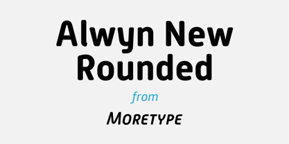
  39. Courier New OS by Monotype, $50.99
    Designed as a typewriter face for IBM, Courier New was re drawn by Adrian Frutiger for IBM Selectric series. A typical fixed pitch design, monotone in weight and slab serif in concept.
  40. New Millennium Linear by Three Islands Press, $24.00
    New Millennium Linear is one of three font families that share a common name, a common design philosophy, a common x-height, and basic character shapes. (The others are New Millennium and New Millennium Sans; all three work well together.) New Millennium Linear is a "monotone" newer version of the Sans face whose smooth, geometric, "Gothic" look gives it a completely different personality. The typeface comes with regular, bold, italic, and bold italic styles, each with a complete character set. New Millennium Linear might best be used in captions, callouts, labels, titles, and similar display situations.
Looking for more fonts? Check out our New, Sans, Script, Handwriting fonts or Categories
abstract fontscontact usprivacy policyweb font generator
Processing