7,771 search results
(0.082 seconds)
- Tme by bb-bureau,
$65.00
- DonJulio by Autographis,
$39.50
- Woodyland by Illushvara,
$16.00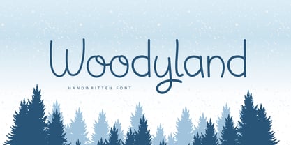
- ITC Musica by ITC,
$29.99 - AZ Hello Brushed by Artist of Design,
$25.00
- Candy Randy by Lauren Ashpole,
$15.00
- National Oldstyle NF by Nick's Fonts,
$10.00
- FATTIP - Unknown license

- Ps Kampen by Fontopia,
$25.00
- Blacksign by Creativework Studio,
$18.00
- Desk Job JNL by Jeff Levine,
$29.00
- Timeless Series by Sakha Design,
$12.00
- Hidup Tenang by Aldedesign,
$25.00
- KampFriendship by Ingrimayne Type,
$9.95
- Opportoonity JNL by Jeff Levine,
$29.00 - Risus LCB Dingbats - Unknown license

- Block Gothic by Red Rooster Collection,
$45.00
- Wayang Jawa by Yoga Letter,
$25.00
- Nomarch by Scriptorium,
$24.00 - Romance Sans by AEN Creative Studio,
$15.00
- Chalky by Alan Meeks,
$45.00
- Hopeful Giraffe by JBFoundry,
$18.00
- Kursk 205 by Talbot Type,
$19.50
- Highboy by Elemeno,
$25.00 - Centrale Sans Inline by Typedepot,
$19.00
- Vermilion by Hanoded,
$15.00
- MISQOT by !Exclamachine,
$9.99
- Senkron by Gurup Stüdyo,
$19.00
- Plakative Grotesk - 100% free

- Cheri Liney - Personal use only

- Jotting - Unknown license

- Alba Super - Personal use only

- Distant Galaxy Outline - Unknown license

- The Beetles - Unknown license

- Farckenzlabb - 100% free

- Send Cash - Unknown license

- Setebos - Unknown license

- Distant Galaxy AltOutline - Unknown license

- Distant Galaxy Condensed - Unknown license

- KR Ookie Bookie - Unknown license


