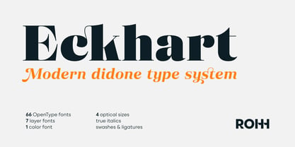
Eckhart™ is a modern didone, high-contrast typeface designed to create elegant, original and expressive character. This versatile font family is delivered in four optical sizes, making it a complete type system for all kinds of use, from branding to setting paragraph text. It is equipped with ligatures, swashes and alternates to enrich design possibilities and make it very distinctive as a display typeface. Eckhart family features a very playful and energetic color font, giving broad new possibilities of display use, especially interesting for posters and magazines. Eckhart Color is delivered both as OTF color font as well as regular layered font in 6 layers - it helps to achieve maximum software compatibility and control over colors. Eckhart consists of 74 fonts in 4 optical sizes - 33 uprights and their corresponding true italics + color fonts. It has extended language support as well as broad number of OpenType features, such as case sensitive forms, standard and discretionary ligatures, stylistic sets, lining, oldstyle figures, slashed zero, fractions, superscript and subscript, ordinals, currencies and symbols. --- Color font - user information: Eckhart Color Folk - OTF color font format has pre-defined color palette. In order to change the colors, please convert the text to outlines. You need compatible software to use the OTF color file, such as Adobe Photoshop CC, Adobe Illustrator CC, Pixelmator, etc. Eckhart Color Layered fonts - use the fonts one on top of the other in the order the fonts are numbered. These are regular OTF files, they work in all professional graphic software and you can edit the color of each layer. For web use - please use the color fonts as graphics, because not all web browsers support them.
The Lohengrin font is a compelling display font that captures the essence of historical artistry and craftsmanship within its letterforms. Created by Dieter Steffmann, a renowned German typographer a...
Sinister Plot is a font that seems to have emerged from the darkest corners of a creative mind, encapsulating a feeling of intrigue and mystery with each stroke. Its name itself evokes images of shad...
Sure, diving into the vibrant and playful world of font design, let's take a look at Rickles, a creation that springs from the imaginative minds at Font Diner. Picture this: a font that captures the ...
BD Renaissance is a font that seems to evoke the beauty and grandeur of the Renaissance era, a period known for its revival of the arts, literature, and philosophy. This typeface, while fictional in ...
As of my last update in April 2023, without direct information on a specific typeface designated as "13_Fletcher," I can fabricate a creative description based around the intriguing elements the name...
The "Decaying" font, as its name vividly suggests, embodies a visual essence of decomposition and agedness, meticulously crafted to convey a sense of historical wear, tear, and a passage through time...
The Guede Demo font, crafted by the talented David F. Nalle, is a distinctive and visually compelling typeface that offers a glimpse into the broader capabilities and aesthetics of its full version. ...
Ah, the elusive Font called Font, a font so enigmatic and self-referential it has become the meta of all typography. Picture, if you will, a typeface caught in an identity crisis, perpetually ponderi...
Aspire by Reference Type Foundry is a captivating typeface that stands out for its elegant and refined design. Conceived with the modern creative in mind, it takes its inspiration from both classical...
The Stencil Camera font is an innovative typeface that cleverly combines the edgy character of stencil lettering with the aesthetic nuances of photography and image-making. Its distinctive style capt...
The HenryMorganHand font by Manfred Klein is a distinctive typeface that carries the essence of personality and flair, drawing its inspiration from the handwriting of historical and possibly mythical...
Major Snafu, conceived by the imaginative mind of Vic Fieger, is a typeface that doesn't merely exist within the realm of digital design but actively jumps off the page, daring the viewer to sit up a...
Sure, let’s spin a web around the whimsically named font, Spiderfingers. Picture this: a typeface that crawled out of the dark, enchanting corner of a misunderstood arachnid’s lair, strutting its way...
The Kingthings Annex font is an intriguing typeface developed by the talented font designer Kevin King, who operates under the name Kingthings. This font is part of the larger Kingthings font family,...
DNNR, a font designed by Pedro Pan, is a captivating typeface that stands out for its unique blend of modern aesthetics with a touch of whimsy. The font, immediately noticeable for its bold personali...
The Rodrigues PERSONAL USE ONLY font, designed by the renowned typographer Måns Grebäck, is a testament to his craftsmanship in creating visually compelling and unique typefaces. This font captures a...
Brie Light, as its name suggests, is a font that embodies a blend of lightness and elegance. This typeface falls into a sophisticated category of fonts that balance between formality and a touch of p...
The font "GHOSTS ITALIC PERSONAL USE" by Billy Argel is a striking and characterful typeface that immediately captures the attention with its unique design. Crafted by the talented type designer Bill...
Kreepshow 'Frigid' is a unique and visually captivating font that seems to have been carefully crafted to evoke a sense of chilling suspense, perfect for uses that require a touch of the eerie or the...
Defatted Milk, designed by Nils von Blanc, is a font that immediately stands out due to its unique characteristics and the intriguing story behind its creation. Nils von Blanc, known for his innovati...
Absolutely, I'd love to talk about the Royal Initialen font created by Dieter Steffmann! Picture this: a typeface that feels like a journey back in time, capturing the elaborate and ornate style of h...
Alright, imagine it's a cozy night, and you decide to dive into a world where every letter tells a story of mystery and magic. That's where Midnight Hour, crafted by the talented David Kerkhoff, come...
Kalenderblatt Grotesk is a true gem in the world of typography, crafted by the talented Dieter Steffmann. This particular font marries the enduring appeal of grotesque design with Steffmann's unique ...
The font named TRUEblood, created by the designer known as SpideRaY, carries with it a level of artistry and inventiveness that makes it stand out in the world of typography. This font draws inspirat...
American Text BT is a distinctive and historically rich typeface that carries the spirit and flair of early American typography. It falls within the category of display fonts, which are typically use...
"Yukon Tech Italic," a distinctive font by Iconian Fonts, embodies a modern and adventuresome spirit, aptly resonating with technology and innovation themes. Created by Iconian Fonts, a foundry renow...
Two Turtle Doves is a distinctive font that bears the creative signature of Tom Murphy 7, a designer known for his eclectic and often quirky approach to typography. This particular font embodies a se...
Nightbird is a font created by David Kerkhoff that captures the essence of spontaneity and a touch of eerie allure, transporting its viewers into a world that blurs the line between the fantastical a...
Embark on a captivating journey into the heart of expression with Dark Theater, a font that whispers the dramatic tales of ancient lore and modern mystique. Like the grand unveiling of a long-awaited...
Ah, the whimsical world of fonts, where the personality of a text comes to live, breathe, and sometimes do a little dance. Enter the scene: Digital Tech by Phuxer Designs. Imagine if the circuits of ...
"Dark11" isn't a recognized standard font at the time of my last update, so I'll take a creative approach to describe what I envision for a font with such a mysterious and intriguing name.
Envision...
Juvelo is a distinguished typeface crafted by the adept type designer Barry Schwartz. It stands out as a testament to Schwartz's commitment to producing fonts that not only serve practical purposes b...
Ah, the Abysmal Gaze font - a creation that seems to hail from the depths of an artist's most intriguing nightmares, or perhaps, their most whimsical dreams. Crafted by the hands and imaginative geni...
Marsh Gas, crafted by the talented Levi Halmos, is a font that seems to rise from the depths of fantasy and enchantment, encapsulating the essence of mystery and peculiar charm. At first glance, Mars...
Schmalfette Fraktur by Dieter Steffmann is an intriguing font that captures the essence of historical German printing and manuscript traditions. Dieter Steffmann, known for his passion for reviving v...
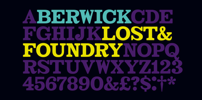
Breaking the cycle of homelessness We are partnered with The House of St. Barnabas, a private members club in Soho Square, whose work as a not for profit charity aims to break the cycle of homelessness in London. Each purchase (of the family pack) comes with a one month membership to The House and 100% of the proceeds from sales of fonts go directly to the charity to help their essential work. This unique collection of 7 typefaces is based on the disappearing signs of Soho, at risk of being lost forever due to the ever changing landscape of the area. By re-imaging the signage as complete fonts, we have rescued this rich visual history from the streets and present the typefaces into a contemporary context for a bright optimistic future. FS Berwick Thanks to its humble tiled origins, this Egyptian serif type maintains a uniform character width, creating the irregular letter proportions found in the final alphabet. Broad-shouldered, the bracketed serifs firmly ground the font, whilst its extreme hairlines become a necessity due to the uniform width. Of note is the upside down ‘S’, to be found on the original sign on Berwick Street. Perhaps due to its ceramic origins, there is a surprising ‘slippiness’ to its final appearance. FS Cattle Cattle & Son is best described as a wide, but not overly extended, grotesque-style sans serif, showing a uniform width and carrying a robust strength to its form. Whilst lightly functional overall, the purposeful diagonal legs of the ‘K’, ‘R’ and the tail of the ‘Q’ add an urgency to its appearance. The reduced size of the ampersand gives away Cattle & Son’s hand-painted origins, and the oblique compacted ‘LTD’ found on the original sign is also included in the final set. This beautiful sign is tucked away under an arch in Portland Mews, sheltering from the weather. Perhaps this is why it has lasted so long. FS Century This somewhat elongated set of Roman capitals was originally rendered in paint circa 1940, but its roots trace back to the Trajan Column in Rome. Witness the slightly unbalanced ‘W’ and the painter’s hand is revealed. Century’s flared serif style is extremely short, sharp and bracketed. The ‘M’ is splayed and has no top serifs. Century has a uniform appearance of width, probably due to its sign-written origins. Yet is elegant, classic and exudes sophistication. FS Charity A true Tuscan letterform, the original is located on The House of St. Barnabas in ceramic tiles and was revealed in all its broken glory in 2014. FS Charity retains the option of using these incorrect characters (try typing lowercase in the test drive above and compare with the more uniform uppercase characters). FS Charity features fishtailed terminals on its strokes, a curious branched ‘T’ and the ‘S’ displays tear-drop ends to its serifs. Almost uniform in width, the ‘A’, ‘M’ and ‘W’ are the widest characters in this set. FS Marlborough The elongated Marlborough features diagonal terminals to some characters and numerals. Also retained is the space-saving contracted ‘T’ glyph from the original sign, while the ‘R’ features a distinctive wedge-shaped leg. Highly individual in this form, similar signage appears around Soho, but featuring a variety of widths in their design. FS Portland The sister type to Cattle & Son, Portland is oblique rather than italic. The serifs are not overly long, yet still enhance its rather rigid cap height and baseline appearance. Its ‘A’ has a top serif, the ‘M’ is square and the ‘G’ foregoes any spur. Particularly delightful is the open ampersand. Numerals align to encourage the horizontal flavour of the oblique style. Overall, Portland is both confident and graceful. FS St James A lineal Continental style, St James also displays a true sense of ‘Londoness’ in its titling form, perhaps influenced by early Underground signage. Irregular letterforms display a continental flavour, particularly evident in its Deco style ‘W’, ampersand and numerals. The rather high cross bar in the ‘A’ is also reflected in the raised middle strokes of the ‘M’. Noteworthy are the distinctive unions found on all of the characters and the additional small caps. The original lettering is still located on Greek St.
Cesium by Hoefler & Co., $51.99 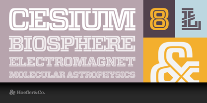
An inline adaptation of a distinctive slab serif, Cesium is an unusually responsive display face that maintains its high energy across a range of different moods. The Cesium typeface was designed by Jonathan Hoefler in 2020. An energetic inline adaptation of Hoefler’s broad-shouldered Vitesse Black typeface (2000), Cesium is named for the fifty-fifth member of the periodic table of the elements, a volatile liquid metal that presents as a scintillating quicksilver. From the desk of the designer, Jonathan Hoefler: I always felt that our Vitesse typeface, an unusual species of slab serif, would take well to an inline. Vitesse is based not on the circle or the ellipse, but on a less familiar shape that has no common name, a variation on the ‘stadium’ that has two opposing flat edges, and two gently rounded sides. In place of sharp corners, Vitesse uses a continuously flowing stroke to manage the transition between upright and diagonal lines, most apparent on letters like M and N. A year of making this gesture with my wrist, both when drawing letterforms and miming their intentions during design critiques, left me thinking about a reduced version of the typeface, in which letters would be defined not by inside and outside contours, but by a single, fluid raceway. Like most straightforward ideas, this one proved challenging to execute, but its puzzles were immensely satisfying to solve. Adding an inline to a typeface is the quickest way to reveal its secrets. All the furtive adjustments in weight and size that a type designer makes — relieving congestion by thinning the center arm of a bold E, or lightening the intersecting strokes of a W — are instantly exposed with the addition of a centerline. Adapting an existing alphabet to accommodate this inline called for renovating every single character (down to the capital I, the period, and even the space), in some cases making small adjustments to reallocate weight, at other times redesigning whole parts of the character set. The longer we worked on the typeface, the more we discovered opportunities to turn these constraints into advantages, solving stubbornly complex characters like € and § by redefining how an inline should behave, and using these new patterns to reshape the rest of the alphabet. The New Typeface The outcome is a typeface we’re calling Cesium. It shares many of Vitesse’s qualities, its heartbeat an energetic thrum of motorsports and industry, and it will doubtless be welcome in both hardware stores and Hollywood. But we’ve been surprised by Cesium’s more reflective moods, its ability to be alert and softspoken at the same time. Much in the way that vibrant colors can animate a typeface, we’ve found that Cesium’s sensitivity to spacing most effectively changes its voice. Tighter leading and tracking turns up the heat, heightening Cesium’s sporty, high-tech associations, but with the addition of letterspacing it achieves an almost literary repose. This range of voices recommends Cesium not only to logos, book covers, and title sequences, but to projects that regularly must adjust their volume, such as identities, packaging, and editorial design. Read more about how to use Cesium. About the Name Cesium is a chemical element, one of only five metals that’s liquid at room temperature. Resembling quicksilver, cesium is typically stored in a glass ampule, where the tension between a sturdy outer vessel and its volatile contents is scintillating. The Cesium typeface hopes to capture this quality, its bright and insistent inline restrained by a strong and sinuous container. Cesium is one of only three H&Co typefaces whose name comes from the periodic table, a distinction it shares with Mercury and Tungsten. At a time when I considered a more sci-fi name for the typeface, I learned that these three elements have an unusual connection: they’re used together in the propulsion system of nasa’s Deep Space 1, the first interplanetary spacecraft powered by an ion drive. I found the association compelling, and adopted the name at once, with the hope that designers might employ the typeface in the same spirit of discovery, optimism, and invention. —JH Featured in: Best Fonts for Logos
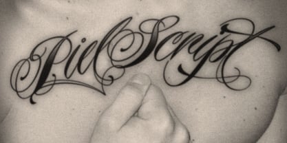
Over the past couple of years I received quite a number of unusual and surprising requests to modify my type designs to suit projects of personal nature, but none top the ones that asked me to typeset and modify tattoos using Burgues Script or Adios. At first the whole idea was amusing to me, kind of like an inside joke. I had worked in corporate branding for a few years before becoming a type designer, and suddenly I was being asked to get involved in personal branding, as literally “personal” and “branding” as the expression can get. After a few such requests I began pondering the whole thing from a professional perspective. It was typography, after all, no matter how unusual the method or medium. A very personal kind of typography, too. The messages being typeset were commemorating friends, family, births, deaths, loves, principles, and things that influenced people in a deep and direct way, so much so that they chose to etch that influence on their bodies and wear it forever. And when you decide to wear something forever, style is of the essence. After digging into the tattooing scene, I have a whole new respect for tattoo artists. Wielding that machine is not easy, and driving pigment into people’s skin is an enormous responsibility. Not to mention that they're some of the very few who still use a crafty, hands-on process that is all but obsolete in other ornamentation methods. Some artists go the extra mile and take the time to develop their own lettering for tattooing purposes, and some are inventive enough to create letters based on the tattoo’s concept. But they are not the norm. Generally speaking, most tattoo artists use generic type designs to typeset words. Even the popular blackletter designs have become quite generic over the past few decades. I still cringe when I see something like Bank Script embedded into people’s skin, turning them into breathing, walking shareholder invitations or government bonds. There’s been quite a few attempts at making fonts out of whatever original tattoo designer typefaces can be found out there - wavy pseudo-comical letters, or rough thick brush scripts, but as far as I could tell a stylish skin script was never attempted in the digital age. And that’s why I decided to design Piel Script. Piel is Spanish for skin. In a way, Piel Script is a removed cousin of Burgues Script. Although the initial sketches were infused with some 1930s showcard lettering ideas (particularly those of B. Boley, whose amazing work was shown in Sign of the Times magazine), most of the important decisions about letter shapes and connectivity were reached by observing whatever strengths and weaknesses can be seen in tattoos using Burgues. Tattoos using Adios also provided some minor input. In retrospect, I suppose Affair exercised some influence as well, albeit in a minor way. I guess what I'm trying to say is there is as much of me in Piel Script as there is in any of the other major scripts I designed, even though the driving vision for it is entirely different from anything else I have ever done. I hope you like Piel Script. If you decide it to use it on your skin, I'll be very flattered. If you decide to use it on your skateboard or book cover, I'll be just as happy. Scripts can't get any more personal than this. Piel Script received the Letter2 award, where they selected the best 53 typefaces of the last decade, organised by ATypI.

