10,000 search results
(0.023 seconds)
- Bestan by Konstantine Studio,
$17.00 Bestan is inspired by the typography of the ship's steel containers and industrial-based business branding. Added a slight touch of futuristic vibes to make Bestan appears as a fresh game-changer, either for corporation purpose and also modern urban vibes to your visual graphic design stuff.
 - Craptoy by PizzaDude.dk,
$20.00Craptoy is a grunge Open Type font - full of different auto ligatures! That means you can write words like beer, letter, bubble, success (just to name a few) without having the double letter repeating itself! (You will need to use OpenType supporting applications to use the autoligatures). - Ambleside by Hanoded,
$15.00 Ambleside is a town in the English Lake District. I used to live and work there, so I decided to name a font after it. Ambleside font is a handmade connected script font. It’s a little rough, but loveable nonetheless. Comes with all the diacritics you need!
 - Normandy Isle JNL by Jeff Levine,
$29.00 Normandy Isle JNL is a condensed sanserif typeface built off of the basic design of an old wood type, but augmented with thick and thin lines to create a whole different look. The font itself is named after a community in the North end of Miami Beach.
 - Fedot by Oleg Stepanov,
$20.00 Fedot is a hand-drawn font, based on shapes of early cyrillic scripts (so-called "ustav" and "poluustav"). Lowercase typesetting with its variable letter heights is more brisk and authentic, and uppercase is more equable and neutral. Some of letters are the same in lowercase and uppercase.
 - Origin Tech by Ronin Design,
$15.00 Origin Tech is a modern typeface inspired from technologies, this display font have a beginning and ending alternate and also have some swashes will make your design perfect. Origin Tech designed for modern project theme, perfect for game/app design, logo design, poster, advertising and many more
 - Bummill by Awanstudio,
$16.00 Bummill signature font allows you to create stunning and easy hand-lettering in an instant. Ideal for the logo, quotes, wedding, product label/packaging, fashion, letter, advertising, invitation, poster, merchandise, greeting cards, etc. This font came along with lots of ligatures option for more natural looks.
 - Shocked Up by Typefactory,
$14.00 Shocked Up is a cute and fancy display font. It embodies playfulness and authenticity and is the perfect choice for any children activity, game font, party invitation, or school project. Add this chunky lettered font to your designs and notice how it makes them come alive!
 - Wallflowers II by Laura Worthington,
$19.00 Create borders, wallpaper, or repeating patterns using Wallflower II’s unique hand drawn wallpaper tiles and accompanying icons. Wallflowers II are easy to use for borders or wallpaper: simply type the same letter consecutively (i.e., aaa) and the pattern will emerge. See what’s included! http://bit.ly/2bGXbnC
 - Ageoline by Blankids,
$17.00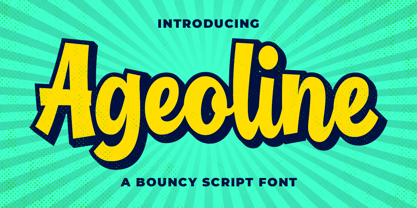 Introducing of our new product the name is Ageoline a Bouncy Script Font. Ageoline inspired by bouncy lettering style this font is a fun theme very good for display, tshirt design, craft, quote sign, logotype and etc FEATURES : Uppercase Lowercase Number Punctuation Multilingual PUA Encode Opentype
 - Opera by Stereo Type Haus,
$10.00 Characterized by its quirky counter spaces, Opera is named after the font’s letter “O”, resembling the open mouth of an opera singer. The 3 weights plus italics can be used individually or together for a variety of applications including magazine body texts or a striking headline.
 - LD Walt by Illustration Ink,
$3.00Know anybody named Walt? Ever seen his handwriting? Well, here it is (at least a similar style). You will enjoy using it for your theme park titles, invitations etc. (And it’s much cleaner and nicer-looking than any other version out there.) Font inspired from Walt Disney. - Cortada Dos Std by Type-Ø-Tones,
$60.00 Cortada is the name we gave to this display font that replaces Cortada Classic. After long discussions, Laura Meseguer gave birth to this brand new form. Cortada comes now in OpenType format in order to allow a wider range of characters, including Central European character set.
 - Brush In Space by Gassstype,
$25.00 **Brush in Space** - Handwritten Brush font with a natural Rough style and comical type. Crafted manually with love and passion, This font is great for your next creative project such as logos, printed quotes, invitations, cards, product packaging, headers, Logotype, Letterhead, Poster, Label, Game project and etc.
 - Death Stinger Horror by Sipanji21,
$15.00 Death Stinger - Horror Font is a horror fantasy hand lettered font. Work great for any design needs : logo, branding, modern advertising design, logos, poster quote, movie, game, novel, book / cover Title, editorial design, website / blog, card, custom mug, pillow, t-shirts, and any fantasy hand-lettered needs.
 - FF Orbital by FontFont,
$41.99 Slovakian type designer Peter Bil'ak created this display FontFont in 1996. The font is ideally suited for film and tv, music and nightlife as well as software and gaming. FF Orbital provides advanced typographical support with features such as ligatures. It comes with tabular lining figures.
 - Alinea Serif by Présence Typo,
$36.00Alinea is a typeface in 3 styles (Sans, Incise, and Serif) conceived for being mixed in the same document. The elegant one of the family, Alinea Serif, is a transitional, a style represented by Caslon and Times. It is a contrasted typeface, strong stems and thin hairlines. - Algeline by Blankids,
$26.00 Introducing of our new product the name is Algeline a Romantic Script Font. Algeline inspired by modern calligraphy style this font is a fun theme very good for display, tshirt design, craft, quote sign, logotype and etc FEATURES : Uppercase Lowercase Number Punctuation Multilingual PUA Encode Opentype
 - Elecstrom by Typefactory,
$14.00 Elecstrom is a storm display font. Elecstrom has a bad weather feels so it has thrilling yet cool experience. Elecstrom is perfect for product cover, signpost, cover album, movie with disaster theme, game, and many more! Features: – Uppercase – Lowercase – Symbols & Punctuation – Numeral – Alternates – Ligature – Multilingual Support
 - Round by OtterType,
$20.00 Round is an elegant and clean modern display font. You can use it for a variety of design projects like posters, business cards, wedding invitations, games, covers, social media posts, quote photos, branding, editorials, and much more. Round is a multilingual font, also supporting Cyrillic alphabet.
 - Twitty Bird NF by Nick's Fonts,
$10.00Dan X. Solo's book of Showcard Alphabets featured the pattern for this devil-may-care face under the name "Conway". Not too pretty, not too proud, but a whole lotta fun. Both versions of the font include 1252 Latin, 1250 CE (with localization for Romanian and Moldovan). - OK Corral by FontMesa,
$20.00 OK Corral is a revival of a very old Italian font that you may have seen in the past under the original name of Italian Print. The Lined version of this font has never been known to have a lower case set of letters until now.
 - Secret Boudoir by Creative Corner,
$9.00 Secret Boudoir is a handwritten type of font with a sensual, romantic vibe. The style of handwritting is feminine. The font contains decorative alternative capitals. It will be perfect for themes like weddings, lifestyle, feminity but also for quotes, titles, blogs for product names and packaging.
 - Hello Nightmare by Blankids,
$21.00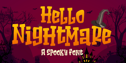 Introducing of our new product the name is Hello Nightmare a Spooky Font inspired by beauty quirky style this font is a fun theme very good for display, T-shirt design, craft, quote sign, logotype and etc FEATURES : Uppercase Lowercase Number Punctuation Multilingual PUA Encode Opentype
 - Sign Project JNL by Jeff Levine,
$29.00 Sign Project JNL is based on vintage water-applied decals once made by the Meyercord Decal Company of Chicago (and later Carol Stream), Illinois. These decals were popular during the 1950s and 1960s for window signage, boat identification, mailbox names and numbers and hundreds of other projects.
 - Shocker by Vozzy,
$10.00 Introducing original label font named Shocker. This font has a multilungual characters support (check out all available characters on previews). The font family has three styles: Regular, Rough and Lightning. This font will look good on any designs like a poster, T-shirt, label, logo, etc.
 - Colesberg Script by Letrasupply Typefoundry,
$20.00 Inspired by vintage script letters, Colesberg Script comes with layered font styles, alternates characters, swash, and ornaments. Have fun with these fonts, you can make a beautiful decorative type and perfect script for any project such as custom name, logos, quotes, invitation, and more creative project easily.
 - FP Elsinore by Fontpartners,
$29.00 FP Elsinore was custom made for street name signs in the city of Elsinore. The font has a straightforward and very classic expression, that blends harmoniously with the architecture of this old coastal city. The corners are gently rounded, because the font is mainly used in signage.
 - Winter Wallflowers by Laura Worthington,
$19.00 Create borders, wallpaper, or repeating patterns using 25 unique hand drawn wallpaper tiles and accompanying icons. Winter Wallflowers are very easy to use for borders or wallpaper: simply type the same letter consecutively (i.e., aaa) and the pattern will emerge. See what’s included! http://bit.ly/2bO1mIE
 - Garden Gnome by Hanoded,
$15.00 I am not really fond of Garden Gnomes, but this font is kinda cute and I figured it'd be a nice name. Garden Gnome is a very happy, easy to read Children's Book font. It is bouncy, rounded and comes with all the diacritics you need.
 - Happy People by Blankids,
$23.00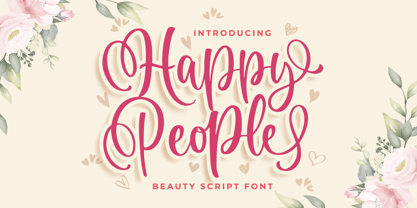 Introducing of our new product the name is Happy People Beauty Script Font. Happy People inspired by bouncy script style this font is a fun theme very good for display, tshirt design, craft, quote sign, logotype and etc. FEATURES : Uppercase Lowercase Number Punctuation Multilingual PUA Encode Opentype
 - BD Unicorse by Typedifferent,
$25.00 BD Unicorse is a retro futuristic mixed case display font with the main characters set on the small keys and alternatives on the capital characters. It features 12 ligatures and is great for the use as headlines in magazines, logotypes on posters, games, movies or music packaging.
 - Ice Cream Man by Hanoded,
$10.00 I was listening to an old Van Halen album when I made this font. I named it after one of my favorites: ‘Ice Cream Man’. Ice Cream Man is a happy, sloppy, wobbly kids font. Use it for your book covers, posters and ice cream packaging!
 - Geodezyx NF by Nick's Fonts,
$10.00Based on a disco-era typeface named—perhaps not surprisingly—Disco, this offering has strong geometric elements which blend together nicely to form tight, commanding healines. This font contains the complete Latin language character set (Unicode 1252) plus support for Central European (Unicode 1250) languages as well. - Adagietto by Hanoded,
$15.00 Adagietto is a musical term and means: ‘fairly slow’. I wasn’t in a rush to create this font, so the name kind of suits! Adagietto is a classic font, ideally suited for posters, book covers and product packaging - and just about everything that needs a classy look.
 - Zagora by CastleType,
$19.00 Based on an art deco design, with alternate characters and numerals. Named for a little town in Morocco on the border of the Sahara desert, with a billboard at the edge of a great expanse of sand that points the way to Timbuktu (several days by camel).
 - Some Assembly by Open Window,
$14.95 Some Assembly is a sans serif printer font which ran into a few problems when it came time to print. Offered with a wide range of distressed styles. It is a pleasantly styled geometric face which is highly legible and its various styles provide dynamic alternatives.
 - Reds Aglonema by Zeenesia Studio,
$13.00 Introducing Reds Aglonema. new font for all of your fun projects! perfect for large design project like Tshirt, mugs, Advertising, bags, quotes, food , poster, fashion, custom sticker, magazine, and many others. It completed with numbers and punctuation. Multilingual support, alternate, ligatures and came with PUA encoded.
 - Melodiously by Get Studio,
$19.00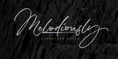 Melodiously Script is handwritten signature style font with stunning brush characters. Include OpenType alternates and common ligatures. Ideal for logos, name tag, handwritten quotes, product packaging, merchandise, social media & greeting cards. Try the alternates and ligatures to give your designs looks good, fresh, casual, stylish, and modern.
 - Road Rage by Vozzy,
$10.00 Introducing a vintage look label font family named "Road Rage". All available characters you can see at the screenshot. This font have 4 styles - Regular, Shadow, Rough and Rough Shadow. This font will good viewed on any retro design like poster, t-shirt, label, logo etc.