10,000 search results (0.033 seconds)
  1. VTC BadPaint - Unknown license
  2. VTC Optika - Unknown license
  3. VTC Anglika - Unknown license
  4. VTC Optika - Unknown license
  5. VTC AllWashedUp - Unknown license
  6. VTC Krinkle-Kut - Unknown license
  7. VTC PizzOff - Unknown license
  8. VTC OldAsCrap - Unknown license
  9. VTC StressedHand - Unknown license
  10. VTC PizzOff - Unknown license
  11. VTC AntiqueFizz - Unknown license
  12. VTC JoeleneHand - Unknown license
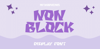
  13. Non Block by Liartgraphic, $15.00
    Hi guys! How are you guys? I bet it's great! Introducing our latest product, we call this product the Non Blok font Non Blok hight is a display type font With a unique and firm touch Non Blok hight font is great to use on: fashion magazines, logos, photography, landing pages, flyers, social media and so on What's included - multilingual support - alternatives - ligatures Thank you, best regards Liarttyype
  14. Printing Press Elements JNL by Jeff Levine, $29.00
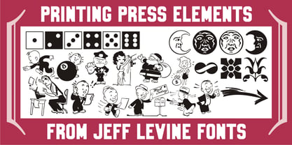
    Printing Press Elements JNL contains an eclectic assortment of printer's elements. From a set of dice (in both black and white faces) to cartoon embellishments to border and decorative elements there's something to fit numerous uses. Also included is an extendable bracket. The left-facing elements are on the (greater than) keys. The right-facing elements are on the [ (left bracket), \ (backslash) and ] (right bracket) keys.
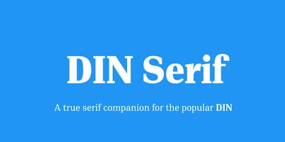
  15. PF DIN Serif by Parachute, $36.00
    DIN Serif: Specimen Manual PDF The DIN Type System: A Comparison Table This is the first ever release of a true serif companion for the popular DIN typeface. DIN Serif originated in a custom project for a watchmaking journal which required a modern serif to work in unison and match the inherent simplicity of DIN. As a result, a solid, confident and well-balanced typeface was developed which is simple and neutral enough when set at small sizes, but sturdy and powerful when set at heavier weights and bigger sizes. It utilizes the skeleton of the original DIN and retains its basic proportions such as x-height, caps height and descenders, whereas ascenders were slightly increased. DIN Serif makes no attempt to impress with ephemeral nifty details on individual letters, but instead it concentrates on a few modern, functional and everlasting novelties which express an overall distinct quality on the page and set it apart from most classic romans. This is a low contrast typeface with vertical axis and squarish form which brings out a balance between simplicity and legibility. Its narrow proportions offer economy of space which is critical for newspaper body text and headlines. At small sizes the text has an even texture, it is comfortable and highly readable. The serifs are narrow at heavy weights and when tight typesetting is applied at large sizes, the heavier weights become ideal for headlines. DIN Serif was inspired by late 19th century Egyptian and earlier transitional roman faces. Bracketed serifs were placed on the upper part of the letterforms (this is where we mostly concentrate our attention when we read) whereas small clean square serifs were placed on and under the baseline to simplify the letterforms. In order to reduce visual tension at the joins and make reading smooth and comfortable, a slight hint of bracketed serif was added at the joins in the form of a subtle angular tapered serif, which softens the harsh angularity. These angular tapered serifs tend to disappear at smaller sizes (or smooth out the joins) but stand out at bigger sizes exuding a strong, modern and energetic personality. What started out as a custom 2 weight family, it has developed into a full scale superfamily with 10 styles from Regular to ExtraBlack along with their italics. Additional features were added such as small caps, alternate letters and numbers as well as numerous symbols for branding, signage and publishing. All weights were meticulously hinted for excellent display performance on the web. Finally, DIN Serif supports more that 100 languages such as those based on the Latin, Greek and Cyrillic alphabet.
  16. As of my last update in April 2023, "Divlit" is not a widely recognized or documented font in the realms of typography commonly discussed or published in well-known typographic resources, databases, ...
  17. Cloud - Personal use only
  18. Confinental FREE - Personal use only
  19. National First Font Dotted - Unknown license
  20. Creampuff - 100% free
  21. Blaster - 100% free
  22. Slicker - Unknown license
  23. handwriting-draft_free-version - Personal use only
  24. AddCityboy - Unknown license
  25. HUFace132 - Unknown license
  26. Comfortaa - 100% free
  27. soul handwriting_free-version - Personal use only
  28. MISFITS - Personal use only
  29. Typist - Unknown license
  30. Barlos-Random - 100% free
  31. Eighties FREE - 100% free
  32. bladeline - 100% free
  33. TooneyNoodle - 100% free
  34. Automobile - 100% free
  35. Korneuburg Slab Regular - Personal use only
  36. SelznickNormal - 100% free
  37. ACID LABEL___ - Personal use only
  38. Derradeira - Personal use only
  39. Fabrica - Unknown license
  40. Rivanna - 100% free
Looking for more fonts? Check out our New, Sans, Script, Handwriting fonts or Categories
abstract fontscontact usprivacy policyweb font generator
Processing