8,303 search results
(0.044 seconds)
- Futura Black Art Deco by URW Type Foundry,
$39.99 - H74 Black Label Whiskey by Hydro74,
$25.00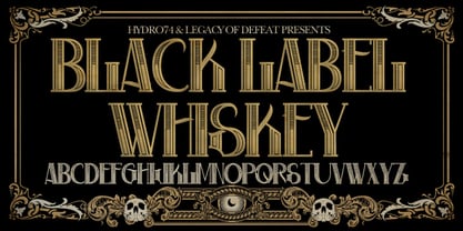
- Well Said Black NF by Nick's Fonts,
$10.00
- Display Black Serif Rough by Gerald Gallo,
$20.00
- P22 Pooper Black Pro by IHOF,
$39.95
- Back To Teacher Outline by NJ Studio,
$19.00
- Back Lot Stencil JNL by Jeff Levine,
$29.00
- LHF Black Rose Script by Letterhead Fonts,
$59.00
- BIG Slant Black UltExp - Personal use only

- View Slant Black ExtExp - Personal use only

- Geoffrey - Personal use only

- 1925 My Toy Print Deluxe Pro by GLC,
$42.00
- Bo Diddlioni Stencil NF by Nick's Fonts,
$10.00 - Ekorre PERSONAL USE ONLY Black - Personal use only

- Back In The USSR DL - Personal use only

- KR Back To School Dings - Unknown license

- SF Archery Black SC Shaded - Unknown license

- SF Archery Black SC Outline - Unknown license

- British Block Flourish, 10th c. - Unknown license

- SF Archery Black SC Shaded - Unknown license

- SF Archery Black SC Outline - Unknown license

- KR Back On The Farm - Unknown license

- Schuss Sans CG Poster Black by typic schuss,
$33.00
- Advertiser JNL by Jeff Levine,
$29.00 - Kremlin Advisor Display Kaps Bo - Unknown license

- Just Fall Holidays by Outside the Line,
$19.00
- LEGO BRIX - Personal use only

- Beiko Heavy by Minor Praxis,
$20.00
- Freshman - 100% free

- Beast Impacted - Unknown license

- VT Showcard by VarsityType,
$15.00
- Wickenburg by VersusTwin,
$21.99
- Chocolate Bar JNL by Jeff Levine,
$29.00
- Intramural JL - 100% free

- Action Is, Shaded JL - Unknown license

- Wedding Doodles by Outside the Line,
$19.00 - EFCO Brookshire by Ephemera Fonts,
$45.00
- Fitzgerald by Greater Albion Typefounders,
$18.00
- ND Raster by NeueDeutsche,
$20.00
- Kiddie Blokz JNL by Jeff Levine,
$29.00


