10,000 search results (0.024 seconds)
  1. Schnorr Gestreckt by HiH, $12.00
    Peter Schnorr was a German artist/illustrator of Art Nouveau period (called Jugendstil in Germany and Austria). He was quite adept at calligraphy and did a variety of commercial work, including business signs. He designed at least four different alphabets and collaborated with Bruce Rogers on advertising work and title page designs for books. One of their clients was the publishing house of Houghton Mifflin. I have not been able to discover anything else about him, but I suspect he might be the grandson of the Bavarian artist Jules Schnorr von Carolsfeld, who was once commissioned to do a mural by Ludwig II of Bavaria (whose famous castle was copied by Disneyland). Schnorr did not give individual names to his fonts. Where there is no historical name, we like to follow the tradition initiated by Bauer and name fonts after their designer, with a descriptive adjective in the designer’s native language. Gestreckt is German for stretched or elongated. An interesting deign detail of this typeface is the cross bar of the “T” --it is NOT symetrical. The right hand side extends only 88% as far as the left hand side (a ratio of 9:8). I presume this was done for a more pleasing letter fit. Today Schnorr’s design is frequently offered under the name “Ambrosia.” However. close inspection will usually reveal that the serifs have been treated differently. I believe our font has a greater fidelity to the original design. Please also compare the design of the various auxiliary characters to those in other fonts. Often they are either borrowed from an inappropriate font of a different period or are missing altogether. We make every effort to design characters that are in keeping with the overall design and spirit of the typeface. For example, see the superscript Registered Trademark symbol (0174) and the Double s (0223). I think both are quite successful. Schnorr Gestreckt ML represents a major extension of the original release. In addition to the standard 1252 Western Europe Code Page with character slots up to decimal position 255, there are glyphs for the 1250 Central Europe, the 1252 Turkish and the 1257 Baltic Code Pages. There are also two alternate letter forms, one ornament and seven ligatures with Unicode codepoints (Private Use Area) and OpenType aalt, ornm & liga GSUB layout features. There are a total of 318 glyphs and 351 kerning pairs. Please note that some older applications may only be able to access the Western Europe character set (approximately 221 glyphs). This release also incorporates a redesign of several glyphs: the comma, quotes, acute accent, and grave accent.
  2. Back to the Futurex - Unknown license
  3. ITC Franklin by ITC, $40.99
    The ITC Franklin™ typeface design marks the next phase in the evolution of one of the most important American gothic typefaces. Morris Fuller Benton drew the original design in 1902 for American Type Founders (ATF); it was the first significant modernization of a nineteenth-century grotesque. Named in honor of Benjamin Franklin, the design not only became a best seller, it also served as a model for several other sans serif typefaces that followed it. Originally issued in just one weight, the ATF Franklin Gothic family was expanded over several years to include an italic, a condensed, a condensed shaded, an extra condensed and, finally, a wide. No light or intermediate weights were ever created for the metal type family. In 1980, under license from American Type Founders, ITC commissioned Victor Caruso to create four new weights in roman and italic - book, medium, demi and heavy - while preserving the characteristics of the original ATF design. This series was followed in 1991 by a suite of twelve condensed and compressed designs drawn by David Berlow. ITC Franklin Gothic was originally released as two designs: one for display type and one for text. However, in early digital interpretations, a combined text and display solution meant the same fonts were used to set type in any size, from tiny six-point text to billboard-size letters. The problem was that the typeface design was almost always compromised and this hampered its performance at any size. David Berlow, president of Font Bureau, approached ITC with a proposal to solve this problem that would be mutually beneficial. Font Bureau would rework the ITC Franklin Gothic family, enlarge and separate it into distinct text and display designs, then offer it as part of its library as well. ITC saw the obvious value in the collaboration, and work began in early 2004. The project was supposed to end with the release of new text and display designs the following year. But, like so many design projects, the ITC Franklin venture became more extensive, more complicated and more time consuming than originally intended. The 22-font ITC Franklin Gothic family has now grown to 48 designs and is called simply ITC Franklin. The new designs range from the very willowy Thin to the robust Ultra -- with Light, Medium, Bold and Black weights in between. Each weight is also available in Narrow, Condensed and Compressed variants, and each design has a complementary Italic. In addition to a suite of new biform characters (lowercase characters drawn with the height and weight of capitals), the new ITC Franklin Pro fonts also offer an extended character set that supports most Central European and many Eastern European languages. ITC Franklin Text is currently under development.
  4. Sure thing! FloraDings isn't your typical font made up of letters and numbers; instead, it's a charming and whimsical collection of what one might call "floral dingbats." It's a creative ensemble of ...
  5. Dirty Ames is a font that dares you to unleash your creative instincts and bring a raw, unfiltered edge to your design projects. Picture this: each stroke and curve of Dirty Ames is infused with a se...
  6. Yellow Magician is a font that seems to leap from the pages of a storybook or a magical scroll, inviting its audience into a world where enchantment and whimsy prevail. It is not merely a collection ...
  7. Oh, if fonts could talk, Growing Script by Nuryanto Dwi would be the charming, smooth-talking poet at the party, captivating everyone with its elegant flourishes and oh-so-expressive curves. Released...
  8. Forever Black is an evocative and potent typeface that has a magnetic pull, thanks to its bold and confident strokes. Designed to make a statement, it carries an air of unwavering assurance, making i...
  9. Wakefield by Galapagos, $39.00
    A gentle breeze caressed his face as his body took on the easy posture of a dancer on break. Flickering sparklets of light sprinkled the glass-smooth surface of the aqua liquid on which he floated. His mind wandered; he was only days away from his scheduled departure date. This day was no different from a hundred other days he had spent melded to his windsurfer, skittering along the breadth of the modest lake, soaking up the sun's rays and forgetting about the entire rest of the world. Lake Quannapowitt, and the town of Wakefield, Massachusetts, were familiar to Steve, a long-time resident of the picturesque New England town. This is where he grew up; this is where he married and lived for many years; and this is the place he was preparing to leave, not one week hence. Not generally prone to nostalgia, it was in just such a state he nonetheless found himself once Zephyrus retreated, as was his custom, periodically, while patrolling the resplendent lake. Steve was going to miss the lake, and he was going to miss the town. How many hours of how many days had he spent exactly like this, standing on his motionless board, waiting for his sail to fill, and staring at the lake's shores, its tiny beach, the town Common with its carefully maintained greenery, and equally well-tended gazebo, the Center church - its spire shadow piercing the water's edge, like a scissor-cut the better to begin a full-fabric tear? Yes, he was going to miss this place - this town which all of a sudden had become a place out of time, just as he was about to become a person out of place. Once this idea struck him, he couldn't shake it. He was transported back in time four score years, now watching his ancestors walk along the shore. Nothing in view belied this belief - not the church's century old architecture, not the gazebo frozen in time, nor the timeless sands of the beach, nor the unchanging Common. Everything belonged exactly where it was, and where it always would be. This, he decided, was how he would remember his hometown. And this is when it occurred to Steve to design a typeface that would evoke these images and musings - a typeface with an old-fashioned look, reflected in high crossbars, an x-height small in size relative to its uppercase, and an intangible quality reminiscent of small-town quaintness. Wakefield, the typeface, was born on Lake Quannapowitt in the town for which it was named, shortly before Steve moved away. It is at once a tribute to his birthplace and a keepsake.
  10. Goldwyre by Mofr24, $11.00
    Introducing Goldwyre, an extraordinary typeface meticulously crafted to captivate and inspire. With its seamless blend of elements from medieval to modern times, Goldwyre stands out as a truly unique font that embodies the essence of timelessness and elegance. Drawing inspiration from the intricate beauty of Gothic Blackletter and enriched with bold calligraphic strokes, this typeface exudes a mesmerizing charm that effortlessly bridges the gap between the past and the present. What sets Goldwyre apart from other typefaces is its ability to seamlessly combine medieval and modern aesthetics. By skillfully integrating the ornate and elaborate forms of Gothic Blackletter with contemporary design elements, Goldwyre offers a truly captivating typographic experience. This fusion of styles creates a font that is both classic and contemporary, making it an exceptional choice for projects that require a touch of sophistication and versatility. In addition to its captivating design, Goldwyre is available in two weights: regular and bold. The regular weight showcases the delicate intricacies of the typeface, while the bold weight accentuates its bold calligraphic strokes, adding a sense of strength and impact to any design. This versatility allows designers to explore a range of creative possibilities, whether it's designing eye-catching posters, compelling marketing materials, engaging titles, stylish T-shirt designs, or attention-grabbing headlines. Goldwyre is also a highly functional typeface, offering extensive multilingual support to cater to diverse audiences. It features a wide range of characters and diacritical marks, ensuring that it can effectively communicate in various languages and scripts. This broad language coverage expands the possibilities for global projects, making Goldwyre an excellent choice for international brands, publications, and design agencies. When conceptualizing Goldwyre, our design team aimed to create a typeface that harmoniously blends the grandeur of medieval typography with the sleekness of modern design. We wanted to pay homage to the rich history of typography while infusing it with a contemporary twist, resulting in a font that seamlessly integrates into both traditional and modern contexts. The deliberate fusion of styles and the meticulous attention to detail in Goldwyre's creation reflect our passion for typography and our commitment to delivering exceptional design solutions. Goldwyre was born out of a desire to provide designers and creatives with a captivating and stylish typographic solution that effortlessly merges the beauty of the past with the demands of the present. We believe that design is a powerful tool for self-expression, and with Goldwyre, we sought to empower designers to create visually striking and evocative designs that leave a lasting impression. Its timeless appeal and versatile nature make it the perfect choice for those who seek to elevate their projects and make a bold statement. Pairing Goldwyre with related families or other typefaces can further enhance its visual impact. It complements well with minimalist sans-serif fonts, such as Futura or Helvetica, providing a striking contrast between the intricate forms of Goldwyre and the clean lines of the sans-serif typefaces. This combination creates a harmonious balance, allowing designers to play with different aesthetics and create visually dynamic compositions. In conclusion, Goldwyre is more than just a typeface; it's a captivating journey through time. With its seamless blend of medieval and modern elements, extensive multilingual support, and versatile weights, Goldwyre empowers designers to create visually stunning designs across a wide range of applications. Whether you're designing posters, marketing materials, titles, T-shirt designs, or headlines, Goldwyre is the ultimate choice for those seeking to infuse their projects with a touch of timeless elegance and captivating beauty. Experience the magic of Goldwyre and unlock the true potential of your designs.
  11. Bethlehem Ephrath by HiH, $10.00
    One menorah that I have long found particularly appealing was named The Tree of Life Menorah, a replica of which I gave as a gift one holiday to a kindly old couple who were neighbors and became friends. It had a simple, organic elegance that I see in the best of Art Nouveau sculpture. To me personally, Judeism is a celebration of life, like the triumph of the flower that blossoms in the crack of the city sidewalk. Just as Hanukkah celebrates the rededication of the temple and the miracle of the oil, it celebrates the victorious quest for freedom of the Hebrew people led by Judah Maccabee. Hanukkah represents determination and courage and faith — and it represents the presence of God in the lives of His people. It is interesting to note that the founding of the Albanian nation in the early twentieth century grew out of the resistance of the Albanian people to the imposition of Greek language and culture in the aftermath of the dissolution of the Ottoman Empire. The typeface, HADASSAH, designed by Henri Friedlander (1904-1996), is my favorite Hebrew typeface. Thirty years in the crafting, I believe it is unsurpassed for its shear beauty, combining a subtle modulation of stroke with a simplicity and clarity of form. No doubt, that is why it has become so popular. For me, the Sîyn/Shîyn characters are especially satisfying. For a Hanukkah message in Hebrew, I would choose HADASSAH LIGHT for a headline and print it as large as I could. If, however, you are looking for a friendly, warm face for a seasonal message in a roman-letter based language, may I suggest BETHLEHEM EPHRATH. It will be as comfortable as a bulky, hand-knit sweater on a frosty afternoon and reflects the solid, encompassing, family orientation of this holiday. It was on the way to Ephrath that Jacob’s beloved wife Rachel gave birth to Benjamin and then died from her labor. It was to Ephrath that Naomi and Ruth returned and in Ephrath that we have the wonderful, heart-warming story of the marriage between Ruth and her Redeemer-Kinsman, Boaz. And it was to Ephrath that prophet, Samuel, went to find a new king and there in Ephrath that the prophet annointed a small shepherd boy named David. The Proverbs tell us to seek wisdom. Never underestimate the impact you have on others. Words of kindness can change people’s lives. The Talmud says that the highest form of wisdom is kindness. Be wise this holiday season. The font BETHLEHEM EPHRATH is based on the typeface Accent with the permission of URW++ of Hamburg, Germany. Like most display fonts, it is most effective at 18 points and larger. Like most script fonts, it is most effective when set with both upper and lower case. Although this font is readable in all caps (many scripts are not), that does not make it a good idea. Do so only with caution.
  12. Anisette Std Petite by Typofonderie, $59.00
    Geometric font inspired by shop signs in 4 styles Anisette has sprouted as a way to test some ideas of designs. It has started with a simple line construction (not outlines as usual) that can be easily expanded and condensed in its width in Illustrator. Subsequently, this principle of multiple widths and extreme weights permitted to Jean François Porchez to have a better understanding with the limitations associated with the use of MultipleMaster to create intermediate font weights. Anisette built around the idea of two widths capitals can be described as a geometric sanserif typeface influenced by the 30s and the Art Deco movement. Its design relies on multiple sources, from Banjo through Cassandre posters, but especially lettering of Paul Iribe. In France, at that time, the Art Deco spirit is mainly capitals. Gérard Blanchard has pointed to Jean Francois that Art Nouveau typefaces designed by Bellery-Desfontaines was featured before the Banjo with this principle of two widths capitals. The complementarity between the two typefaces are these wide capitals mixed with narrow capitals for the Anisette while the Anisette Petite – in its latest version proposes capitals on a square proportions, intermediate between the two others sets. Of course, the Anisette Petite fonts also includes lowercases too. Anisette Petite, a geometric font inspired by shop signs in 4 styles So, when Jean François Porchez has decided to create lowercases the story became more complicated. His stylistic references couldn’t be restricted anymore to the French Art-déco period but to the shop signs present in our cities throughout the twentieth century. These signs, lettering pieces aren’t the typical foundry typefaces. Simply because the influences of these painted letters are different, not directly connected to foundry roots which generally follow typography history. The outcome is a palette of slightly strange shapes, without strictly not following geometrical, mechanical and historical principles such as those that typically appear in typefaces marketed by foundries. As an example, the Anisette Petite r starts with a small and visible sort of apex that no other similar glyphs such as n or m feature, but present at the end of the l and y. The famous g loop is actually inspired by Chancery scripts, which has nothing to do with the lettering. The goal is of course to mix forms without direct reports, in order to properly celebrate this lettering spirit. This is why the e almost finishes horizontally as the Rotis – and the top a which must logically follow this principle and is drawn more round-curly. This weird choice seemed so odd to its designer that he shared his doubts and asked for advise to Jeremy Tankard who immediately was reassuring: “Oddly, your new top a is fine, it brings roundness to the typeface, when the previous pushes towards Anisette Petite to unwanted austerity.” The Anisette Petite, since its early days, is a mixture of non-consistent but charming shapes. Anisette, an Art Déco typeface Anisette Petite Club des directeurs artistiques, 46e palmarès Bukva:raz 2001
  13. The Diner font, created by Brøderbund Software, is a captivating display typeface that harks back to the mid-20th century American diner culture. Its design embodies the spirit of the era, characteri...
  14. Imagine a font that feels like what would happen if Björk, the eclectic Icelandic singer-songwriter, transformed into typographical form. That's the essence of BjorkFont. It’s not simply a font; it’s...
  15. Mati by Sudtipos, $19.00
    Father's Day, or June 17 of this year, is in the middle of Argentinian winter. And like people do on wintery Sunday mornings, I was bundled up in bed with too many covers, pillows and comforters. Feeling good and not thinking about anything in particular, Father's Day was nowhere in the vicinity of my mind. My eleven year old son, Matías, came into the room with a handmade present for me. Up to this point, my Father's Day gift history was nothing unusual. Books, socks, hand-painted wooden spoons, the kind of thing any father would expect from his pre-teen son. So you can understand when I say I was bracing myself to fake excitement at my son's present. But this Father's Day was special. I didn't have to fake excitement. I was in fact excited beyond my own belief. Matí's handmade present was a complete alphabet drawn on an A4 paper. Grungy, childish, and sweeter than a ton of honey. He'd spent days making it, three-dimensioning the letters, wiggle-shadowing them. Incredible. A common annoyance for graphic designers is explaining to people, even those close to them, what they do for a living. You have to somehow make it understandable that you are a visual communicator, not an artist. Part of the problem is the fact that "graphic designer" and "visual communicator" are just not in the dictionary of standard professions out there. If you're a plumber, you can wrap all the duties of your job with 3.5 words: I'm a plumber. If you're a graphic designer, no wrapper, 3.5 or 300 words, will ever cover it. I've spent many hours throughout the years explaining to my own family and friends what I do for a living, but most of them still come back and ask what it is exactly that I do for dough. When you're a type designer, that problem magnifies itself considerably. When someone asks you what you do for a living, you start looking for the nearest exit, but none of the ones you can find is any good. All the one-line descriptions are vague, and every single one of them queues a long, one-sided conversation that usually ends with someone getting too drunk listening, or too tired of talking. Now imagine being a type designer, with a curious eleven year old son. The kid is curious as to why daddy keeps writing huge letters on the computer screen. Let's go play some ball, dad. As soon as I finish working, son. He looks over my shoulder and sees a big twirly H on the screen. To him it looks like a game, like I'm not working. And I have to explain it to him again. This Father's Day, my son gave me the one present that tells me he finally understands what I do for a living. Perhaps he is even comfortable with it, or curious enough about that he wants to try it out himself. Either way, it was the happiest Father's Day I've ever had, and I'm prouder of my son than of everything else I've done in my life. This is Matí's font. I hope you find it useful.
  16. HU Ketchup KR by Heummdesign, $25.00
    In HU Ketchup KR, the consonant and vowel strokes are naturally connected to add writing power to the thick headline, and the vowels are shaped like 'ㅅ', adding personality and cuteness at the same time.
  17. Ah, the Zodiastic font by the whimsical artists of alphabets at Fontalicious—a name that sounds like a cross between a zodiac enthusiast and a plastic material, doesn't it? If fonts could dance, Zodi...
  18. Ah, the Armalite Rifle font, designed by the infamous Vic Fieger. If fonts had personalities, Armalite Rifle would be that one friend who thinks camouflage print is suitable for every occasion and be...
  19. Imagine if a font went to the gym, skipped every workout except leg day, and then treated every day like a carb-loading day. Meet Fat Legs, the font that took "thick thighs save lives" as a personal ...
  20. The Magic Owl Personal Use font, created by the talented team at Shaped Fonts, is nothing short of whimsical and captivating. It embodies a unique blend of fantasy and playfulness that instantly tran...
  21. The KR Chinese Zodiac font by Kat Rakos is a captivating and expressive display font that captures the essence of the Chinese Zodiac's symbolism through its intricate designs. Each character within t...
  22. Alright, prepare yourself for a typographic voyage to the land of "Rational Integer" by Tepid Monkey Fonts, where numerals and letters coexist in a harmonious utopia devoid of irrationality. Ration...
  23. Oh, Havelseen! Imagine if your charmingly eccentric aunt, who spends her summers sailing through Europe in a hand-painted boat, decided to become a typographer. That's Havelseen for you. It's not jus...
  24. Regarding your inquiry, as of my last update in April 2023, "Cher Font" specifically may not refer to an officially recognized font type or widely used typeface named after the iconic singer and actr...
  25. The "Hello Pirates - Personal Use" font by Typhoon Type is a distinctive and playful typeface that captures the adventurous spirit of pirate lore and sea voyages. It presents a mix of whimsy and bold...
  26. Ah, KG Seven Sixteen, a font that confidently saunters into the world of typography, tipping its hat with a cheeky grin. Crafted by the whimsical wand of Kimberly Geswein, it's as if this font was sp...
  27. Ah, Pacmania! The very name conjures up a whirlwind of nostalgia, doesn't it? Created by the font wizard Neale Davidson, it's like stepping into a time machine and zooming straight back to the golden...
  28. "The Hands of Deaf" by SpideRaY is a font that truly speaks in the silent poetry of hands. Imagine a world where the alphabet dances gracefully at the tips of fingers, where each letter is a ballet o...
  29. Ah, Savia Outline, the font that decided it was too cool for school and then became the school everyone wanted to attend. Crafted with the delicate touch of a love-stricken poet and the precision of ...
  30. Imagine if your high school chemistry teacher decided to become a typographer, and their first project was to somehow capture the essence of every "Eureka!" moment they ever had in a font. The result...
  31. Oh, Tipbrush Script! Imagine taking a whimsical wander through a calligrapher's dream, where each stroke dances to the tune of elegance and charm—that's Tipbrush Script for you. Created by the wizard...
  32. Shenandoah Clarendon by Megami Studios, $7.50
    With a hint of flair and some nice update touches, Shenandoah Clarendon is a beautiful and modernized revival of the traditional Clarendon font. Adding new glyphs and measurements into the mix, it's sure to add a distinctive touch to your works!
  33. MTF Gosh Darn Trouble Maker by Miss Tiina Fonts, $12.00
    Gosh Darn Trouble Maker is a fresh and fun sans-serif font capable of adding a whimsical touch to your designs. Add it to covers, branding materials, packaging, or anything. You’ll love its fantastic legibility and alternates!
  34. Preissig Antikva Pro by Storm Type Foundry, $39.00
    This vintage, iconic typeface of original Czech letter-founding has been faithfully revised, extended and newly rendered in 2012. The majority of Vojtěch Preissig’s type faces have been, from their very creation, subject to controversial evaluations which might perhaps fill more pages than have been set in these type faces so far. The considerable technological backwardness of Czech typography between the world wars intensified the author’s creative effort even more. He had been devoting thought to his Antikva type face from 1912 onwards and dozens of hardly perceptible nuances of the same design have been preserved in his drawings. It was his only book type face, but it shows no signs of any hard struggle in creating it. Its extraordinary vividness and elegance are really surprising. It may be still indebted to the forms of Art Nouveau, which was withering away at that time, but its proportions, colour and expression inspire other Czech type designers. Preissig’s Antikva, Menhart’s Figural (and also Růžička’s Fairfield) and Týfa’s Antikva represent a clear line of development, very far away from the soft aesthetics of Tusar, Dyrynk or Brunner. The co-author of the modification for computer composition is Otakar Karlas. Without his experience the work would remain only a shadow of Preissig’s design. Our aim was to produce a large family of type faces for the setting of both books and jobbing works. The digital transcription of Preissig’s Antikva came into existence from summer till winter 1998. The direct model for this type face is the most successful, two-cicero (24 pt.) design dating from 1925. The designs of other sizes (12 pt., 14 pt., 16 pt. and then 36 pt. and 49 pt.) lack vividness and are the source of the widespread mistaken belief that Preissig’s Antikva consists of straight lines. That is, unfortunately, how even Muzika and Menhart describe it. Neither is it a Cubist type face as many of the semi-educated think today. Special attention had to be paid to italics. It is apparent that their design is not as perfect as that of Preissig’s Antikva. In contradistinction to the original we have deleted almost all lower serifs in the lower-case letters, enlarged the angle of inclination and completely redesigned the letters a, e, g, s, k, x, ... All crotches have been lightened by marked incisions. In other words, none of the italic letters corresponds to Preissig’s model. The signs which were missing have been supplemented with regard to the overall character of the alphabet. Preissig did not deal with bold designs, but the crystal-clear logic of his “chopping-off” of the round strokes enabled us to complete the type face family without any greater doubts. An excessively fragile type face, however, cannot be used for setting in smaller sizes; that is why we have prepared a separate family of text designs which has shortened ascenders, normal accents, slightly thickened strokes, and is, in general, optically more quiet and robust. We recommend it for sizes under 12 points. By contrast, the elegance of the basic design will be appreciated most in the sizes used for headlines and posters. Preissig’s Antikva is suitable not only for art books and festive prints, but also for poetry and shorter texts.
  35. Affair by Sudtipos, $99.00
    Type designers are crazy people. Not crazy in the sense that they think we are Napoleon, but in the sense that the sky can be falling, wars tearing the world apart, disasters splitting the very ground we walk on, plagues circling continents to pick victims randomly, yet we will still perform our ever optimistic task of making some little spot of the world more appealing to the human eye. We ought to be proud of ourselves, I believe. Optimism is hard to come by these days. Regardless of our own personal reasons for doing what we do, the very thing we do is in itself an act of optimism and belief in the inherent beauty that exists within humanity. As recently as ten years ago, I wouldn't have been able to choose the amazing obscure profession I now have, wouldn't have been able to be humbled by the history that falls into my hands and slides in front of my eyes every day, wouldn't have been able to live and work across previously impenetrable cultural lines as I do now, and wouldn't have been able to raise my glass of Malbeck wine to toast every type designer who was before me, is with me, and will be after me. As recently as ten years ago, I wouldn't have been able to mean these words as I wrote them: It’s a small world. Yes, it is a small world, and a wonderfully complex one too. With so much information drowning our senses by the minute, it has become difficult to find clear meaning in almost anything. Something throughout the day is bound to make us feel even smaller in this small world. Most of us find comfort in a routine. Some of us find extended families. But in the end we are all Eleanor Rigbys, lonely on the inside and waiting for a miracle to come. If a miracle can make the world small, another one can perhaps give us meaning. And sometimes a miracle happens for a split second, then gets buried until a crazy type designer finds it. I was on my honeymoon in New York City when I first stumbled upon the letters that eventually started this Affair. A simple, content tourist walking down the streets formerly unknown to me except through pop music and film references. Browsing the shops of the city that made Bob Dylan, Lou Reed, and a thousand other artists. Trying to chase away the tourist mentality, wondering what it would be like to actually live in the city of a billion tiny lights. Tourists don't go to libraries in foreign cities. So I walked into one. Two hours later I wasn't in New York anymore. I wasn't anywhere substantial. I was the crazy type designer at the apex of insanity. La La Land, alphabet heaven, curves and twirls and loops and swashes, ribbons and bows and naked letters. I'm probably not the very first person on this planet to be seduced into starting an Affair while on his honeymoon, but it is something to tease my better half about once in a while. To this day I can't decide if I actually found the worn book, or if the book itself called for me. Its spine was nothing special, sitting on a shelf, tightly flanked by similar spines on either side. Yet it was the only one I picked off that shelf. And I looked at only one page in it before walking to the photocopier and cheating it with an Argentine coin, since I didn't have the American quarter it wanted. That was the beginning. I am now writing this after the Affair is over. And it was an Affair to remember, to pull a phrase. Right now, long after I have drawn and digitized and tested this alphabet, and long after I saw what some of this generation’s type designers saw in it, I have the luxury to speculate on what Affair really is, what made me begin and finish it, what cultural expressions it has, and so on. But in all honesty it wasn't like that. Much like in my Ministry Script experience, I was a driven man, a lover walking the ledge, an infatuated student following the instructions of his teacher while seeing her as a perfect angel. I am not exaggerating when I say that the letters themselves told me how to extend them. I was exploited by an alphabet, and it felt great. Unlike my experience with Ministry Script, where the objective was to push the technology to its limits, this Affair felt like the most natural and casual sequence of processions in the world – my hand following the grid, the grid following what my hand had already done – a circle of creation contained in one square computer cell, then doing it all over again. By contrast, it was the lousiest feeling in the world when I finally reached the conclusion that the Affair was done. What would I do now? Would any commitment I make from now on constitute a betrayal of these past precious months? I'm largely over all that now, of course. I like to think I'm a better man now because of the experience. Affair is an enormous, intricately calligraphic OpenType font based on a 9x9 photocopy of a page from a 1950s lettering book. In any calligraphic font, the global parameters for developing the characters are usually quite volatile and hard to pin down, but in this case it was particularly difficult because the photocopy was too gray and the letters were of different sizes, very intertwined and scan-impossible. So finishing the first few characters in order to establish the global rhythm was quite a long process, after which the work became a unique soothing, numbing routine by which I will always remember this Affair. The result of all the work, at least to the eyes of this crazy designer, is 1950s American lettering with a very Argentine wrapper. My Affair is infused with the spirit of filete, dulce de leche, yerba mate, and Carlos Gardel. Upon finishing the font I was fortunate enough that a few of my colleagues, great type designers and probably much saner than I am, agreed to show me how they envision my Affair in action. The beauty they showed me makes me feel small and yearn for the world to be even smaller now – at least small enough so that my international colleagues and I can meet and exchange stories over a good parrilla. These people, whose kindness is very deserving of my gratitude, and whose beautiful art is very deserving of your appreciation, are in no particular order: Corey Holms, Mariano Lopez Hiriart, Xavier Dupré, Alejandro Ros, Rebecca Alaccari, Laura Meseguer, Neil Summerour, Eduardo Manso, and the Doma group. You can see how they envisioned using Affair in the section of this booklet entitled A Foreign Affair. The rest of this booklet contains all the obligatory technical details that should come with a font this massive. I hope this Affair can bring you as much peace and satisfaction as it brought me, and I hope it can help your imagination soar like mine did when I was doing my duty for beauty.
  36. Chive Turkey JNL by Jeff Levine, $29.00
    Chive Turkey JNL is a solid version of Jeff Levine's inline font, Toucan Tango JNL. This bold and sassy sans serif has the great retro look of hand lettering and can really add some punch to ad copy.
  37. Sejen by Differentialtype, $10.00
    Sejen is a beautiful and elegant font, perfect for branding, logos, invitation cards, and more. Adding it to any of your projects will add a touch of luxury. This font is PUA encoded, which means you can access all of the glyphs and swashes with ease!
  38. Langit Salju by Aisyah, $12.00
    This casual handwriting font adds a touch of personality and charm to any project. With its organic, flowing lines and unique character, it captures the essence of natural handwriting while remaining legible and easy to read. The font is perfect for adding a natural touch to invitations, posters, social media graphics, and more. Its versatility makes it a great choice for a wide range of creative projects. Whether you're looking to add a fun and casual vibe or simply want to create something that stands out, this handwriting font is the perfect choice.
  39. Corrodated J, a font by the creative minds at Immortalware, is what you might call the rebellious teenager of the typeface family. Imagine a font that decided it wasn’t going to follow the rules, swi...
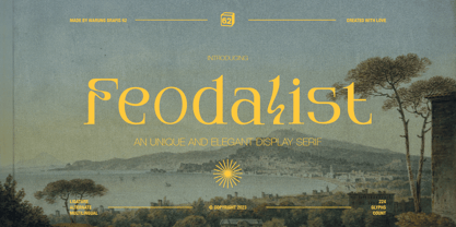
  40. Feodalist by Warung Grafis 62, $15.00
    Feodalist is a timeless serif font that effortlessly embodies elegance and luxury. Its classic design, with a touch of uniqueness, adds sophistication to various projects. With meticulously crafted letterforms, Feodalist seamlessly fuses tradition and modernity. The font encompasses: - Uppercase and lowercase letters - Symbols, numbers, and punctuation - Ligatures and alternates for added versatility - Multilingual support for broader usability.
Looking for more fonts? Check out our New, Sans, Script, Handwriting fonts or Categories
abstract fontscontact usprivacy policyweb font generator
Processing