10,000 search results (0.032 seconds)
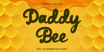
  1. Daddy Bee by WNGSTD, $10.00
    Daddy Bee is a bold and cute handwritten font. It is the perfect font for making original and outstanding designs!
  2. Set Theory by Haiku Monkey, $10.00
    If you were a superhero, wouldn't you want your unitard to sport Set Theory, big and bold, on the front?
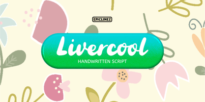
  3. Livercool by Epiclinez, $18.00
    Livercool is a bold and playful handwritten script font. It is suitable for logo, branding, apparel, social media, and more.
  4. Ginga> - Personal use only
  5. Gretoon Highlight - Personal use only
  6. SoulCalibuR - 100% free
  7. gAbAcHiTA FFP - Personal use only
  8. Tribal Dragon - Personal use only
  9. Night Club 70s - Personal use only
  10. Ruthless Wreckin TWO - Personal use only
  11. MKorsair - 100% free
  12. JFJungleRock - Unknown license
  13. Alba Super - Personal use only
  14. Brother Bear - 100% free
  15. Bamf - Unknown license
  16. CMCorruged - 100% free
  17. IRR3V3RSIBL3 - Unknown license
  18. aaaiight! - Unknown license
  19. SPARKS MADE US - Personal use only
  20. font twelve - Personal use only
  21. HVD Peace - Unknown license
  22. Project Z - Personal use only
  23. Cubiculo Gallery) - Personal use only
  24. Stargazers - Unknown license
  25. Kid Kosmic - Personal use only
  26. Psiphoon BB - Personal use only
  27. Sweeep - Unknown license
  28. CMSquish - 100% free
  29. Shot - Unknown license
  30. Karloff - Unknown license
  31. Gothic Alarm Clock - Unknown license
  32. Achilles - Unknown license
  33. QuickQuick - Unknown license
  34. Vila Morena - Unknown license
  35. Tetris - Unknown license
  36. TNG Monitors - Unknown license
  37. Vaguely Repulsive - Unknown license
  38. Quiroga Serif Pro by TipoType, $29.00
    Quiroga Serif began in 2007 with the name Quadratta Serif. This typography was designed for continuous text, legible at medium and small sizes, with great saving of space, optimized for 6, 8, 10 and 12 points. The morphology is a mix between tradition and innovation; it has a vertical axis, thick serifs, tall x-height, light modulation and a lot of internal space between letters: key to improve legibility at small sizes. Formally, my idea was to make a serif type that had a unique color, this is visible due to the light modulation. This is also complemented with the incorporation of not common, alternative signs. Some parts of the letters that are usually curb or diagonal where made horizontal (for example: a, q, p, etc.), this makes the eye of each character to be wide and unique. The serifs (wedge type) suffered diverse variations during the process. At the begining they where thicker and ended vertically, but this caused a great deal of printing errors. And so we decided to modify them by giving them an angle to avoid visible errors in medium and small sizes. The ch, and ll ligatures where rescued because they are a part of our current spanish alphabet. The historic ligatures and stylistic alternates give different options to users who want different alternatives within a text. The accentuation signs were composed in a middle line above all signs to avoid visual shock. We also gave plenty of importance to small caps numbers, mathematical signs and currency signs so that the could interact well.
  39. Besley Clarendon by HiH, $12.00
    Besley Clarendon ML is our version of the Clarendon registered by Robert Besley and the Fann Street Foundry in 1845. Besley Clarendon ML represents a significant change from the slab-serif Antiques & Egyptians that had become so popular in the prior three decades. Like Caslon’s Ionic of 1844, it brackets the serifs and strongly differentiates between the thick and thin strokes. Besley Clarendon is also what today is considered a condensed face, as a comparison to the various contemporary Clarendons will show. Robert Besley’s Clarendon was so popular that many foundries quickly copied it, a fact that caused him to complain vigorously. The reason it was so widely copied is simple ó it was extremely useful. It provided the attention-getting boldness to highlight a word or phrase, yet at the same time was compact and easier to read than the fat faces and antiques of the period. It wasn't until sixty years later that the concept of a typeface family of different weights was developed with DeVinne and Cheltenham. Until then, Clarendon served as everyone’s all-purpose bold face. It can be used for ads, flyers, headers or even short text. Don't leave home without it. Besley Clarendon ML includes the following features: 1. Glyphs for the 1250 Central Europe, the 1252 Turkish and the 1257 Baltic Code Pages. Added glyphs to complete standard 1252 Western Europe Code Page. Special glyphs relocated and assigned Unicode codepoints, some in Private Use area. Total of 353 glyphs. 158 kerning pairs. 2. OpenType GSUB layout features: pnum, salt, liga, dlig, hist and ornm. 3. Inclusion of tabular (std) and proportional (opt) numbers. 4. Kreska-accented letters.
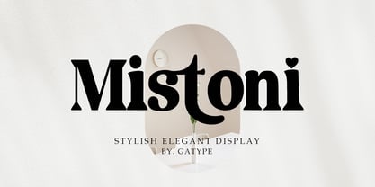
  40. Mistoni by Gatype, $15.00
    Mistoni An elegant font designed when in a creative mood and perfect shape, inspired by the bold, natural look of serifs so beautiful for today's fashion. bold, balanced and varied, born for luxury and beauty. including uppercase letters, numbers, and various kinds of punctuation Mistoni is perfect for invitations, logos & branding, photography, advertising, watermarks, social media posts, product packaging, product designs, labels, wedding designs, stationery.
Looking for more fonts? Check out our New, Sans, Script, Handwriting fonts or Categories
abstract fontscontact usprivacy policyweb font generator
Processing