10,000 search results (0.037 seconds)
  1. Uchrony Circle - Personal use only
  2. Uchrony Cube - Personal use only
  3. Jt Gilboys by Jolicia Type, $19.00
    Jt Gilboys Inspired by bold and rounded typefaces.Very characterful, fat and rounded , it is the best choice for editorial, You can use glyphs to create a different appearance for your design. world name or brand design, charismatic shape,
  4. Cintra by Graviton, $12.00
    Cintra font family has been designed for Graviton Font Foundry by Pablo Balcells in 2014. It is a sans serif, bold, geometric typeface with subtle rounded angles, which provides a soft, pleasent appearence. Cintra consists of 8 styles.
  5. Ganbate Script by Balevgraph Studio, $12.00
    Gilbert Script is a bold and modern script font. Be intrigued by its ravishing style and use it to create beautiful wedding invitations, beautiful stationary art, engaging social media posts and more! What's Included? Uppercase & Lowercase Numbers & Punctuation Ligature, Alternate & Swashes Multilingual Support PUA Encoded
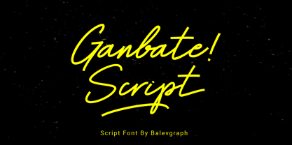
  6. Jetblack by Tigade Std, $35.00
    Midnight is a cool, bold, and thick lettered sans serif font. It will elevate a wide range of crafting ideas, from cards, to branding, labels, and much more. Add it confidently to your favorite creations and let yourself be amazed by the outcome generated.
  7. Mousony by Sakha Design, $12.00
    Mousony is a bold, vintage styled and thick lettered slab serif font. It will elevate a wide range of crafting ideas, from cards, to branding, labels and much more. Add it confidently to your favorite creations and let yourself be amazed by the outcome generated.
  8. King Tut by Canada Type, $24.95
    King Tut is a restoration and expansion of the original Egyptian Expanded, a single bold face cut in 1850 by Miller & Richard, the famous Edinburgh founders. This aesthetic, though originally issued to help drive simple print advertising of those days, is perhaps the longest lasting genre of typeface. This aesthetic flourished in the later part of the 19th century, helped by the surge of similar faces from England (such as Figgins' Antique 6 and Expanded Antique), and became the defining index of the old American wild west that continues to this very day. King Tut serves up its impact through a balance between the wide, compact letterforms and elegant curvature that manages to come through even in confined areas. The family's weight variety allows for more options in counterspace use as well as precision in the amount of curve definition and contrast needed by the typographer. The lighter weights completely oppose that 19th century boldness and expose the alphabet's skeleton in a strive for simplicity that fits modern applications. With generous language support to boot, King Tut's diverse offerings make it an essential addition to today's designer repertoire.
  9. Siberian by omtype, $37.00
    Siberian is a geometric unicase sans-serif. It was inspired by Russian avant-garde typography and old Siberian runic scripts (Orkhon-Yenisey script). The idea was to create a typeface so simple, cold and beautiful as the snow in Siberia. And varied of course, as the snow too (according to a legend snow has more than 100 names in the north Siberian people’s language). So, every letter in this typeface has 7 stylistic alternates. And you can choose how cold your typography should be today. Siberian was initially designed for the I'm Siberian project (the tourist branding of Siberia).
  10. KidzOnlyTooSSK - Unknown license
  11. BengaliDhakaSSK - Unknown license
  12. BadDogSCapsSSK - Unknown license
  13. GujaratiRajkotSSK - Unknown license
  14. Lakshmi by Océane Moutot, $32.90
    Lakshmi is an elegant and friendly script font. Inspired by brushed typography, it adds elegance, tension and typographic rigour to traditional script fonts. It's identified by its dynamic curves and the softness of its design. Lakshmi is ideal for display use, logotype, headline, packaging and advertising. Lakshmi is designed with extended language support, alternative characters as well as various ligatures and old-style numbers.
  15. Modern West JNL by Jeff Levine, $29.00
    Presenting… a Western style alphabet from the 1960 edition of Samuel Welo’s “Studio Handbook for Artists and Advertisers”… Extra bold, featuring slab serifs and concave corners, this type style could easily have been found on building signage in the Old West… but in redrawing it digitally, it’s been named Modern West JNL because at one time, this would have been considered a modern style of lettering. Modern West JNL is available in both regular and oblique versions.
  16. HIGHUP ITALIC PERSONAL USE - Personal use only
  17. GIANTS ITALIC PERSONAL USE - Personal use only
  18. BOOKER ITALIC PERSONAL USE - Personal use only
  19. Regatta Condensed by ITC, $29.00
    Regatta is a bold, narrow sans serif designed by Alan Meeks in 1987. Its strong, robust figures makes it a particularly good font for headlines in larger point sizes. Regatta is distinguished by its diamond shaped dots on i and j as well as the slanted strokes of several figures. These characteristics relax the closed, static image of Regatta and let the font seem cheerful and friendly.
  20. Manufacturer JNL by Jeff Levine, $29.00
    Manufacturer JNL is a reinterpretation of the classic type face Venus Extra Bold Extended, and is available in both regular and oblique versions. According to Wikipedia: “Venus or Venus-Grotesk is a sans-serif typeface family released by the Bauer Type Foundry of Frankfurt am Main, Germany from1907 onwards. Released in a large range of styles, including condensed and extended weights, it was very popular in the early-to-mid twentieth century. It was exported to other countries, notably the United States, where it was distributed by Bauer Alphabets Inc, the U.S. branch of the firm.”
  21. Senatsfraktur by RMU, $25.00
    Friedrich Bauer’s Senatsfraktur, coming in two styles, regular and bold, released by Genzsch and Heyse, Hamburg, in 1912, has come to life again. Both styles contain the traditional long s which can be accessed by either the OT feature historical alternatives or by typing [alt] + b. To get access to all ligatures, it is recommended to activate both Standard and Discretionary Ligatures.
  22. Metropolis CT by CastleType, $29.00
    Metropolis Bold was commissioned by Publish magazine for their 1990 redesign. Although other digital versions exist, I think this was the first one and is characterized by extremely pointy serifs. It is well to remember in laying out copy for Metropolis to allow plenty of white space in the layout. Metropolis is based on the 1932 Stempel cut as designed by W. Schwerdtner.
  23. Modern Abstract by Cultivated Mind, $19.00
    Introducing Modern Abstract by Cultivated Mind. Modern Abstract is a bold serif font with a retro vibe. Modern Abstract comes in a regular and a bold weight. Try using Modern Abstract for branding, headline use, film, magazines, websites, packaging, invitations and weddings.
  24. Kolesom by Frantic Disorder, $12.00
    Kolesom is bold display font that inspired from classic rusty stuff like old signage and poster. This typeface has various styles of font that includes Clean, Alt, Texture, and Western. I found it perfect for poster design, t-shirt design, and other display design needs. Works best in 100pt and above.
  25. AZ Script by Artist of Design, $25.00
    AZ Script font was inspired from a need to have a "worn look" on bold headline script of letters This font utilizes an "old look" to the line work which is designed to have a "worn feel" to it. Ideal for use as headline or sub-head text in you design.
  26. Atyp by Suitcase Type Foundry, $80.99
    The sources of inspiration for the Atyp typeface are spread out widely both stylistically and chronologically. The basic proportions of the uppercase refer to the elementary geometric constructions of the Bauhaus. The subtle details in the drawing of the characters and the microscopic adjustments, which evoke the illusion of uniformity and mechanical purity, pay homage to the rationalism of the typefaces popular in the International Style. The increased contrast of the joints of the bowls and shoulders in the Display weight, which in certain diagonal curves transition into almost deconstructive permutations. For a change these take delight in doing things on purpose, teasing readability and breaking the rules of the new millennium's typography. Atyp was created by adapting a typeface originally made for a commercial television station. The potential of the neutral grotesque, proven by its excellent readability on screens, gave the impetus for its preparation into an extremely wide character set with full support for three language scripts. Coherence across all eight key masters lays the groundwork ideally for using the variable font format. The key benefits of this technology are a significant reduction in data consumption in the case of web fonts, as well as an unlimited access to the full range of styles, which in turn is a significant benefit in the area of responsive design.
  27. Carllosta by Letterhend, $17.00
    Introducing, Carllosta, a Victorian style font. Carllosta is a layered typeface which is inspired by vintage lettering sign and art. While this font has a victorian touch, it still looks bold and solid. Very suitable for for headline, logotype, apparel, invitation, branding, packaging, advertising etc. This typeface contains with beautiful decorative ornaments that ready to use to create a vintage lettering in sec. It also comes in uppercase, lowercase, punctuations, symbols & numerals, stylistic set alternate, ligatures, etc also support multilingual and already PUA encoded.
  28. Musk by Eko Bimantara, $21.00
    Taking the name from substance of the best quality perfumery, Musk present an elegant form of high contrast sans serif combine with an expressive connected script. The sans serif contain three weight; regular, medium and bold within it’s quality for display and also text. Each glyphs shown an unique variation of forms, especially the terminals in regards to achieve legibility and readability. The sans serif contain three weight; regular, medium and bold within it’s quality for display and legible for body text. With over than 240 glyphs. Some open type features contain in Musk sans; old style figures and standard ligature and the Musk script contain swash.
  29. Kozmik Vibez - Personal use only
  30. ESP - Unknown license
  31. Tecate - 100% free
  32. Sargento Gorila - Personal use only
  33. Ethnocentric - Unknown license
  34. Patron - Personal Use - Personal use only
  35. Mexican Tequila - Personal use only
  36. Blaster - 100% free
  37. Bitsumishi - Unknown license
  38. Zenzai Itacha - Personal use only
Looking for more fonts? Check out our New, Sans, Script, Handwriting fonts or Categories
abstract fontscontact usprivacy policyweb font generator
Processing