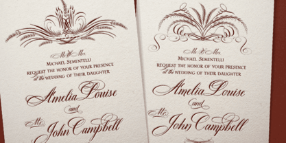
Dom Loves Mary has a baby brother! Check out Fratello Nick here: http://www.myfonts.com/fonts/correspondence-ink/fratello-nick/ The DomLovesMary font family has all you need to create unique, custom stationery products. THE INSPIRATION BEHIND THE DOMLOVESMARY FONT FAMILY: DomLovesMary is named in memory of Dominic and Mary Sementelli, Debi’s in-laws. Dom and Mary were opposites who were truly “made for each other”. A snazzy dresser, Mary was feisty, loved to dance, sing, and be the life of the party. Dom was cool, calm and collected and was happy to shine the spotlight on the love of his life. They balanced each other out in a really great way. Going through some of her in-laws old photos, Debi found their wedding album. She was struck by the beautiful look on their faces as they got ready to start their life together. She saw the excitement, joy and anticipation of them envisioning “Una Bella Vita!” (A beautiful life!) She decided to create a hand-lettered font with them in mind represented by two totally different lettering styles that were, like Dom and Mary, “made for each other”. It’s her way of honoring them and sharing their beautiful life with all of the couples just starting theirs together. They truly had “Una Bella Vita” and we hope you do too. WHAT'S UNIQUE ABOUT THE DOMLOVESMARY FONT FAMILY: The SCRIPT & TEXT FONTS are lettering styles that were made to compliment each other. With a vintage, classic feel, they will add elegance to your design, while the TEXT serves to offer support with easy to read simplicity. In addition to the standard character set, each of the uniquely styled script fonts includes a collection of flourished ornaments. Use them to create corners, headers or other embellishments to complete the look. And if you really want to fancy things up, we offer two sets of 72 additional flourishes that were specifically made to add to upper and lower case letters for easy customization. Dress them up with one, two or more. It’s like choosing simple pearls or piling on the glitz! Or combine several to create unique flourished ornaments of your own. To add even more panache, we're pleased to present our ready made set of most frequently used ADD-ON WORDS. Created with the wedding client in mind, this set of 66 includes envelope friendly titles: Mr and Mrs, Mr, Mrs, Miss, Ms, Doctor, the Doctors, as well as words to fill out your invitation suite: RSVP, Respond, Save the Date, Accommodations, Directions and more! Easily create Bride and Groom signs or Thank You cards or tags with the click of a key. Or use angled words like “and, at, to, on, for, from and of” to add a special touch to your large groups of copy. PACKAGES: We are pleased to have a variety of customers. From professional invitation designers to DIY brides, publishing companies and website / blog designers among others. So we've created packages to help fit their diverse needs. Purchase just one of our beautiful DomLovesMary SCRIPT fonts, each with its collection of included flourishes or the PRO VERSION complete with ALL THREE script fonts and a combined total of over 100 flourished ornaments. Add our TEXT font, a set of FLOURISHES or ADD-ON WORDS. Love the idea of customizing your letters with all the possible combinations? We offer a special price when you purchase both sets of flourishes. Or choose our Accoutrements Package containing both sets of FLOURISHES for letter customization as well as our ADD-ON WORDS. Want to have it all? The “DomLovesMary Total Design” package is for you. Each of these packages are offered at a 25% savings. WHAT PROGRAM WILL YOU USE?: All of the font options come in both Pro and Standard format fonts. For those with programs that can take advantage of OpenType features (click on the link to see if the program your using is one of them) the Pro fonts are for you. http://www.typotheque.com/fonts/opentype_feature_support/ For others without the ability to use Open Type features, we provide all of the script fonts that comprise the Pro Version as separate versions (Regular, Contextual and Stylistic). If you are using a program like Microsoft Word, and want all three script fonts, you can still purchase the Pro Version (a $50.00 savings), and install the individual fonts bundled in the Standard Fonts folder. We have set it up so they will appear separately as DomLovesMary, DomLovesMary Contextual and DomLovesMary Stylistic in your fonts list. Exciting news! In an effort to help our customers access all the goodies that are normally only available in Open Type Capable programs (like the flourished ornaments that come with our script fonts), we have found a simple application that allows you to do just that. For this reason, we've made sure to unicode all of our characters and glyphs so that they will work in this type of program. There may be others, but we checked this one out and found that it works. Check out PopChar
The font "Anna" is an artistic labor of love created by the talented designer Keith Bates. It stands out in the realm of typography with its distinctive charm and uniqueness. This font encapsulates a...

Tavern is a super font family based on our Algerian Mesa design, with Tavern we've greatly expanded the usability by creating light and bold weights plus all new for 2020 with the introduction of extra bold and black weights Tavern is now a five weight family. The addition of the bold weight made it possible to go further with the design by adding open faced shadowed, outline and fill versions. Please note, the fill fonts are aligned to go with the open faced versions, they may work with the outline versions, however you will have to apply them one letter at a time. The Tavern Fill fonts may also be used a stand alone font, however, the spacing is much wider than the regular solid black weights of Tavern. In the old days of printing, fill fonts rarely lined up perfect with the open or outline font, this created a misprinted look that's much in style today. To create that misprinted look using two different colors, try layering the outline fonts offset over the top of the solid black versions. Next we come to the small caps and X versions, for a font that's mostly seen used in all caps we felt a small caps would come in handy. The X in Tavern X stands for higher X-height, we've taken our standard lowercase and raised it for greater visibility in small text and for signage where you want the look of a lowercase but it needs to be readable from the street. In August of 2016 I started the project of expanding this font into more weights after seeing the font in use where someone tried creating a bold version by adding a stroke fill around the letters. The result didn't look very good, the stroke fill also caused the shadow line to merge with the serifs on some letters. This lead me to experiment to see if a new bold weight was possible for this font and I'm pleased to say that it was. After the bold weight was finished I decided to type the regular and bold weights together in a first word thin second word bold combination, however the weight difference between the two wasn't enough contrast. This lead me to wonder if a lighter weight was possible for this font, as you can see yes it was, so now for the first time in the history of this old 1908 type design you can type a first word thin second word bold combination. So why the name change from Algerian to Tavern? Since the original font was designed in England by the Stephenson Blake type foundry I decided to give this font a name that reminded you of the country it came from, however, there were other more technical reasons. During the creation of the bold weight the engraved shadow line was sticking out too far horizontally on the bottom right of the serifs dramatically throwing the whole font off balance. The original font encountered this problem on the uppercase E, L and Z, their solution was a diagonal cut corner which was now needed across any glyph in the new bold weight with a serif on the bottom right side. In order to make the light and regular weights blend well with the bold weight diagonal cut offs were needed and added as well. This changed the look of the font from the original and why I decided to change the name, additional concerns were, if you're designing a period piece where the font needs to be authentic then this font would be too new. Regular vs. Alt version? The alternate version came about after seeing the regular version used as a logo and secondary text on a major product label. I felt that some of the features of the regular version didn't look good as smaller secondary text, this gave me the idea to create an alternate version that would work well for secondary text in an advertising layout. But don't stop there, the alternate version can be used as a logo too and feel free to exchange letters between both regular and alternate versions. Where are the original alternates from Algerian? Original alternates from Algerian are built into the regular versions of Tavern plus new alternates have been created. We're excited to introduce, for the first time, all new swash capitals for this classic font, you're going to love the way they look in your ad layout, sign or logo. The best way to access alternate letters in Tavern is with the glyph map in Adobe Illustrator and Adobe InDesign products, from Adobe Illustrator you can copy and paste into Photoshop as a smart object and take advantage of all the text layer style features Photoshop has to offer. There may be third party character maps available for accessing alternate glyphs but we can't advise you in that area. I know what you're thinking, will there be a Tavern Condensed? It takes a lot of hours to produce a large font family such as this, a future condensed version will depend on how popular this standard version is. If you love Tavern we're happy to introduce the first weathered edge version of this font called Bay Tavern available in February 2020.
Ah, Signika, the font that seems to wear a business suit with a quirky tie — sophisticated yet undeniably friendly. Crafted by the immensely talented Anna Giedrys, Signika strides into the world of t...
Saginaw is an elegant and versatile typeface that stands out for its classic yet contemporary feel. Its design is a harmonious blend of traditional serifs and modern design principles, making it a ve...
Oxona is a futuristic sans serif with 4 weights , meticulously calculated square proportions that aims to redefine readability and visual impact. Every stroke, every curve and every angle has bee...
SchilderGrotesk is an intriguing font that captures the attention of design enthusiasts and typographers alike. Crafted by Uwe Borchert, a designer with a meticulous eye for the balance and character...
The Berthside font, created by Graham Meade under GemFonts, is a unique and charismatic typeface that captures the essence of creativity and versatility. This font falls under the category of decorat...
The font Sekona, carefully crafted by Kimberly Geswein, stands as a testament to the intricacy and passion that can be instilled within the realm of typography. Kimberly Geswein's reputation for crea...
Globet Rounded is a multipurpose conceptual font that perfectly combines boldness with elegance. Globet was born from the desire to balance legibility and personality. Gentle geometry and optical p...
The MonaKo font by Manfred Klein is a distinctive and creative typeface that beautifully encapsulates the essence of artistic expression and modern design sensibilities. Manfred Klein, known for his ...
Ingleby Regular is part of the Ingleby typeface family, designed by David Engelby, a typeface designer who brings a detail-oriented and thoughtful approach to his creations. This particular font, Ing...
Juvelo is a distinguished typeface crafted by the adept type designer Barry Schwartz. It stands out as a testament to Schwartz's commitment to producing fonts that not only serve practical purposes b...
Equilibrium is a font that masterfully balances beauty and functionality, embodying the essence of stability and harmony in its design. Imagine each letter crafted with a meticulous eye for detail, w...
As of my last update in April 2023, there wasn't a widely recognized font specifically named "BOODAS DREIECKE". However, the inspiration drawn from the name can conjure a vivid, imaginative depiction...
Althera is a refined modern serif crafted for editorial elegance and premium branding. Designed with balanced proportions and smooth, controlled contrast, Althera delivers a sophisticated voic...
Fely, though not a widely recognized font at the time of my last update, conjures an image of a font that is likely characterized by its unique blend of personality and practicality, based on the tre...
The Rotterdam Demo typeface, crafted by Omaikraf Studio, stands as a testament to modern design with a nod to classical typography principles. This font embodies a unique blend of contemporary aesthe...
Moderna, a distinctive font crafted by Paul Lloyd Fonts, stands out as a testament to the fusion of traditional artistry with contemporary design sensibilities. This font family offers a compelling v...
Present Bold is a vivid and vibrant typeface that embodies strength and clarity in its design. With its bold and assertive strokes, this font captures the attention immediately, making it an ideal ch...
Beautiful concept. I like how the rounded corners soften the geometric structure without sacrificing clarity, making it feel both modern and approachable. The range of weights also adds a lot of ver...
Duralith is a distinctive font created by Apostrophic Labs, a collective known for their innovative and diverse typefaces. Duralith stands out with its unique blend of stylized features and contempor...
As of my last update in April 2023, the font "AB Nirvana*" designed by Redfonts may not be widely recognized in mainstream typography repositories or font collections. It's possible that it's a newer...
Day Roman, designed by Apostrophic Labs, is a distinctive and elegant typeface that pays homage to the classic and timeless beauty of Roman inscription letterforms. Its creation stems from a devotion...
Whola is a unique and visually striking font that captivates at first glance. Its design is a harmonious blend of classic and contemporary styles, making it extremely versatile for various design app...
Torgny, a font designed by Mattia Marchi, is a notable typeface that stands out for its unique character and versatility. This font encapsulates a blend of traditional and modern elements, making it ...
Covington Condensed, designed by Apostrophic Labs, is a versatile and elegant font that seamlessly blends classic charm with modern sophistication. This typeface stands out for its condensed nature, ...
Altea, designed by Paul Lloyd Fonts, embodies a stylistic mix of elegance and creativity, making it a standout typeface in the realms of digital and print design. It is a testament to the innovative ...
The "Rolloglide" font, created by the design house Fontalicious, stands as a remarkable example of typographic design that uniquely balances creativity and functionality. At its core, Rolloglide exud...
Eau by YOFonts is an artistically refined font that captures the essence of elegance and fluidity, suggesting a beautiful amalgamation of classic and modern design elements. The name 'Eau,' French fo...
As of my last update in April 2023, the font "Sophie" crafted by Philippe Blondel echoes the sentiments of artistry and intimacy, marrying the essence of approachability with a touch of elegance. Thi...
ADIstiLleRS Font, crafted by the talented typeface designer Canopus, strikes a unique balance between artistic flair and functional typography. This font effortlessly merges the aesthetic qualities o...
SF Piezolectric is a distinctive font designed by ShyFoundry, a type foundry known for creating innovative typefaces with meticulous attention to detail. SF Piezolectric stands out because of its uni...
Manfred Klein, a prolific and versatile German type designer known for his wide range of font creations, crafted the Senats-Antiqua typeface, which embodies a blend of historical elegance and contemp...
The Sweden font, crafted by Vladimir Nikolic, is an exemplar of modern design ingenuity blended with an essence of Scandinavian minimalism. This typeface stands out for its clean lines and geometric ...
The Sucker Font, crafted by the talented Juan Casco, embodies a unique amalgamation of creativity and playful sophistication. Its design hinges on contemporary aesthetics while paying homage to class...
The SF Espionage Medium font is a creation of ShyFoundry, a foundry known for its high-quality typefaces that often blend unique character with high functionality. SF Espionage Medium, part of the SF...
Areplos by Storm Type Foundry, $53.00 To design a text typeface "at the top with, at the bottom without" serifs was an idea which crossed my mind at the end of the sixties. I started from the fact that what one reads in the Latin alphabet is mainly the upper half of the letters, where good distinguishableness of the individual signs, and therefore, also good legibility, is aided by serifs. The first tests of the design, by which I checked up whether the basic principle could be used also for the then current technology of setting - for double-sign matrices -, were carried out in 1970. During the first half of the seventies I created first the basic design, then also the slanted Roman and the medium types. These drawings were not very successful. My greatest concern during this initial phase was the upper case A. I had to design it in such a way that the basic principle should be adhered to and the new alphabet, at the same time, should not look too complicated. The necessary prerequisite for a design of a new alphabet for double-sign matrices, i.e. to draw each letter of all the three fonts to the same width, did not agree with this typeface. What came to the greatest harm were the two styles used for emphasis: the italics even more than the medium type. That is why I fundamentally remodelled the basic design in 1980. In the course of this work I tried to forget about the previous technological limitations and to respect only the requirements then placed on typefaces intended for photosetting. As a matter of fact, this was not very difficult; this typeface was from the very beginning conceived in such a way as to have a large x-height of lower-case letters and upper serifs that could be joined without any problems in condensed setting. I gave much more thought to the proportional relations of the individual letters, the continuity of their outer and inner silhouettes, than to the requirements of their production. The greatest number of problems arose in the colour balancing of the individual signs, as it was necessary to achieve that the upper half of each letter should have a visual counterbalance in its lower, simpler half. Specifically, this meant to find the correct shape and degree of thickening of the lower parts of the letters. These had to counterbalance the upper parts of the letters emphasized by serifs, yet they should not look too romantic or decorative, for otherwise the typeface might lose its sober character. Also the shape, length and thickness of the upper serifs had to be resolved differently than in the previous design. In the seventies and at the beginning of the eighties a typeface conceived in this way, let alone one intended for setting of common texts in magazines and books, was to all intents and purposes an experiment with an uncertain end. At this time, before typographic postmodernism, it was not the custom to abandon in such typefaces the clear-cut formal categories, let alone to attempt to combine the serif and sans serif principles in a single design. I had already designed the basic, starting, alphabets of lower case and upper case letters with the intention to derive further styles from them, differing in colour and proportions. These fonts were not to serve merely for emphasis in the context of the basic design, but were to function, especially the bold versions, also as independent display alphabets. At this stage of my work it was, for a change, the upper case L that presented the greatest problem. Its lower left part had to counterbalance the symmetrical two-sided serif in the upper half of the letter. The ITC Company submitted this design to text tests, which, in their view, were successful. The director of this company Aaron Burns then invited me to add further styles, in order to create an entire, extensive typeface family. At that time, without the possibility to use a computer and given my other considerable workload, this was a task I could not manage. I tried to come back to this, by then already very large project, several times, but every time some other, at the moment very urgent, work diverted me from it. At the beginning of the nineties several alphabets appeared which were based on the same principle. It seemed to me that to continue working on my semi-finished designs was pointless. They were, therefore, abandoned until the spring of 2005, when František Štorm digitalized the basic design. František gave the typeface the working title Areplos and this name stuck. Then he made me add small capitals and the entire bold type, inducing me at the same time to consider what to do with the italics in order that they might be at least a little italic in character, and not merely slanted Roman alphabets, as was my original intention. In the course of the subsequent summer holidays, when the weather was bad, we met in his little cottage in South Bohemia, between two ponds, and resuscitated this more than twenty-five-years-old typeface. It was like this: We were drinking good tea, František worked on the computer, added accents and some remaining signs, inclined and interpolated, while I was looking over his shoulder. There is hardly any typeface that originated in a more harmonious setting. Solpera, summer 2005 I first encountered this typeface at the exhibition of Contemporary Czech Type Design in 1982. It was there, in the Portheim Summer Palace in Prague, that I, at the age of sixteen, decided to become a typographer. Having no knowledge about the technologies, the rules of construction of an alphabet or about cultural connections, I perceived Jan Solpera's typeface as the acme of excellence. Now, many years after, replete with experience of revitalization of typefaces of both living and deceased Czech type designers, I am able to compare their differing approaches. Jan Solpera put up a fight against the digital technology and exerted creative pressure to counteract my rather loose approach. Jan prepared dozens of fresh pencil drawings on thin sketching paper in which he elaborated in detail all the style-creating elements of the alphabet. I can say with full responsibility that I have never worked on anything as meticulous as the design of the Areplos typeface. I did not invent this name; it is the name of Jan Solpera's miniature publishing house, in which he issued for example an enchanting series of memoirs of a certain shopkeeper of Jindrichuv Hradec. The idea that the publishing house and the typeface might have the same name crossed my mind instinctively as a symbol of the original designation of Areplos - to serve for text setting. What you can see here originated in Trebon and in a cottage outside the village of Domanín - I even wanted to rename my firm to The Trebon Type Foundry. When mists enfold the pond and gloom pervades one's soul, the so-called typographic weather sets in - the time to sit, peer at the monitor and click the mouse, as also our students who were present would attest. Areplos is reminiscent of the essential inspirational period of a whole generation of Czech type designers - of the seventies and eighties, which were, however, at the same time the incubation period of my generation. I believe that this typeface will be received favourably, for it represents the better aspect of the eighties. Today, at the time when the infection by ITC typefaces has not been quite cured yet, it does absolutely no harm to remind ourselves of the high quality and timeless typefaces designed then in this country.In technical terms, this family consists of two times four OpenType designs, with five types of figures, ligatures and small capitals as well as an extensive assortment of both eastern and western diacritics. I can see as a basic text typeface of smaller periodicals and informative job-prints, a typeface usable for posters and programmes of various events, but also for corporate identity. Štorm, summer 2005
The Desyrel font, masterfully designed by Apostrophic Labs, emanates a unique charm that gracefully bridges the gap between whimsicality and legibility, making it a delightful choice for various desi...
Blok, a font designed by Tup Wanders, stands out in the typographic landscape with its distinctive and bold character. It belongs to a category of typefaces that draws inspiration from geometric form...