10,000 search results
(0.073 seconds)
- Dorothy Clark by Letterhend,
$14.00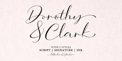 Dorothy Clark Script is a stylish script comes with 3 styles, regular script, signature script and ink script. This typeface has unique opentype feature as you can see the explanation at 2nd preview image. This font perfectly made to be applied especially in logo, and the other various formal forms such as invitations, labels, logos, magazines, books, greeting / wedding cards, packaging, fashion, make up, stationery, novels, labels or any type of advertising purpose. This font comes with 3 style, Regular script that gives you the weight of calligraphy feel, Signature that gives you a consistent stroke with the same weight, and ink to add handfcrafted inky feel. All of them just in one font! Features : uppercase & lowercase numbers and punctuation multilingual ligatures alternates swashes PUA encoded contextual alternate We highly recommend using a program that supports OpenType features and Glyphs panels like many of Adobe apps and Corel Draw, so you can see and access all Glyph variations. Email us to letterhend@gmail.com if you need something! Happy Designing!
 - Georgia Pro by Microsoft,
$40.00Georgia was originally designed in 1996 by Matthew Carter and hand-tuned for the screen by Tom Rickner. The Georgia family received a major update in 2011 by Monotype Imaging, The Font Bureau and Matthew Carter. Georgia is the serif companion to the sans serif screen font, Verdana. It was designed specifically to address the challenges of on-screen display with elegant yet sturdy and open forms. If you must have one serif face for reading on a computer, then you've found the best one right here. The original Georgia family included four fonts: regular, italic, bold and bold italic. The new and expanded Georgia Pro family contains 20 fonts in total. The Georgia Pro and Georgia Pro Condensed families each contain 10 fonts: Light, Regular, Semibold, Bold and Black (each with matching italic styles). Georgia Pro includes a variety of advanced typographic features including true small capitals, ligatures, fractions, old style figures, lining tabular figures and lining proportional figures. An OpenType-savvy application is required to access these typographic features. - Hexa by Hexa,
$19.00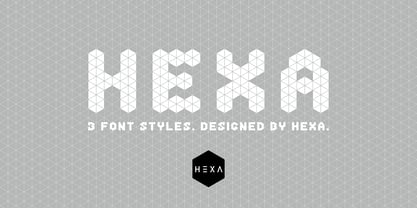 The font HEXA is inspired by the Hexagon. The HEXA fonts are dynamically and uniquely designed typefaces based on the grid systems of the hexagon that extends infinitely. From this image, we have created the HEXA font. Hexa is Latin-based and a completely crafted font that consists of 3 typefaces. Each typeface contains 190 sets of characters. This font family is in all-caps fonts, and we provide different styles of uppercase and lowercase glyphs with the exception of letters c, ç, and comma/ single low-9 quotation mark. In lowercase glyphs, we emphasize the image, character, and identities of Hexa. The font family includes regular, black, and thin. We created the witty expression with Hexa’s regular identity; thin emphasizes the lines; black fills in the blanks. Hexa is a monospaced fonts. So kerning is not applied. We recommend using our fonts for big-sized uses. This typeface is a display font and looks more attractive in larger formats than on main texts. Features: -190 characters -Monospaced fonts -All-caps fonts (different styles provide uppercase and lowercase)
 - Univia Pro by Mostardesign,
$25.00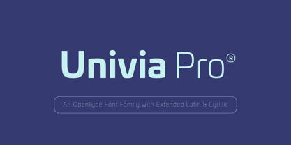 Designed by Olivier Gourvat in December 2015, Univia Pro is a new contemporary OpenType font family with modernity and versatility in mind. Distinctive with its pleasant look and extremely modern, Univia Pro has a lot of personality mostly achieved by smooth curves and round corners that forms a very identical style of the entire family. Univia Pro is perfect both for display and text use and due to its ultra modern look, it is more than excellent for e-books, web-sites, user interface font, mobile apps etc. The Univia Pro font family is heavily equipped with OpenType features: case sensitive, scientific superiors and inferiors, standard ligatures, old style, lining figures, proportional and tabular figures, slashed zeros, stylistic sets. It also provides broad language support. The font family offers 18 variations (9 weights plus italics): Thin, Thin Italic, Ultra Light, Ultra Light Italic, Light, Light Italic Book, Book Italic, Regular, Regular Italic, Bold, Bold Italic, Black, Black Italic, Ultra and Ultra Italic. Univia Pro supports Latin, Extended latin and Cyrillic languages.
 - Kalista by Great Studio,
$18.00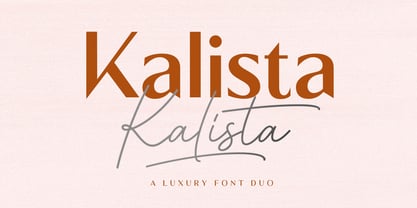 Kalista Font Duo is a luxury font. which comes with a combination of modern and elegant fonts, namely serif and signature style. You can combine them to create beautiful typography. This handcrafted style makes it perfect for use in all your design projects be it logos, labels, packaging designs, blog titles, posters, wedding designs, social media posts, Instagram designs, invitation cards, art quotes, home decor, book / title covers, etc. This is what includes: Kalista Script Regular / Bold • Thin and realistic signature font containing 40+ ligatures and alternates, lowercase, uppercase, all punctuation & numbers. Kalista Serif Light / Regular / Bold • Serif Fonts with upper and lowercase letters, all punctuation, numbers and Language support 8 BONUS Logo Templates that you can edit and customize in Adobe Photoshop and Adobe Illustrator. Language Support • Kalista supports the following languages; English, French, Italian, Spanish, Portuguese, German, Swedish, Norwegian, Danish, Dutch, Finnish, Indonesian, Malay, Hungarian, Polish, Croatian, Turkish, Romanian, Czech, Latvian, Lithuanian, Slovak, Slovenian. I hope you enjoy this font. If you have questions, don't hesitate to give me a message :)
 - Tavern by FontMesa,
$25.00 Tavern is a super font family based on our Algerian Mesa design, with Tavern we've greatly expanded the usability by creating light and bold weights plus all new for 2020 with the introduction of extra bold and black weights Tavern is now a five weight family. The addition of the bold weight made it possible to go further with the design by adding open faced shadowed, outline and fill versions. Please note, the fill fonts are aligned to go with the open faced versions, they may work with the outline versions, however you will have to apply them one letter at a time. The Tavern Fill fonts may also be used a stand alone font, however, the spacing is much wider than the regular solid black weights of Tavern. In the old days of printing, fill fonts rarely lined up perfect with the open or outline font, this created a misprinted look that's much in style today. To create that misprinted look using two different colors, try layering the outline fonts offset over the top of the solid black versions. Next we come to the small caps and X versions, for a font that's mostly seen used in all caps we felt a small caps would come in handy. The X in Tavern X stands for higher X-height, we've taken our standard lowercase and raised it for greater visibility in small text and for signage where you want the look of a lowercase but it needs to be readable from the street. In August of 2016 I started the project of expanding this font into more weights after seeing the font in use where someone tried creating a bold version by adding a stroke fill around the letters. The result didn't look very good, the stroke fill also caused the shadow line to merge with the serifs on some letters. This lead me to experiment to see if a new bold weight was possible for this font and I'm pleased to say that it was. After the bold weight was finished I decided to type the regular and bold weights together in a first word thin second word bold combination, however the weight difference between the two wasn't enough contrast. This lead me to wonder if a lighter weight was possible for this font, as you can see yes it was, so now for the first time in the history of this old 1908 type design you can type a first word thin second word bold combination. So why the name change from Algerian to Tavern? Since the original font was designed in England by the Stephenson Blake type foundry I decided to give this font a name that reminded you of the country it came from, however, there were other more technical reasons. During the creation of the bold weight the engraved shadow line was sticking out too far horizontally on the bottom right of the serifs dramatically throwing the whole font off balance. The original font encountered this problem on the uppercase E, L and Z, their solution was a diagonal cut corner which was now needed across any glyph in the new bold weight with a serif on the bottom right side. In order to make the light and regular weights blend well with the bold weight diagonal cut offs were needed and added as well. This changed the look of the font from the original and why I decided to change the name, additional concerns were, if you're designing a period piece where the font needs to be authentic then this font would be too new. Regular vs. Alt version? The alternate version came about after seeing the regular version used as a logo and secondary text on a major product label. I felt that some of the features of the regular version didn't look good as smaller secondary text, this gave me the idea to create an alternate version that would work well for secondary text in an advertising layout. But don't stop there, the alternate version can be used as a logo too and feel free to exchange letters between both regular and alternate versions. Where are the original alternates from Algerian? Original alternates from Algerian are built into the regular versions of Tavern plus new alternates have been created. We're excited to introduce, for the first time, all new swash capitals for this classic font, you're going to love the way they look in your ad layout, sign or logo. The best way to access alternate letters in Tavern is with the glyph map in Adobe Illustrator and Adobe InDesign products, from Adobe Illustrator you can copy and paste into Photoshop as a smart object and take advantage of all the text layer style features Photoshop has to offer. There may be third party character maps available for accessing alternate glyphs but we can't advise you in that area. I know what you're thinking, will there be a Tavern Condensed? It takes a lot of hours to produce a large font family such as this, a future condensed version will depend on how popular this standard version is. If you love Tavern we're happy to introduce the first weathered edge version of this font called Bay Tavern available in February 2020.
 - Artisan Paris by Jolicia Type,
$25.00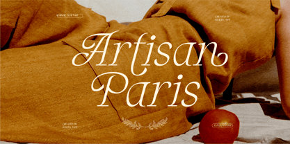 Artisan Paris, a true embodiment of Parisian finesse and grace, is a mesmerizing display font crafted with a delicate and aesthetic feminine style. Characteristics: Aesthetic Feminine Style: Artisan Paris showcases a refined, feminine aesthetic that speaks of sophistication and beauty. Its design embraces the elegance synonymous with Parisian artistry. Intricate Craftsmanship: The font is meticulously designed, with every character bearing intricate details reminiscent of the craftsmanship seen in the heart of Paris. Delicate curls and ornate elements define this font, showcasing the skilled artistry of Parisian artisans. Two Weights: Artisan Paris provides versatility with two distinct weights – Regular and Italic. The Regular weight exudes a balanced and poised demeanor, while the Italic weight adds a playful and dynamic touch, enhancing your creative expressions. Usage: Artisan Paris is the font of choice when you want to infuse your designs with the grace and allure associated with Parisian artistry. Ideal for headlines, titles, branding, invitations, and any design project seeking an elegant and feminine touch. Designer: Artisan Paris was meticulously designed by a team of dedicated artists and designers, drawing inspiration from the chic and timeless femininity of Paris. Every element in this font reflects their passion for capturing the essence of Parisian artisans.
 - Crayond by Dora Typefoundry,
$15.00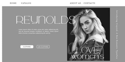 - Elegan / Bergaya / Modern - Introducing a beautiful and classy Crayond modern san serif typeface with lots of alternative styles to choose from, planting it firmly in a modern design. It is a careful collaboration between beauty and function. The beautiful modern Crayond sans serif is available in 3 regular and Italic weights including Light, Regular, and Bold. The style of the font family stems from the classic Didone, but makes steps to simplify and modernize some letterforms and make Didone feel more contemporary. If you want to get that classic Haute Couture look - Crayond Sans is a great choice. It is the perfect choice for fashion logos, headlines, short text, magazines, because its simplicity looks great in big typography, branding, identity, website design, album art, covers, posters, advertisements, etc. This purchase includes: Crayond - San serif typeface containing upper and lowercase characters, numbers 0-9, as well as a series of punctuation marks and symbols as well as an alternative style. If you have trouble finding a certain character, you can access it via the glyph panel. You can see all the characters available in the screenshot above, and you can try the font below. Please let me know if you have any questions, leave a comment!
 - Pocketknife by Blank Is The New Black,
$13.00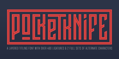 Pocketknife is a simple grid-based titling font on it’s surface, but it has a surprisingly prolific set of features under the surface. The most notable of these features is an abundant set of ligatures that give Pocketknife it’s unique look. There are very few kerning pairs contained within Pocketwatch, and these ligatures fill in most gaps that could be created by letters with more empty space, such as L and T, and also give a more playful look to an otherwise sharp-edged typeface. Pocketknife also contains with 2 full sets of alternate characters, one pairing with the uppercase set and one pairing with the lowercase—available as OpenType stylistic alternates or individually in the Glyphs panel. Pocketknife Regular is designed to be used on it’s own, while the Inline and Base fonts are designed to be used as a simple layered combination. The Base font is nearly identical to Regular, but contains a few specially adjusted characters that better accommodate the Inline style. Pocketknife Outline is a combination of the Inline/Base styles, to be used individually. Pocketknife is sharp, but playful. Simple, but sophisticated. Sporty, technical, and aggressive, yet elegant and fun. Pocketknife, while simple at first glance, is a deceivingly versatile typeface.
 - Maleha by Afkari Studio,
$13.00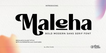 Maleha Bold Modern Sans Serif Font Introducing Maleha, a bold and sophisticated modern sans serif font designed to elevate your projects with its confident and sleek aesthetic. Crafted with precision, Maleha embodies a perfect balance between professionalism and contemporary style. With two versatile styles—regular and slant—Maleha offers a dynamic range of possibilities, enabling you to effortlessly convey a sense of authority and modernity in your designs. The bold strokes and clean lines of Maleha's characters exude confidence, making it ideal for headlines, branding, editorial designs, logos, posters, and more. Its versatile nature ensures readability across various mediums while maintaining a strong visual impact. Maleha's boldness is matched by its adaptability; whether for digital or print, its clarity and elegance remain consistent. The regular style presents a crisp, clean appearance, while the slant adds a touch of dynamic flair, perfect for emphasis or adding a contemporary twist to your typography. Features: - Uppercase, Lowercase, Number, and Punctuation - Standard and Special Ligatures and alternates - Works on PC & Mac - Simple installations - Accessible in Adobe Illustrator, Adobe Photoshop, Adobe InDesign, and even works on Microsoft Word - Fully accessible without additional design software - Multilingual Support, ä, ö, ü, Ä, Ö, Ü, ß, ¿, and ¡. Unleash the power of expression and professionalism with Maleha, the bold modern sans serif font that effortlessly commands attention while conveying a sense of sophistication and modernity in every project.
 - Ability by Scholtz Fonts,
$15.00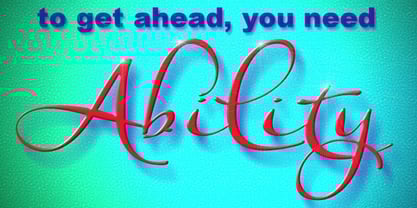 Ability is a family of stylish and contemporary handwriting fonts that combine the vigor of hand-drawn fonts such as Affable with the elegance of fonts such as Blythe. What is unusual about Ability is that it enables a word to be formed from a group of letters in a variety of ways: not only the conventional linking of letters as in a cursive script or the placing of letters close to each other on a common baseline, but it uses the overlapping of the swashes and swirls that contribute to the individuality of the characters to integrate the letters into a single word. Ability comes in a number of styles: Legacy - Regular (medium weighted and the basic type of the other styles); - Black (a vigorous and dramatic version of Regular); - Condensed Medium - Condensed Light - Linear 45 (medium-weight font made from a mono-width line) - Linear 25 (light-weight font made from a mono-width line) Suggestions for use: - wedding stationery - greeting cards - valentines day media - beauty products media - lingerie tags - women’s magazine pages - classical music media - award certificates - magazine pages The font is fully professional: carefully letterspaced and kerned. It contains over 235 characters - (upper and lower case characters, punctuation, numerals, symbols and accented characters are present). It has all the accented characters used in the major European languages.
 - Katfish by ITC,
$29.00Katfish is the work of Michael Gills, a unique and inventive script font. Initial capitals are complemented by a lively lowercase and a number of alternative characters, ligatures and swash elements. Katfish has a fun, irregular style and includes charming cat, fish and dolphin illustrations. - Kandidat by Fontroll,
$30.00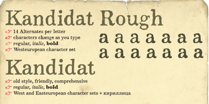 Imagine being printer in the early nineteenth century, your stock isn’t the finest, your lead characters are worn out: Voilá Kandidat Rough. But wait, Kandidat isn’t the usual scan-an-old-book,-put-the-glyphs-in-a-font-and-you’re-done-font. Kandidat Rough has a variety of whopping 14 alternates for most characters. Our algorithm changes the letters automatically. All you have to do is turn on Contextual Alternates in your layout app. The algorithm is the best we’ve seen so far, and it’s so good that even same words appear in different forms. And should by coincidence words have the same glyphs, just assign a different Style Set to the first letter, and all other letters in the word will change as well (well, it depends a bit on your software). The mechanism isn’t perfect and maybe we stretched OpenType capabilities a bit over the top, but we yet haven’t seen any better routine for switching letters on the fly. Is it worth to mention that Kandidat Rough not only speaks English, but also German, French, Spanish, Dutch, Danish, Norwegian, Swedish, Croatian, Turkish and most likely some other languages? Maybe. To be sure whether your language is supported, this is the typeset of all letters: ABCDEFGHIJKLMNOPQRSTUVWXYZÀÁÂÃÄÅÆÇÈÉÊËÌÍÎÏÑÒÓÔÕÖØÙÚÛÜÝĆČĐĞ݌ފŸŽ abcdefghijklmnopqrstuvwxyzàáâãäåæçèéêëìíîïñòóôõöøùúûüýÿćčđğıœşšž Apart from that we also included the following punctuation and currency symbols: !"#$%&'()*+,-./:;?@[\]_{|}¡©«®°±¶·»¿×–—‘’‚“”„†•…‹›⁄≠☞ €¢$£¥ This sums up to nearly 3000 glyphs per font, and we have three of them: Regular, Italic and Bold. All neatly kerned. All in all a great repertoire for even the most demanding book or advert jobs with a look of old times. And now imagine you are sick of the rugged print experience Kandidat Rough delivers: go for Kandidat. This is our Scotch-ish ancestor the Rough version was made from. A sturdy, friendly, round, warm friend from the beginning of the nineteenth century. A bit dark, maybe. You will like it. Kandidat has the aforementioned type set plus complete Baltics, Eastern Europe and Cyrillic. Plus a couple of gimmicks like fleurons, stars, circled numbers, arrows, and, and, and… Kandidat Regular additionally has small caps for Latin based scripts (not Cyrillic). The spick and span Kandidat font set also consists of Regular, Italic and Bold cuts. The bold cut is on the very bold side and can nicely be used for headings, whereas Italic is a great companion for Regular. It took us some time and trouble to finish this project, but after all we are very proud of our little feat and hope you will enjoy Kandidat as much as we do. Enjoy!
 - Parisi by Eurotypo,
$34.00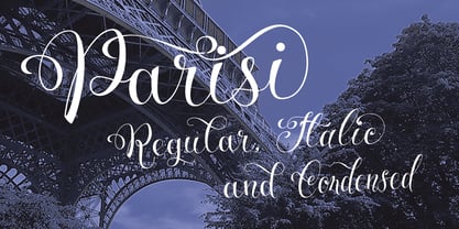 The Parisii was a small Gallic people settled in the current Paris region, which gave its name to the city of Paris. According to Caesar (53 BC.), their main town (oppidum) was Lutetia (Paris). Parisii was born of inspiration to be leafing through some old magazines on the terrace of a cafe in the beautiful city that is Paris. Parisi is like the city: casual, youth, romantic, free spirited and, at the same time, sophisticated, elegant and classic. The Parisi family font is a lovely and casual handlettering script, which is based on gestual calligraphy. Parisi has a slight bounce and intentional irregularity giving your words a wonderful flow. Fat and thin stroke in this font impresses the harmony. Parisi consists of 3 subfamilies: Regular, Italic and Condensed. This font includes Parisi font has OpenType features such as Stylistics and Contextual alternates, swashes, Standard and Discretional Ligatures, stylistic sets and ornaments that allow you to mix and match pairs of letters to fit your design. This will help your creativity and make it easier to make the impressive and elegant typographic work. This OpenType features may only be accessible via OpenType-aware applications, a Central European language support. Parisi looks lovely on wedding invitations, greeting cards, logos, business-cards and is perfect for using in ink or watercolour based designs, fashion, magazines, food packaging and menus, book covers and more!
 - Mirielle by Typadelic,
$19.00Mirielle is curvy yet angular at the same time. Whimsical yet orderly. As with all Typadelic fonts, this script typeface is unique and original, with a playful twist. - Barranom by PojolType,
$12.00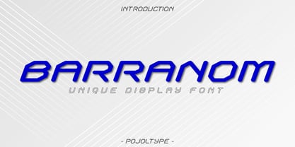 This Barranom font is great for logos, branding, apparel and headlines. This typeface encapsulates a wide variety of nuances, apparently, opposing elements like technology with friendly angular shapes.
 - Monoline Deco JNL by Jeff Levine,
$29.00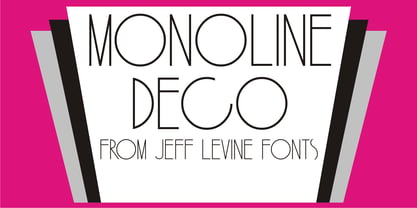 Monoline Deco JNL is a thin, elegant typeface that is reminiscent of the Art Deco Streamline influence of the 1930s and 1940s, complete with angular and truncated characters.
 - Balance by Victory Type,
$12.00The three typefaces that make up the Balance font set are legible, funky and stylish. Every character has been spaced and designed on a uniform geometric grid to insure true typographic "balance." There are only two shapes that make up every character: a parallelogram and a quarter circle. This design renders Balance a distinct family of fonts which are appropriate for all documents. Balance Regular is legible, funky and stylish. Every character has been spaced and designed on a uniform geometric grid to insure true typographic "balance." There are only two shapes that make up every character: a parallelogram and a quarter circle. This design renders Balance Regular a distinct font that is appropriate for all documents. Balance Light is legible, funky and stylish. Every character has been spaced and designed on a uniform geometric grid to insure true typographic "balance." There are only two shapes that make up every character: a parallelogram and a quarter circle. This design renders Balance Light a distinct font that is appropriate for all documents. Balance Unicase is legible, funky and stylish. Every character has been spaced and designed on a uniform geometric grid to insure true typographic "balance." Each letter, in this unicase version of Balance uses a single character height. There are only two shapes that make up every character: a parallelogram and a quarter circle. This design renders Balance Unicase a distinct font that is appropriate for all documents. - Fattern - 100% free

- Anabel - Personal use only

- TypographerTextur Schatten - Personal use only

- Print Clearly OT - Unknown license

- VTC FuzzyPunkySlippers - Unknown license

- TypographerFraktur Contour - Personal use only

- TypographerFraktur Shadow - Personal use only

- British Cinema JNL by Jeff Levine,
$29.00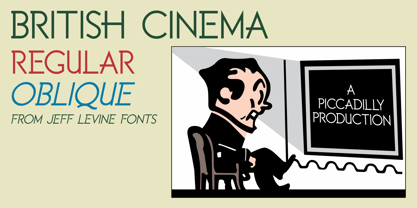 The hand lettered titles and credits from the 1945 British film “The Way to the Stars” were the working model for the aptly-titled British Cinema JNL, which is available in both regular and oblique versions.
 - Marde Sauve by Hishand Studio,
$15.00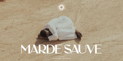 Introducing MARDE SAUVE, an elegant display with aesthetic look. Perfect for who needs touch of elegancy, stylish, classy beautiful bold type, and modernity for their design. Complete with ligatures alternates regular hollow icon kerning multilingual support
 - LUELLA by Cultivated Mind,
$29.00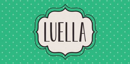 Luella is an elegant, hand drawn vintage inspired font by Cultivated Mind. Luella has been carefully crafted and comes in three weights (Regular/Bold/Black). This font works perfectly with the Luella frames and ornaments sets.
 - Tabasco by SoftMaker,
$7.99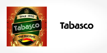 SoftMaker revives John Schaedler’s popular Tabasco typeface with this release. SoftMaker’s Tabasco comes in regular and bold styles, and the famous bi-line variant (sometimes called “Paprika”) is also available again under the name Tabasco Twin.
 - Industrial Stencil JNL by Jeff Levine,
$29.00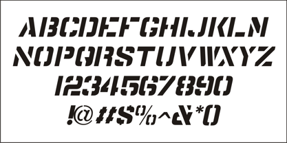 Samples of vintage machine-punched stencils used for marking crates and cartons were spotted in an online auction. These served as the basis for Industrial Stencil JNL, which is available in both regular and oblique versions.
 - Midwest Railway JNL by Jeff Levine,
$29.00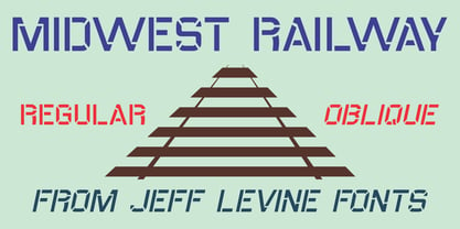 An antique, hand-cut metal stencil for the Chicago-Burlington rail route stating “CB&Q RR – Private Property” inspired the sans serif stencil design Midwest Railway JNL, which is available in both regular and oblique versions.
 - Deskmark Pro Slab by Alexey Makarov,
$14.00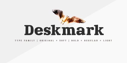 Hi! Introducing Deskmark Slab Pro Typefamily. Original and soft version. 3 weight for each version, bold, regular and light. Language support: Contains full set of Latin alphabet, including diacritical marks for European languages and Cyrillic alphabets.
 - Radio Singer JNL by Jeff Levine,
$29.00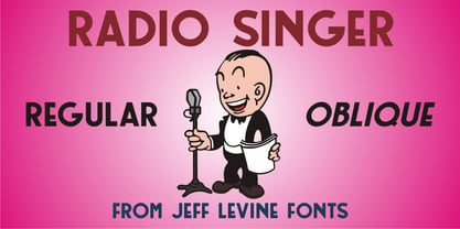 The hand lettered sans serif title on the sheet music for the 1930s song "I'm Alone Because I Love You" was the inspiration for Radio Singer JNL, which is available in both regular and oblique versions.
 - Eu Alonira by Hishand Studio,
$15.00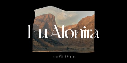 Eu Alonira is elegant serif font that look aesthetic Perfect for Logo brand, advertisement, product packaging, social media post, clothing brand, magazine headers and many more complete with ligatures alternates regular italic icon kerning multilingual support
 - Royalana by Kufic Studio,
$15.00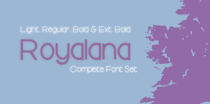 Royalana is a modern royal font with a minimalist factor. A complete font set containing all the important glyphs. Royalana has been inspired by the very minimalist and compact designs in trend to deliver a new look and yet keeping the professional outlook of any design or print. Royalana font set includes; Royalana Light, Royalana Light Italic, Royalana Regular, Royalana Italic, Royalana Bold, Royalana Bold Italic, Royalana Extra Bold & Royalana Extra Bold Italic. Kufic Studio is a platform that provides professional and high-quality designs & fonts to fill the gap that has been missing in the market.
 - House of Montague by IKIIKOWRK,
$17.00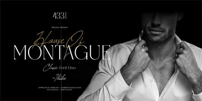 Introducing House of Montague - Classic Font Duo, created by ikiiko. House of Montague is a traditional font for the classic serif type with the addition of a script type. A simple font, with a thin size, adds an elegant and classy impression. This typeface is perfect for an elegant logo, branding, travel promotion, layout magazine, beauty product, packaging product, quotes, or simply as a stylish text overlay to any background image. What's included? Regular & Script Uppercase & Lowercase Number & Punctuation Multilingual Support Enjoy our font and if you have any questions, you can contact us by email : ikiikowrk@gmail.com
 - HiTone by Scholtz Fonts,
$19.00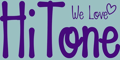 HiTone emulates a natural hand-lettered typeface that provides exceptional legibility with a quirky style. It comes in three widths, the narrowest of which enables text to be placed compactly within a limited space. The widest, on the other hand, increases readability while maintaining the same stroke weight. In addition, each width comes in two weights, regular and black, enabling the user to provide emphasis or headline display without changing the essential style of writing. The font is most useful as a stylish text font. The font has all the features of a fully professional typeface. Language support includes all European character sets.
 - Ragtime Gal JNL by Jeff Levine,
$29.00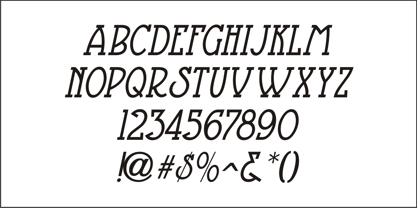 Amongst a batch of antique sheet musical instruction booklets offered for sale online was a piece with Art Nouveau hand lettering on the cover entitled “Seven Musical Travelogues for Piano”. This design served as the inspiration and model for Ragtime Gal JNL, which is available in both regular and oblique versions. The font’s name comes from the line ‘Hello my baby, hello my honey, hello my ragtime gal…’ from the 1899 song “Hello Ma Baby”; a tune that found a new burst of popularity in an odd way within a 1955 Warner Brother’s cartoon [“One Froggy Evening”].
 - Loneliness by Supfonts,
$12.00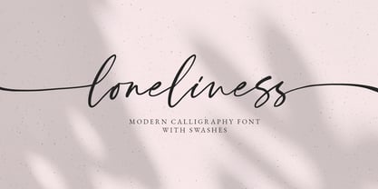 This modern calligraphy script has been attentively written, with gentle curves to produce a font thats completely distinctive and original. It contains a full set of lower & uppercase letters, a large range of punctuation, numerals, and multilingual support. Perfect for adding a elegant and unique touch to your lettering projects and branding Also with their help, you can create a Wedding lettering or beautiful frame for your home. Or just use for your small business, book covers, stationery, marketing, magazines and more. What's included - Loneliness Regular - Loneliness initial and final Swashes - Cricut support --- Check out my blog: - https://www.instagram.com/superdizigner - https://pinterest.com/dmitriychirkov7
 - Norman Variable by Resistenza,
$110.00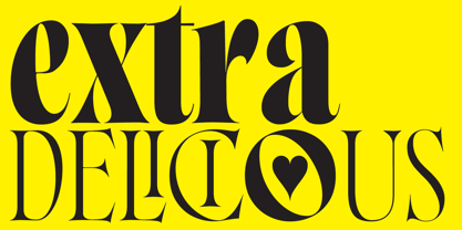 Norman Variable contains all the weights in between Norman Regular and Norman Fat. Get to know Norman, elegant and fashion forward. This new condensed and high contrast serif font is based on expansion giving a sense of self confidence. The oblique ax was specially added to get a contemporary and innovative sense. Norman is young and idealist, he has a distinctive sense of style. A complete set of ligatures and stylistic alternates is included, this will help the designer to customize and give a special look to any layout. We recommend to use it for big title, magazine, editorial purposes and display.


