10,000 search results
(0.046 seconds)
- Pink Bottom by Supfonts,
$12.00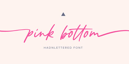 This modern calligraphy script has been attentively written, with gentle curves to produce a font thats completely distinctive and original. It contains a full set of lower & uppercase letters, a large range of punctuation, numerals, and multilingual support. Perfect for adding a elegant and unique touch to your lettering projects and branding Also with their help, you can create a Wedding lettering or beautiful frame for your home. Or just use for your small business, book covers, stationery, marketing, magazines and more. What's included Loneliness Regular Loneliness Swashes Multilingual support Cricut support Check out my blog: https://www.instagram.com/superdizigner https://pinterest.com/dmitriychirkov7
 - Okaluera by Hishand Studio,
$15.00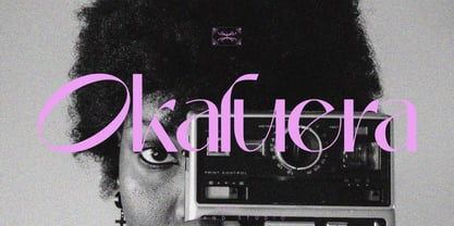 Okaluera Sans Serif font seamlessly blends elegance and luxury with a touch of minimalism, creating a sophisticated visual experience. Its sleek and graceful letterforms exude opulence, making it ideal for projects that demand a touch of class. The font's minimalist design adds a sense of modernity, ensuring it remains versatile for various applications. Whether used in print or digital media, Okaluera effortlessly captures attention, making a bold statement with its refined aesthetics. Good for logos, branding, invitations, stationery, wedding designs, social media posts, and much more. Complete with ligatures alternates regular italic icon kerning multilingual support
 - Eckhardt Informal JNL by Jeff Levine,
$29.00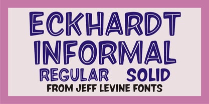 Eckhardt Informal JNL was found in a Dan Solo alphabets book under the name "Circus Wagon". This hand-lettered design with a playful inline is reminiscent of the show cards of the 1940s and 1950s. The Eckhardt series of typefaces is named in honor of the late Al Eckhardt, Jr. - a good friend of type designer Jeff Levine whose talents in hand-crafting attractive lettering was appreciated by many. His work, like the others before him is fast become a lost art in today's technology-driven world. Eckhardt Informal JNL is available in it's regular (inline) version and also as a solid version.
 - Mimosa by Pelavin Fonts,
$25.00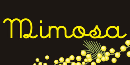 The inspiration for Mimosa comes directly from the packaging for “Moulinard Jeune”, a line of French toiletries from the 1920s. I created the 240-odd glyphs needed to make up a complete font based upon the style of a handful of hand-lettered characters that were used on the original items. Mimosa is a mono-weight, connecting vertical script with a fairly regular set of lower case and slightly more decorative upper case glyphs. As with any decorative script, if you set copy in all caps, you will be tracked down and severely punished by the type police.
 - Density by Alandya TypeFoundry,
$15.00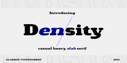 Density Heavy Slab Serif Features a smooth slab serif and a wide surface that makes it especially suitable for horizontal and lengkungan compositions. This is a front view, best used at larger sizes when weight and impact are desired. It's classic with a modern edge and most importantly packed with different styles, and ligatures Density is a heavy slab serif that comes with regular, oblique, outline, outline slanted, rough, rough slanted, extrude and extrude slanted style. this font is perfect for every project. suitable for branding logo, badge design, or apparel design. This font also comes with multilingual support.
 - Tupã by Just in Type,
$19.00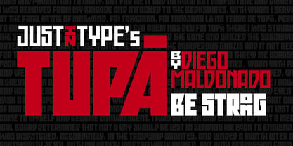 Tupã is the Brazilian indigenous word for thunder, that is worshiped like God in their mithology (in Tupi language). The typeface was developed to be strong and with great impact. The UPPERCASE was carefully designed with a lot of different features, and the lowercase is a mix of small caps and traditional forms, which brings a lot of personality and uniqueness to the design. Tupã familly is composed by two weights and four styles: Regular, Italic, Bold and Bold Italic. It’s a project recommended for titles, logos, posters and everything else you think it works. Take a look at the complete Specimen here.
 - Talent Stencil by Jeff Levine,
$29.00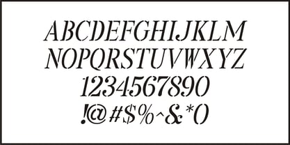 Stencils have played a number of roles over the years, from decorative patterns to military markings; from labeling shipping containers to a student’s school project. One unusual application of a stencil alphabet was some metal letters spotted for sale at an online auction site. These antique letters were used for promoting the current show on a theater marquee just as plastic ones are used nowadays. Following the auction images as a guide, the Roman stencil font from those marquee letters is now preserved digitally as Talent Stencil JNL; which is available in both regular and oblique versions.
 - Couturier by Latinotype,
$29.00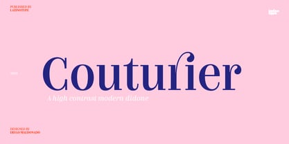 Couturier font is all about haute couture: classy ready-to-use characters for each project, perfectly drawn curved shapes and well-balanced counterforms. Elegantly embroidered ligatures, alternative glyphs and beautiful swashes give the font an extremely elegant look. Couturier comes in 4 weights, ranging from Regular to Black, with matching italics, resulting in a total of 8 fonts that help you achieve a strong composition in your publishing projects. Its true italics with a humanist feel give each design a chic personality. The font contains a set of more than 1,200 characters that support over 200 languages.
 - Lark by Shana Hu,
$20.00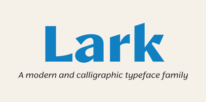 Lark is a modern calligraphic sans inspired by a rich history of broad-edge and translation contrast calligraphy. By combining its sharp geometry with flared curves, Lark exhibits a nice warmth as a display face. Lark was initially conceived as a final project as part of the Type@Cooper West Extended Program's post-graduate certificate program in typeface design, so its journey has benefitted from routine feedback from experienced typeface designers. Comes in Bold, Medium, Regular, and Light weights for both roman and italic, and supports multiple languages including Danish, Dutch, English, French, German, Italian, Portuguese, Spanish, Swedish, and more.
 - Handy Typewriter by Ana's Fonts,
$14.00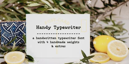 Handy Typewriter is a handwritten typewriter font in 4 handmade weights, with extras. Handy Typewriter has a more casual look than classic typewriter fonts, but can still be used in any designs that need a vintage touch. This font is very legible at a wide range of sizes and looks great in both long or short texts, in digital collages, branding and packaging, social media posts, logotypes, etc. Included in this font family: - Handy Typewriter font in 4 weights: Thin, Regular, Bold and Black, hand drawn from scratch - Handy Typewriter Extras is a set of 62 hand drawn doodles, to decorate your text
 - Viable Logic by Twinletter,
$12.00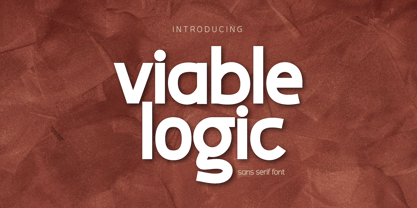 Viable Logic font, has a neat and clean character new face sans serif fonts, in response to the need for innovative and new designs, for that this sans serif font family has different characters namely bold, thin and regular. This font is simple yet neat and elegant, the design of this typeface gives it a clean, modern look and a unique style to help give it a captivating look when you use it. This font is perfect for strong text with displays for a wide variety of branding, advertising, posters, banners, packaging, news headlines, magazines, websites, logo design, and more.
 - Mexborough by Greater Albion Typefounders,
$11.50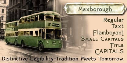 Tradition meets tomorrow in Mexborough. Mexborough owes its origins to a challenge from a client of ours- they wanted a clear and easily readable typeface to use for signage in public spaces, but with enough flair and style to be suitable for use in heritage precincts. The result is a family of six Roman faces in a single weight, encompassing Regular, Text, Flamboyant, Small Capitals, Capitals and Title forms. These faces combine legibilty with traditional character, ideal for signage and poster work, where dignity and character are required. Mexborough's simple clean lines also lend themselves readily to web and online use.
 - The Bellonte by Aminmario Studio,
$20.00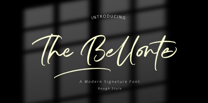 The Bellonte is a fashionable and relaxed handwritten font with a unique feel and a stunning impact. Comes with rough style regular and italic. This font is great for your creative projects such as watermark on photography, and perfect for logos & branding, photography, invitation, watermark, advertisements, product designs, stationery, wedding designs,label, product packaging, social media, movie titles, books titles, a short text even a long text letter and good for your secondary text font with sans or serif. And also for special events or anything that need handwritting taste. Thanks for checking out this font. I hope you enjoy it!
 - Sundash by Jehoo Creative,
$16.00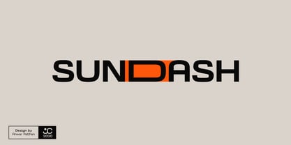 Sundash versatile typeface with wide allternate allcaps. This bold modern font explores the style of Allcaps, we add a wide character to make it look more flexible. based on forms inspired by free urban culture, Sundash has a modern and vibrant spirit. Sundash explores how the shapes and curves of letters change their Focus. This font has a variable weight of 5 Light, regular, medium, bold, extrabold to make the sundash more solid. Sundash has 247 glypghs with a unique and bold character perfectly suited for a wide variety of applications from editorial design to branding, advertising, publications and digital.
 - Devilion by Letterhend,
$15.00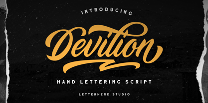 Say hallo to our newest item: Devilion, an amazing hand lettering bold script typeface with attractive swashes and alternates! This font is perfect to be applied especially in logos and various other formal forms such as invitations, labels, magazines, books, greeting/wedding cards, packaging, fashion, make up, stationery, novels, or any type of advertising purpose. This fonts comes in 2 style, Regular with clean script looks and Stamp to give an aged and vintage feel. Features : uppercase & lowercase numbers and punctuation multi-lingual ligatures alternates swashes PUA encoded What will you get : Devilion Regular Devilion Stamp We highly recommend using a program that supports OpenType features and Glyphs panels like many of Adobe apps and Corel Draw, so you can see and access all Glyph variations. Email us to letterhend@gmail.com if you need something! Happy Designing!
 - Antiquary by DimitriAna,
$22.00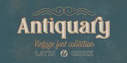 The Antiquary font collection was designed and illustrated, to reanimate the art of vintage advertising design. The fonts are inspired by the old ad posters and product labels, as well as the art of sign-making. The 4 typographic styles are combined with shapes and ornaments to create a variety of designs. They are ideal for logos, packaging, branding and all kinds of advertisements. Typographic styles: Antiquary: Old fashioned, serif, with 2 styles (Regular and Outline), stylistic alternates and ligatures. Antiquary Wide: All caps, bold, serif, vintage, with 3 styles: Regular, Inline and Outline. Antiquary Script: Modern brush calligraphy with terminal forms, contextual alternates, stylistic alternates and ligatures. Antiquary Thin: All caps, minimal, old fashioned. Antiquary Elements: 52 symbols, ribbons, frames and ornaments. The font collection supports Western, Central, Eastern, European, Baltic, Turkish and Greek languages.
 - Costa Std by Typofonderie,
$59.00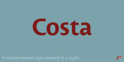 A mediterranean style sanserif in 4 styles The original idea of Costa was to create a contemporary mediterranean typeface style. Costa is a synthesis of the purity, as found on Greek capitals, and softness, found in Renaissance scripts. First thing was the design concept that take its roots on the Chancery script. Such writing style appeared during Italian Renaissance. Later few typefaces have been developed from such cursive models. Today most serifed typeface italic take their roots on such triangular structure we can find on gylphs like the n, p, or d. The Costa capitals remains close to pure sanserif models when the lowercases features an ending serif on many letters like the a, n, d, etc. This ending serif being more like a minimal brush effect, creating a visual contrast and referencing the exoticness of the typeface. Knowing that the Costa typeface family began life in the 90s as a bespoke typeface for Costa Crociere, an Italian cruise company — it suddenly makes sense and explains well why Jean François Porchez focused so much on Italian Chancery mixed to a certain exotism. The curvy-pointed terminals of the Costa n can obviously get find on other glyphs, such as the ending of the e, c and some capitals. So, the sanserif looks more soft and appealing, without to be to pudgy or spineless. The general effect, when set for text, remains a sanserif, even not like Rotis Semiserif. Costa is definitly not a classical typeface, or serif typeface which convey past, tradition, historicism as Garamond does beautifully. Because of the Costa crocieres original needs, Costa typeface was designed to be appropriate for any uses. Anytime you’re looking for good mood, qualitative effects, informal tone, cool atmosphere without to be unconvential or blowzy, Costa will convey to your design the required chic and nice atmosphere, from large headlines sizes, brands, to small text sizes. It’s a legible typeface, never boring. A style without neutrality which doesn’t fit comfortably into any typeface classification! Does it proves the novelty of its design and guarantees as well as its originality? Its up to you to be convinced. Barcelona trip Originally not planned, this need appeared because of a trip to Barcelona at the time of the project, where Jean François was giving a lecture. He wanted to pay an homage to that invitation to create something special. So, he designed during his flight some variations of the Spanish Ch, following ideas developed by the Argentinian type designer Rubén Fontana for his typeface called Fontana ND (published by the Barcelona foundry Bauer). Then, he presented during his lecture variations and asked to the audience which design fit the best to their language. They selected the design you can find in the fonts today. Read more about pairing Costa Type Directors Club 2000 Typographica: Our Favourite Typefaces 2004
 - PF DIN Serif by Parachute,
$36.00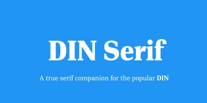 DIN Serif: Specimen Manual PDF The DIN Type System: A Comparison Table This is the first ever release of a true serif companion for the popular DIN typeface. DIN Serif originated in a custom project for a watchmaking journal which required a modern serif to work in unison and match the inherent simplicity of DIN. As a result, a solid, confident and well-balanced typeface was developed which is simple and neutral enough when set at small sizes, but sturdy and powerful when set at heavier weights and bigger sizes. It utilizes the skeleton of the original DIN and retains its basic proportions such as x-height, caps height and descenders, whereas ascenders were slightly increased. DIN Serif makes no attempt to impress with ephemeral nifty details on individual letters, but instead it concentrates on a few modern, functional and everlasting novelties which express an overall distinct quality on the page and set it apart from most classic romans. This is a low contrast typeface with vertical axis and squarish form which brings out a balance between simplicity and legibility. Its narrow proportions offer economy of space which is critical for newspaper body text and headlines. At small sizes the text has an even texture, it is comfortable and highly readable. The serifs are narrow at heavy weights and when tight typesetting is applied at large sizes, the heavier weights become ideal for headlines. DIN Serif was inspired by late 19th century Egyptian and earlier transitional roman faces. Bracketed serifs were placed on the upper part of the letterforms (this is where we mostly concentrate our attention when we read) whereas small clean square serifs were placed on and under the baseline to simplify the letterforms. In order to reduce visual tension at the joins and make reading smooth and comfortable, a slight hint of bracketed serif was added at the joins in the form of a subtle angular tapered serif, which softens the harsh angularity. These angular tapered serifs tend to disappear at smaller sizes (or smooth out the joins) but stand out at bigger sizes exuding a strong, modern and energetic personality. What started out as a custom 2 weight family, it has developed into a full scale superfamily with 10 styles from Regular to ExtraBlack along with their italics. Additional features were added such as small caps, alternate letters and numbers as well as numerous symbols for branding, signage and publishing. All weights were meticulously hinted for excellent display performance on the web. Finally, DIN Serif supports more that 100 languages such as those based on the Latin, Greek and Cyrillic alphabet.
 - Lite On by Factory738,
$15.00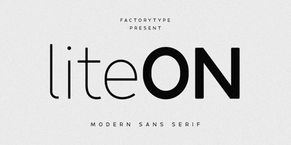 LiteOn is a lovely sans serif font family with a contemporary feel. The elegant design was achieved by combining modern and minimalist elements. When it comes to choosing the right typographic color for your project, the different weights give you a lot of options. The available Ligatures and alternate glyphs provide a diverse range of characters to make your project design stand out. 6 Weights (Thin, Light, Regular, Medium, Bold, Black) Basic Latin A-Z and a-z Numerals & Punctuation Stylistic Ligatures and Alternate glyphs Multilingual Support for ä ö ü Ä Ö Ü ... Free updates and feature additions Thanks for looking, and I hope you enjoy it.
 - Cumbre by Antipixel,
$22.00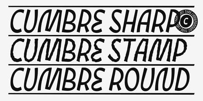 Cumbre is a slanted display type with unorthodox anatomy, a dynamic rhythmic structure, movement expression, and intense visual language. An eccentric rebel with ribbon-like moves, a balanced extrovert that makes meticulous use of ink traps. Both the name and design got inspiration from mountain peaks. "Cumbre" in Spanish means summit, and that's the motive for the spiked design and the angular serrated structure. Cumbre is built by balancing sharp angles and venturous curves. The stems are spiky, and they vary in width. Cumbre is slanted and unicase. It has condensed proportions, moderate weight contrast, spacious counters, pointy terminals, and square ink traps. Cumbre is meant for large display settings to make the most out of the precise outlines and the clean intersections. The font styles: 'Sharp' has straight paths and precise intersections. 'Round' has the same outlines but with round corners. 'Stamp' has irregular wavy contours and heavy swelling at intersections.
 - Cantarell - 100% free

- Cralter by Edignwn Type,
$18.00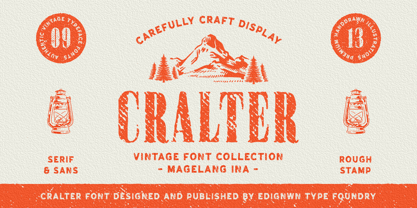 The Cralter Font is inspired by authentic typefaces in old posters. These font collections contain serif and sans serif fonts. Every font comes with 4 style typefaces (regular, rounded, rough and stamp). Cralter gives more extras 1 pack illustrations. The Cralter matches apply in some designs such as the logo, poster, label, badge, packaging, t-shirt, branding, quotes and more custom design. Cralter features : 4 style typefaces (regular, rounded, rough and stamp) All-caps, numeral, symbol and punctuation Multilingual PUA Encoded Cralter includes : 9 fonts (serif, sans serif and dingbat) 13 hand-drawn illustrations in dingbat
 - Kleader by Edignwn Type,
$18.00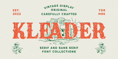 The Kleader Font is inspired by authentic typefaces in old posters. These font collections contain serif and sans serif fonts. Every font comes with 3 style typefaces (regular, rough and stamp). Kleader gives more extras 1 pack illustrations. This font includes some ligatures. The Kleader matches apply in some designs such as the logo, poster, label, badge, packaging, t-shirt, branding, quotes and more custom design. Kleader features : 3 style typefaces (regular, rough and stamp) All-caps, numeral, symbol and punctuation Ligatures Multilingual PUA Encoded Kleader includes : 7 fonts (serif, sans serif and dingbat) 13 hand-drawn illustrations in dingbat
 - Vintage Crafted by Edignwn Type,
$18.00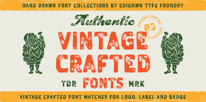 The Vintage Crafted Font is hand drawn typeface with retro themes. This font collections contain script and sans serif font. Every font comes with 3 style typefaces (regular, rough and stamp). This sans serif font includes some ligatures. The Vintage Crafted matches apply in some designs such as the logo, poster, label, badge, packaging, t-shirt, branding, quotes and more custom design. Vintage Crafted includes : 6 fonts (script and sans serif) 3 style typefaces (regular, rough and stamp) Uppercase, lowercase, numeral, symbol and punctuation in script font All-caps, numeral, symbol, punctuation and ligature in sans serif font Multilingual and PUA Encoded
 - Clarendon Wide by Canada Type,
$24.95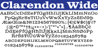 By overwhelming popular demand, this is the wide display companion to Canada Type's Clarendon Text family. It comes in ten styles: regular, medium, bold, with small caps and oldstyle Figures counterparts, as well as stencil and sketch versions of the regular and the bold. All the fonts come equipped with superscripts/numerators, denominators, and scientific inferiors. The OpenType fonts also contain automatic fractions and class-based kerning. The Clarendon Wide fonts are available in all popular formats. Language support includes Western, Central and Eastern European character sets, as well as Baltic, Esperanto, Maltese, Turkish, and Celtic/Welsh languages.
 - Kis Antiqua Now TH Pro by Elsner+Flake,
$99.00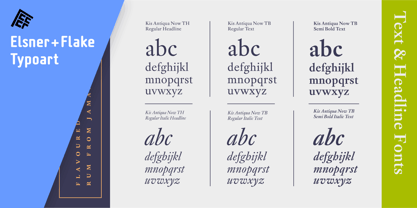 In the course of the re-vitalization of its Typoart typeface inventory, Elsner+Flake decided in 2006 to offer the “Kis Antiqua” by Hildegard Korger, in a re-worked form and with an extended sortiment, as an OpenType Pro-version. After consultation with Hildegard Korger, Elsner+Flake tasked the Leipzig type designer Erhard Kaiser with the execution of the re-design and expansion of the sortiment. Detlef Schäfer writes in “Fotosatzschriften Type-Design+Schrifthersteller”, VEB Fachbuchverlag Leipzig, 1989: No other printing type has ever generated as far-reaching a controversy as this typeface which Jan Tschichold called the most beautiful of all the old Antiqua types. For a long time, it was thought to have been designed by Anton Janson. In 1720 a large number of the original types were displayed in the catalog of the „Ehrhardische Gycery“ (Ehrhardt Typefoundry) in Leipzig. Recently, thanks to the research performed by Beatrice Warde and especially György Haimann, it has been proven unambiguously that the originator of this typeface was Miklós (Nicholas) Tótfalusi Kis (pronounced Kisch) who was born in 1650 in the Hungarian town of Tótfal. His calvinistic church had sent him to the Netherlands to oversee the printing of a Hungarian language bible. He studied printing and punch cutting and earned special recognition for his Armenian and Hebrew types. Upon his return to Hungary, an emergency situation forced him to sell several of his matrice sets to the Ehrhardt Typefoundry in Leipzig. In Hungary he printed from his own typefaces, but religious tensions arose between him and one of his church elders. He died at an early age in 1702. The significant characteristics of the “Dutch Antiqua” by Kis are the larger body size, relatively small lower case letters and strong upper case letters, which show clearly defined contrasts in the stroke widths. The “Kis Antiqua” is less elegant than the Garamond, rather somewhat austere in a calvinistic way, but its expression is unique and full of tension. The upper and lower case serifs are only slightly concave, and the upper case O as well as the lower case o have, for the first time, a vertical axis. In the replica, sensitively and respectfully (responsibly) drawn by Hildegard Korger, these characteristics of this pleasantly readable and beautiful face have been well met. For Typoart it was clear that this typeface has to appear under its only true name “Kis Antiqua.” It will be used primarily in book design. Elsner+Flake added these two headline weights, which are available besides a separate font family Kis Antiqua Now TB Pro. Designer: Miklós (Nicholas) Tótfalusi Kis, 1686 Hildegard Korger, 1986-1988 Erhard Kaiser, 2008
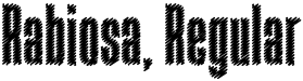
 - Rabiosa - Personal use only
- Saturday Script by Nicky Laatz,
$16.00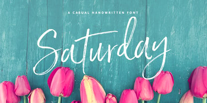 Say hello to Saturday Script! A a care-free, casual, handwritten script with authentic tell-tale dry brush imperfections. Saturday Script has the added bonus of having 'multiple personalities'! Saturday Script has 2 sets of lowercase stylistic sets, allowing you to make each word look completely unique to the next. Whether you need "flaunty & loud" or "soft & romantic" Saturday Script has the look for you. There are 2 variants of Saturday Script, to add even more flexibility to your designs: Regular, and Oblique
 - Ace Sans by Factory738,
$15.00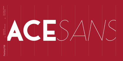 Ace Sans is a modern and minimalist sans serif font family. The combination of minimal and geometric elements renders a modern design. Ace Sans family includes 8 fonts, clean and modern caps, thereby creating more variability. This is irreproachable sans serif to diversify your headlines, branding visual identity, poster, logo, magazines and etc. 8 Weights (Thin, Extralight, Light, Regular, Medium, Bold, Extrabold, Black) Oblique font is available Numbers & Punctuation Extensive Language Support Thanks for looking, and I hope you enjoy it.
 - HS Dream by Hiba Studio,
$50.00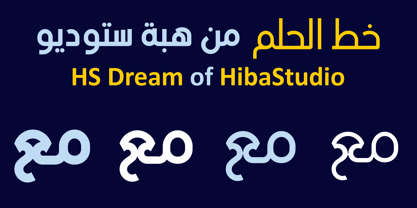 HS Dream is based on some modern lines of Kufi calligraphy which supports Arabic, Persian. The typeface has been optimized for corporate identity work and modern projects when a contemporary and simple look is requested. It is an Opent type Arabic font and features four stylistic sets. This font consists of four weights (light, regular, medium and bold) which can constitute a striking addition to the library of Arabic fonts models that meet the purposes of various designs for all taste.
 - Summer Surfing by Edignwn Type,
$16.00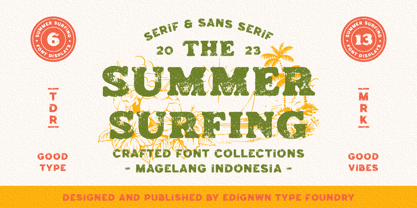 Introducing "Summer Surfing", a font duo - serif and sans serif designed to bring the energy of the waves to your designs! With three styles - regular, rough, and texture - you can create a range of effects, from clean and modern to weathered and rustic. Each style of the font features bold, rounded letters that evoke the movement and curves of the ocean. But that's not all! Summer Surfing also includes 13 beach-themed illustrations as dingbats, including surfboards, waves, and palm trees.
 - Marselind by Josstype,
$18.00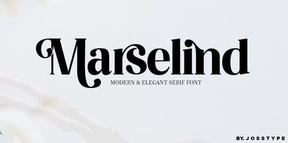 Marselid Serif. Marselid Serif.is a Serif Display Font with a modern, classy, fun, unique and versatile style. It looks amazing at display size and is easy to read in text size. This font also has lots of unique alternatives and binders that will make for stunning design projects. Marselid Serif. works well for branding projects, logos, wedding designs, social media posts, advertisements, product packaging, product designs, labels, photography, watermarks, invitations, or any project you are working on. File Includes: Regular Slant Outline Condensed
 - Espander by Great Studio,
$16.00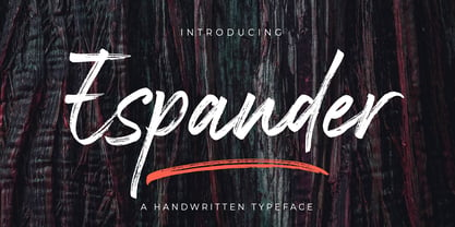 Espander is a rough brush script font with a clear style and dramatic movement this font is great for your next creative project such as logos, printed quotes, invitations, cards, product packaging, headers, Logotype, Letterhead, Poster, Apparel Design, Label, and etc. Espander has two Espander Regular and Espander Italic letters, complete with uppercase and lowercase letters, as well as multi-language support, numbers, punctuation. also provide some ligatures and extra swash. Mail Support: If you have any question, please contact : greatstudio92@gmail.com
 - Picky Action by PizzaDude.dk,
$17.00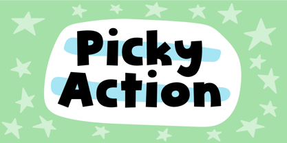 Sometimes you may be picky about your choices: What’s for dinner? Where are we going for vacation? Vanilla or chocolate? Which font suits this product the best? The answers are many, but on that last question, the answer could be Picky Action - because of the super clean and smooth letters, that goes well with anything that needs a fresh, legible and loose look (without being to loose!) I have added a Regular, Italic and rounded versions of these two. Enjoy!
 - Marvaloha by Fontforecast,
$14.99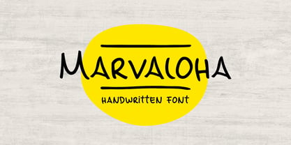 Marvaloha is based on the handwriting of an Advertising creative director. The casual but powerful strokes he uses for sketching are also visible in his writing. The Marvaloha font family consists of the original Marvaloha Regular and a Bold version. Both have matching Italics. All four styles have double letter ligatures and a set of symbols and catchwords to give your design some extra power. You will need an Open Type Savvy Application to get the most out of Marvaloha.
 - Yassitf by Ingrimayne Type,
$6.00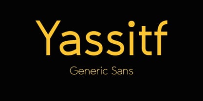 Yet another san serif typeface, Yassitf is a generic sans, a font meant to blend in rather than stand out. It has little contrast and is almost monoline. It includes three widths: condensed, narrow, and regular. The widths have four to six weights: ultra thin, thin, light, plain, bold, and extra bold. Further, each width and weight combination has both upright and italics styles. The thirty fonts in the family contain several open-type features, including both proportional and tabular (monospaced) numbers.
 - Coffinated by Ingrimayne Type,
$9.00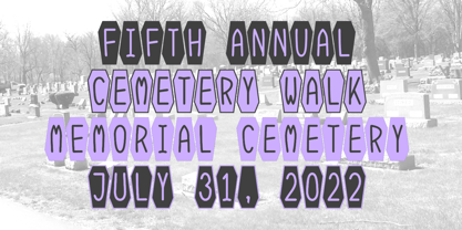 Coffinated features letters on coffin shapes. This caps-only family has two sets of characters, with one on coffins that are flipped from those in the other set. The OpenType feature contextual alternatives (calt) prevents two characters from the same set being adjacent. The two styles, bold and regular, can be used in layers to add color. There are not a lot of uses for macabre lettering (horror? Halloween?) but Coffinated is available for those who do find a use.
 - Syahila by Ably Creative,
$9.00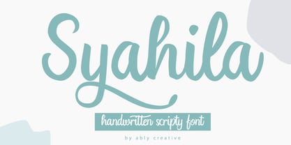 Syahila is consisting of a perfect font, come with regular. This font was created with contextual alternates opentype features to create more beauty. It’s simple and friendly style makes this design incredibly versatile, fitting a wide variety of creative ideas. Syahila is perfect for branding projects, social media posts, advertisements, product packaging, product designs, label, stationery and anything that you want. It is suitable for logo, packaging, apparel, social media, and more. whats you get: Works on PC & Mac Simple installations Supports multilingual
 - Kungfoo Fighter by IKIIKOWRK,
$15.00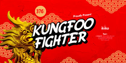 Introducing Kungfoo Fighter typeface, created by ikiiko. This typeface is inspired by the asian character brush strokes. This font has a bold & bold character, with flexible curves. This typeface is perfect for poster design, food & beverages, asian stuff, community logo, magazine, quotes, or simply as a stylish text overlay to any background image. What's included? 2 Weights : Regular & Oblique Uppercase & Lowercase Number & Punctuation Multilingual Support Enjoy our font and if you have any questions, you can contact us by email : ikiikowrk@gmail.com
 - Exter by Variable Type Foundry,
$22.99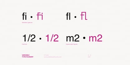 Exter is a geometric Sans-Serif font inspired by the work of Russian artist Alexandra Exter that combines geometric and angled forms. Exter has been designed for advertising, posters, web, branding, packaging or any place where you need a clean and forceful voice. This personal character of its forms is due to the variety of weights it has (Black, Ultra Bold, Bold, Semi Bold, Regular, Light, Ultra Light, Extra Light and Thin). All are fully The character set is robust, covering extended Latin.

