10,000 search results
(0.013 seconds)
- Sierrra - Personal use only
- hakee2 - Unknown license
- whatever - 100% free
- Lumio - Unknown license
- CARMEN - Unknown license
- kallot - Unknown license
- AnthologY - Unknown license
- grumble - Unknown license
- junkohanhero - Unknown license
- lizzielongstocking - Unknown license
- Mohawk - Unknown license
- Aerofoil - Unknown license
- Tinet - Unknown license
- Guttural - Unknown license
- DisorderedBold - Unknown license
- TECNO - Personal use only
- rr - Personal use only
- ympyroity - Unknown license
- vuur - Unknown license
- Gordala - Personal use only
- Acuate - Unknown license
- Allstar4 - Unknown license
- murro - 100% free
- CuttyFruty - Personal use only
- Kraftfahrzeugkennzeichen - Unknown license
- Christopherhand - Unknown license
- hardcorium - Unknown license
- Athena by Solotype,
$19.95 - Suave silky by Aomam,
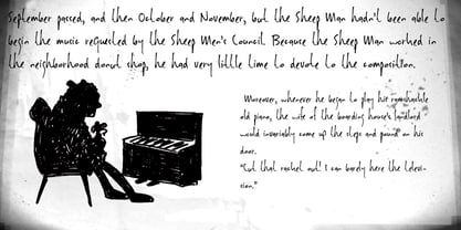
$10.00 - Sheepman by Hanoded,
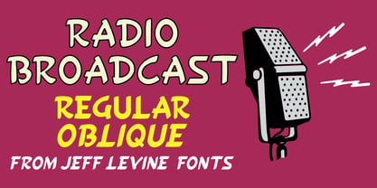
$15.00 - Radio Broadcast JNL by Jeff Levine,
$29.00 - Metropolis by Monotype,
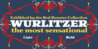
$29.99 - Wurlitzer Pro by Red Rooster Collection,
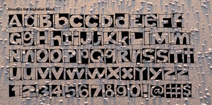
$60.00 - Doodles the Alphabet by Outside the Line,
$19.00 - Omibez by PizzaDude.dk,
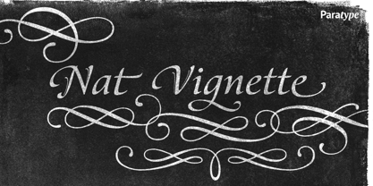
$20.00 - Nat Vignette by ParaType,
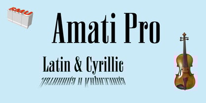
$25.00 - Amati Pro by RMU,
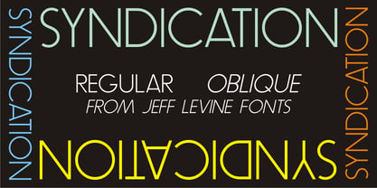
$40.00 - Syndication JNL by Jeff Levine,
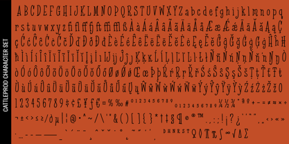
$29.00 - Cattleprod PB by Pink Broccoli,
$14.00 - Schlub by Typadelic,
$19.00


