10,000 search results
(0.14 seconds)
- ITC Handel Gothic Arabic by ITC,
$103.99 ITC Handel Gothic Arabic is a modern Kufi design by Nadine Chahine, created especially for headlines and display purposes. It comes in 5 different weights ranging from Light to Heavy which extends its usage capabilities considerably. The design is mono-linear and with the typical geometric construction associated with the Kufi style. Its usage can vary from headlines to logos to packaging. Given its large counters, it can function quite well in very small sizes too. Its pattern is quite homogenous, so it is not recommended to use this for whole paragraphs. The character set supports Arabic, Persian, and Urdu and also includes Basic Latin.
 - ITC New Rennie Mackintosh by ITC,
$50.99 Looking to add a little Arts & Crafts flavor to your next project? Perhaps you just need a distinctive, new sans serif design? And one with a large international character set. In either case, ITC New Rennie Mackintosh™ may be the typeface for you. Its narrow proportions saves space, and the design shines at large sizes. While it can be an excellent typeface for Art Nouveau flavored labels, name tags and chapter call-outs, this is a suite of fonts that you can also turn to for a bevy of print and on screen uses. Games and apps, as well as print headlines and menus all benefit from ITC New Rennie Mackintosh’s vintage vibe. Based on Phill Grimshaw’s original 1996 design, Monotype Studio designers reimagined the iconic family, added lowercase characters, a new weight structure of light, regular and a more robust bold design; each with an italic counterpart. In addition, a large international character set that include support for many Western and Eastern European languages – including Cyrillic and Greek – give the family a deep typographic bench. An added benefit: the new designs can also be combined with Grimshaw’s original ornament and initial character fonts.
 - ITC Franklin Gothic LT by ITC,
$43.99 Franklin Gothic was designed between 1903 and 1912 by Morris Fuller Benton for the American Type Founders Company. The font serves as the American Grotesk prototype. It was named after Benjamin Franklin. Even today, Franklin Gothic remains one of the most widely used sans serif typefaces. The robust character of the font gives text a modern feel. It is widely used in newspapers and advertising and is frequently seen in posters, placards and other material where space is restricted. Featured in: Best Fonts for Tattoos
 - ITC Seven Treasures Ornaments by ITC,
$29.99Akira Kobayashi's ITC Seven Treasures is a symbol font for use in patterns and textures. The interlocking patterns, usually circular or oval, are taken primarily from motifs used in Japanese textiles. Most of these designs are known as komon, or tiny patterns," and they are often applied to kimono and other textiles, although their use is not limited to fabrics. They also appear carved in wood in traditional architecture, and painted in pictures as background patterns. Each of the individual designs in ITC Seven Treasures Ornaments is carefully sized and spaced so that it will fit together into a continuous pattern. Most overlap slightly but precisely, so that when you type a row of them you can't tell where one leaves off and the next begins. They may be combined or alternated to vary the texture of a background pattern." - ITC Legacy Square Serif by ITC,
$40.99 .
. - ITC Stone Sans II by ITC,
$45.99 The ITC Stone Sans II typeface family is new from the drawing board up. Sumner Stone, who designed the original faces in 1988, recently collaborated with Delve Withrington and Jim Wasco of Monotype Imaging to update the family of faces that bears his name. Sumner was the lead designer and project director for the full-blown reworking – and his own greatest critic. The collaborative design effort began as a relatively simple upgrade to the ITC Stone Sans family. As so often happens, however, the upgrade proved to be not so simple, and grew into a major design undertaking. “My initial intent,” recalls Sumner, “was to provide ITC Stone Sans with even greater versatility. I planned to add an additional weight, maybe two, and to give the family some condensed designs.” As Sumner began to look more closely at his twenty-year-old typeface, he decided that it would benefit from more extensive design improvements. “I found myself making numerous refinements to character shapes and proportions,” says Sumner. “The project scope expanded dramatically, and I’m pleased with the final result. The redesign has improved both the legibility and the overall appearance of the face.” The original ITC Stone Sans is part of the ITC Stone super family, along with ITC Stone Serif and ITC Stone Informal. In 2005 ITC Stone Humanist joined the family. All of these designs have always offered the same three weights: Medium, Semibold, and Bold – each with an italic counterpart. Over time, Stone Sans has emerged as the godfather of the family, a powerful design used for everything from fine books, annual reports and corporate identity programs, to restaurant menus, movie credits and advertising campaigns. ITC Stone Sans, however, lacked one attribute of many sans serif families: a large range of widths and weights. “These fonts had enjoyed great popularity for many years – during which graphic designers repeatedly asked for more weights and condensed designs in the family,” says Sumner. “Their comments were the impetus.” ITC Stone Sans II includes six weights ranging from an elegant Light to a commanding Extra Bold. An italic counterpart and suite of condensed designs complements every weight. In all, the new family encompasses 24 typefaces. The ITC Stone Sans II family is also available as a suite of OpenType Pro fonts, allowing graphic communicators to pair its versatile design with the capabilities of OpenType. These fonts offer automatic insertion of ligatures, small caps and use-sensitive figure designs; their extended character set also supports most Central European and many Eastern European languages. ITC Stone® Sans II font field guide including best practices, font pairings and alternatives.
 - ITC Modern No. 216 by ITC,
$40.99 Modern typefaces refer to designs that bear similarities to Bodoni and other Didone faces, which were first created during the late 1700s. Ed Benguiat developed ITC Modern No. 216 in 1982 for the International Typeface Corporation (ITC). Showing a high degree of contrast between thick and thin strokes, as well as a large x-height, this revival is more suited to advertising display purposes than the setting of long running text, or books. Many traits in Benguiat's design are worth further notice. The thick stems of the roman weights have a very stately, solid presence. Their thin serifs have been finely grafted on, a masterful solution to the challenge of bracketing presented by Modernist designs. The italic weights have a very flowing, script-like feel to them, and the letters take the form of true italics, not obliques. The ITC Modern No. 216 family contains the following font styles: Light, Light Italic, Medium, Medium Italic, Bold, Bold Italic, Heavy, and Heavy Italic.
 - 123 and... - Unknown license

- And Then by Throndsen,
$10.00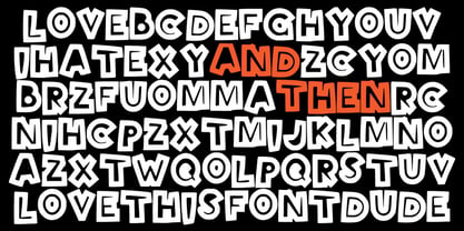
- Andes Neue by Latinotype,
$29.00 Unlike its predecessor, Andes Neue contains a larger character set of 759 glyphs which support 219 Latin-based languages from 212 countries. The font comes in 4 variants that provide a wide stylistic range. Andes Neue is the most similar to the original Andes design. The Alt1 character set bears some similarity to the old Andes's (yet cleaner); Alt2 uses the alternates in the font as default glyphs; and Alt3 is a mixture of the other three variants that offers a balanced set of characters. Andes Neue also includes new accents and glyphs for a wider language support, and a set of small caps (in each variant). All of these features give the font a strong personality that helps make text look more appealing. Andes Neue varied weights work well with both short and mid-length text sections, providing a wide range of choices for any design project.
 - Yue Han by Phoenix Group,
$13.00 Yue Han is a font created as a form of gratitude for all the feelings and love that has been given, this font symbolizes the willingness to let go of someone we love and move on to a better place.
 - Andes Italic by Latinotype,
$29.00 Andes, designed by Daniel Hernández, is a display typeface that has neo-humanist characteristics. Its different terminals, among other elements, give it a look of mixed typography. Andes is a typeface with 10 Upright weights, 10 Italics & Condensed version, ranging from Ultra Light to Black, each of the same x-height. This typeface contains additional italic glyphs (a, y, z, g) that help to emphasise text or words. Andes is based on the design of Merced and both of them share several features. This type is well-suited for use in retail, magazines, logotypes, books, etc.
 - Andes Condensed by Latinotype,
$29.00 Andes, designed by Daniel Hernández, is a display typeface that has neo-humanist characteristics. Its different terminals, among other elements, give it a look of mixed typography. Andes is a typeface with 10 Upright weights ,10 Italics & Condensed version, ranging from Ultra Light to Black, each of the same x-height. This typeface contains additional italic glyphs (a, y, z, g) that help to emphasise text or words. Andes is based on the design of Merced and both of them share several features.
 - Andes Rounded by Latinotype,
$29.00 Andes Rounded, designed by Daniel Hernández, is a display typeface that has neo-humanist characteristics. Its different terminals, among other elements, give it a look of mixed typography. Andes is a typeface with 10 Upright weights, 10 Italics & Condensed versions, ranging from Ultra Light to Black, each of the same x-height. This typeface contains additional italic glyphs (a, y, z, g) that help to emphasise text or words. Andes is based on the design of Merced and both of them share several features. This type is well-suited for use in retail, magazines, logotypes, books, etc.
 - Han Zi by ParaType,
$25.00 The display typeface that is based on the shapes of traditional Chinese hieroglyphic characters. Designing the font for imitations in the Chinese style the author nevertheless demonstrates serious attitude and thoroughness using the table of keys of the regular Kaishu script. As a result the font looks stylistically authentic and genuine. The typeface was designed by Aleksandra Egorova, the young type designer from St. Petersburg, and released by ParaType in 2008 .
 - Hedgehog Hans by Hanoded,
$15.00 Hans My Hedgehog is an old fairytale which was made famous by the Grimm Brothers, when they published it in the early 19th century. Hedgehog Hans font is a fat, rounded and rather cute typeface, which is ideal for children's books and posters. It is highly legible, and comes with extensive language support.
 - CANDY INC. - Personal use only

- VTC-SumiSlasherOne - Personal use only

- Vtc-NueTattooScript - Personal use only

- Detectives Inc - Personal use only

- VTC-KomikaHeadLinerChewdUp - Personal use only

- VTC-RoughedUp - Personal use only

- VTC-TribalThreeFree - Personal use only

- VTC Embrace - Unknown license

- VTC ScreamItLoudSliced - Unknown license

- VTC Tribal - 100% free

- VTC NightOfTheDrippyDeadOuttie - Unknown license

- VTC SubwaySlamSC - Unknown license

- VTC-FreehandTattooOne - Personal use only

- VTC CoppaKroma - Unknown license

- VTC SubwaySlam - Unknown license

- VTC SeeJoBend - Unknown license

- VTC PunkettePumps - Unknown license

- VTC FuzzyPunkySlippers - Unknown license

- VTC BadPaint - Unknown license

- VTC NightOfTheDeadCorruptCaps - Unknown license

- VTC NightOfTheDrippyDead - Unknown license

- VTC JoeleneHand - 100% free

- VTC JezzabelBimbo - Unknown license

- VTC-BadEnglischOne - Personal use only


