10,000 search results
(0.044 seconds)
- Soft Press by Canada Type,
$24.95
- Wagner Round by Canada Type,
$24.95
- Tasneem NF by Nick's Fonts,
$10.00 - LED Counter 7 - Personal use only

- Vampetica - Personal use only

- Savia Outline - Personal use only

- Savia Shadow - Personal use only

- Savia Regular - Personal use only

- Konga Next by RodrigoTypo,
$25.00
- Basika by NOS,
$15.00
- Ladronn by Comicraft,
$39.00
- Superfont by CozyFonts,
$20.00
- Magical Dreams - Personal use only

- Creepy Crawlies - Personal use only

- Channel B by Just My Type,
$25.00
- October Crow - 100% free

- MONACO - Personal use only

- MythBusters - Personal use only

- Space Rave - Personal use only

- Bianka Script - Personal use only

- League of Ages - Personal use only

- Jellyka BeesAntique Handwriting - Personal use only

- Lithean - Personal use only

- Niobium Pro by CheapProFonts,
$10.00
- lauralinda - Unknown license

- So Narrow - Unknown license

- Laurels Qeylla by Asd Studio,
$15.00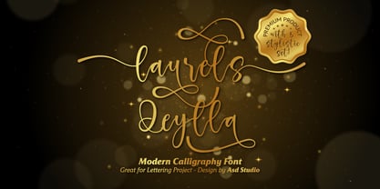
- Next Stop by Kenneth Woodruff,
$15.00 - Konga Pro by RodrigoTypo,
$35.00
- Jolly - Personal use only

- Tattoo Sailor - Personal use only

- Posterizer KG Rounded by Posterizer KG,
$40.00
- Revel by Emily Lime,
$21.00
- Le chant des Albatros - Personal use only

- Commander Edge - Personal use only

- Chicken Butt - Personal use only

- LED Digital 7 - Personal use only

- Kreeture Italic - Unknown license

- So Shady - Unknown license

- So Extended - Unknown license


