10,000 search results
(0.223 seconds)
- Kingthings Annex - 100% free

- FALLING SKIES - Personal use only

- Nova SOLID - Personal use only

- Nuixyber Glow Next - Personal use only

- WHEN THE GOES SUN . SCENE - Unknown license

- Trek - Unknown license

- Web Serveroff - 100% free

- Oramac - Personal use only

- Ab Fangs - Unknown license

- Romance Fatal Sans - Personal use only

- Display Dots - 100% free

- TooneyNoodle - 100% free

- Pabellona (B) Dúplex - Personal use only

- JICAMA - Unknown license

- Pinniepoker - Personal use only

- BIRTH OF A HERO - Unknown license

- Docteur Atomic - Personal use only

- Nascent - Unknown license

- SF Big Whiskey - Unknown license

- Squeeze Me Baby! - 100% free

- loco - Personal use only

- Green Fuz - Unknown license

- Bullpen 3D - Unknown license

- Certified - Unknown license

- Komika Text Kaps - Unknown license

- Umbrage - Unknown license

- Parafuse - 100% free

- Hardcore - Unknown license

- ACED IT - Personal use only

- Refuse - Unknown license

- WALLRIDER - Personal use only

- Husky Stash - Unknown license

- !PaulMaul - Personal use only

- CosmosCaps - Unknown license

- Sonic Mega Font - Unknown license

- Biotrip Serif was born as a humanist slab serif , that particular kind of typeface that blends rational geometry with Egyptian boldness and the sensitivity of a hand-drawn stroke. Slab serifs—...
- PIXymbols Backstitch by Page Studio Graphics,
$40.00 - Murottal by Arendxstudio,
$15.00
- Qualiga by Arendxstudio,
$21.00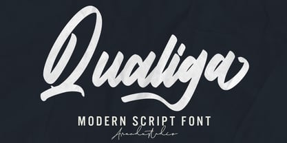
- Heykido by Blankids,
$19.00


