10,000 search results (0.013 seconds)
  1. Evening Gown JNL by Jeff Levine, $29.00
    Evening Gown JNL comes from the lettering displayed on a printed ad for the fictional "Gowns by Roberta" in a scene in the 1935 film of the same name. "Roberta" starred Fred Astaire and Ginger Rogers and was based on the successful 1933 stage play.
  2. Toon In JNL by Jeff Levine, $29.00
    Lettering in the credits of classic animated cartoons was the inspiration for Toon In JNL, a fun and lighthearted typeface. Use this font anywhere a relaxed, informal or playful message is displayed.
  3. Times Kangaroo Down by Elemeno, $25.00
  4. Snoodle Toons NF by Nick's Fonts, $10.00
    Lettering on a menu from a Pennsylvania hotel, circa 1930, provided the inspiration for this happy-go-lucky take on the alphabet. Lowercase letters are variants of the uppercase and kerning has been applied to every possible letter combination, so feel free to double-clutch the shift key to create a truly handlettered feel with this font. Both versions of this font include the complete Latin 1252 and CE 1250 character sets, with localization for Romanian and Moldovan.
  5. DT Stoner Toon by Dragon Tongue Foundry, $10.00
    Inspired by early cool cartoon fonts, early rock and hippie posters, I created this casually organic 'DT Stoner Toon' font. Please use with contextual ligatures turned on when possible. These letters like to adapt to their neighbours. 60's 60s artdeco artnouveau cartoon cartoonesque Cartoon Font cartoonish cartoony casual contextual cool cool font cool typeface dots fun fun font gigposter hippie hippy joined party poster poster font poster typeface rock poster spots spotted Stoned Stoner stones theater poster toon wet with dots written
  6. Tooned Out JNL by Jeff Levine, $29.00
    Tooned Out JNL gives a serif treatment to the cartoon-inspired lettering of Toon-In JNL. Both fonts are great for any casual or fun messages or themes.
  7. Down The Wall by Hanoded, $15.00
    I have no great love for walls, especially when they are built to keep people out. When I started working on this font, I realized it looked a bit like protest graffiti, found on… yes, walls. Down The Wall is a great little font: it is handwritten, messy and in your face. It has no real baseline and glyphs jump all over the place. Use it for book covers, posters, album covers - anything really. It certainly would look good on a wall too! Comes with a whole bunch of diacritics, so whatever you have to say, the world will understand.
  8. Dot Font - Unknown license
  9. Got heroin? - Personal use only
  10. Fortuna Dot - Unknown license
  11. Toms Handwriting - 100% free
  12. Top Secret - 100% free
  13. Display Dots - 100% free
  14. DS Dots - Unknown license
  15. Broken Toys - Unknown license
  16. Big Top - Unknown license
  17. Tom-Bombadill - Personal use only
  18. Uncle Tom - Unknown license
  19. SlabStruct Too - Unknown license
  20. 3x3 dots - 100% free
  21. Pot roaster - Unknown license
  22. 3x3 dots - 100% free
  23. Top Speed - Unknown license
  24. Too Late - Unknown license
  25. Top Bond - Unknown license
  26. Poison Dots - Unknown license
  27. Tom Violence - 100% free
  28. Toy Train - Unknown license
  29. Patterns & Dots - Unknown license
  30. 5x5 Dots - 100% free
  31. Terylene Top - Unknown license
  32. Teddybers Too - Personal use only
  33. Got heroin? - Unknown license
  34. Zekton Dots - Unknown license
  35. Not Sassure by Australian Type Foundry, $30.00
    Excessive photocopying, with extreme enlargements and reductions to magnify the imperfections, helped to rough the edges and give Not Sassure a non-digital quality.
  36. Hot Coffee by Fonthead Design, $19.00
  37. Funny Toys by Letterafandi Studio, $14.00
    Funny Toys is a fun and bubble display font. No matter the topic, this font will be an incredible asset to your fonts’ library, as it has the potential to elevate any creation.
  38. Matrix Dot by Fonthead Design, $9.00
  39. Top Banana by Throndsen, $10.00
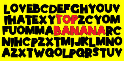
  40. TWT Prospero by Three Islands Press, $24.00
    TWT Prospero is the kind of typeface you seldom find in blocks of continuous text these days. Similar fonts based on late-18th-century work by Bodoni, the Didots, and others tend to be reserved for display type: their exaggerated contrast and vanishing hairlines can make you squint and strain at small sizes. But TWT Prospero, with its moderate contrast and fairly robust hairlines, is impressively legible in book text while remaining ideal for use in display situations. The full family has seven styles: roman, italic, bold, bold italic, condensed roman, condensed italic, and condensed bold.
Looking for more fonts? Check out our New, Sans, Script, Handwriting fonts or Categories
abstract fontscontact usprivacy policyweb font generator
Processing