10,000 search results
(0.02 seconds)
- Hannover Modern by Type-Ø-Tones,
$40.00 Hannover Modern belongs to a series of typefaces used at the Estudio Mariscal in Barcelona. José Manuel Urós developed this weight, a vigorous egyptian-style, the embodiment of the Javier Mariscal style.
 - AZ Clouds by Artist of Design,
$20.00 AZ Clouds was inspired from a need to develop a sans serif typeface with center accents for a t-shirt design. This font was designed for use as a fun bold headline.
 - Baby Boss by Nirmalagraphics,
$14.00 Baby Boss was inspired by the writing style of my brother who focused on learning to write and read. This font works well for children themed uses and has multi-lingual support.
 - HS Alfaris by Hiba Studio,
$59.00 The idea of this font started while designing a logotype for a company named (Mazarat), consisting of 3D geometric looking shapes and overall structure. After designing several words, I thought of using the design concept of this logo to develop a geometric Kufi font for headline category. All letters of this typeface family were conceived with suitable coordinates and dimensions to create the first weight, bold, before finishing the rest of the letters to support Arabic, Persian, Urdu and Kurdish languages. Another weight was conceived, regular, which was designed closer to light to support applications that require variations in thickness. With a 3D look, this font is a simple and creative addition which can be useful for book titles in addition to a variety of other geometrical constructions projects. It brings new design concept for ends of Jeem, Ayn, Reh and Waw to enhance beauty and harmony and to enrich our previous geometrical font contributions which started with the release of HS Alhandasi and HS Almohandis from HibaStuido.
 - Palo Slab by TypeUnion,
$30.00 Palo Slab is an epic font family made up of 9 weights in four widths, along with italic & oblique options to total a massive 108 styles. Using our 2020 release Palo as the base, the slab version began to take on its own life and personality to become a unique entity in its own right. From super punchy heavy weights to the delicate lighter weights, the Palo Slab super family is a versatile beast that offers you ultimate flexibility. The heavy weights ranging from Compressed Black to Wide Black are built with super tight spacing and love to be big and bold, so perfect for showing off your brand. The Italic styles add curves to the slab feel, providing a beautiful flow, but we've also included an oblique option if you want to use the blockier version. Palo Slab features extensive latin language support as well as OpenType features such as case sensitive punctuation, old style figures, scientific numbers and ligatures, + arrows. You can check out our 2020 release Palo here.
 - CA Yoshiro by Cape Arcona Type Foundry,
$30.00 Tomorrow’s Typeface Today Are you ready to take your science fiction, action, military films, shows or video games to the next level? Our family of fonts brings a touch of nostalgia and a dash of modernity to your titles and typography. The CA YOSHIRO “Wide” style bears a striking resemblance to the iconic Eurostile typefaces of the 1960s. It has an immediate sense of familiarity. But what sets it apart is its contemporary, fresh sci-fi design. It’s the perfect blend of classic and cutting-edge, delivering an unprecedented, unconsumed style that promises to captivate audiences like never before. The CA YOSHIRO “Normal” style can also be used for a variety of other projects that require a normal width and just need to show a light technical touch without immediately suggesting a sci-fi reference. In addition, CA Yoshiro has subtle similarities to the monospace fonts commonly used on computer displays and screens. These fonts are the foundation of written programming code and sequences, lending a distinctive character to the digital realm.
 - spinwerad - Unknown license

- Renny Hybrid - 100% free

- B de bonita shadow - Personal use only

- Gothic Birthday Cake - 100% free

- B de bonita - Personal use only

- Exo - 100% free

- kawoszeh - 100% free

- Alright, prepare yourself for a typographic voyage to the land of "Rational Integer" by Tepid Monkey Fonts, where numerals and letters coexist in a harmonious utopia devoid of irrationality. Ration...
- FF Mark Paneuropean by FontFont,
$79.00Geometric sans fonts in the Bauhaus tradition were the inspiration for the design of FF Mark®, for example the Universal font by Herbert Bayer, Erbar® Grotesk, Kabel®, Neuzeit Grotesk and of course Paul Renner's Futura®. From an aesthetic point of view, FF Mark is a descendant of these classics of German typeface design that intends to meet the needs of modern communication. Hannes von Döhren and Christoph Koeberlin had the support of the entire FontFont Type Department in the design of FF Mark, including Erik Spiekermann, who took over the artistic direction of the project. The teamwork resulted in carefully planned, balanced forms, which are responsible for the harmonious overall impression of the font. The capitals are not based on Roman square capitals; rather, they have a uniformly wide letter form in a comfortable ratio to the x-height. Thanks to the x-height, which is significantly larger compared to the historical models, FF Mark is also very legible in small sizes. This makes it a very flexible font in terms of its range of applications. A contrast in the stroke width is barely noticeable. At the same time, light modulation supports readability, especially in the bold styles in small sizes. The uniform line ends are obvious for a contemporary sans family nowadays (unlike some of the historical precedents, which evolved over years). Other details from the predecessors are consciously maintained and provide for added individuality in FF Mark. For example, the limbs in the uppercase "K" and "R" are offset slightly from the stem. Alternative characters with crossbars are available for the numbers "0", "1", "7" and the uppercase "Z" and the lowercase "a" also has an alternative with an open form. German typesetters have the option of uppercase umlauts with points that are set lower, as well as a long "s" from the Fraktur. And last but not least, FF Mark has the very characteristic ft-ligature of Futura. FF Mark is available in ten finely tuned weights ranging from Hairline to Black. A Book style for text setting further emphasizes the well-rounded features of this contemporary typeface. When the font was published, it also included ten carefully designed cursives for all weights. Users also have the option of various numeral sets with old-style and uppercase numbers as well as small capitals. FF Mark also has some geometric shapes and arrows based on the features of Futura. FF Mark is a modern, full-featured, geometric sans serif that you can use without hesitation for large projects in headlines as well as in texts. FF Mark's design is a nod to the historical models and transports their charm, elegance and in some cases unusual design applications into a modern font family equipped with the most current typographical features. NEW: the new FF Mark W1G versions features a pan-European character set for international communications. The W1G character set supports almost all the popular languages/writing systems in western, eastern, and central Europe based on the Latin alphabet and also several based on Cyrillic and Greek alphabets. - As of my last update, there isn't a widely recognized or standardized font specifically known as "Special K" within the major font directories or among prominent type designers. However, let's indulg...
- EG Dragon Caps - 100% free

- DejaVu Sans Mono - Unknown license

- DejaVu Serif - Unknown license

- DejaVu Serif Condensed - Unknown license

- Aramis - Unknown license

- Molto by TypeTogether,
$49.00 Xavier Dupre’s Molto font family is a tonal master, creating tenderness in a slab serif and tempering toughness with flourishes. Slab serifs created their original niche by their ability to grab attention and overwhelm, which caused them to be seen as strong, dominant, and desired fonts, especially in advertising. Slab serifs are the result of placing defined edges on something meant to take up an inordinate amount of space, rather than meant to be graceful. Molto updates this concept to allow a greater, and gentler, range in the lighter weights. Molto’s nine weights are defined by their intended use. The two extreme weights (Hair and Fat) act as display partners for magazines, titles, and posters. The Hair weight is runway ready with its sturdy serifs, breathy internal space, and stable lettershapes that were designed both to perform and impress. Molto’s Fat weight packs maximum punch in a believable way. Its wide and deliberate curves contrast against thin connections and landing strip stems. Molto can be put to perfect use in a fashion magazine using swashy Hair headlines set against its darkest weight. Molto’s seven intermediate weights, with their classic and legible shapes, are meant for texts of all sizes. The notches on diagonals, distinct numerals, and acute terminals grant benefits from caption sizes up to headings. Molto’s refined light weights and punchy heavy weights set the stage for a swashy surprise — alternate capital letters act as refined garments laid atop its concrete skeleton. The Molto font family rejects saving space in favour of intensifying shapes, placing maximum weight on the edges for better legibility and impact. Latin-based digital and printed designs will benefit from Molto’s design voice and breadth. This means UI, video, and online text, and print materials like dictionaries, packaging, advertising, and branding can all put Molto’s robust forms to multipurpose use. Molto successfully creates balance in a slab serif design: an opinionated and striking type family, stalwart in captions and exuberant in display, thanks to swashes which add some originality to the slab category.
 - Ronet by yasireknc,
$10.00 It can be tricky to find typefaces that can convey the feeling of personal warmth that comes from a handwritten note, custom brandings, special series of products, especially as we type more and more and write with a pen or pencil less and less. To add some more of that warmth to a font, I’ve made Ronet. A duo font based on the my handwriting. Double eponymous styles of the font —Ronet and Ronet Alternative— each have a unique flavor with its own rhythm and character. It can be used on branding designs, product labels, invitation cards, social purposes which is bloggers, influencers but they were capable of so much more, and I’m happy to share them for general use. Ronet has extraordinary alternative characters, that makes these fonts so impressive. These two styles have dynamic substitution, alternates, and beautiful kerning! Nevertheless, they each support an impressive range of languages using the Extended Latin alphabets and because they were designed to work well in a simple tool, a rare feature of these fonts is that they look just as good no matter where you use them. LOTS of writing, and then even more care once I developed and refined digital outlines from the samples. Ronet and Ronet Alternative each wrote pages and pages of letters to produce lots of examples for comparison and selection, in order to get the most authentic overall texture that captured the spirit of my left hand.. Ronet feels friendly and personal, like a neighbor or local shopkeeper who always seems happy to see you. This will perk up your social feeds in a snap. Start with Ronet and just add in your design to make it perfect. What started with a simple pen and paper has become a diverse and ever-expanding creative outlet that blends hand-drawn creativity with cutting-edge technology — and the end results are popping out everywhere, from advertising to design and decor to art and DIY.
 - As of my last update in April 2023, the font named Riquoth by Statica Productions might not be widely recognized in mainstream font directories or collections. Therefore, I'll approach this descripti...
- Sugar Pie by Sudtipos,
$79.00 When Candy Script was officially released and in the hands of a few designers, I was in the middle of a three-week trip in North America. After returning to Buenos Aires, I found a few reactions to the font in my inbox. Alongside the congratulatory notes, flattering samples of the face in use, and the inevitable three or four “How do I use it?” emails, one interesting note asked me to consider an italic counterpart. I had experimented with a few different angles during the initial brainstorming of the concept but never really thought of Candy Script as an upright italic character set. A few trials confirmed to me that an italic Candy Script would be a bad idea. However, some of these trials showed conceptual promise of their own, so I decided to pursue them and see where they would go. Initially, it seemed a few changes to the Candy Script forms would work well at angles ranging from 18 to 24 degrees, but as the typeface evolved, I realized all the forms had to be modified considerably for a typeface of this style to work as both a digital font and a true emulation of real hand-lettering. Those were the pre-birth contractions of the idea for this font. I called it Sugar Pie because it has a sweet taste similar to Candy Script, mostly due to its round-to-sharp terminal concept. This in turn echoes the concept of the clean brush scripts found in the different film type processes of late 1960s and early 1970s. While Candy Script’s main visual appeal counts on the loops, swashes, and stroke extensions working within a concept of casual form variation, Sugar Pie is artistically a straightforward packaging typeface. Its many ligatures and alternates are just as visually effective as Candy Script’s but in a subtler and less pronounced fashion. The alternates and ligatures in Sugar Pie offer many nice variations on the main character set. Use them to achieve the right degree of softness you desire for your design. Take a look of the How to use PDF file in our gallery section for inspiration.
 - Tabarra Black - Personal use only

- Tabarra Shadow - Personal use only

- Qebab Shadow FFP - Personal use only

- Hooking by Canden Meutuah,
$20.00 is a beautiful handwritten font. this font is so simple that i write very carefully. Even though it looks simple, this font still looks cool and stylish. Handwritten script font. This Fonts are perfect for: logos, branding, wedding invitations, business cards, greeting cards, posters, magazines, social media, proliferate fonts, planner prints and websites. Get creative with their unique fun, and use them to brighten up any craft project! Get this font now and boost your creativity with it! If you have any questions, before or after your purchase, don't hesitate to contact us. Thank You
 - Leegione by Almarkha Type,
$35.00 Introducing The Neon Sci-fi Futuristic Font called Leegione A unique font with a futuristic style can make your futuristic logotype more interesting. Inspired by real world neon light signs, this font is perfect for adding your own glowing light effects or can be used to actually design real world neon signs. Leegione fonts with 9 unique ligatures are ideal for your project and will allow you to create beautiful designs, headlines, posters, logos, badges, and much more. It is also best used for posts, logos, posters, labels, and more.
 - Galih Ratna by Allouse Studio,
$16.00 Galih Ratna A Lovely Calligraphy Font Galih Ratna is perfect for any titles, logo, product packaging, branding project, megazine, social media, wedding, or just used to express words above the background. Galih Ratna also come with beginning and ending swash, stylistic set and Multi-Lingual Support. We highly recommend using a program that supports OpenType features and Glyphs panels like many of Adobe apps and Corel Draw, so you can see and access all Glyph variations. Enjoy the font, feel free to comment or feedback, send me PM or email. Thank You!
 - 1917 Stencil by GLC,
$38.00 We have created this family inspired by the old-fashioned stencil letters like those the French army used during the WWI to write on soldiers' clothes, blankets, signals, ammunition, supplies and so on. This is a Didone-style font. We offer two variants for the same font: monospaced or proportionally spaced. Our Open Type specification allows automatic substitution of letters to avoid repeating the same glyph when a letter is repeated (for example “ee” or “bb”)(Not available with accented characters and a few others like “Q” that are never repeated in common use).
 - Gotten Say by Rhd Studio,
$20.00 Gotlen Say, I hope you are interested in this font, if you want to use it for your work This font can be used easily and simply because there are many features in it it contains a complete set of lowercase and uppercase letters, various types punctuation, numbers, and multilingual support. Fonts also contain several Binder and Device Style Style for those of you who have software it can work. Any question? Send me a message! I'm ready to answer any pre-sale or post-purchase questions you may have about this product!
 - Happiness Machine by Allouse Studio,
$16.00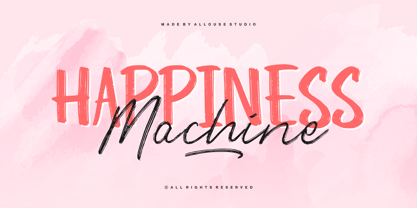 Proudly Presenting, Happiness Machine a cool Font Duo. Happiness Machine is perfect for any titles, logo, product packaging, branding project, megazine, social media, wedding, or just used to express words above the background. Happiness Machine come with alternates, underline style and also Multi-Lingual Support. We highly recommend using a program that supports OpenType features and Glyphs panels like many of Adobe apps and Corel Draw, so you can see and access all Glyph variations. Enjoy the font, feel free to comment or feedback, send me PM or email. Thank You!
 - Maiden Orange Pro by Stiggy & Sands,
$29.00 Our Maiden Orange Pro is a light and festive slab serif font inspired by custom hand lettered 1950's advertisements. Clean and legible, while also being offbeat and friendly, this font lends itself to a wide variety of uses. The SmallCaps and extensive figure sets offer a slightly more serious tone as well as a wider range of design use. Opentype features include: - SmallCaps. - Full set of Inferiors and Superiors for limitless fractions. - Tabular, Proportional, and Oldstyle figure sets (along with SmallCaps versions of the figures). - Stylistic Alternates for Caps to SmallCaps conversion.
 - Hand Stamped JNL by Jeff Levine,
$29.00Years before the many "modern" ways to creates signs and posters, the popular method was the rubber stamp printing set. Many of these sets used the classic DeVinne typeface, and were manufactured by at least a half dozen different companies. The "sign and chart printers" (as they were known) often consisted of both upper and lower case letters, numbers, punctuation, pointing hands and other symbols. "Hand Stamped JNL" puts all the fun of the rubber stamp printing set into an easy-to-use digital font with no messy ink spills or clean-up. - Neoncity by PandAE86,
$10.00 Neoncity is a bold and fresh display font with a vintage feel. Inspired by the flashing 80’s, it will add a distinct look to any design project. This font is perfectly used in larger type sizes, above 48 pt. Neoncity is perfect for a design that wants to imitate neon—use it in Photoshop, InDesign, Illustrator or Corel with color & blend effects, and its geometry also lends itself for signage, packaging, posters, branding, event invites, quote, blog posts, social media, and more! Thanks and have a wonderful day, Dedi T
 - Akira by IKIIKOWRK,
$19.00 Introducing Akira - Zenbrush Script, created by ikiiko. Calm brush script type, adapted from Japanese zen culture. Akira typeface uses firm lines with strong curves with lots of alternates & stylistic options to choose. This typeface is perfect for an elegant logo, poster design, beauty product, packaging product, community logo, magazine, quotes, or simply as a stylish text overlay to any background image. What's included? Uppercase & Lowercase Number & Punctuation Alternates & Stylistic Multilingual Support Enjoy our font and if you have any questions, you can contact us by email : ikiikowrk@gmail.com
 - Asly Brush by Artisan Studio,
$12.00 Asly Brush is the font style handmade dancing and then live trace to have Grungy brush and unique forms of calligraphy, the writing style is very natural. The Features of this fonts is: Standart ligatures Stylistic Alternates Stylistic sets PUA Unicode (Private Use Areas) Can be used for various purposes.such as headings, logos, wedding invitation, t-shirt, letterhead, signage, labels, news, posters, badges etc. To enable the OpenType Stylistic alternates, you need a program that supports OpenType features such as Adobe Illustrator CS, Adobe Indesign & CorelDraw X6-X7
 - Nadimo by Twinletter,
$12.00 Nadimo is an elegant, charming, and sensual sans serif font. Designed with subtle curves and flexible shapes to create a beautiful typeface that fits all your projects. Whether you’re looking for a typeface for a logo, t-shirt, poster, or even a large typography installation, Nadimo is here to help. Of course, your various design projects will be perfect and extraordinary if you use this font because this font comes with a font family, both for titles and subtitles and sentence text, start using our fonts for your extraordinary projects.


