10,000 search results
(0.023 seconds)
- Display Dots Two Serif by Gerald Gallo,
$20.00
- Mailbox Letters Two JNL by Jeff Levine,
$29.00 - Two Step Nouveau JNL by Jeff Levine,
$29.00
- MFC Franklin Corners Two by Monogram Fonts Co.,
$19.95
- Cheddar Gothic Sans Two by Adam Ladd,
$25.00 - Headline Helpers Two SG by Spiece Graphics,
$39.00
- HWT Bulletin Script Two by Hamilton Wood Type Collection,
$29.95
- MFC Arteaga Borders Two by Monogram Fonts Co.,
$19.95
- Two Cents Plain JNL by Jeff Levine,
$29.00
- Display Dots Two Sans by Gerald Gallo,
$20.00
- Varial Two Super Rounded by Paavola Type Studio,
$21.00
- MFC Bruce Corners Two by Monogram Fonts Co.,
$19.95
- Calligraphia Latina Versals Two by Intellecta Design,
$21.90 - Privilege Sign Two JNL by Jeff Levine,
$29.00
- Bodoni Classic Deco Two by Wiescher Design,
$39.50
- BAHAMAS TWO PERSONAL USE - Personal use only

- TT - Unknown license

- Block Tilt BRK - Unknown license

- Block Tilt (BRK) - Unknown license

- Dusk Till Dawn by Comicraft,
$19.00
- Sunrise Till Sunset by Comicraft,
$19.00
- OL Titling Deco Semi Hilight by Dennis Ortiz-Lopez,
$40.00 - SlabStruct Too - Unknown license

- Too Late - Unknown license

- Aklatanic TSO - Unknown license

- Teddybers Too - Personal use only

- TWT Prospero by Three Islands Press,
$24.00 - Too Much by Comicraft,
$19.00 - Baka Too by Positype,
$20.00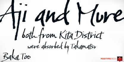
- FF Zwo by FontFont,
$68.99
- Doodles Too by Outside the Line,
$19.00
- TWT Pavane by Three Islands Press,
$29.00 - Dusk Til Dawn by Scholtz Fonts,
$19.95
- We Love Nature Stems Two by kapitza,
$85.00
- Antique Stencil Borders Two JNL by Jeff Levine,
$29.00
- PTF NORDIC Rnd - Unknown license

- PTF NORDIC Std - Unknown license

- GD-Digit13LED-OTF - Unknown license

- TPF Senseless Strokes - Unknown license

- GD-TiVangerionJA-OTF - Unknown license


