10,000 search results (0.015 seconds)
  1. KG Skinny Latte by Kimberly Geswein, $5.00
    This cute, slightly tall unicase handwriting has a slightly bubbly personality while still being completely legible and neat.
  2. Never Let Go by Kimberly Geswein, $5.00
    Natural, authentic cursive handwriting. Legible, yet imperfect.
  3. The Last Shuriken by Arterfak Project, $26.00
    Konichiwa! Introducing our brand new font "The Last Shuriken" a Japanese-style typeface. Inspired by modern Japanese food branding and anime title. Designed in a bold stroke, this font is an all-caps font that has the same cap height and different shapes. The Last Shuriken is perfect for display, especially for Japanese food, title, logo, poster, short quote, movie, games, apparel. Complete with stylistic alternates and PUA Encoded with multilingual support! Thank you. Ramz.
  4. Old Fat Boy by Gleb Guralnyk, $14.00
    Hello! Introducing a creative all caps font named Old Fat Boy. It's a vintage shape smooth typeface with authentique 90's style look. This font includes lots of multilingual characters (check out a screenshot with available letters and signs).
  5. Lord Rat AOE by Astigmatic, $19.95
    LordRat is a rugged unicase typestyle built for childish and off kilter purposes. A mix of heavy and light with quickcut appearance makes this typestyle offbeat and even festive. Put some dignified childish offbeat flavor into your designs today with LordRat. If you've been looking for a playful yet bold typestyle with papercut looks, LordRat is what you've been looking for. Get it today!
  6. Old English (Let) by ITC, $29.99
    Old English is a digital font that was produced by Monotype's design staff, circa 1990. But its roots go much further back: the face's design is based on that of Caslon Black, a Blackletter type cast by the venerable William Caslon foundry in England, circa 1760. This design has been popular throughout England for centuries. Its style of lettering, conveniently also called Old English, can be found all over the UK. Old English-style typefaces belong to the Blackletter category. They nicely combine the design attributes of both the medieval and Victorian eras. This is mostly because their Textura forms, which were born during the Middle Ages, became quite fashionable again in the late 1800s! This Old English font is very legible for a Blackletter face. Perhaps that is why it is more familiar to readers in the UK and North American than German Blackletter varieties, like Fraktur. A favorite once again today, Old English is ideal for certificates, diplomas, or any application which calls for the look of stateliness and authority. It's a sturdy and sure bet for newspaper banners, holiday greeting cards, and wedding announcements.
  7. Printers Lot JNL by Jeff Levine, $29.00
    Printers Lot JNL is another eclectic mix of cartoons, ornaments, catch words, decorations and embellishments re-drawn from vintage source material used in the days of letterpress printing. For those who like to assemble their own larger borders, a set of elements is on the 2-9 keystrokes, but it must be noted that some manual adjustment is necessary to line up all of the parts in a complete border pattern. From a Happy New Year greeting to whimsical cartoon characters; from singular ornamental design elements to beautiful brackets, this mix of subjects is a great overview of the kinds of cuts found in printers' job case drawers in years gone by.
  8. Cat e Poultry by Proportional Lime, $19.99
    Love them or hate them Cats are one of the most successful animals on the planet. If they had thumbs we would all be in trouble. Fortunately for us these four legged sharks have managed to domesticate us and we are able to coexist peacefully. So this font is to share the joy of being blessed with the presence of such noble animals be it those of the Pantherinae Felidae or the not so humble Felis Catus (Domestic Cat). Why the Turkey? Well... you will have to buy the font to find out.
  9. TMBG Severe Tire Damage - Unknown license
  10. Five And Dime NF by Nick's Fonts, $10.00
    A font with a strong architectural feel, inspired by those great commercial emporiums of a bygone era. To cap the crossbars, use [brackets] to enclose uppercase letters, {braces} to enclose lowercase letters, and the upright bar | between upper- and lowercase letters. Both versions of the font include 1252 Latin, 1250 CE (with localization for Romanian and Moldovan).
  11. LT Signage - 100% free
  12. LT Funk - 100% free
  13. LT Soul - 100% free
  14. LT Highlight - 100% free
  15. LT Yorkshire - 100% free
  16. LT Panneaux - 100% free
  17. LT Perfume - 100% free
  18. LT Novelty - 100% free
  19. La Babaca - Personal use only
  20. LT Diploma - 100% free
  21. LT Oksana - Personal use only
  22. LT Focus - 100% free
  23. LT Staircase - 100% free
  24. LT Starlight - 100% free
  25. LT Marathon - 100% free
  26. LT Hoop - 100% free
  27. LT Anomaly - 100% free
  28. LT Oksana - Personal use only
  29. La chata - 100% free
  30. LT Chickenhawk - Personal use only
  31. La Mamucha - Unknown license
  32. La Ment - Unknown license
  33. la fraktouille - Unknown license
  34. La Macchina by FontMesa, $20.00
    La Macchina is a bold script suitable for logos, letterheads & headlines. It also resembles the lettering used by Lamborghini Automobiles.
  35. Dom LT by Linotype, $29.99
    Dom Casual and Dom Diagonal are a set of informal script typefaces that look like brush writing. They were designed by Peter Dombrezian for American Type Founders in 1952 and were an immediate success. Use these typefaces to create a friendly, informal look in signs, advertising, and invitations.
  36. AT Orlando by Monotype, $29.99
    Orlando is the work of British designer Freda Sack. It is an all capital, outline typeface including a complete set of swash initials and an array of stunning flourishes designed especially for this typeface. Orlando was inspired by and modelled upon 19th century antique type styles.
  37. Las Enter by Mans Greback, $59.00
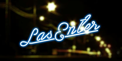
  38. Corona LT by Linotype, $29.99
    Corona was designed by C.H. Griffith and appeared with Mergenthaler Linotype in 1941. It is a part of Griffith’s Legibility Group’, on which he began working in 1922 and which contains typefaces especially well-suited to newsprint. Corona is based on forms of the Ionic type, perhaps the first style designed specifically for newspapers. The font is relatively small but gives an impression of strength and modernity.
  39. La Casa by URW Type Foundry, $35.99
    Font design meets architecture – the unique and architectural design of the urban villa “Dupli.Casa” by the architect J.Mayer.H triggered the inspiration for the typeface “La Casa”.
Inclinations and curvatures mirror the linear, modern impression of the architecture. The overall impression of the sans serif accounts for the great readability, even in lower point sizes – perfect for the design of books and magazines. The fresh and modern appearance of the font is particularly suitable for corporate designs of enterprises. The seven-font weights support more than 100 languages and the Cyrillic characters ensure a versatile and international use. The low contrast, the reduction of the corner points and the clear nature of the font make “La Casa” perfectly applicable as a web font.
  40. Excelsior LT by Linotype, $36.99
    Before designing this font, C.H. Griffith consulted the results of a survey of optometrists regarding optimal legibility. Excelsior was then presented by Mergenthaler Linotype in 1931 and remains one of the most legible and popular fonts worldwide.
Looking for more fonts? Check out our New, Sans, Script, Handwriting fonts or Categories
abstract fontscontact usprivacy policyweb font generator
Processing