7,952 search results
(0.063 seconds)
- Cleverda by Realtype,
$13.00 Cleverda Script is a beautiful hand painted script, organic, fun with dancing baseline and different ligatures. This fonts can be used for various purposes.such as headings, signature, logos, wedding invitation, t-shirt, letterhead, signage, labels, news, posters, badges etc.
 - Hardinge by Typefactory,
$14.00 Hardinge is born from an original and blackletter style font. It has a classic, vintage-style which is perfect for logos, branding materials, t-shirts, prints, business cards, and every other design which needs a unique and striking typeface.
 - Death Demon by Yoga Letter,
$15.00 "Death Demon" is a horror font that is very scary and full of mystery. This font is perfect for Halloween moments, movie titles, book titles, Halloween party invitations, and more. Equipped with uppercase, lowercase, numerals, punctuation, and multilingual support.
 - Marleen Script by Ingo,
$81.00 An authentic style of feminine handwriting with a pencil Who still writes by hand? And who still writes nicely? What constitutes beautiful handwriting anyway? In Marleen Script nearly 100 stylistic alternates for individual letters and more than 400 ligatures are included. With these options it is finally possible to convincingly simulate the effect of true handwriting with a typeface. So, the form of the single character seldom repeats itself since it is mostly replaced with a ligature; and, with each combination of characters the result is a slightly different form of the individual character. Type set in Marleen Script appears remarkably similar to a text actually handwritten with a pencil. The characters of Marleen Script have intentionally been digitalized as a bit loose and irregular. Stylistic alternates are available for many of the letters, some even with various alternates to choose from, in order to produce a font with a very lively appearance. This typeface also fills a completely different kind of gap: finally, a ”typically female“ font. Spirited capital letters, the tendency toward loops and the obvious inclination toward the left are all common characteristics of ”female scripts.“ The original for Marleen Script was created by Marleen Baumann from Augsburg in the spring of 2010 using a sharp pencil on rough handmade paper. In spite of irregularities, this font is aesthetical. Although most people rarely put forward an effort with their handwriting, in Marleen Script one can see the desire for an attractive form.
 - Frutiger Stones by Linotype,
$29.00In Adrian Frutiger, the discipline of a mathematically exact mind is joined with an unmistakable artistic sense. His independent work possesses the controllable language of letterforms. Personal and intensive, this work is the manifestation of his expressive will. Frutiger's precise sense of outline reveals itself two- or three-dimensionally in wood, stone, or bronze, on printing plates and in the form of reliefs. However, even his independent work can be understood as objectivized signs; in their symbolism, they are embedded in the fundamental questions of human existance. They might have developed in the spirit of playfulness, but their nature is always conceptual, directed towards a complex, yet harmonic, whole. Following function, form also necessarily follows the content of the language. The entire spiritual world becomes readable through letters. Essentially, Adrian Frutiger attempts to fathom the basic, central truth which defines our lives: change, growth, division - beginning and end. In a virtual synthesis, he seems to close the circle in which the world reflects itself in symbolic forms. Frutiger Stones is for Adrian Frutiger the example of his formal artistic sensibility par excellence. Searching for the fundamental elements in nature, he has discovered the pebble, rounded and polished over innumerable years by gently flowing water. And out of this, he has created his complete system, a ruralistic typeface of letters and symbols. It depicts animals and plants, as well as astrological and mythical signs. Because of its unique aura, Frutiger Stones is particularly well-suited to different purposes - in headlines and prominent pictograms, as symbol faces, illustrations, and more. - Jack Stanislav - Personal use only

- Libertatus Duas - Personal use only

- A Cuchillada - Personal use only

- Libertinas-co. - Personal use only

- Amaboxi by Scholtz Fonts,
$19.00In Amaboxi the upper-case letters are all placed upon a background inspired by the cardboard boxes that many people in Africa use to carry their possessions. The box takes its shape from the character and conversely, the character is influenced by the shape of the box. All characters except the six "fractions" are included in Amaboxi. It includes all upper and lower case letters as well as all numerals, punctuation, accented and special characters. All characters have been letter-spaced and kerned in terms of the box (not the character). This improves legibility, however, the inter-character spacing has been minimized so that there is often a very slight overlap between the boxes of adjacent characters. This generates an exciting and variable "white space" around the characters. - Linotype Notec by Linotype,
$29.99Franciszek Otto of Poland designed Linotype Notec in 1999. Linotype Notec is a low-tech" (or even "no tech!") typeface. By embracing handwriting's spontaneity, it has gotten as far away from technology as it can. Classified as an "inky"-style script face, for lack of a better term, Linotype Notec's informal design seems immediately artful and full of expression. Its irregularity and unexpectedness enlivens any composition, similar to how jazz or modern dance animate a room. Quite full of "ink," Linotype Notec's "strokes" are written in a sort of short-note-handwriting-style, which a slow-writing, thoughtful humanist might theoretically scribble to himself late at night. Yet Linotype Notec's character still maintains a jolt of energy; try Linotype Notec in small applications, in any size from 12-point on up." - Ninova by Fontuma,
$24.00 Ninova is a historical city that was the capital of the Assyrian Kingdom and its ruins are located within the borders of Iraq today. It is also known as the city where Prophet Jonah was sent. Ninova font family consists of fonts with aesthetic forms that appeal to human taste at the maximum level. Ninova font will more than meet the needs and expectations in terms of the glyphs it contains, the weights it has and the number of styles. This font includes two font families: Ninova: A family of fonts containing only the Latin scripts Ninova Pro: A family of fonts including Latin and Arabic scripts The Ninova font can be used for multiple purposes. It can also be used in the internet environment and operating systems along with printing areas.
 - Caballero by Fabio Godoy,
$29.95 Typographical Caballero is a family created by Fabio Eduardo Godoy Angel, the concept is inspired by a type with firm and clear, with perfect posture and personality to be used by Graphic Designers and Architects, in terms of print, TV Corporate Identity, Merchandising - Other Projects. Ideal for antetétulos, titles, subtitles, texts from 12 Pts. Caballero Outline and Caballero Outline Italic, are presented as an option for antetétulos, titles and subtitles as well as short texts from 20 Pts. Caballero in his presentation Outline, allows wide range of applications in regard to the use of color, and be combined with Caballero Regular and Caballero Italic. Font Project Caballero, is set with a vertical and horizontal logic calligraphic lines, amount of contrast medium, antlers mullet and its completions are straight.
 - Refinest by Nathatype,
$29.00 Whether for personal or professional purposes is absolutely needed to light up your result. Ignite the potential within you and elevate all your design performance with the Refinest. Refinest is an amazing serif font. While it certainly gets the job done in terms of readability, the unique characters give this particular font a more artistic vibe but still elegant than other serifs. Features: Alternates Ligatures Swashes Numerals and Punctuations PUA Encoded It can be used for many design projects, such as poster, logo, book cover, branding, heading, printed product, merchandise, quotes, social media campaign, etc. Learn more about how to use it by seeing the font preview. Thank you for purchasing our fonts. Please don’t hesitate to contact us, if you have any further question or issues. We’re happy to help. Happy Designing.
 - Marlino by Nathatype,
$25.00 Do you want to achieve more? Marlino makes your work got even easier. Marlino is a sans serif font family. It's simple, modern yet purposely function and definitely helps you achieve favorable design results. There are 8 different styles in this family. This variety in styles and character availability gives you some flexibility in terms of where and when you decide to use it. Features: Multilingual Supports Numerals and Punctuations PUA Encoded It can be used for many design projects, such as poster, logo, book cover, branding, heading, printed product, merchandise, quotes, social media campaign, etc. Learn more about how to use it by seeing the font preview. Thank you for purchasing our fonts. Please don’t hesitate to contact us, if you have any further question or issues. We’re happy to help. Happy Designing.
 - Gulitov by ParaType,
$25.00 Original type work designed in unconventional technique by type and graphic designer Yuri Gulitov. The shapes of signs were built up in a very specific routine. At the first stage signs were drawn on the black sheets of paper by the PVA adhesive, then a white sheets was placed above, and finally after some time the white sheets were torn off. The scraps of white paper presented the signs. Inverse style shows hypothetic result of tearing off the black sheets. The style together or separately can be used in display and advertizing works for demonstration of fight between the forces of good and evil or vice versa. Analog version of the font was awarded by diploma on Third International Biennale of Graphic Design “Golden Bee”. Digital version was released by ParaType in 2008.
 - Hollander by Linotype,
$29.99Hollander is a refined, yet sturdy text typeface designed by Gerard Unger. The name stems from the font’s similarity to the types attributed to van Dijk and Voskens, two Dutch punchcutters from the seventeenth century. Like those earlier Dutch types, Hollander has generous proportions, a tall x-height, and high contrast between thick and thin strokes. It was designed to work in the early arenas of digital technology, when letters were generated as coarse pixels with a cathode ray tube in the typesetters of the 1970s, and then as finer pixels with a laser beam in the machines of the 1980s. Hollander has a well-drawn stability that maintains legibility even on inferior quality paper. When used as a display face, Hollander is an excellent companion to one of Unger’s most successful text faces, Swift. - Ongunkan Khazar Rovas A by Runic World Tamgacı,
$50.00 Khazar, member of a confederation of Turkic-speaking tribes that in the late 6th century CE established a major commercial empire covering the southeastern section of modern European Russia. Although the origin of the term Khazar and the early history of the Khazar people are obscure, it is fairly certain that the Khazars were originally located in the northern Caucasus region and were part of the western Turkic empire (in Turkistan). The Khazars were in contact with the Persians in the mid-6th century CE, and they aided the Byzantine emperor Heraclius (reigned 610–641) in his campaign against the Persians. Although the Khazar Empire had a secular administrative structure, the administrative staff chose the Jewish religion. The Khazars are the only Turkish state that converted to Judaism.
 - Mesca by S6 Foundry,
$39.00 Mesca is a distinctive multi-language font with characters (Latin, Greek, Cyrillic) for industry and digital, with elegant, high-quality typographic responses to the complex technological needs for different media and digital uniforms: TV screens, computers, and mobile phones, smartwatches also editorial fields such as print or digital magazines, books. Furthermore, its multifunctional character goes far beyond editorial and digital use. It promises great performance in terms of branding, advertising, signage, mobile app, etc. Mesca is a contemporary humanist sans-serif font with a generous x-height and slightly condensed proportions. Which offers a combination of good readability and space-saving. Built on rational lines of pure geometry, which presents a notable inclination in the terminals of the letters with external and internal acute angles that create a strong contrast.
 - Stoutface SC - Personal use only

- BIG Slant Black UltExp - Personal use only

- Biotrip - Personal use only

- Biotrip Serif - Personal use only

- Biotrip Caps - Personal use only

- Gravesend Sans by Device,
$39.00 Smart, legible and elegant, Gravesend Sans is a based on the unique typeface used for the iconic grass-green signage for the Southern Railway. In existence from 1923 to 1948, when the network was nationalised, the Southern Railway linked London with the Channel ports, South West England, the South coast resorts and Kent. The same design was also used for the ‘hawkeye’ signs on the London, Midland and Scottish Railway, differentiated by black letters on a yellow background. Reference for each letter was taken from vintage ‘target’ station nameplates and other platform signage. The rarest letters were the Q, seen in Queens Road Battersea, the X, seen in East Brixton, and the Z, used in Maze Hill, site of an infamous train crash in 1958. Being hand-made, the letters often differ in width and thickness. There was no lower case. The Bluebell Railway, a heritage steam line, runs over part of the old Southern Railway network and uses a very similar type. The design of the numbers differed considerably, but here have been taken from the Device 112 Hours font Smokebox. As well identifying platforms, they were used on the front of the steam engine’s smokebox, hence the name, and stylistically are more in keeping with the letters than some of the squarer versions that can be seen in old photographs. William Caslon IV is credited with the first Latin sans-serif type, shown in a 1816 Caslon specimen book. ‘Two Lines English Egyptian’, as it was called, was caps-only, and there are several other correlations between that type design and this one. Includes a selection of authentic arrows and manicules, plus abbreviated ligatures such as ‘St.’ (Saint or Street) ‘Rd.’ (Road) and ‘Jn.’ (Junction). The Cameo version includes many graphic banner elements that can be freely combined.
 - Celtic Monograms by Kaer,
$24.00 Here is my next Celtic Monograms font family. I used a lot of authentic knots and curves to imitate Insular art style. The term derives from insula, the Latin term for “island” in this period Britain and Ireland shared a largely common style different from that of the rest of Europe. I've drawn sketches set, manually vectorized it and assemble the font family. In an attempt to replicate the intricate patterns found in Celtic art, I endeavored to create a design that embodied the essence of true Celtic knot work. The interweaving lines, which were prominent motifs in Celtic art prior to the arrival of Christian influence around 450, served as the foundation for my creation. Over time, these designs seamlessly integrated into early Christian manuscripts and artwork, incorporating depictions of various elements from everyday life, including animals, plants, and even human figures. In the beginning, the patterns were intricate interwoven cords, called plaits. This particular style is often linked to the Celtic regions, but it was also widely embraced in England and spread throughout Europe through the efforts of Irish and Northumbrian monks. The utilization of the Celtic knot as a tattoo design gained popularity during the 1970s and 1980s in the United States. Consequently, it has proven to be a highly advantageous font choice for various applications such as posters, banners, and sportswear. You can also create a vintage color shift effect. Please note, you should use graphic applications such as Adobe Illustrator or Photoshop, but not Microsoft Word. All you need is put Two or Three lines style initial on the top of Back style. I’m happy to present you the Rough, Two lines, Three lines, and Back styles for your design. You’ll get uppercase and numbers set. Thank you!
 - Comic Sans by Microsoft Corporation,
$49.00The Comic Sans® typeface, one of Microsoft's most popular designs, has received a makeover courtesy of Monotype Imaging. The company has introduced the four-font Comic Sans Pro family of typefaces. Featuring elements such as speech bubbles and cartoon dingbats, Comic Sans Pro extends the versatility of the original Comic Sans, designed by Vincent Connare for Microsoft in 1994. Hats off to Monotype Imaging for enlivening Comic Sans and getting it back to its roots as a comic book lettering face. Now everyone can write with more panache - and look even more like a pro using swashes, small caps and other typographic embellishments," said Connare. "Every day, millions of people rely on Comic Sans for countless applications ranging from scrapbooking to school projects," said Allan Haley, director of words and letters at Monotype Imaging. "Comic Sans is also a favorite in professional environments, used in medical information, instructions, ambulance signage, college exams, corporate mission statements and executive reprimands - even public letters from sports team owners to their fans. Breaking up with your spouse? Why not write a letter in Comic Sans Pro, embellished with a typographic whack!, pow! or bam! Comic Sans is everywhere, and now it's even better." The Comic Sans Pro family includes regular and bold fonts, in addition to two new italic and bold italic fonts drawn by Monotype Imaging's Terrance Weinzierl. "Our aim is to put the 'fun' back in 'functional.' We can't wait to see Comic Sans Pro used in everything from second wedding announcements to warning labels," said Weinzierl. "Long live Comic Sans!" Comic Sans Pro contains a versatile range of typographic features including swashes, small caps, ornaments, old style figures and stylistic alternates - all supported by the OpenType® font format. OpenType-savvy applications, such as Adobe® Creative Suite®, QuarkXPress® or Mellel™ software are required to access these features. Comic Sans Pro can also be used in new versions of Microsoft® Office including Microsoft Word 2010 and Microsoft Publisher 2010. In addition, Comic Sans Pro includes a set of ornaments and symbols, including speech bubbles, onomatopoeia and dingbats, pre-sized to work well as bullets." - Dirt2 SoulStalker - Personal use only

- Overline Stencil by WAP Type,
$15.00 Overline Stencil font is perfect for your up coming projects. Such as logo branding, editorial design, fashion, stationery design, sport design, blog design, modern advertising design, card invitation, art quote, home decor, book/cover title, special events and any more.
 - Arthouse Display Pro by FHFont,
$19.00 Arthouse is a display font with a vintage style. It includes OpenType features such as standard ligatures, discretionary ligatures, stylistic sets, decorative elements, and is suitable for various designs, and weddings, events, t-shirts, logos, badges, stickers, and awesome work.
 - Quintton by TypoBureau Studio,
$15.00 Quintton script is a casual clean brush stroke font, perfect for logo design, branding, invitations, t-shirts print, mock up, magazines, signage and so much more. With its handmade feel, Quintton is perfect for your upcoming projects so don't miss out.
 - Diane Amorta by Grezline Studio,
$10.00 Diane Amorta is a cute handdrawn sans serif font crafted very carefully. Diane Amorta is perfect use for a logo for branding, typography design, product packaging, invitation, quotes, t-shirt design, label poster, special events and anything that need handwriting taste.
 - Ft Thyson by Fateh.Lab,
$30.00 FT Thyson is a powerful and elegant display typeface. can be used to present your ideas in sports/fitness or editorials, Its weight is superior in posters, social media, headlines, titles, large format print - and wherever you want to be noticed.
 - Stencil Army by WAP Type,
$15.00 stencil army font is perfect for your up coming projects. Such as logo branding, editorial design, fashion, stationery design, sport design, blog design, modern advertising design, card invitation, art quote, home decor, book/cover title, special events and any more.
 - TXT Monique by Illustration Ink,
$3.00Customize your lettering project with this cool and clever font. Download it for fanciful journaling on scrapbook pages and greeting cards. Try it on Halloween party invitations or wherever you might want to add a whimsical touch to a unique publication. - Regisa by Haniefart,
$17.00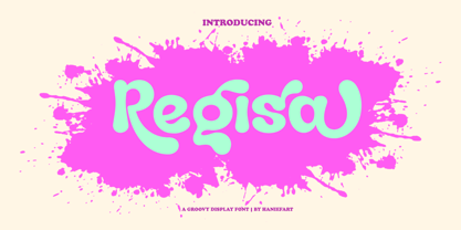 Regisa is a handcrafted typeface, inspired by water drops, coming in uppercase, lowercase, ligature and alternate. You can really make Regisa feel personalized for your client's project. Regisa is suitable for business brands, magazines, comics, T-shirts, banners and many others.
 - 21 Emmerson by Deniart Systems,
$20.00 A bit grungy, a bit stern, 21 Emmerson is a tribute to my birthplace and was designed with punky headline posters in mind. The simple lines of this font are angular and sharp - great for party posters, invitations, labels, etc.
 - Abine by Olexstudio,
$16.00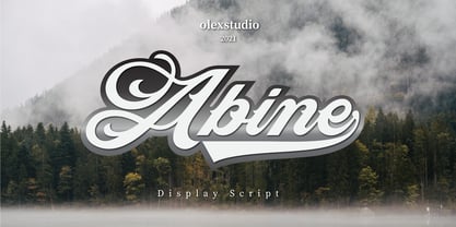 Abine - Display Script will look gorgeous on all your designs, invitation, poster design, book design, branding materials, logo's, t-shirt and all project design other. Abine - Display Script contains standard characters, Uppercase, Lowercase, Swashes, numbers, punctuation, ligatures and international glyphs
 - CaliCholo by Graffiti Fonts,
$19.99The CaliCholo font is inspired by the wide array of Chicano styles seen on the bay area and southern California streets. This simple representation is natural & rough in emulation of hand written letters using spray paint. Two alphabets, numbers, symbols. - Dark Graffiti by Yoga Letter,
$20.00 "Dark Graffiti" is a very elegant and unique graffiti font. This font is equipped with uppercase, lowercase, numerals, punctuation, and multilingual support. It is very suitable for painting street walls, designing t-shirts, jackets, logos, stickers, tattoos, bag designs, and others.


