10,000 search results
(0.701 seconds)
- Jazzfest NF by Nick's Fonts,
$10.00Based on the 1932 typeface Newport, designed by Willard T. Sniffin for ATF, this Art Deco standard packs a lot into multi-line heads and subheads due to its very short descenders, cleverly accomplished by “fudging the baseline” on the g, p, q, and y. All versions of this font include the Unicode 1250 Central European character set in addition to the standard Unicode 1252 Latin set. - Asie - Unknown license

- Garcon - Unknown license

- MFC Vice Monogram by Monogram Fonts Co.,
$19.95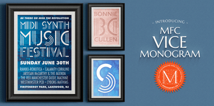 The source of inspiration for Vice Monogram is an Art Deco letterset (capitals only) from a 1915 publication by Cartier-Bresson of Paris containing classic and modern monogram patterns for embroidery. This Art Deco monogram style has been redrawn, balanced, and brought into the digital age for your type-setting use and enjoyment. Vice Monogram can create one-, two-, or three-letter monograms as well as basic headline and titling settings. By default, Vice Monogram types in a horizontal format, but by utilizing Opentype Contextual Alternates, you can typeset in a three smallcap or smallcap-Capital-smallcap diagonal format as well! It is a refined vintage look that is perfect for a wide array of classic personalization settings. Download and view the MFC Vice Monogram Guidebook if you would like to learn a little more.
 - PGF Elyss Sans by PeGGO Fonts,
$29.00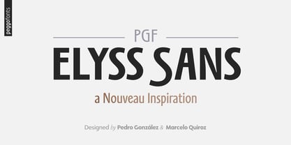 To see more technical details download PDF specimen document: https://peggofonts.com/pdf/PGF-Elyss-Sans_%28Specimen-2023%29.pdf PGF Elyss Sans is based on its previous family relative PGF Elyss Roman. With clean and modern lines, but preserving the original Roman style, created to be in labels, invitation, website design, digital graphics, book headlines & titles, brochures, newspaper and magazines design, logotypes, branding and corporate design and much more. In seven weights with more than 900 glyphs each, and ready for more than 200 languages. Including: Standard and Discretionary Ligatures Contextual Alternates Scientific and fractional forms Lining, OldStyle and Tabular figures (Numerals, Mathematical operators and Currency Symbols) SmallCaps (alphabet, numerals and symbols) Social Network & Letter alike symbols Localized language customization (for Azeri, Crimean Tatar, Tatar, Kazakh German, Dutch, Polish, Catalan, Romanian, Moldavian and Turkish)
 - Rocking the Kasbah NF by Nick's Fonts,
$10.00This lively script is based on a handlettered offering from The Hunt Brothers, which they called simply "Ornamental Italic". Ornamental, yes, but there’s also a lot of action and attitude in this typeface. Please note that, due to the extreme slant of the characters, spacing in the font has been optimized for upper- and lowercase use. Both versions of this font contain complete Unicode 1252 (Latin) and Unicode 1250 (Central European) character sets, with localization for Romanian and Moldovan. - Ballyhaunis NF by Nick's Fonts,
$10.00Lewis F. Day, in his 1910 classic Alphabets Old and New, filed this work by Laurence Schall under the category of Celtic-inspired, and surely it is both. This font included a few special extras, including a Celtic cross in the florin position, a Celtic knot is the dagger position, a shamrock as the asterisk, and a double shamrock in the double-dagger position. Both versions of this font include the Latin 1252 and Central European 1250 character sets. - Welo Casual NF by Nick's Fonts,
$10.00Another tip of the hat to master draftsman Samuel Welo. His famous Studio Handbook was hand-lettered throughout, and provided the inspirations for many of Nick's favorite fonts. This little number is based on the unnamed style Mr. Welo used for much of his paragraph text. Use it when you want to convey homespun warmth and a handmade feel. Both versions of this font include the complete Unicode Latin 1252, Central European 1250 and Turkish 1254 character sets. - Snoodle Toons NF by Nick's Fonts,
$10.00Lettering on a menu from a Pennsylvania hotel, circa 1930, provided the inspiration for this happy-go-lucky take on the alphabet. Lowercase letters are variants of the uppercase and kerning has been applied to every possible letter combination, so feel free to double-clutch the shift key to create a truly handlettered feel with this font. Both versions of this font include the complete Latin 1252 and CE 1250 character sets, with localization for Romanian and Moldovan. - Vasari NF by Nick's Fonts,
$10.00The pattern for this font was found in the 1906 specimen book for the Keystone Type Foundry under the name Ancient Gothic, which is a pretty accurate description of the particular appeal of this typeface. Use it liberally anytime you want to add an air of mystery or menace...or simply some quaint charm. Both versions of the font include complete Latin 1252, Central European 1250 and Turkish 1524 character sets, with localization for Moldovan, Romanian and Turkish. - Foda Sans by Fo Da,
$25.00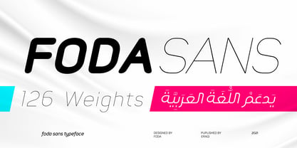 FodaSans typeface is a Multi-language font family for a wide range of uses, comes with 126 weights with 463 glyph for each weight, supports Latin and Arabic language and covers OpenType features like Glyph Composition / Decomposition, Kerning, Standard Ligatures, Mark Positioning .. and more. The Typeface Have 6 Styles (Normal, Curved, Rounded, Solid, Solid Curved, Solid Rounded) with their obliques and italics ranging from Extra light to Black. Thank you for choosing FodaSans fonts from Fo Da Foundry.
 - Ziggy Stardust NF by Nick's Fonts,
$10.00Sheet music from the 1921 edition of the Ziegfeld Follies provided the blueprint for this sparkly, sprightly font. Upper and lowercase characters are identical, with the exception of the letter s, which offers a version of the letter with a big caboose rather than an overbite. Named for David Bowie’s 1972 breakthrough album. Both versions of this font contain the Unicode 1252 (Latin) and Unicode 1250 (Central European) character sets, with localization for Romanian and Moldovan. - Fucha by Oliveira 37,
$20.00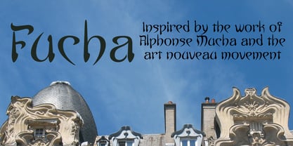 Fucha is a typography inspired by the Art Nouveau movement, and by the lettering of Alphonse Mucha's posters. Fucha is a decorative display font in the Art Nouveau style that originated over a century ago. The style showcases in its elaborate, lightweight curves a bold approach to organic lines and luxurious decor. A complete repertoire of Latin Extended-A characters is contained in the font. Supporting 219 Latin languages, which are spoken in different 212 countries.
 - Marathon by Linotype,
$29.99Marathon was originally designed by Rudolf Koch in 1931 for Schriftgiesserei Klingspor. It is a roman with short ascenders and descenders. The serifs are small, but longer at the ends of the arms of E, F and L, M is rather splayed and is without top serifs, like M in other typefeaces designed by Rudolf Koch. The lowercase g has no link and an open tail, again like the g in other Koch types. U has the lower-case design. In the W the middle strokes cross, the lower case w has no middle serif. The figures are short-ranging. Ute Harder from the Fachhochschule Hamburg had redesigned Marathon with the help and supervision of Professor Jovica Veljovic. She has added a book weight to offer more flexibility with this beautiful typeface. - Bommer Sans by dooType,
$30.00Bommer Sans is a warm and friendly type with a distinguishable look. It has been designed to add our twist to the flavour of English humanistic sans serif typefaces. Bommer Sans works like a charm for editorial, headlining, exhibition, signage and wayfinding projects. The big x-height and ascenders close to cap height favor tighter interlinear spacing. The ‘Q’ tail, resting on the baseline, is an invitation to play vertical, stacking lines of caps. Curved strokes on the ‘i’, ‘k’, ‘l’, ‘K’ and ‘R’ bring a friendly touch without compromising the sturdy structure, a marked characteristic of the design of the figure set. With seven weights in the upright and its matching italics, Bommer Sans has 14 styles and is part of the Bommer family. Check Bommer Slab for a great companion! - Preface by Shinntype,
$39.00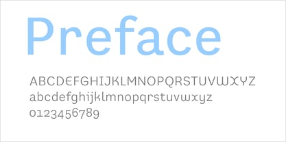 Preface vs. Helvetica/Futura/Gill: a different strategy of text color. Whereas the established classes of sans serif typeface achieve a dynamic balance between stroke and space by combining a diversity of letterform with an evenness of fit, Preface switches the emphasis, driving out diagonals to create a dominant harmony of curves and perpendiculars, matched with a greater variety of inter-character space shapes—the result of extra width introduced in the “f” and “t”, and by the openness that accompanies the wide tails of the “ a” and “l”, the long ear of the “r”, and the serif of the “i”. En masse, and in keeping with the present trend in typography, Preface exhibits a coarser texture than the traditional sans serif faces, but one that is nonetheless even and precise. With tabular, oldstyle figures.
 - CMC7 - Unknown license

- Geefium Serif - Personal use only

- Kremlin Soviet - 100% free

- Vauxhall NF by Nick's Fonts,
$10.00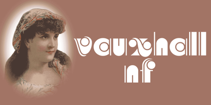 Get your groove on with this trippy little gem, based on a Fotostar face called Angelica. Not for the faint of heart. Both versions support the Latin 1252, Central European 1250, Turkish 1254 and Baltic 1257 codepages
 - Camelopard NF by Nick's Fonts,
$10.00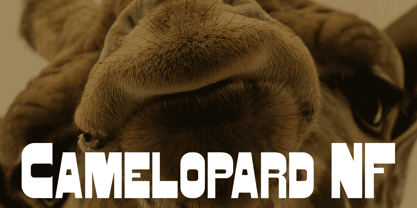 A wooden face, rather prosaically named Gothic Bold, from Hamilton's 1889 specimen book provided the pattern for this bold and brassy face. Both versions support the Latin 1252, Central European 1250, Turkish 1254 and Baltic 1257 codepages.
 - Morticia NF by Nick's Fonts,
$10.00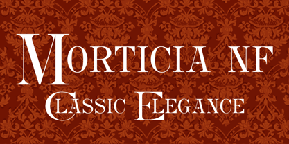 From Mortised to Morticia, this quaint titling face will add antique charm and a bit of drama to any project it graces. Both versions support the Latin 1252, Central European 1250, Turkish 1254 and Baltic 1257 codepages.
 - Droobie NF by Nick's Fonts,
$10.00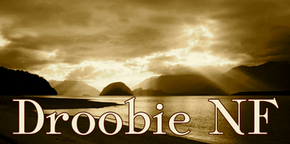 An offering from the 1910 specimen book from Inland Type Foundry, originally called Drew, provided the pattern for this engaging little face. Both versions support the Latin 1252, Central European 1250, Turkish 1254 and Baltic 1257 codepages.
 - HongKong - Unknown license

- Jellyka CuttyCupcakes - Personal use only

- Hatter Display Pro by RodrigoTypo,
$35.00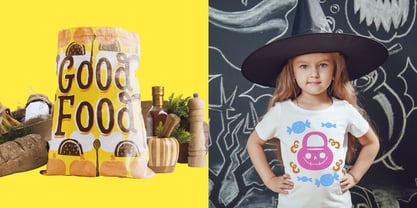 This is the most complete and final version of Hatter, it contains more than 12 fonts, among them it contains Cyrillic, Swash, Alternatives, Dingbats, Ornaments, all to make an entertaining graphic.
 - Basel Neue by Isaco Type,
$30.00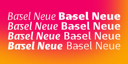 Basel Neue is the complete redesign of BaselSans ITD font, the first typeface of Isaco Type foundry, launched in 2009. As with the predecessor version, Basel Neue is a legible and discrete typeface, a sans serif with thickness variation and humanistic touch. The family consists of 8 styles, 4 weights plus their respective italic versions. Download the “OT Features” pdf to know and take advantage of all font features as best as possible (in OpenType-savvy applications)! You can also view all symbols in the glyph panel of your program, or in Character Map tool (Win) or Character Viewer/Palette (Mac). 1) Basel Neue has ligatures strategically chosen. Herbert S. Zim, in the book “Codes and secret writing”, elected the most common letter pairs of English, that in the Basel Neue became discretionary ligatures. And, of course, it also has standard ligatures. 2) It’s a fun typeface. Basel Neue has a set of emoticons and fun symbols that can be activated by discretionary ligatures. Type “:-)” and a smileface appears. Type “8-)” and a smiley with glasses appears. Type “ ”, “ ” and “ ” and a telephone, star and heart appears. Or “ ”... and a graceful corresponding symbol will appear. 3) Basel Neue contains lots of useful glyphs and features. All versions have 12 recycling symbols, 7 to different types of plastic, and over 30 currency symbols. It also has fractions, old style-, lining-, tabular numbers and other OpenType features. 4) It has an organized and large character set. The fonts have extended character set to support CE, Baltic, Turkish as well as Western European languages. If you work with languages like Catalan, German, Croatian, Romanian, Dutch, Turkish, for example, the font will use the correct ligatures or characters used in these languages. 5) It’s rigorously tested. Basel Neue is available in OpenType PS e TT flavors and each version undergoes a battery of tests, with a systematic review of nodes, curves, spacing and internal data. This eliminates the possibility of errors in the font.
 - Octavus is a retro-futuristic, technological, wide and slanted typeface , with a 32-degree slant that gives it an unmistakable dynamism and bold minimalism. This is a robust and bold typeface ...
- Oxona Caps is a revamped and streamlined version of the Oxona family , preserving the essence of its predecessor. It is a capital letter and small caps typeface that redefines legibility and visual ...
- BIG Slant, with a decisive 16° slant, brings speed, contemporaneity, and an unmistakable look —as its name suggests, enormous, because with just three letters, it says more than others in a full lin...
- I am Monotonous - Unknown license

- Corsa Grotesk by Typedepot,
$39.00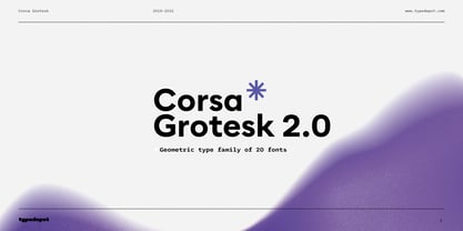 Corsa Grotesk is our very own tribute to two typographic giants: the Futura and Avenir typefaces. It is Designed with geometric simplicity in mind with well balanced strokes and modern touch. Generous proportions and x-height with more contemporary details - the single story ‘a’ and the horizontally barred ‘k’ being just two of many examples makes it shine in every jobs it takes. Corsa Grotesk blends the classic geometric aesthetics into a well-balanced font with generous proportions and minimal contrast. It features 10 weights ranging from Hairline to Black plus matching italics, as well as Cyrillic support for Bulgarian and Russian localizations. Filled with all the essential OpenType features like tabular figures, fractions, ligatures etc, it is a great choice for branding, advertising, user interfaces or any text that needs a bit of polish and a slick, present-day look that still feels familiar. With its 2.0 version we managed to polish the font even more. We revisited every path and fixed all the inaccuracies throughout. Corsa Grotesk now comes with way better and consistent spacing and kerning, just the right amount of contrast and balance. Live Tester | Download Demo Fonts | Subscribe
 - Sutro Shaded by Parkinson,
$25.00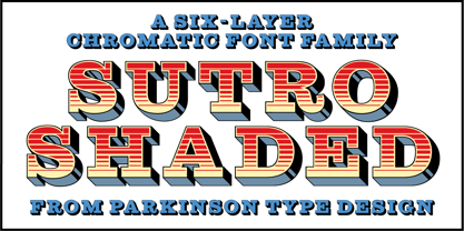 My affection for Slab Serifs began in the early 1960s in Kansas City when Rob Roy Kelly was at the Kansas City Art Institute, teaching and writing his book on American Wood Type. I got to know him just well enough to gain access to his fabulous collection of wood type and wood type catalogs. Later, in the1970s, I tried to re-create a Nebiolo Egiziano for Roger Black at New West magazine. And again for Roger, in the 1980s, I designed a Slab Serif logo for Newsweek Magazine. Finally, in 2003, designed the Sutro Family. There were things I didn't like about it, so, over time, I’ve been adding some things and dressing it up a little. Sutro Shaded has existed for a few years as a one color, outlined, drop-shadowed display font. It seemed like it was just dying for a little color. I added five more fonts: Fill, Gradient, Hatching, Rules and HiLite. These fonts can be used in different combinations to achieve various effects. There is a downloadable SUTRO SHADED USER MANUAL PDF in the Gallery section for this family.
 - Neo Latina by deFharo,
$12.00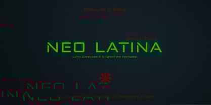 Neo Latina is a classic sans serif typography in small caps of square proportions and rectilinear character with the ends of the rounded horns and a semi-stencil design that gives a futuristic aspect and of science fiction. Neo Latina is the right heiress of geometric fonts from the early 20th century inspired by the Bauhaus school and is specially designed for use in any size for both screen and print. Neo Latina is a very versatile typography for graphic design, you can use it in advertising posters, video games, film titles, logos, editorial design, etc. The Commercial version includes: - Two fonts: Regular & Bold - 460 glyphs. Latin Extended-A • OTF & TTF - Neo Latina fonts can be used unlimited for both Commercial and Personal projects. - The download file includes a PDF with the specimen sheet of typography. - OpenType features compatible with: Photoshop, Illustrator, QuarkXpress, Indesign. - OpenType Features: Subscript, Additional languages, Alternate Annotation Forms, Capital Spacing, Denominators, All Alternates, Oldstyle Figures, Superscript, Superiors, Superior letters, Standard Ligatures, Kerning, Extended Fractions, Small Capitals, Historical Forms, Inferiors, Fractions, Localized Forms, Numerators, Ordinals, Discretionary Ligatures, Scientific Inferiors, Slashed Zero. - Bitcoin & Chaos symbol: b# - a#(ligatures)
 - Pristine Pro Slab by AZCRTV Studio,
$23.00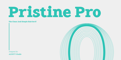 Meet Pristine Pro, the epitome of elegance and precision in typography. This Slab Serif font, meticulously developed with a humanistic touch, promises unparalleled sophistication for your projects. Its 18 versatile font families, ranging from Thin to Black, offer a tailored solution for every design need. Explore the seamless blend of clean lines and firm structure that defines Pristine Pro. This font isn't just a typeface; it's a statement of modernity and style. With support for 89 international languages, including English, French, Spanish, and German, Pristine Pro caters to a global audience, ensuring your designs communicate effectively worldwide. Desire perfection in your designs? Pristine Pro delivers. Craft compelling branding, striking posters, or editorial layouts with confidence. Its immaculate precision and extensive language support empower your creativity. Your desire for flawlessness finds its match in Pristine Pro, promising visuals that captivate, leaving a lasting impression on any audience. Ready to elevate your designs? Take action now. Download Pristine Pro and witness your creativity flourish. Unleash the power of clean Slab Serif typography with international appeal. Dominate the digital space, ensuring your projects rank high and capture attention. Seize this opportunity and transform your designs into timeless masterpieces.
 - Kon Tiki Aloha JF by Jukebox Collection,
$36.99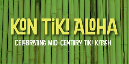 Kon Tiki Aloha is a font that celebrates the design style of mid 20th Century Hawaiian kitsch. This font was inspired by the ad poster of a popular 1960s Hawaiian themed attraction, and contains 120 alternate interlocking ligatures to give it a Polynesian feel. The ligatures can be found under the Discretionary Ligatures OT feature or added from the glyph palette. Jukebox fonts are available in OpenType .otf format and all fonts contain basic OpenType features as well as support for Latin-based and most Eastern European languages.
 - Resolve Sans by Fenotype,
$20.00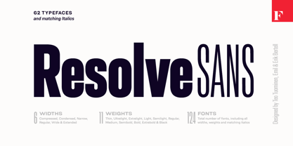 One font family to cover it all. Resolve Sans is an extensive super family of 124 fonts: from compressed to extended, thin to black. Resolve Sans perfectly balances a universally neutral appeal with a distinct level of sophistication. Effortless to adapt to any contexts of use, Resolve Sans is both a workhorse and a display font with impact and flair. As expected, all Resolve Sans fonts come with clever Open Type features such as built-in small capitals and multiple numeral styles. Gladly use it for everything, all day, everyday.
 - Barn Owl by astroluxtype,
$20.00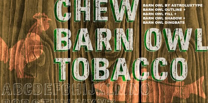 Vintage, country, distressed or just plain worn out. The Texas general store on the side of the highway that has been there since 1954 and they're still selling old fashion bottled soda. A renovation/excavation at a downtown urban construction site reveals the old ad on exterior brick. Barn Owl provides the headline in your project with the ultimate in aged retro visualization. It is a basic minimal font set which includes only uppercase letterforms. It is a headline font best used above 36 points in size. The first of our “Trifonictype” (Tin Sign is the 2nd) there are three components to the font, Barn Owl Outline, Barn Owl Fill and Barn Owl Shadow. These can be used in different combinations for different effects, copy and paste type then indicate a different font each time. Paste in the front or back in application to see effects in combination. Fill and Shadow could be used with irregular letter spacing for various effects. Outline could be used with just Shadow for a another effect. Use your photo manipulation program to overlay and change the transparency of your headline. There are a few extended glyphs and barn(ding)bats in the lowercase letter strokes indicated in a poster sample, these are found only in the Barn Owl Outline. Download PDF manual for complete showing.
 - Plethora by Sudtipos,
$49.00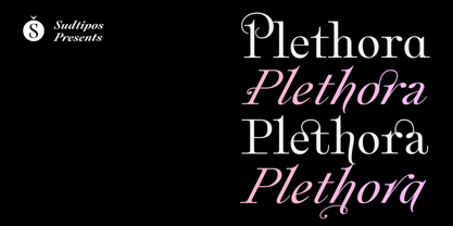 A few years ago I've discovered the work of one of the most prolific typeface designers of the Bruce type Foundry in NYC during late nineteenth century. Browsing Julius Herriet's work I found a very unique kind of ligatures in his patented "Old Style Ornamented" type design. Some letters were designed with a little top tail that allowed them to connect to each other. After that, I found that he also designed a single italic weight of the same font 7 years later. Since the beginning of the Opentype days I’ve been deeply obsessed with exploring different ways to build ligatures, so that lead me up to this point where I felt the need to create “Plethora”, this new font inspired by Herriet’s work. Extrapolating weights, adding variable technology and playing with additional interconnected letters and alternates. Definitely, Plethora means a large or excessive amount of something, and this font tries to bring back this abundance of details two centuries later. Available in 9 weights, from roman to italic, and also as variable format, “Plethora” supports plenty of latin languages and is a perfect choice for today’s design tides.
 - Top Speed - Unknown license


