2,171 search results
(0.036 seconds)
- Quietism by Michael Rafailyk,
$20.00 A smooth contemplative Antiqua with aspiring to the sky ascenders, inspired by the Quietism philosophy. Clarity of the mind is achieved by bringing the body into a state of calm and contemplation, and this is reflected in the design – the quiet horizontal serifs (body) are opposed to the peaky soaring ascenders (mind). The design also features four optical size subfamilies with different x-height and contrast, oldstyle diagonal stress, oldstyle figures by default, smooth details and slightly dark texture. Video about the Quietism typeface concept: https://www.youtube.com/watch?v=gBqkROHMEAc Scripts: Latin, Greek, Cyrillic. Languages: 480+. The complete list of supported languages: michaelrafailyk.com/quietism The promo images used illustration of Ola Rafailyk, paintings of Pieter Bruegel the Elder and Tom Roberts, photos of Boys in Bristol Photography and Ken Cheung from Pexels, and photo of Rodin's The Thinker at the Musée Rodin.
 - Letterhythm by Letterhythm Studio,
$30.00 Letterhythm is a modern, contemporary handcrafted blackletter typeface made with experienced by the hand of Dhiya Roslan. The style was influenced by Old School Blackletter Calligraphy Script culture, Fraktur style, and with an extra touch of urban street attitude of Calligraffiti (Calligraphy+Graffiti). The letterform took years of practices to finally made it into digital format. Letterhythm is a very flexible font for almost anything from merchandise, logo, branding, artwork, title, sub-title, body text, tattoo arts, apparels to infinity and beyond. Letterhyhm is a timeless typeface that suits and fit perfectly in any timeframe or style you want. It comes with Multilingual Support for most Latin alphabet's languages derived with 3 unique font styles that made a total of 220 glyphs each style to complete the typeface including ligatures, alternates and all necessary symbols & punctuations.
 - Escritura by Vanarchiv,
$30.00 The handwriting typeface Escritura was created for editorial purposes and the letter forms are influenced by chancery handwriting from the Italian Renaissance. The asymmetrical shapes of the undulating serifs cause the characters to have a large aperture. Originally designed for display sizes, the typeface also comes in a text version for small sizes. With taller vertical proportions, the text version has slightly longer serifs and increased white space between the characters to optimize legibility in small sizes. Ascenders and descenders and serifs are shorter in the display version, which has more economical letter spacing resulting in a visually compact text image. The stress in the letter strokes create changing widths according to their direction, improving the calligraphic rhythm in the characters. The oblique crossbar as well as other typographic details lend the typeface that typical Renaissance atmosphere.
 - Ovink by The Northern Block,
$30.36 Ovink is a rounded type family designed for great distance legibility. Named after the legibility researcher Gerrit Willem Ovink, in its early stages was subjected to experimental legibilty investigations of distance and time threshold methods. The results of this heavily influence the design. The high regularity of the letters also makes the typeface suitable for running text and the wide span of weights motivates a broad usage for the setting of both display and text. Ovink is also loosely inspired by Knud V. Engelhardt’s work for the street signage, designed around the years 1926-27 for Gentofte in Denmark. Being rooted in the Danish typography tradition, Ovink has a sturdy unpretentious look to it, yet compared to its predecessor the curves are tighter, and characters have a higher level of differentiation. Details include 9 weights with matching italics.
 - Guau by Cuchi, qué tipo,
$9.95 From the abyss and the quarantine hell, drawn in absolute lonelyness, and finished during the darkest hours of confinement… "Guau" is born, the type that barks directly at your face! "Guau" is a high-contrast display font with as many weights and versions as there are types of puppies in this fantastic world. It is thought to bring up glances in middle and heavy boxing weights, although you can also take its compressed and italic styles just for a walk. "Guau" is a font with three axes (italic, weight and width) and 20 instances, and it also contains thousands of glyphs and Opentype features that means a "guaorld of posibilities". This name comes from the time when you could only go to the street to take a walk to your pooch. Definitely, "Guau!, your new best friend!".
 - Stellar by Monotype,
$29.99Robert Hunter Middleton drew the original design of Stellar for the Ludlow Typograph Company in Chicago. Work began in the late 1920s, when Middleton was asked to create a sans serif type family to compete with European imports of Futura and Kabel. Stellar was Middleton's attempt to raise the ante. Where Futura and Kabel were geometric in design and monotone in weight, Stellar was based on roman character proportions and stroke weighs were stressed. In the late 1990s, Dave Farey took on the task of reviving the Stellar design. While Ludlow cut Stellar in a full range of point sizes, the family was limited to just a roman and bold design. Farey's revival is twice as large a family. It ranges from a very light called Stellar Nova to a very bold called Zeta In between are Lyra and Epsilon. - Punk Rotten by Prioritype,
$19.00 Street art style is endless. Here comes a font with a cool and fun graffiti tagging style. Coupled with ornaments that make it more attractive. You can access the ornament by typing underscore + underscore + number (1-14). Example: __14. The program must support the opentype feature or contain a glyph panel. Suitable for merchandise designs, posters, stickers or album covers. Features: Uppercase, Lowercase, Numeral, Punctuation, Multilingual & Ornament. Multilingual contained: Afrikaans, Albanian, Asu, Basque, Bemba, Bena, Breton, Catalan, Chiga, Cornish, Danish, Dutch, English, Estonian, Filipino, Finnish, French, Friulian, Galician, German, Gusii, Indonesian, Irish, Italian, Kabuverdianu, Kalenjin, Kinyarwanda, Luo, Luxembourgish, Luyia, Machame, Makhuwa-Meetto, Makonde, Malagasy, Manx, Morisyen, North Ndebele, Norwegian Bokmål, Norwegian Nynorsk, Nyankole, Oromo, Portuguese, Quechua, Romansh, Rombo, Rundi, Rwa, Samburu, Sango, Sangu, Scottish Gaelic, Sena, Shambala, Shona, Soga, Somali, Spanish, Swahili, Swedish, Swiss German, Taita, Teso, Uzbek (Latin), Volapük, Vunjo, Zulu. Thanks!
 - Sidestroke by Ramen,
$9.00 The typeface is inspired by our love of old hand-painted signs in butchers, and based on some very quick sketches using a brush pen to find what shapes worked. There is quite a quirky element to the type, as we tried to create the original sketches by rotating the brush pen to reflect the strokes of a paint brush. This lead to a horizontal stressing, which is most noticeable in letters like C, G, S and J. Sidestroke comes in 2 styles, both a standard solid version, and a pre-shadowed outline version. This can be outlined and divided in Illustrator to quickly create an alternate coloured fill for your letters. The lowercase letters have been designed to automatically horizontally align with any uppercase letters, which is a great shortcut when creating logos or other unique type layouts.
 - Card-O-Mat by PintassilgoPrints,
$30.00 Card-O-Mat is an inspiring font family that makes it easy to design awesome greeting cards for many occasions. Each font is packed with an impressive number of items, check out the glyphs map and get surprised! Card-O-Mat Messages font counts more than 170 unique lettering designs, with a great assortment of messages. From an effusive ‘Happy Birthday’ to a sensible ‘Thank You’, you'll find charming choices for many situations. Card-O-Mat BuddyBirds brings more than 180 picture elements, comprising a pocketful of birds and handy adornments such as flowers, leaves, stars, clouds, speech bubbles and so on. Beyond making a perfect pair with Card-O-Mat Messages, it also goes brilliantly well with our hand-crafted fonts, like Populaire, Oyster, Berimbau, Amarelinha and many others. Pick the ones that fit you better and happy card making!
 - Old Man Eloquent by Three Islands Press,
$29.00 John Quincy Adams, sixth President of the United States, didn't hit his stride until he'd left that lofty office. It was during his many years in Congress that he assured his legacy, not least because of his long, masterful oratory opposing slavery. His speeches, in fact, won him the nickname "Old Man Eloquent." So when I decided to simulate Adams's penmanship in his legendary diary (which he kept for nearly 70 years), it seemed fitting to call the font by that name. I focused on his handwriting from about 1810, when he was Ambassador to Russia, but also consulted pages from later years. Old Man Eloquent has both regular and bold weights. The OpenType version has more than 450 glyphs, including alternate uppercase characters, old-style and lining figures, and numerous ligatures; all formats contain several common (English) words.
 - Winslow Book by Kimmy Design,
$25.00 Winslow Book is a playfully modern typeface with 6 weights and packed with styling features. Delicate features give it a playful feel while keeping Scotch Modern attributes of vertical stress, bracket serifs and ball terminals, while unique features give it a personality of its own. Winslow was designed to be a perfect typeface for text and display purposes. Because optionality is always fun, Winslow comes with an array of alternative features that add an extra bit of flair. From stylistic alternatives to tail serifs (in K, k, d, h, m, n) to complete new character designs (for g, y and &) a designer can choose which style they need for any project. Discretionary ligatures also create alternatives to all capital letter combinations. The family also comes with a playful set of italics that compliment the roman as well as their own set of alternatives.
 - Point Panther by Sarid Ezra,
$13.00 Introducing, A NEW POWERFUL BOLD FONTS WITH ALTERNATES, Point Panther! Point Panther is a headline font with super bold style that contains up to 6 Alternates each characters! You can make a unique branding with this fonts. this powerful bold fonts also included italic and outline style! This fonts suitable to use for poster, branding, merchandise, and any street art style! Also support multilingual. What will you get: Point Panther Regular (Regular, Italic ) Point Panther Bold (Bold, Bold Italic) Point Panther Outline Regular (Regular, Italic ) Point Panther Outline Bold (Bold, Bold Italic) How to access the alternates! If you use PS/AI you can see the tutorial in this : https://helpx.adobe.com/illustrator/using/special-characters.html You can use the PUA for software design that not support Opentype. For another questions, please send a mail to saridezra@gmail.com. Thank You!
 - Sapphire Script by Design by Laney,
$32.00 Sapphire Script is a hand-lettered modern calligraphy font based on the signature script of Design by Laney. Made with wedding invitations in mind, this font with over 500 playful, romantic characters is perfect for branding, stationery, packaging, social media templates, magazine layouts, artist prints, and more! With 3 or more characters for each uppercase letter and 35 stunning standard ligatures, you'll be able to create that perfectly imperfect calligraphy style. Sapphire Script contains over 500 unique, coded features for a realistic, handwritten look: 35 standard ligatures, full Western European language support, over 100 stylistic alternates, ordinals (1st, 2nd, 3rd, etc.), 2 alternate number sets including 1-10 Roman Numerals, and a few word glyphs (for, to, from, and). Sapphire Script was named for the street where Design by Laney began, and where I moved in downstairs from my future husband!
 - Shandy BF by Bomparte's Fonts,
$40.00 Shandy is a cheerful, free-spirited font that dances jauntily along an undulating baseline. Like Gene Kelly merrily cavorting through that rain-soaked street, in the famous dance scene from Singin’ in the Rain. Curiously, it’s got the liveliness of a bouncy brush script, with some elements of a robust Copperplate-style script, that appear to have been defined by a funhouse carnival mirror. In order to promote variety, no two letters are identical within most occurrences of typical lowercase double-letter pairings (bb, dd, ee, ll, nn, oo, tt, etc.) To enhance your typography, Shandy features many automatic OpenType ligatures, beginning and terminal lowercase forms and Stylistic Alternates for letters E, M and N which are accessible in OpenType-capable applications. Suitable for Branding, Logos, Product Packaging, T-shirts, Magazine headlines, Fashion Glossies, and Food Advertising to name a few arenas.
 - Ink Outlaw by Rochart,
$25.00 Ink Outlaw is not just a font; it's a rebellious statement in every stroke. Inspired by the raw energy and urban artistry of graffiti and vandalism, this font unleashes a torrent of creativity onto your canvas. Each letter is a work of defiant art, meticulously designed to capture the edgy spirit of street culture. With Ink Outlaw, your designs will command attention and provoke thought. Its bold and irregular lines, dripping paint effect, and rugged edges give your text a gritty, authentic graffiti feel. Whether you're working on posters, apparel, album covers, or any project that needs an unapologetically bold aesthetic, Ink Outlaw will be your accomplice in making a powerful statement. Embrace the outlaw spirit, break free from conformity, and let Ink Outlaw become the voice of your artistic rebellion. Transform your designs into urban masterpieces with this distinctive and daring font.
 - Dimitrina by Evolutionfonts,
$- Dimitrina was created with a simple premise: Can there exist a typeface which features a minimum of sharp angles? And a readable typeface, as well? With these strict rules in mind, the development started. At first the typeface looked more like a script, and some characters ( M G or R, to name a few) still hold traces of a handwritten style which spices the overall taste of Dimitrina. Since the first draft every character was redrawn, and edited several times, for the purpose of making the typeface readable, and distinct at the same time. Estimate for yourself if our goals are achieved, while you observe the three weights which are available exclusively in MyFonts. All of them feature a full set of characters plus cyrillic support. You can also try the regular weight which is offered free.
 - Wet Pet, designed by the prolific Canadian typographer Ray Larabie, is a whimsical and expressive font that bursts with creative energy. Known for his wide range of typefaces, Larabie has a knack for...
- Kristolit by Sasha Denisova Type Foundry,
$35.00 Kristolit is a Scotch Roman-inspired typeface with a technological twist. Version 1.0 features regular and italic styles with basic Latin and Cyrillic sets. It’s both elegant and robust: its ample curves contrast with the brutality of its lines, the verticality of its axis and stroke contrast. It is optimized type family for editorial use, branding projects and identities striking a balance between aesthetic experimentation, functionality, and legibility. The italic version adds a calligraphic touch while maintaining its tech-savvy and robust character.
 - Klangfarbe Script by Mysterylab,
$18.00 Klangfarbe is a quirky ultramodern script with unique stroke tapers and droplet-like finials. This font is a true chameleon and is very much at home with a variety of looks: from a reimagining of kitschy 1950s scripts, to analog retro-tech, to steampunk, to high-fashion futuristic logos and beyond. Klangfarbe — a German language term meaning “timbre” or “sound color” — references the visual appearance of audio frequency waveforms echoed in many of the lowercase letters. A truly eye-catching choice.
 - MC Rayon by Maulana Creative,
$15.00 Rayon is a tech-square sans display font with all-caps design. With heavy stroke and slanted style, fun character with a bit of ligature and alternates. To give you extra creative work. Rayon font support multilingual more than 100+ language. This font is good for logo design, Social media, Movie Titles, Books Titles, short text even long text letters, and good for your secondary text font with script or serif. Make stunning work with Rayon font. Cheers, Maulana Creative
 - Warp Three NF by Nick's Fonts,
$10.00This face is a bit of a time traveler. It combines the lowercase from a font called simply Square Gothic from the 1888 James Conner’s Sons specimen book with the uppercase of Morris Fuller Benton’s 1932 monocase masterwork Agency Gothic, resulting in a high-tech typeface right at home in the twenty-first Century. Available in three weights. All versions of this font include the Unicode 1250 Central European character set in addition to the standard Unicode 1252 Latin set - MC Syntak by Maulana Creative,
$16.00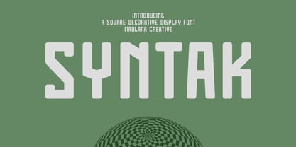 Syntak is an all caps Tech vibe square-is Display Sans font. Regular stroke, fun character with a bit of ligatures and alternates. To give you an extra creative work. Syntak font support multilingual more than 100+ language. This font is good for logo design, Social media, Movie Titles, Books Titles, a short text even a long text letter and good for your secondary text font with script or serif. Make a stunning work with Syntak font. Cheers, Maulana Creative
 - Gigabot by Grontype,
$12.00 Gigabot is a decorative based font with unique shape inspired from robot-made that will make your design looks hi-tech and modern. You can use this font for any purpose, especially to make logotype and sci-fi movie poster. You can mix and match the uppercase and lowercase to make your logo more stand out. This font also support multi language. Gigabot Features: Uppercase glyphs Lowercase glyphs Numeral and Punctuations Currencies Standard Ligatures Stylistic Alternates Thankyou for choosing this font, Enjoy
 - Boxley by Shinntype,
$45.00 The original superellipse typefaces coincided with the emergence of the CRT (cathode ray tube) TV screen, but there is more than this visual analogy of high-tech in play, as the pumped up angularity of the curved components of the genre also informs the quality of set text. In particular, due to the straightness of the round letters’ side stems, there is a neat modularity of vertical letter spacing, which denotes authority, with precision, complementing the tautness of the face’s curves.
 - K-Block by HiH,
$10.00 K-Block was inspired by a hand-lettered sign by a young lady by the name of Kristina Lee. It captures a light-hearted, youthful feeling and is not intended to be taken too seriously. It was drawn for fun and is fun to use. Its very inconsistency insists on being casual and relaxed. Probably better for a birthday party announcement than a bank letterhead. Can you imagine a Just-For-Fun National Bank? K-Block Solid compliments K-Block and provides a stronger presence when required. For two-color work, K-Block can be layered on top of K-Block Solid to provide a different color outline for a very effective presentation. Full Western European character set plus alternate g and y, as well as a Th ligature. If you have a drawing program like Corel Draw, you can easily convert the alternate g and y to curves and stretch out the tails to underline an entire word. The zip package of each font includes two versions. There is an OTF version which is in Open PS (Post Script Type 1) format and a TTF version which is in Open TT (True Type)format. Use whichever works best for your applications. K-Block and K-Block Solid are sold separately.
 - Waldorfschrift by Joachim Frank,
$23.00 The Waldorfschrift family was created in digital form in the years 1993-1994 by Joachim Frank, inspired by the naturally organic letters from the anthroposophical movement of the 20th century of Rudolf Steiner . In nature there are no right angles, straight lines or complete uniformity, but instead round corners, varying thicknesses and all kinds of variability. This is what the anthroposophical movement created in their buildings, their art, in their music – and also in their lettering. And this Font is like the plants in nature: it grows upwards, branches out, letters hugs to some letters, with others they keeps more distance, some letters proudly stretch their belly, others crouch in the corner - a completely natural font. Take a look at the brand of Weleda (the natural cosmetics company), Demeter (one of the biggest organic foods companies), Filderklinik (a great anthroposophical hospital in Germany) and you will see these great companies work with different but organic letter styles. More recently, Joachim revisited the Waldorf fonts with modern type design software and added extra characters such as the euro sign, and extra weights to make the fonts useable for a wide variety of design tasks. Dez 21: A big update: All fonts have been digitized again and given a complete character set, new kerning, minor bugs removed.
 - The Nightmare AOE font, created by Astigmatic One Eye, is an exceptional display typeface that embodies a distinctive blend of horror and whimsy, making it a standout choice for projects looking to c...
- Mundbind DK by PizzaDude.dk,
$15.00 A few days ago, my good friend David from Hanoded.com visited me for a few days. We drank a lot of coffee and walked the streets of Copenhagen - we even took a trip up in Rundetårn! :) Well, on one of our walk (of course looking for inspiration for new fonts) we spotted this handmade sign. We agreed to make a font of the 7 letters available, using our own imagination and style! I called my font Mundbind DK and David named his Mundbind NL - of course it is the landcodes of Denmark and Holland. As you can tell, the font is uneven and somewhat unpredictable - following only the "rules" of the person who handprinted that sign ... and not many of the rules of the good old and respected painter who make beautiful signs ... however, this sign had it's beauty in a natural and innocent way.
 - Therock by MlkWsn,
$15.00 The Rock is a supercharged, street-wise brush font bursting with energy. With extra attention to quick strokes and sharp details, The Rock is ideal for logos, apparel,T-shirts, Hoodie, quotes, product packaging, or anything which needs a typographic turbo-boost. The Rock Regular is the standard version of the font. Perfect for titles and logos. The Rock Swash is if you need a cool underline under your text or a splash of paint. This font set has you covered. Type any letter a-z using this font, and you'll get a unique swash to accompany the font. Language Support - We've added in a great deal of extra characters to support many different languages. Commercial/Extended License - This is in your design arsenal for life! Use on end products for sale is permitted with the standard license. Ligatures - Even though this is a capital letter, it is equipped with Ligatures.
 - Beriot by Boyanurd,
$19.00 Beriot is a sans serif whose basics are condensed in Regular (Normal) weight, getting a lot of form inspiration from the topic also known as Steile Futura which is a letterform that Paul Renner himself explored in the mid-1950s, where shapes are constructed with little stress on modular squares but there are changes in certain parts so they become less modular. The Beriot family is available in 42 weights with matching slanted cuts, divided into 3 subfamilies: Condensed, Normal and Expanded. Each has been designed for a range of text sizes each, and already variable, allowing you to choose and make your own type of weight you like. OpenType Features are available in each of these font styles, including alternative characters, different numbers set and case-sensitive and there are additional symbols that make it the perfect choice for professional types of branding, digital design and editorial.
 - Ropers by Ardyanatypes,
$17.00 Feel how the tones mesmerize you - say HELLO to "Ropers" - a Bold Serif Typeface with agile and alive ligatures and alternates. Designed to use in mid-tones harmonic, the stark contrast of the bold & wondrous uppercase of the regular serif balances calmly to mix matches your works More unique with the ligatures and alternates shape stream will make your typography truly eccentric Ropers are easy to pair with other fonts and no special software is required to type out the standard characters of the Typeface. To access the Opentype Ligatures and Alternates you will need software that supports Opentype features in fonts. super match with various types of works such as promotional themes, greetings, products cover, brands logo, and much more. No need to worry, Ropers are also available in multi-language usage, which makes your work easier. Thank you and have a nice day
 - Black Drum by Coniglio Type,
$19.95 Black Drum is a rare revival typewriter face, made digital from analog samples gathered with great care by Coniglio Type. A time and place; type and life. Black Drum is contemporary designer type, made from the struck steel hammers of an Art Deco Period san serif face transferred from a mechanical 1926 custom editor Royal Portable typewriter. Anna Conroy of Type Heritage, LLC, Philadelphia comments on Black Drum and its new place in time today: “Wow! nice lookin’ face Joseph! —Perfect, somewhere between Cable; [Rudolph Koch, 1927] (which was about the first transatlantic telegraph cable) with its raised x-height; and Futura [Paul Renner, 1928]. Yup, it has that great “Monopoly Game” question mark -- and all on a period-piece typewriter! You should have no trouble grafting that sorely needed Euro symbol.” –And he very well did! Author: Joseph Coniglio Producer: Coniglio Type MyFonts debut: October 2021
 - Stadia by Device,
$29.00 Stadia is designed around a series of modular units: quartercircles, teardrop shapes, squares, circles and variations thereon. The versatility of these basic shapes is such that a teardrop, for example, can represent a looped bowl, as in the lower part of the a, while also representing a curved arc at the top of the same character. The strict grid is broken for the T and the Y, and the placement of accents. The alternative – basing a T, for example, across three units – though rational, is far less aesthetically pleasing. As always with type design, one has to know when the internal structural rules should be bent for a more beautiful result. The horizontal lines appear to travel through the letters, bursting into stars in the counters of lower-case characters such as the o and p. The outline version is weighted to the same width as the gaps between the units.
 - Super School by Putracetol,
$16.00 Super School - Funny Kids 10 Various Font is a delightful and quirky display font with a school and kids' theme. This font embodies a playful and fun spirit with its rounded and bold letterforms, making it perfect for designs aimed at children and school-related projects. It features 10 alternative font versions, each inspired by various school-related motifs, including dots, stitches, rulers, math symbols, balls, books, graduation caps, paper planes, apples, and pencils. Crafted with a specific focus on the school theme, Super School is the go-to choice for designs revolving around education, kids, and toddlers. Whether you're creating educational materials, posters for school events, or any project targeting young audiences, this font adds a whimsical and child-friendly touch to your work. With its crafty and playful style, Super School helps you infuse a sense of joy and learning into your creative endeavors, making them engaging and delightful.
 - Barata Display by Estudio Arellano Type Foundry,
$25.00 Barata Display is an all caps script family font inspired by the street vendors and informal commerce in Latin countries. A condensed defined and thick stroke evokes the chalk signs that are made in "tianguis", markets, greengrocers, barbecues and flea markets from Los Angeles to Buenos Aires. It is a typeface that "SCREAM" buy me, save money, discounted, almost Free, opportunity!. What distinguishes the New Barata Display from Estudio Arellano Type Foundry is the expressive power of its structure. The Alphabet is built on the geometric principle of free traces from freehand writing. Composed of 236 capital Roman characters, Barata Display includes most common accents and diacritics. Barata Display can be used in any kind of commercial or personal promotion, in graphic design, web, print, animation, etc. Perfect for price labels, tags and other applications such as posters and t-shirts. It is a typeface ideal for headlines and Lettering.
 - Vecthorized by ryan creative,
$15.00 hello creatives Introducing Vecthorized Graffiti which is inspired by street shooting writing which has a unique appearance with the addition of Alternate, Ligature, Swash and is accompanied by additional ornaments that you can adjust to your own style. Can be applied such as t-shirt designs, stickers, image styles, etc. FEATURES; Upper and lower case letters. Support Foreign, Numbers and Punctuation. Alternates, Ligatures, Swashes and Ornaments Works on PC and Mobile. Simple installation. Can be accessed in Adobe Illustrator, Adobe Photoshop. Adobe InDesign, even works in Microsoft Word. Fully accessible without additional design software. Vecthorized is encoded with Unicode PUA, which allows full access to all additional characters without having to design any special software. Mac users can use the Font book, and Windows users can use the Character map to view and copy any additional characters to paste into your favorite text editor/app. Thank you for visiting ;)
 - LOLO City by Okaycat,
$24.50Ready to release your inner urban planner? Next time you need to lay out some buildings for an illustration, use LOLO City. The concept for LOLO City originates partly from my childhood, spending many hours playing a city simulation game, and also from my schooling -- which included architectural drafting and civil engineering studies. The building designs themselves are largely from my imagination -- but much inspired by architecture seen in my travels around Canada, America, Thailand, and Japan. The zoning of LOLO City is easy to remember, so you won't get lost in its streets: Small Letters (a-z): Light Residential(a-m), Light Commercial(n-t), Light Industrial(u-z) Capital Letters (A-Z): Dense Residential(A-M), Dense Commercial(N-T), Dense Industrial(U-Z) Digits, Shift Digits & Punctuation: random extras, small utilities (cars, trucks, traffic signals, park bench, etc.) Whenever you need a prefabricated city design --- think LOLO City! - Nobody Home JNL by Jeff Levine,
$29.00 Nobody Home JNL is unusual in nature as it combines two vintage typestyles into one font. Both have been used for home and property identification for decades and still remain popular. Over the years the letters and numbers have been made of cast steel, aluminum, brass and plastic. The alphabet is in a distinctly bold, asymmetrical style, while the numbers almost take on a calligraphic feel. There is just a basic character set - alphabet, numerals and simple punctuation. While the font has been reasonably spaced and kerned, it's best to remember that neither type design was made with digital technology in mind, so it's suggested to adjust your layout manually for optimum results. Nobody Home JNL is best-suited for replicating street addresses, apartment numbers on doors, and homeowner (or apartment house) names on buildings - whether in print design or as plotter-cut vinyl graphics.
 - Friendly Monster by Putracetol,
$24.00 Friendly Monster - Character Monster Font. Friendly Monster funny font is a kid's friendly spooky monster for your projects. When we talk about monster, it's not always the one that really scary. We can all have a cute, adorable, and friendly monster as well. Friendly Monster comes just like that. Friendly Monster has a strict style, but still gives a cheerful impression, making it very easy to read and apply in all design projects such as poster designs, clothing, logos, quotes, album covers, books, business cards, product designs, and many more design projects The alternative characters were divided into several Open Type features such as Swash, Stylistic Sets, Stylistic Alternates, Contextual Alternates, and Ligature. The Open Type features can be accessed by using Open Type savvy programs such as Adobe Illustrator, Adobe InDesign, Adobe Photoshop Corel Draw X version, And Microsoft Word. This font is also support multi language.
 - French Bulldog by Sudtipos,
$49.00 Day after day we are running from here to there, living in a society that does not allow us to slow down for a minute. Having so many things on our minds, we often unnecessarily complicate our problems, and our stress is so great that we forget what happiness is. French Bulldog was made to celebrate the unnoticed precious little moments. A hot coffee in the morning, the sea breeze on your face, the sweet smell of a flower, a nap with your dog, a meeting with friends, the tenderness of a maternal caress, traveling, walking, crying, sharing, feeling, being onesself. French Bulldog creates spontaneity from chaos with different shapes working randomly to form finesse or coarseness, just like a casual hand works a brush and tries to follow the rules with unpredictable results. It is versatile and fresh, friendly and relaxed. Flow in the moment.