2,171 search results
(0.034 seconds)
- City Boys by Dharma Type,
$19.99 City Boys is a fashionable contrasted sans-serif that can be used in almost any situation. City Boys has basic, natural and neutral letterforms and skeletons for a wide range of usage. The glyphs are somewhat humanist yet they have vertical stress for modern and sophisticated impression. The ratio of the contrast was carefully designed for modern usage –websites, digital, printings and merchandises–. City Boys consists of 7 weights and their matching Italics for a wide range of usages. Farther, City Boys is supporting international Latin languages and basic Cyrillic languages including Basic Latin, Western Europe, Central and South-Eastern Europe. Also CSS covers Mac Roman, Windows1252, Adobe1 to 3. This wide range of international characters expands the capability of your works. City Boys Soft is a softly rounded version of this City Boys.
 - Baldufa Cyrillic Ltn by Letterjuice,
$93.00 Baldufa is a charming typeface with strong personality, which looks very comfortable in text. There is a search to obtain complicated curves and detailed features, which gives the typeface a touch of beauty and elegance. However, this is also a self-conscious design that claims through the rounded serifs and irregular vertical stems appreciation for quirkiness and human imperfection. The letterforms are inspired by the slight distortions and idiosyncrasies that came with old printing methods. It has distinct, features such as rounded serifs, irregular vertical streams, ink traps and extremely thin junctions. In the Italic, serifs have been removed to enhance movement and expressivity. These experiments in form have not come at the cost of legibility: The typeface remains suitable for both small and display text. Baldufa Cyrillic Latin contains Cyrillic Extended and Latin.
 - Senlot by insigne,
$34.99 Steal the spotlight with Senlot. A high contrast sans serif, Senlot’s figure is perfect for enrapturing your audience. The font shows off a unique calligraphic stress, which--with the contrast--makes the face quite usable in luxury and high quality design work. The gorgeous appearance of Senlot is accompanied by a complete set of small capitals and a true italic. Dress your text in any of nine separate styles from Thin to Bold. Senlot also holds a full set of OpenType features, including titling capitals, superscripts and subscripts, and oldstyle figures and has an extended Latin cover with span for over 72 languages. A special thanks to Lucas Azevedo and ikern for production assistance on Senlot. Let Senlot’s beauty and simplicity carry the stage on your new text or webpage.
 - Cruickshank ML by HiH,
$12.00 Cruickshank is a decorative typeface from the late Victorian period. The upper case includes several letters with swash strokes, extending well below the baseline, as found in the original design. Alternatives to the swash caps are provided. The lower case contains small caps of simpler design. The face was designed by William W. Jackson and released by MacKellar, Smiths and Jordan Type Foundry of Samson Street, Philadelphia, Pennsylvania in 1886. MS&J was founded originally as Binny & Ronaldson in 1796 and later known as The Johnson Type Foundry. Cruickshank has a strong late Victorian flavor without the extravagance of so many fonts of the period. In its simplicity and clarity, it may be seen as a precursor to the Art Nouveau style that would develop a decade later.
 - City Boys Soft by Dharma Type,
$19.99 City Boys Soft is a fashionable contrasted sans-serif that can be used in almost any situation. City Boys has basic, natural and neutral letterforms and skeletons for a wide range of usage. The glyphs are somewhat humanist yet they have vertical stress for modern and sophisticated impression. The ratio of the contrast was carefully designed for modern usage –websites, digital, printings and merchandises–. City Boys consists of 7 weights and their matching Italics for a wide range of usages. Farther, City Boys is supporting international Latin languages and basic Cyrillic languages including Basic Latin, Western Europe, Central and South-Eastern Europe. Also CSS covers Mac Roman, Windows1252, Adobe1 to 3. This wide range of international characters expands the capability of your works. City Boys is a normal corner version of this City Boys Soft.
 - Fortezza by Eurotypo,
$22.00 Fortezza is a family of fonts inspired by the great masters who have created the Modern Roman style: Firmin Didot (1764 -1836) and Giambattista Bodoni (1740 -1813) Both typefaces can be similar, but a trained and close vision, show clear differences in the final result, like its weight and the degree of transition of the strokes. The type of Didot suggests greater warmth and elegance, they are characterized by extreme contrast in thick strokes and thin strokes, by the use of serifs very thin and by the vertical stress of the letters. while the Bodoni type conveys a greater robustness and hardness. Fortezza brings together the elegance and spirit of both types, but proposes a contemporary vision, establishing a distance with certain features typical of the baroque that was manifested at that time.
 - Shopping Guide by Jeff Levine,
$29.00 While watching the 1947 holiday classic “Miracle on 34th Street”, one scene in particular presented a chance to develop a retro type design. ‘Kris Kringle’ suggests to a mother visiting with her child in the Macy’s toy department to try Gimbel’s for a toy she couldn’t find at the store. The news of this behavior reaches Mr. Macy himself, who embraces the practice as a brilliant marketing strategy. A number of departments are then presented with reference books containing competitor ads, and the visual of the cover stating “R.H. Macy & Co. Shopping Guide for the Convenience of Our Customers” shows on screen. The thin, Art Deco sans serif monoline with a few serif-like hooks added onto some characters became the basis for Shopping Guide JNL, which is available in both regular and oblique versions.
 - Rogik by holyline design,
$19.00 Rogik by Holyline, Rogik is a expressive serif font family, This font very elegant, unique , has a strong and sharp character. This font comes in nine weight with italic so there are a total of 18 fonts and support variable for upright and italic. It's very unique, playful, elegant and very easy to combine with your design style. Rogik also inspire by metal, pop, punk and street ware, fashion brand. Rogik perfect for headline, sub headline ,custom logo, packaging, quote, merchandise, sticker, badges, social media posts, label, album cover and anything for your creativity. Rogik is perfect font if you want something new with your project, you can play the 18 fonts style, and you can pairing this font with the weight, its very satisfy. So happy creating!
 - Fabrikat Mono by HVD Fonts,
$40.00 Fabrikat Mono is a type family designed by Christoph Koeberlin. The monospaced Sans Serif family is published by HVD Fonts and consists of seven weights plus matching italics. It is an addition to the popular Fabrikat type family that emphasises its engineering roots. Compared to Fabrikat, the Mono version evens out not only the characters’ variable widths but also its more subtle characteristics: Letters like B and R are counterbalanced, the height difference between caps, ascenders and even “t” are eliminated, while characters like the percent sign together with the stressed punctuation give a nod to typewriter typefaces. The type family is equipped for complex, professional typography with OpenType Features like alternate letters, arrows and an extended character set to support Central and Eastern European as well as Western European Languages.
 - Silver Shield by Taznix Creative,
$14.00 Silver Shield is a bold and unique display font! This font was masterfully designed to bring each of your creative ideas to the highest levels! The racing style makes this font look stronger!!! Silver Shield Perfect for for many creative products such as logos, tattoo design, t-shirt prints, street wear, headlines, tattoo lettering, calligraphy, clothing brands, music, sports, labels and much more. What's Included : Web Fonts Standard glyphs Ligature Works on PC & Mac Simple installations Accessible in the Adobe Illustrator, Adobe Photoshop, Adobe InDesign, even work on Microsoft Word. PUA Encoded Characters - Fully accessible without additional design software. Fonts include multilingual support for; ä ö ü Ä Ö Ü ß ¿ ¡ Image used : All photographs/pictures/vector used in the preview are not included, they are intended for illustration purpose only.
 - Victoria Park by kapitza,
$99.00 Inspired by the diverse and dynamic neighborhoods around their studio, kapitza’s most recent work is about observing and recording the transient nature of inner-city populations. This visual research results in vibrant sets of silhouettes with site-specific names like ‘Liverpool Street’, ‘Victoria Park’ and ‘Brick Lane’. This ongoing project charts the visual component of local transformation, managing to reflect something that is deeper, invisible and beyond the surface. These fresh, creative typologies make sense of sensory overload. Though stark and simple, these silhouettes make the increasingly complex connections between people (s) and place(s). Somehow identities are represented in the absence of context and locations are curiously referenced without surroundings. By focusing on an area’s inhabitants, their work highlights distinct subtleties regarding the interplay time and place.
 - Bodoni Highlight by Image Club,
$29.99Giambattista Bodoni (1740-1813) was called the King of Printers; he was a prolific type designer, a masterful engraver of punches and the most widely admired printer of his time. His books and typefaces were created during the 45 years he was the director of the fine press and publishing house of the Duke of Parma in Italy. He produced the best of what are known as modern" style types, basing them on the finest writing of his time. Modern types represented the ultimate typographic development of the late eighteenth and early nineteenth centuries. They have characteristics quite different from the types that preceded them; such as extreme vertical stress, fine hairlines contrasted by bold main strokes, and very subtle, almost non-existent bracketing of sharply defined hairline serifs. Bodoni saw this style as beautiful and harmonious-the natural result of writing done with a well-cut pen, and the look was fashionable and admired. Other punchcutters, such as the Didot family (1689-1853) in France, and J. E. Walbaum (1768-1839) in Germany made their own versions of the modern faces. Even though some nineteenth century critics turned up their noses and called such types shattering and chilly, today the Bodoni moderns are seen in much the same light as they were in his own time. When used with care, the Bodoni types are both romantic and elegant, with a presence that adds tasteful sparkle to headlines and advertising. This version of Bodoni was done by Morris Fuller Benton for American Typefounders between 1907 and 1911. Although some of the finer details of the original Bodoni types are missing, this family has the high contrast and vertical stress typical of modern types. It works well for headlines, logos, advertising, and text." - Dirtstorm by Typodermic,
$11.95 Introducing Dirtstorm—the ultimate street stencil typeface that is sure to make your message stand out from the rest. With its raw, hand-cut edges and tattered texture, this font exudes an undeniable edge that will leave an impression on anyone who sees it. Featuring unique OpenType ligatures, Dirtstorm creates bespoke character sequences that add an extra layer of realism to your design. Whether you’re creating posters, flyers, or social media graphics, this typeface is the perfect way to convey your message with a distinct, grungy tone. Dirtstorm is not your typical, cookie-cutter font. It’s a rebellious, handcrafted typeface that embraces the imperfections and roughness of street art. So if you’re looking for a font that speaks volumes and demands attention, look no further than Dirtstorm. Most Latin-based European writing systems are supported, including the following languages. Afaan Oromo, Afar, Afrikaans, Albanian, Alsatian, Aromanian, Aymara, Bashkir (Latin), Basque, Belarusian (Latin), Bemba, Bikol, Bosnian, Breton, Cape Verdean, Creole, Catalan, Cebuano, Chamorro, Chavacano, Chichewa, Crimean Tatar (Latin), Croatian, Czech, Danish, Dawan, Dholuo, Dutch, English, Estonian, Faroese, Fijian, Filipino, Finnish, French, Frisian, Friulian, Gagauz (Latin), Galician, Ganda, Genoese, German, Greenlandic, Guadeloupean Creole, Haitian Creole, Hawaiian, Hiligaynon, Hungarian, Icelandic, Ilocano, Indonesian, Irish, Italian, Jamaican, Kaqchikel, Karakalpak (Latin), Kashubian, Kikongo, Kinyarwanda, Kirundi, Kurdish (Latin), Latvian, Lithuanian, Lombard, Low Saxon, Luxembourgish, Maasai, Makhuwa, Malay, Maltese, Māori, Moldovan, Montenegrin, Ndebele, Neapolitan, Norwegian, Novial, Occitan, Ossetian (Latin), Papiamento, Piedmontese, Polish, Portuguese, Quechua, Rarotongan, Romanian, Romansh, Sami, Sango, Saramaccan, Sardinian, Scottish Gaelic, Serbian (Latin), Shona, Sicilian, Silesian, Slovak, Slovenian, Somali, Sorbian, Sotho, Spanish, Swahili, Swazi, Swedish, Tagalog, Tahitian, Tetum, Tongan, Tshiluba, Tsonga, Tswana, Tumbuka, Turkish, Turkmen (Latin), Tuvaluan, Uzbek (Latin), Venetian, Vepsian, Võro, Walloon, Waray-Waray, Wayuu, Welsh, Wolof, Xhosa, Yapese, Zapotec Zulu and Zuni.
 - Bavaroir by URW Type Foundry,
$39.99 Bavaroir looks like a techno party in the throne room of Neuschwanstein: grandiose, original and still high-tech, modern, stylish and chic? anything but lifeless. The design experiment was to create a sans serif based on ?dropping endings?. Something between elegance and protest, Bavaroir coquettishly hides its edges. Although pretty narrow in design, Bavaroir still flows easily, openly and well readably, even in very small sizes. Bavaoir was designed for the URW++ FontForum.
 - Booden by Lithographe,
$36.00 Booden is a name not to boo but to use in display type situations. but as texts funtion s to be read its functionality ges beyond a Cyber-tech font single weight single time use. it can be used for branding purposes or any type of editorial text because of its readability. Be it a logo, or a Title headliner, web or print booden typeface can certainly entertain your need for simple variation.
 - Dark Star by PleasureFonts,
$19.00Dark Star is a modern, futuristic typeface with a sci-fi, high-tech look. The letter design is a geometric sans but also slightly rounded to make a more organic and natural impression. The suggested use for Dark Star is logo design, headlines in editorial design, packaging, web and print titles and game design. This futuristic typeface was designed in 2021, released by pleasurefonts and comes in 6 weights with a glyphs amount of 394. - Sky Fire by Yock Mercado,
$14.00 Skyfire is a Sans Serif font inspired by digital interfaces, spaceships, and galaxies, embodying cosmic adventure and progress. Its sleek design is perfect for branding and tech projects, promising a future full of possibilities. Ideal for space-related work, it immerses viewers in a universe of wonders. With Skyfire, each stroke is a cosmic journey, merging imagination with design. A guiding light for bold projects, it leads to new horizons and innovates in typography.
 - Dempster by Ascender,
$40.99 Dempster is a geometric sans serif design by Jim Ford. It is tall, bold and square with interesting details such as the angled terminals on the lowercase letters and friendly-looking punctuation. This typeface could feel at home with Art Deco and Modernism themes, as well as Sci-Fi and high-tech flavored graphics. Medium to large headline sizes work best when using Dempster. Dempster features include Extended Latin, Greek and Cyrillic support.
 - DT Partel by Dragon Tongue Foundry,
$9.00 DT Portal: This stylised, partially serifed font, made with a slightly rounded square form, may have been inspired initially by old cathode ray tubes and computer screens. Although not intended to be purely a ‘tech’ font, it can have a strong tech feel to it. More suited to being a headline font than body text. It also appears to have a monospaced look to it, since most letters, (other than letters like ‘i, l and t’), do have the same width. There is some automatic contextual shape adjustment happening in places, to avoid taking up too much space, so contextual ligatures should be turned on. As is the case with most of my fonts, when given the choice, ‘metric’ spacing should be used in preference to ‘optical’. Initially this font was going to be called ‘DT Portal’, because its form was similar to that of a window or doorway. But due to other fonts already having that name, I chose to rename it as ‘DT Partel’, for no reason other than it is only a very small change visually.
 - Futurism by Artyway,
$19.00 I am pleased to present you an excellent futuristic font "Futurism" in modern graphic style! The font supports the Latin alphabet and Cyrillic alphabet. It is recommended to use it at long intervals between letters, but you can customize it perfectly for your own design, use it to create logos, emblems, posters and posters. Futurism is very stylish, it ideally suited for a space mood, future tech and innovative products! Uppercase and lowercase english letters Uppercase cyr letters Numbers
 - MC Skitsy by Maulana Creative,
$16.00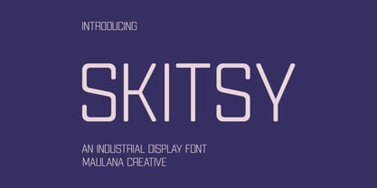 Skitsy is an industrial tech genre sans display font. With regular stroke, fun character with a bit of ligatures and alternates. To give you an extra creative work. Skitsy font support multilingual more than 100+ language. This font is good for logo design, Social media, Movie Titles, Books Titles, a short text even a long text letter and good for your secondary text font with script or serif. Make a stunning work with Skitsy font. Cheers, Maulana Creative
 - MC Riegal by Maulana Creative,
$16.00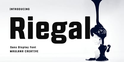 Riegal is a Square-is sans Display Tech font. Bold stroke, fun character with a bit of ligatures and alternates. To give you an extra creative work. Riegal font support multilingual more than 100+ language. This font is good for logo design, Social media, Movie Titles, Books Titles, a short text even a long text letter and good for your secondary text font with script or serif. Make a stunning work with Riegal font. Cheers, Maulana Creative
 - Ratushy by Sealoung,
$19.00 Ratushy is a serif-based display font with lowercase letters that have connecting characters for a unique look and crafted with care that will make your designs stand out and modern. You can use this font for any purpose, especially to make your business more attractive. This font is also suitable for sports, e-sport logos, games or hi-tech company logos. This font also supports multilanguage. Featured Fonts: Uppercase Lowercase Numbers & Punctuation Accented characters: ÀÁÂÃÄÅÆÇÈÉÊËÌÍÎÏÑÒÓÔÕÖØÙÚÛÜÝÞŒŠŽßàááâãäåæçèéêëìíîïñòóôõöøùúûüýþÿœš ž
 - Space Boards by Sarid Ezra,
$15.00 Introducing, Space Boards, a sci-fi logo font! Space Boards is a sans based font with unique lowercase & uppercase that will make your design looks futuristic and modern. You can use this font for any purpose, especially to make hi-tech logotype. This font is also suitable for science-fiction movie poster. You can mix and match the uppercase and lowercase to make your logo more unique and stand-out. This font also support multi language.
 - MC Kartoz by Maulana Creative,
$16.00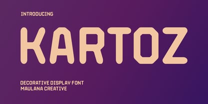 Kartoz is a modern Tech Decorative Display font. Medium stroke, fun character with a bit of ligatures and alternates. To give you an extra creative work. Kartoz font support multilingual more than 100+ language. This font is good for logo design, Social media, Movie Titles, Books Titles, a short text even a long text letter and good for your secondary text font with script or serif. Make a stunning work with Kartoz font. Caps only Fonts. Cheers, Maulana Creative
 - Oakters by Maulana Creative,
$24.00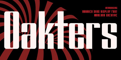 Oakters is an Industrial tech vibes display font. With medium high contrast stroke, fun character with a bit of ligatures and alternates. To give you an extra creative work. Oakters font support multilingual more than 100+ language. This font is good for logo design, Social media, Movie Titles, Books Titles, a short text even a long text letter and good for your secondary text font with sans or serif. Make a stunning work with Oakters font. Cheers, Maulana Creative
 - MC Alysse by Maulana Creative,
$16.00 Alysse is a tech industrial genre sans display font. With regular condensed stroke, fun character with a bit of ligatures and alternates. To give you an extra creative work. Alysse font support multilingual more than 100+ language. This font is good for logo design, Social media, Movie Titles, Books Titles, a short text even a long text letter and good for your secondary text font with script or serif. Make a stunning work with Alysse font. Cheers, Maulana Creative
 - Ohex by kome.studio,
$12.00 Contemporary geometric typeface. Ohex™font family consists of 5 unique font styles — thin, light, regular, bold and black + VARIABLE version. Opentype features including stylistic alternates, ligatures and kerning pairs. Currency glyphs and stylish digits. Capital letters are designed on the shape of a hexagon. Lowercase letters to cooperate with them, refers to the street style look. Great for logos, posters, magazine layouts, headers, apparel and prints. - Multilanguage support covering Western, South and Central Europe. 1256 Latin 1 / 1250 Latin 2: Eastern Europe / 1254 Turkish / 1257 Windows Baltic / Macintosh Character Ser (US Roman) 1256 Latin 1: Afrikaans, Basque, Catalan, Danish, Dutch, English, Faeroese, Finnish, French, Galician, German, Icelandic, Irish, Italian, Norwegian, Portuguese, Scottish, Spanish, and Swedish. 1250 Latin 2: Eastern Europe / 1254 Turkish / 1257 Windows Baltic : Czech, Polish, Hungarian, Croatian, Romanian, Estonian, Latvian , Lithuanian, Turkish, Slovak and Slevenian -
 - Baldufa Paneuropean by Letterjuice,
$139.00 Baldufa is a charming typeface with strong personality, which looks very comfortable in text. There is a search to obtain complicated curves and detailed features, which gives the typeface a touch of beauty and elegance. However, this is also a self-conscious design that claims through the rounded serifs and irregular vertical stems appreciation for quirkiness and human imperfection. The letterforms are inspired by the slight distortions and idiosyncrasies that came with old printing methods. It has distinct, features such as rounded serifs, irregular vertical streams, ink traps and extremely thin junctions. In the Italic, serifs have been removed to enhance movement and expressivity. These experiments in form have not come at the cost of legibility: The typeface remains suitable for both small and display text. Baldufa Paneuropean covers Eastern and Western Latin, Greek and Cyrillic Extended.
 - Daily Challenge by Hanoded,
$15.00 My daily challenge is how to get my kids out of bed, feed them breakfast, get them to dress, wash and pack their school bags and drop them off at school before the bell rings. The rest of the day, the challenge is to renovate our house, get my work done, pick up the kids from school (plus all of their friends, who want to come and play) and cook dinner. Of course, the word ‘challenge’ was misused by the internet. Not too long ago, there seemed to be and endless stream of crazy challenges that ended up hurting or even killing a few people. Daily Challenge font is none of the above: it is a clean cut, 100% handmade, all caps font. The only challenge here is how to adapt your design so it fits this font perfectly… ;-)
 - Mikal by Eurotypo,
$88.00 David was promised Saul’s daughter in marriage after he defeated Goliath. However, while Saul procrastinated in delivering his elder daughter for marriage, David fell in love with the younger daughter Mikal (1 Samuel 18:20,28). Mikal was the only wife who was reported to have loved David. Her name, Mikal, meant brook, or stream, a symbol of the water of the word. Mikal is a versatile and elegant script font; well suited in the area of magazines, web pages, packaging, logotypes and advertising, etc. This font can be used as body text for its good legibility and accurate kerning. Mikal font has all the advantages of OpenType technology that allows a variety of combinations: Swash, old style numerals, standard and discretionary ligatures, contextual alternates, word ending and tails. Mikal supports all Central European character set as well as basic Western languages.
 - Acton by Device,
$29.00 Acton is a deceptively simple, grid-based design. Though derived from a 2 by 3 arrangement of blocks, it uses white spaces to allow for more complex shapes – for example as the R – where the underlying 3 by 5 arrangement is apparent. It also departs from this strict grid-based logic for characters such as the the T, L, f and r, whose cross-bars are shorter than they would otherwise be in order to promote optical evenness. No elegant solution could be found for the V, which in geometric fonts can appear very similar to the U, lacking as it does the cross-bar that can differentiate a square A from the capital form of the n. However, the resultant diagonal retroactively proved useful on the lower-case e and a, characters that otherwise would have more uninteresting design solutions.
 - Dorset by Positype,
$49.00 Dorset marks Léon Hugues first script typeface and first release with the Positype Flourish label. Built crosscurrent to a strict revival or calligraphic digitization, Dorset’s aim was to understand how a font could interact with various calligraphic influences in a single execution and how that interpretation by Léon would lead to new, exclusive design choices. The design purposely chose to connect various gestures from Spencerian handwriting and copperplate calligraphy and meld that with his initial experiments with fine, flat nibs. The result is wholly unique and useful when clear, open, and legible script typography is desired. OpenType features included in this typeface allow the user to seamlessly move from an italic to connected script, while the various stylistic sets can lead you to variations of texture and rhythm, allowing for a more personal and exact expression.
 - Xunga by Huy!Fonts,
$17.00 Xunga is a cheerful display typeface. My goal was to design a font able to fit any layout with boldness and playfulness, mixing a sign painter taste in the uppercase and some of my crappy calligraphic reverse contrast explorations with the flat brush for the lowercase. I designed several of widths to fit the page, and though about a different way of expanding the family shifting the horizontal stress axis to move the letter weight in different heights, making a 15 fonts family, suitable for making bold layouts. Xunga has an extended character set for European languages as well as Vietnamese, and shows all its potential with OpenType-savvy applications. Every font includes ligatures, catchwords in discretional ligatures, contextual alternates to avoid conflictive glyph pairs and localized forms to avoid problems with several glyphs and languages.
 - Baldufa Greek Ltn by Letterjuice,
$78.00 Baldufa is a charming typeface with strong personality, which looks very comfortable in text. There is a search to obtain complicated curves and detailed features, which gives the typeface a touch of beauty and elegance. However, this is also a self-conscious design that claims through the rounded serifs and irregular vertical stems appreciation for quirkiness and human imperfection. The letterforms in the Latin are inspired by the slight distortions and idiosyncrasies that came with old printing methods. It has distinct, features such as rounded serifs, irregular vertical streams, ink traps and extremely thin junctions. In the Italic, serifs have been removed to enhance movement and expressivity. These experiments in form have not come at the cost of legibility: The typeface remains suitable for both small and display text. Baldufa Greek Ltn covers Greek and Latin.
 - Blocke by RicardoLetters,
$9.00 Bloque es una fuente moderna de tipo bloque perfecta para proyectos de grandes dimensiones como vallas, pósters artísticos, señalización, packaging, títulos y logotipos. Ya que su contador es tan estrecho no debes usarla en tamaños pequeños porque la definición de cada carácter se perderá. Es una fuente que cuenta con una sensación limpia y minimalista. Bloque es una excelente elección cuando se necesita una fuente impactante de letras en bloque para crear diseños impresionantes. Bloque is a modern block font perfect for large projects like billboards, poster art, signage, packaging, headlines and logos. Since its counter is so narrow you should not use it in small sizes because the definition of each character will be lost. It's a font that boasts a clean, minimalist feel. Bloque is an excellent choice when you need a striking font of block letters to create impressive designs.
 - Blackhawk by Set Sail Studios,
$14.00 Blackhawk is a supercharged, street-wise brush font bursting with energy. With extra attention to quick strokes and sharp details, Blackhawk is guaranteed to deliver an unapologetically loud & fast-paced message; ideal for logos, apparel, quotes, product packaging, or anything which needs a typographic turbo-boost. Blackhawk Consists of; Blackhawk ~ A hand-made, all-capitals brush font which has a complete set of alternate A-Z characters. Simply switch between upper & lower case to access the alternates. (Tip: Try mixing up both upper and lowercase characters in a word to achieve the best text layout). Blackhawk Italic ~ A slanted version of the regular font, creating faster movement in the characters. Blackhawk Swashes ~ A bonus set of 11 swashes and 4 paint-splatters. Simply select this font and type any A-O character to create one of the bonus elements.
 - ITC Elan by ITC,
$29.99 ITC Élan combines a gothic simplicity with elegance in a distinctive yet subtle typeface design. There is also a feeling of architectural strength which is derived primarily from an optically even line-weight and a sense of vertical stress. The small, almost Latin, serifs add distinction at both display and text sizes. The large x-height, minimum stroke variance, and open counters are ideal design traits for typeface legibility. Additional characteristics which distinguish ITC Élan are the splayed M" and bowls which do not quite close in the "a," "b" and several other letters. In contrast to the roman, there is almost a calligraphic playfulness to the italic. ITC Élan is the second ITC typeface from Albert Boton of France, who also designed ITC Eras. ITC Élan comes in four weights, book, medium, bold, and black, each with a corresponding italic."
 - SK Skrynka by Shriftovik,
$10.00 SK Skrynka™ is a strict monospaced geometric accidental typeface. He absorbed both industrialism and simplicity, and futurism along with modernism. It is imbued with the spirit of the distant future and refers to the culture of cyberpunk. With its features, it resembles a computer's electrical circuit and fits perfectly into a futuristic design. SK Skrynka font supports many languages: extended Latin (Western European, Eastern European and Central European, etc.), extended Cyrillic (Russian, Ukrainian, Belarusian, Serbian, etc.), Greek and even Hebrew. This allows you to use it in absolutely any direction and style of design. Also, this font has many stylistic alternatives that bring variety to the monospaced typeface, further expanding its expressive capabilities. The SK Skrynka typeface will look great in headlines, or in stylized text and will become a functional addition to design work or game design.
 - Lupulus by W Type Foundry,
$25.00 Lupulus is a typeface inspired by the works of german expressionist artist and type designer Rudolf Koch. Drawing inspiration from types such as Neuland and Kabel for some of its features, it possesses a gothic and contemporary essence. Its constant rhythm; strict, solemn, yet boldly exuberant keeps it clean and functional. Its expressiveness allows for a wide range of uses: short texts, headlines, posters and branding, for which it is exceptionally well-suited. Lupulus consists of 17 fonts: 8 weights, 8 italic variables and one free ornamental variable. Featuring alternate characters, it is a comprehensive and versatile set built to suit your design needs. It comes fully equipped with Opentype for any and all technical requirements. Learn about upcoming releases, work in progress and get to know us better! On Instagram W Type Foundry On facebook W Type Foundry wtypefoundry.com