6,419 search results
(0.031 seconds)
- Drebiek - Unknown license

- Romantically by Abo Daniel,
$13.00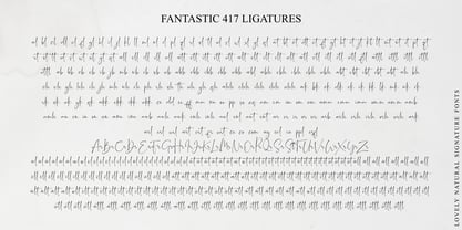 Romantically -the lovely natural signature font- It is classy, it is naturally, it is beauty signature fonts... - Fantastic 417 Ligature I was created 417 ligatures to keep this font looks naturally, al bl cl dl el fl gl hl il jl kl ll ml nl ol pl ql rl sl tl ul vl wl xl yl zl at bt ct dt et ft nt ot pt qt rt st tt ut yt all ell att ett itt ott utt alt elt ilt olt ult atl etl itl otl utl ftl attl ettl ittl ottl uttl ab bb cb eb ib jb mb nb ob sb ub abb ebb ibb obb ubb abl abh ebh ibh obh ubh abt ebt ibt obt ubt ah bh ch eh gh hh ih jh mh nh oh ph rh yh zh ahh ehh ihh ohh uhh ak ek ik kk ok rk sk uk yk zk akk cc dd ee ff mm nn oo pp ss zz am em im om um amm emm imm omm umm amb amh an en in on un ann inn anb anh ank enh inh anl enl ant ent ar er ir or ur arb arh erh irh orh urh ark arl erl url art ert fr urt ce co com ay eel iu ppl erfl Ar Br Cr Dr Er Fr Gr Hr Ir Jr Kr .............and more as you seen on presentation pictures. I am also created it for multilingual characters. àl ál âl ãl äl ål æl œl èl él êl ël ìl íl îl ïl ñl òl ól ôl õl öl ùl úl ûl ül àt át ât ãt ät åt æt ............and more as you seen on presentation pictures. - Swashes Swashes make it completed. You only need adding underscore 2x after lowercase from a to j . For example a__ - Multilingual Support Fonts include punctuations and multilingual support. Romantically is perfect for branding, photography, invitations, quotes, watermarks, advertisements, product designs, labels, and much more! I hope you really enjoy it.. Regards, Abo Daniel
 - TT Norms Pro by TypeType,
$39.00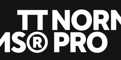 Introducing TT Norms® Pro, version 3.200! The updated font now supports more languages and boasts a larger character set. These implementations have made the typeface even more advanced and convenient. TT Norms® Pro is a functional geometric sans serif for aesthetic design choices and TypeType studio's bestseller. It has been a massive success since its release, and rightfully so! This stylish, elegant, and versatile font will become the full-fledged core of your collection. TT Norms® Pro is ideally suited for products in any domain: streaming services, banking, clothing brands, or the automotive industry. It's equally convenient to use in both web and printing. Now, the TT Norms® Pro typeface includes the most extensive font package, both in terms of font styles and character sets. The base version of TT Norms® Pro consists of 22 fully redesigned font styles and 4 additional subfamilies. Besides, this font boasts the most comprehensive language support in the TypeType collection. We've added the characters of extended Cyrillic and Latin writing systems to the updated TT Norms® Pro and configured the new languages support. The character set has become more extensive—we've added currency symbols with their minuscule version and minuscule mathematical symbols. The 3.200 version of TT Norms® Pro includes: 44 roman font styles, 44 italics, and 2 variable fonts; 7 roman and 7 italic font styles in TT Norms® Pro Mono; 2 variable fonts: TT Norms® Pro Variable with three parameters of variation (weight, width, and slant) and TT Norms® Pro Mono Variable with weight and slope axes of variation; 1993 characters in each font style, including an extended set of punctuation marks, symbols, and currencies; 5 widths: TT Norms® Pro with classic proportions, monospaced TT Norms® Pro Mono, narrower-proportioned TT Norms® Pro Compact and TT Norms® Pro Condensed, and wider TT Norms® Pro Expanded; 38 OpenType features, including a large number of ligatures, fractions, numerators, and denominators; 17 stylistic sets; - 280+ languages support, counting in new symbols for French, Norwegian, Bulgarian, Uzbek, Abkhaz, and more; Flawless kerning and manual TrueType hinting. TT Norms® Pro has already become the signature font of Intercom, Inc., Sartorius AG, CSN, CBSN, Shieldex, and many other global brands. Customization is available for TT Norms® Pro upon request—we adjust the font to suit your project. Learn more about customization options in the corresponding website section. In addition to the TT Norms® Pro, we've designed the TT Norms® Pro Serif typeface. These fonts complement each other perfectly, making an ideal typeface pair.
 - Milio by Tipo Pèpel,
$22.00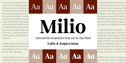 Any typeface has two intrinsic elements that does´t work at the same levels, form and appearance. These peculiar visual behavior generate a wide range of graphics games. At reading level, we observe a uniform gray spot, but large bodies allows us to appreciate their shapes and counterforms. Milio takes this duality to offer unparalleled service in newsprint and magazine publishing, specially in small bodies but hard and formal cogency in titling. Its wide variety of weights, 10 in total, together with a slight condensation allows us to save space without losing legibility, even under poor printing conditions. Its basic quasi humanistic forms include support for a wide range of details that give great originality and strength. A friendly appearance, but a strong, all-road typeface with internal forms that reinforced visibility in small sizes thanks to its high average eye and the contrast that generates its soft curved external and internal squared angles. The nuances here are fundamental and explain its powerful large sizes, where you can see these contrasts between the curved, organic, humanistic, and straight, angled, almost mechanical shapes. Milio has the bonus of a large multilingual support for all alphabets based on the Latin and Cyrillic, as well as large Opentype features for expert users, among which we have true small caps, ligatures and automatic contextual alternates. Several sets of numerals for use on tables and other “delicatessen” as fractions are also included. Having in mind the daily struggle in newspaper and magazines´ edition, Milio has been designed with the idea of being Cinta´s perfect couple, a similar contrast and proportion typographic san serif family produced by the same Foundry as Milio, to cover almost all the graphic needs in actual DTP.
 - logoskate - Unknown license

- round - Personal use only

- TRASHED - Unknown license

- junkohanhero - Unknown license

- HollyWould - Unknown license

- Weimar - Unknown license

- PR Uncial Alt Caps - Unknown license

- Treglonou - Unknown license

- Demagogue by Hanoded,
$15.00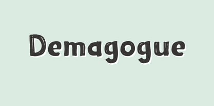 I was listening to the radio and a song caught my attention. It was ‘Demagogue’ by a band called the Urban Dance Squad. That song brought back memories from when I was a student, so I decided to name this font after it. Demagogue was made using a Sharpie pen and a piece of expensive paper. The result is a very legible, very neat and very bold font. Demagogue is ideal for when you want to get your message across, but hopefully not in a demagogue-ish way! ;-)
 - Gogosquat by Bogusky 2,
$34.50Usually, the condensed version of a face comes after the regular design. Not with gogo squat. After gogo big, I thought how strong a regular version would be. A nice clean gutsy face. A "today" Franklin Gothic Extra Bold. I find it ideal for contemporary headlines as well as for logo solutions. As with gogo big, in my terms and conditions, I permit the modification of up to ten of the letter forms for logos and monograms, but logos and monograms only, not the typeface in normal usage. - The Freakshow II font is an extremely decorative and unique typeface, classified as a grunge-trash or distorted display font. It is explicitly themed around a circu...
- 2006 - Personal use only

- Charlie - Unknown license

- Carrington - Unknown license

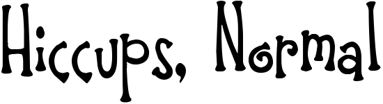
- Hiccups - Unknown license

- Vtg Stencil Ornaments A by astype,
$24.00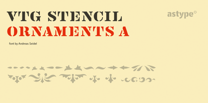 Vtg Stencil Ornaments are designed to work with all the US stencil fonts from astype. Have a look at Vtg Stencil US No.2, No.51 and No.72.
 - Reyhan by Plantype,
$30.00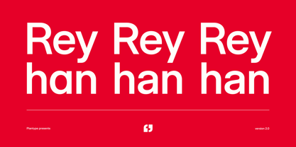 Reyhan is a low contrast typeface that looks legible and clean in small sizes. On large sizes, it wraps the space around. Finely drawn negative spaces, neat and minimal shapes define Reyhan. Simple and clean lines give the typeface a solid and finished look. Reyhan is pure and powerful with well designed proportions. Different alternatives such as square dots, alternate /a /l /y /R /1 /6 /9, coverage of 94 Latin languages, various Opentype features, and 18 styles expand the usage area of Reyhan, making it a versatile workhorse. With high-quality spacing, Reyhan looks good on all sizes, making it not only a valuable tool for graphic designers but also a total typeface solution for every person who communicates with type. Reyhan is a typeface designed to adapt requirements of modern and traditional communication. For more information please visit www.plantype.co
 - Acton by Device,
$29.00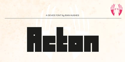 Acton is a deceptively simple, grid-based design. Though derived from a 2 by 3 arrangement of blocks, it uses white spaces to allow for more complex shapes – for example as the R – where the underlying 3 by 5 arrangement is apparent. It also departs from this strict grid-based logic for characters such as the the T, L, f and r, whose cross-bars are shorter than they would otherwise be in order to promote optical evenness. No elegant solution could be found for the V, which in geometric fonts can appear very similar to the U, lacking as it does the cross-bar that can differentiate a square A from the capital form of the n. However, the resultant diagonal retroactively proved useful on the lower-case e and a, characters that otherwise would have more uninteresting design solutions.
 - Grund by SIAS,
$29.90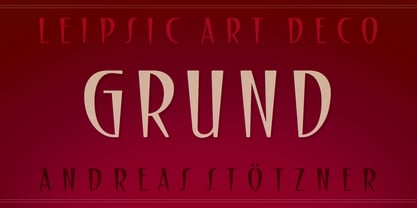 GRUND is a new fontographic adaption of a remarkable 1920s epigraphical find in the city of Leipsic. This old well-known European trade fair hotspot struggled with a severe shortage of exhibition space around 1920. The solution was to dig deeper into the matter – literally – and 1924 the world’s first underground trade fair exhibition hall was opened right under the city’s central market square. After several changes of use during the past decades the sophisticated Art Deco entrance structure (architect: Otto Droge) was re-opened in December 2013 as a gateway to a new subway rail track. – The original brass lettering of the UNTERGRUNDMESSHALLE MARKT has been retrieved – and served as the inspiration for this new and unique font. If you’d like to see more exceptional Art Deco type, have a look at my Arthur series. __________________________________________________________________________________________
 - Klaud by Tour De Force,
$25.00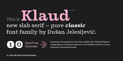 Klaud is our new slab serif family with 14 styles. It is compact, stable typeface that's carefully designed to suit in every possible situation where an working horse typeface could be used. Klaud is good balanced, visually equalized family that looks and feels smooth in longer texts and paragraphs, but works well in headlines also cause it's gentle decorative letter parts. Strong look is achieved by more squared then rounded characters design. As mentioned, Klaud is perfect to fit into any designer's project – from editorial use as the main typeface to situations where you are looking for a couple of words only like posters or packages. It is fully legible and versatile as web font also. Klaud is offered with OpenType features like Numerator, Denominator, Fractions, Small Caps, Oldstyle Figures, Lining Figures, Standard Ligatures, Case Sensitive Forms, Arrows, Alternate Annotation Forms.
 - Boxr by R9 Type+Design,
$38.00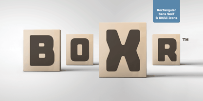 Boxr™ is a contemporary font family named after its boxy, square shape. We softened all the sharp corners on stems and connections to achieve a harmonious balance between the clean, corporate look and the warm, friendly feel. This versatile rectangular sans serif typeface is an excellent choice for your prints, packaging, editorial, and digital design projects. Boxr™ comes in 5 weights, 10 styles, and 1,100 glyphs/style. This Canadian-designed typeface also packs with OpenType features such as stylistic alternates, case-sensitive punctuations, ligatures, and date vs fraction recognitions. It also supports 200+ Latin-based languages and comes 120 essential UX/UI icons available in three different stylistic options. Try Boxr™ on your new design projects today! To find out more about Boxr™ Opentype features and type specimen, please visit https://r9typedesign.com/boxr-fonts-features-specimen
 - Tilden Sans by Delve Fonts,
$29.00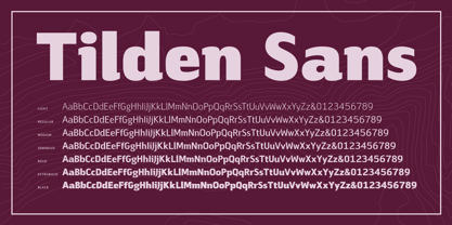 Thoroughly contemporary, clean, and ready for work, Tilden Sans was designed by Delve Withrington to be no-nonsense but still stylish and friendly. Tilden Sans is square-ish with low contrast and a generous x-height. Curvilinear strokes like those in the capitals C or S, and many lowercase letters feature incised terminals offering a measure of distinction from other sans serifs, without sacrificing legibility. All of those features work in unison to make this typeface a pleasure to use and read. The Tilden Sans family has seven useful weights ranging from Light to Black and features a glyph repertoire of over 900 glyphs with language support for 225 languages. This versatile typeface performs brilliantly in a host of sizes. The Regular and Medium weights can be used at text sizes, while the Light and Black weights are great for display size settings.
 - Masonic Lodge by Eclectotype,
$20.00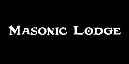 As part of the day job I had to trace an old hand drawn logo of a Masonic Lodge from a very poor scan. When I finally got to the end of it I had almost a whole alphabet and I really liked the hand drawn uneven quality, so I made up the rest of the letters and set about making it into a font. I roughened up all the edges for an even older look, added a host of OpenType features and hey presto, Masonic Lodge was born. There are two versions of each letter and number which automatically alternate when contextual alternates are set, more alternates for O and o characters, a good amount of interlock style L and T ligatures (uppercase) and a square & compass ornament. Use it for pub signs, secret society meetings, monster movie titles and pub menus.
 - Jetlab by Swell Type,
$15.00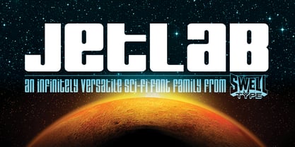 Jetlab is a typographic time machine that drops you squarely into the techno-futuristic optimism of the 1960s, 1970s and 1980s! While certain weights may conjure familiar space race-era logos from the sci-fi movies, board games, sports teams, new wave bands and sneaker brands of the late 20th century, the complete 45-weight Jetlab font family is loaded with modern features to power your retro-futuristic designs with near-infinite versatility. Features: 45 weights provide widths from squeezed to stretched and weights from light to heavy, plus reverse-stress (that's thick horizontal strokes with thin verticals) high, medium and low crossbar options upper and lowercase letters provide two distinct styles a four-axis variable font provides precise control of width, vertical & horizontal weight, and crossbar height 500 glyphs support 223 languages, including Western & Central Europe and Vietnamese
 - Zest by Scholtz Fonts,
$22.00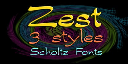 Zest is an informal brush script drawn with quick, thick brush strokes. While it is based on everyday handwriting, the expansive and easy flow of the script hides the care that has been given to the crafting of each character. In style it harks back to the hey-day of American lettering and calligraphy, yet it has a looseness that is thoroughly modern. Zest comes in three styles: -- Zest-Medium, which is medium-weighted and appropriate to a wide range of applications; -- Zest-Drama, in which the contrast between the the thicker and thinner parts of a brushstroke has been dramatically enhanced; and -- Zest Bezel, in which the brush strokes have been given a contemporary, square-cut appearance. Zest is ideal for invitations to stylish but relaxed events, for advertisements that are intended to create a special ambiance, for posters and for announcements.
 - Escritura Hebrew by Vanarchiv,
$21.00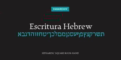 It was my first attempt to drawing a Hebrew alphabet to mach directly with other typeface (Latin) which I already designed. The Latin version is an handwriting display typeface influenced by chancery handwriting from the Italian Renaissance (broad-nib pen). One of the most typographic characteristic is there wavy forms, especially the serifs, where contains some of the main calligraphic references from this font family. The Hebrew script contain reverse contrast, the vertical proportions are more tall and the stroke weight is slightly more strong than latin lowercase to produce a correct visual balance between them, especially on small sizes (text proportions). This Hebrew square book-hand was influenced by Sephardic script style. The Latin characters contains interrupted strokes, the same was made for Hebrew letterforms to transpose correctly the same calligraphic approach between these two different alphabets.
 - Oxona - Personal use only

- Tiger Rag by ITC,
$29.00Tiger Rag is the work of English calligrapher John Viner, who was inspired by Japanese calligraphy when creating this dramatic, informal typeface. The font is extensive and flexible, with many alternate characters. Tiger Rag is an excellent choice for casual display typography which should produce a fresh, random effect. - HU Flat White by Heummdesign,
$15.00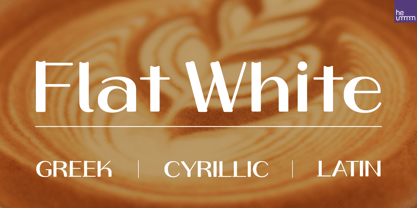 HU Flat White is a retro vibe headline typeface. It has a full module, but, the inner space created by large strokes' contrast gives a cool feeling. Overall, the extended typeface with a wide width is attractive, and the shape of every alphabets' tip create a retro feel.
 - Burin by Monotype,
$29.99The Burin family of typefaces consists of Roman and Sans variations. Burin Roman has very distinct lowercase characters b, c, d, g and y with a quirky use of tapered strokes and hairlines. Burin Sans is a light display face with an extended tail on the lowercase y. - Churchward Legible by BluHead Studio,
$25.00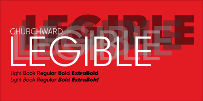 Churchward Legible is an extensive typeface family designed by New Zealand type designer Joseph Churchward. A geometric sans serif, it is, as its name boasts, highly legible and readable on screen as well as in print. The family includes five weights from Light to Extra Bold, with companion italics.
 - Burin Sans by Monotype,
$29.99The Burin family of typefaces consists of Roman and Sans variations. Burin Roman has very distinct lowercase characters b, c, d, g and y with a quirky use of tapered strokes and hairlines. Burin Sans is a light display face with an extended tail on the lowercase y. - Yaty by Mans Greback,
$59.00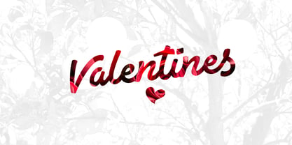 Yaty is a relaxed and spontaneous script font. With its long descenders, bold capital letters and genuine style, this typeface fits perfectly for a down-to-earth logo or headline, emitting familiarity and friendliness. The font contains ligatures and support for an extensive range of world-wide languages.
 - Mainlux by Digitype Studio,
$20.00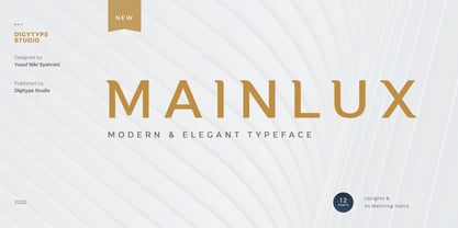 MAINLUX is an elegant typeface family with a unique touch to each character.It comes in 12 weights, 6 straights & italics. MAINLUX was designed to give a luxurious impression to your artwork, products, web business cards and various other needs. Each weight includes extended language support and standard ligature.
 - Bethencourt by Apostrof,
$30.00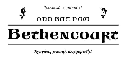 Bethencourt is a font family designed by Vsevolod Buravchenko & Viktor Kharyk with technical support by Konstantin Golovchenko. It is based on uncial, half-uncial, Old Roman Cursive and New Roman Cursive. The character set includes Latin Extended characters, stylized Cyrillic and decorative elements in the form of playing dolphins.
 - Affiche by RMU,
$35.00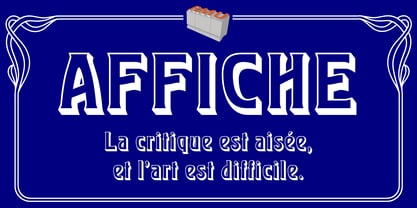 Based on the fin-de-siècle Helios Reklameschrift of the Klinkhardt foundry, Leipzig, Affiche preserves the beautiful art nouveau character of its hot-metal forerunner and was carefully extended to make it multilingual. For more historical authenticity, you can use the long s by typing [alt] and [b].