250 search results
(0.019 seconds)
- Simone by Berthold,
$67.99
- Semonic by Warisand,
$17.00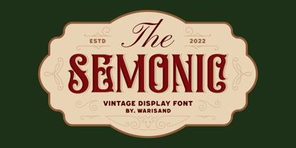
- Simeon by astype,
$40.00
- Limon by Typesenses,
$49.00
- Circulaire by Canada Type,
$24.95
- Circularis by JAF 34,
$12.00
- Circula by Paragraph,
$16.50
- Sion - 100% free

- Clearblock circular - Unknown license

- Zirkular by RMU,
$30.00
- Circulo by MMD Fonts,
$6.29
- Simeon 2D by 2D Typo,
$46.00
- SF Limone by Fonts66,
$16.00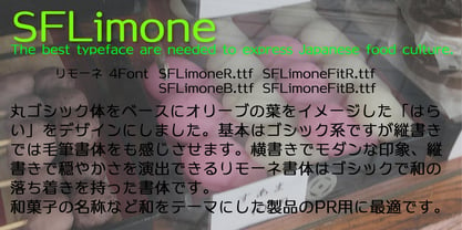
- Circularis Alt by JAF 34,
$12.00
- Clearblock circular - 3DFX - Unknown license

- Meriwether Circular NF by Nick's Fonts,
$10.00
- Circulate (BRK) - Unknown license

- Circulate BRK - Unknown license

- ZirkleOne - Unknown license

- Kaya - Personal use only

- Holitter Circle - 100% free

- Autobahn Stencil - Personal use only

- Scramble - Unknown license

- Spin Cycle OT - 100% free

- derail - Personal use only

- WhereCracksAppear - Unknown license

- Mod - Personal use only

- Grill Sans - Unknown license

- Facet Black - 100% free

- Paranoid - 100% free

- CloseCall - Unknown license

- CloseCall - Unknown license

- Gridder - Unknown license

- Gridder - Unknown license

- Gridder - Unknown license

- Rococo Titling by Three Islands Press,
$15.00 - Karika Hypnotica by Deniart Systems,
$20.00
- Karika Encore by Deniart Systems,
$20.00
- Medallion Ornaments by Gerald Gallo,
$20.00
- FF Littles by FontFont,
$30.99


Page 1 of 7Next page