10,000 search results
(0.032 seconds)
- Montebello - Personal use only

- venfro - Personal use only

- vemanem - Personal use only

- Faqro Extended Wide Trial - Personal use only

- FEAR Logo - Unknown license

- FF PQR Trial - Personal use only

- LT Energy - 100% free

- LT Binary Neue - 100% free

- Kah Hoot - Personal use only

- ahonde - Personal use only

- FEAR Logo - Personal use only

- FF Mab - Personal use only

- LT Superior - 100% free

- LT Renovate - 100% free

- Rintvera - Personal use only

- THINK EXTRA PERSONAL USE - Personal use only

- Boldstrom - Personal use only

- Crosshatcher - Personal use only

- Grinched 2.0 - Personal use only

- Multi by Type-Ø-Tones,
$60.00 Multi is an extensive sans serif typeface family that consists of two subfamilies: Multi Text that comprises three weights (roman & italic) and Multi Display (seven weights, roman & italic). Vitality bursts forth from Multi. It has a distinctive ‘phrasing’ (in the musical sense), neither humanist nor glyphic, somewhere in between, exploring uncharted territory. Its design is pragmatic, yet not rigid, slightly tinged with tiny incised touches. This is clearly noticeable in Multi Display: the roman lowercase’s asymmetric stems are very softly tapered, with bevelled, sharp upstrokes. Furthermore, all weights consistently share these idiosyncrasies from Thin to Poster. With its lower contrast, wider proportions, shorter ascenders and descenders, Multi Text was purposely adjusted to meet all the requirements of a legible typeface for newspapers in paper and screen, as they were manually hinted. It also has a few new features, such as the outstrokes of the roman ‘l’ and the italic ‘a’, which bring a subtle calligraphic feel to the text flow.
 - AC Honey Bee by Will Albin-Clark,
$35.00 Honey Bee is a type family developed over the course of 2020. Consisting of two sub-families that share the same DNA of two opposing styles. Honey Bee Serif is a transitional modern serif with some reference to fundamental letterforms. Honey Bee Sans is a low contrast semi-geometric sans serif with bold rounded letterforms. These typefaces were made in unison, designed for perfect font pairing for a variety of projects and intensions. It’s design is ideal for small and large scale, with the distinct characters of the Sans family and funky headlines or titles with the stylistic Serif Italic. Super legible and a variety of characters allow for multi-lingual use.
 - Apocalyptic by Artisticandunique,
$9.00 Apocalyptic - Sans Serif Font Family - Multilingual - 24 Style (2022) Apocalyptic - Sans serif font family is a futuristic-modern font. The emotional integrity it creates due to its structure is suitable for use in technology, science, space and similar subject contents.Apocalyptic - sans serif font family, from Thin to Heavy, offers a full range of expression for interfaces and corporate design; in multiple languages, from print to screen media.It offers rich solutions to your creative projects with its alternative versions.You can easily use the sans serif font feature in many areas.You can create your text with normal characters and highlight Heavy characters and titles. It is functional in many sizes and environments that you can use as a main actor in strong headlines. If you are looking for a font with these features, Apocalyptic sans serif font family may meet your needs. With this font you can create your unique designs. If you have a question, please contact me. Have a good time.
 - An Electronic Display LED LCD LED7 Seg 3 by Fortune Fonts Ltd.,
$15.00 * For when you need the most realistic looking electronic display. * See User Manuals Main advantages: - Spacing between characters does not change when entering a decimal point or colon between them. - Custom characters can be produced by selecting any combination of segments to be displayed. Low cost electronic displays have a fixed number of segments that can be turned on or off to represent different symbols. A digital watch would be the most common example. Fonts typically available for depicting electronic displays are often in the artistic style of these common LED or LCD displays. They provide the look-and-feel, but fall short when technical accuracy is required. Failure to represent an accurate and consistent representation of the real thing can be a cringe-worthy experience for the product design and marketing team, or even the hobbyist for that matter. To solve this problem, Fortune Fonts has released a range of fonts that accurately depict the displays typically found on low cost electronic devices: watches, answering machines, car stereos, alarm clocks, microwaves and toys. These fonts come with numbers, letters and symbols predefined. However, they also allow you to create your own segment combinations for the custom symbols you need. When producing manuals, marketing material and user interfaces, accuracy is an all-or-nothing concept. Instructions in the user manual describe how to turn these fonts into realistic displays according to your own design, in the manner of the images above. If you cannot see a license option for your specific application, such a license may be purchased from here. By purchasing &/or using &/or distributing the fonts the buyer user and distributor (including Monotype Imaging Inc. & Monotype Imaging Hong Kong) agree to (1) indemnify & hold harmless the foundry, for any consequential, incidental, punitive or other damages of any kind resulting from the use of the deliverables including, but not limited to, loss of revenues, profits, goodwill, savings, due to; including, but not limited to, failure of the deliverables to perform it’s described function, or the deliverable’s infringement of patents, copyrights, trademarks, design rights, contract claims, trade secrets, or other proprietary rights of the foundry, distributor, buyer or other parties (2) not use the fonts to assist in design of, or be incorporated into, non-software displays
 - An Electronic Display LED LCD LED7 Seg 2 by Fortune Fonts Ltd.,
$15.00 * For when you need the most realistic looking electronic display. * See User Manuals Main advantages: - Spacing between characters does not change when entering a decimal point or colon between them. - Custom characters can be produced by selecting any combination of segments to be displayed. Low cost electronic displays have a fixed number of segments that can be turned on or off to represent different symbols. A digital watch would be the most common example. Fonts typically available for depicting electronic displays are often in the artistic style of these common LED or LCD displays. They provide the look-and-feel, but fall short when technical accuracy is required. Failure to represent an accurate and consistent representation of the real thing can be a cringe-worthy experience for the product design and marketing team, or even the hobbyist for that matter. To solve this problem, Fortune Fonts has released a range of fonts that accurately depict the displays typically found on low cost electronic devices: watches, answering machines, car stereos, alarm clocks, microwaves and toys. These fonts come with numbers, letters and symbols predefined. However, they also allow you to create your own segment combinations for the custom symbols you need. When producing manuals, marketing material and user interfaces, accuracy is an all-or-nothing concept. Instructions in the user manual describe how to turn these fonts into realistic displays according to your own design, in the manner of the images above. If you cannot see a license option for your specific application, such a license may be purchased from here. By purchasing &/or using &/or distributing the fonts the buyer user and distributor (including Monotype Imaging Inc. & Monotype Imaging Hong Kong) agree to (1) indemnify & hold harmless the foundry, for any consequential, incidental, punitive or other damages of any kind resulting from the use of the deliverables including, but not limited to, loss of revenues, profits, goodwill, savings, due to; including, but not limited to, failure of the deliverables to perform it’s described function, or the deliverable’s infringement of patents, copyrights, trademarks, design rights, contract claims, trade secrets, or other proprietary rights of the foundry, distributor, buyer or other parties (2) not use the fonts to assist in design of, or be incorporated into, non-software displays
 - An Electronic Display LED LCD LED7 Seg Platz by Fortune Fonts Ltd.,
$15.00 * For when you need the most realistic looking electronic display. * See User Manuals Main advantages: - Spacing between characters does not change when entering a decimal point or colon between them. - Custom characters can be produced by selecting any combination of segments to be displayed. Low cost electronic displays have a fixed number of segments that can be turned on or off to represent different symbols. A digital watch would be the most common example. Fonts typically available for depicting electronic displays are often in the artistic style of these common LED or LCD displays. They provide the look-and-feel, but fall short when technical accuracy is required. Failure to represent an accurate and consistent representation of the real thing can be a cringe-worthy experience for the product design and marketing team, or even the hobbyist for that matter. To solve this problem, Fortune Fonts has released a range of fonts that accurately depict the displays typically found on low cost electronic devices: watches, answering machines, car stereos, alarm clocks, microwaves and toys. These fonts come with numbers, letters and symbols predefined. However, they also allow you to create your own segment combinations for the custom symbols you need. When producing manuals, marketing material and user interfaces, accuracy is an all-or-nothing concept. Instructions in the user manual describe how to turn these fonts into realistic displays according to your own design, in the manner of the images above. If you cannot see a license option for your specific application, such a license may be purchased from here. By purchasing &/or using &/or distributing the fonts the buyer user and distributor (including Monotype Imaging Inc. & Monotype Imaging Hong Kong) agree to (1) indemnify & hold harmless the foundry, for any consequential, incidental, punitive or other damages of any kind resulting from the use of the deliverables including, but not limited to, loss of revenues, profits, goodwill, savings, due to; including, but not limited to, failure of the deliverables to perform it’s described function, or the deliverable’s infringement of patents, copyrights, trademarks, design rights, contract claims, trade secrets, or other proprietary rights of the foundry, distributor, buyer or other parties (2) not use the fonts to assist in design of, or be incorporated into, non-software displays
 - An Electronic Display LED LCD LED7 Seg dots1 by Fortune Fonts Ltd.,
$15.00 * For when you need the most realistic looking electronic display. * See User Manuals Main advantages: - Spacing between characters does not change when entering a decimal point or colon between them. - Custom characters can be produced by selecting any combination of segments to be displayed. Low cost electronic displays have a fixed number of segments that can be turned on or off to represent different symbols. A digital watch would be the most common example. Fonts typically available for depicting electronic displays are often in the artistic style of these common LED or LCD displays. They provide the look-and-feel, but fall short when technical accuracy is required. Failure to represent an accurate and consistent representation of the real thing can be a cringe-worthy experience for the product design and marketing team, or even the hobbyist for that matter. To solve this problem, Fortune Fonts has released a range of fonts that accurately depict the displays typically found on low cost electronic devices: watches, answering machines, car stereos, alarm clocks, microwaves and toys. These fonts come with numbers, letters and symbols predefined. However, they also allow you to create your own segment combinations for the custom symbols you need. When producing manuals, marketing material and user interfaces, accuracy is an all-or-nothing concept. Instructions in the user manual describe how to turn these fonts into realistic displays according to your own design, in the manner of the images above. If you cannot see a license option for your specific application, such a license may be purchased from here. By purchasing &/or using &/or distributing the fonts the buyer user and distributor (including Monotype Imaging Inc. & Monotype Imaging Hong Kong) agree to (1) indemnify & hold harmless the foundry, for any consequential, incidental, punitive or other damages of any kind resulting from the use of the deliverables including, but not limited to, loss of revenues, profits, goodwill, savings, due to; including, but not limited to, failure of the deliverables to perform it’s described function, or the deliverable’s infringement of patents, copyrights, trademarks, design rights, contract claims, trade secrets, or other proprietary rights of the foundry, distributor, buyer or other parties (2) not use the fonts to assist in design of, or be incorporated into, non-software displays.
 - An Electronic Display LED LCD LED14 Seg 1 by Fortune Fonts Ltd.,
$15.00 * For when you need the most realistic looking electronic display. * See User Manuals Main advantages: - Spacing between characters does not change when entering a decimal point or colon between them. - Custom characters can be produced by selecting any combination of segments to be displayed. Low cost electronic displays have a fixed number of segments that can be turned on or off to represent different symbols. A digital watch would be the most common example. Fonts typically available for depicting electronic displays are often in the artistic style of these common LED or LCD displays. They provide the look-and-feel, but fall short when technical accuracy is required. Failure to represent an accurate and consistent representation of the real thing can be a cringe-worthy experience for the product design and marketing team, or even the hobbyist for that matter. To solve this problem, Fortune Fonts has released a range of fonts that accurately depict the displays typically found on low cost electronic devices: watches, answering machines, car stereos, alarm clocks, microwaves and toys. These fonts come with numbers, letters and symbols predefined. However, they also allow you to create your own segment combinations for the custom symbols you need. When producing manuals, marketing material and user interfaces, accuracy is an all-or-nothing concept. Instructions in the user manual describe how to turn these fonts into realistic displays according to your own design, in the manner of the images above. If you cannot see a license option for your specific application, such a license may be purchased from here. By purchasing &/or using &/or distributing the fonts the buyer user and distributor (including Monotype Imaging Inc. & Monotype Imaging Hong Kong) agree to (1) indemnify & hold harmless the foundry, for any consequential, incidental, punitive or other damages of any kind resulting from the use of the deliverables including, but not limited to, loss of revenues, profits, goodwill, savings, due to; including, but not limited to, failure of the deliverables to perform it’s described function, or the deliverable’s infringement of patents, copyrights, trademarks, design rights, contract claims, trade secrets, or other proprietary rights of the foundry, distributor, buyer or other parties (2) not use the fonts to assist in design of, or be incorporated into, non-software displays
 - Lancea by Asenbayu,
$15.00 Lancea is a fancy sharp serif font. Inspired by medieval roman writing combined with the sharpness of a lance, Lancea is packaged in a font that has sharpness in each letter with an elegant shape that has a strong appeal. Lancea also gives it a sophisticated feel with a sleek and clean serif shape. Lancea typography can help you complete various projects such as luxury brand logos, journals, business cards, headline, products, social media posts, web, etc. There is a decorative alternative style feature for uppercase letters. If you are involved in a project that requires fancy and professional writing, Lancea is perfect to assist you in completing it. Thank you!
 - Idealista by Suitcase Type Foundry,
$39.00 Idealista directly responds to its other members, Nudista and Kulturista. It shares the same proportions and the same set of weights, yet it enriches the expression means of the two typefaces with new themes — the character set is smooth, even round, and it boasts a number of special details and perky moves. Most of all, Idealista relishes juicy magazine titles, typographic logotypes and propagandist posters. Unlike cold, technicist typefaces, it has great zest for life, so there's no wonder that in each of the letters, intuition wins over intellect. Owing to this, the text set in Idealista has a special voluptuous quality and unmistakable temperament — in a single typeface Idealista combines the best of sans-serif, slab-serif, as well as geometric and calligraphic construction principles, coming down to one impressive, expressive cocktail. Some letters have serifs, some do not, some are sharp, some are smooth, and all this results in the nice hip-hop beat of the line of text. The typeface has five weights and ten styles in total, so it can easily accommodate to the needs of complex texts, unlike many of its display counterparts. Idealista is valuable partner for the more text-suited Nudista and, if need for tiny sizes arises, to Kulturista as well.
 - Vemanem Pro by ffeeaarr,
$11.00 Vemanem is dynamic sans serif display fonts, you can use it for advertising, movie, titles & more.
 - Memoire by Reserves,
$49.00 Memoire is an elegant linear hairline contemporary sans. It is based on the underlying form of Vanitas, yet is rendered in a nearly monolinear hairline weight. Memoire is intended to be used selectively for headline use starting at 60pt and above. Stylistically, Memoire retains Vanitas’ alluring, sophisticated sensibility that is directly inspired by high fashion. The delicate linear form creates a sense of cohesiveness and lends the typeface an intriguing lightness of character. The upright styles are complimented by a pairing of optically adjusted true italics, which were purposefully adapted to retain the sharpness of their counterparts. Abandoning traditionally executed cursive italic letterforms retains Memoire’s sharp characteristic through each style.
 - Daisy Lovers by Sarid Ezra,
$15.00 Introducing, Daisy Lovers, a tall handwritten sans! Daisy Lovers is a sans font with handwritten touch. This font will make your project or your design more human. You can use this font for your brands, quotes, book covers, etc. With unique lowercase, Daisy Lovers can make your project more stand out! This font also support multi language. Happy Creating!
 - Roadie PB by Pink Broccoli,
$16.00 Roadie was inspired by a 1981 Hallmark card with lettering that was full of frolicking fun. Filled with a childish persona and a playful bounce, this Roadie has a lot to offer. As with some of my previous type designs, it is a typographic dance, wonderfully skipping across designs, surprising with each letter typed. With an extensive character set, and clean sharpie marker-like look, Roadie is a joy to typeset with, and it comes with a stylistic alternates feature that shuffles the Capitals and lowercase that share similar unicase forms that add to the quirky playfulness.
 - Alasassy Caps by Leksen Design,
$19.00 Bring some sass to your signage! Alasassy is a font inspired from Sharpie pen drawings, featuring ink ball terminals. The lowercase letters are a mix of uppercase and lowercase letters that share the same cap height and baseline. There are several alternate characters with a mix of high and low crossbars as well as crossbar overhang options and language support for each. This display font will bring some zest to your logo, signage, packaging design or large titles on book covers or advertising. It is a great combination of an organic, hand drawn feel but still clean and crisp enough to look professional.
 - Blue Bridge by Asenbayu,
$14.00 Blue Bridge is a creative decorative sharp serif display font. This font is an experimental font by combining the aesthetic characteristics of serifs and decorative flow shapes. The combination of sharp serif feet and beautifully curved lines presents a new experience in an elegant and attractive class. You can use this font in both modern and vintage designs. This font is suitable for attractive packaging label designs, unique desired logos, trendy poster designs, fashion and many more.
 - Abigaila Delinta by Letterena Studios,
$9.00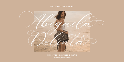 Abigaila Delinta feels equally charming and elegant. It will add a luxury spark to any design project that you wish to create! This font is PUA encoded which means you can access all of the amazing glyphs and ligatures with ease!
 - Tropical Leaves by Sakha Design,
$10.00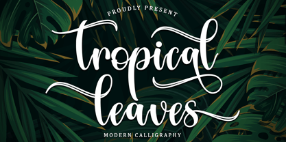 Tropical Leaves is a modern calligraphy font. It will add a luxury spark to any design project that you wish to create! This font is PUA encoded which means you can access all of the amazing glyphs and ligatures with ease!
 - Gangsar by Surotype,
$20.00 Gangsar is a Condensed typefamily, Inspired by Enge Hermes (1935). Having 6 weights including italic version, strong character, Sharp edges and proportional contrast. The typeface is versatile and can be successfully used in Branding, Posters, Magazines, Websites, Mobile Apps, etc.*
 - Ringtrack by Patria Ari,
$15.00 Ringtrack is a sharp and strong brush script font with variable swashes you can try on. This font perfect for branding projects, apparel, logo, social media posts, advertisements, product packaging, product designs, label, and any projects that you work on.
 - Big Bright by loryn ipsum,
$14.00 Meet Big Bright, a (very) tall sans serif inspired by some photo of a vintage mid-century furniture catalogue I saw on instagram. It's perfect for logos, headings and posters. Big Bright has a vintage edge yet and modern feel and can sway from soft and gentle to striking and bold depending on how it's styled. Hope you have big love for Big Bright


