10,000 search results (0.023 seconds)
  1. Mark - 100% free
  2. OldStyle 1 - Unknown license
  3. DMF studio D clear2 - Unknown license
  4. Punavuori 00150 - Unknown license
  5. Solemnity - Unknown license
  6. Fatsans - 100% free
  7. Gazzarelli - Personal use only
  8. Xilosa - Unknown license
  9. Offshore Banking Business - Unknown license
  10. AB Exp - 100% free
  11. Squid - Unknown license
  12. Krizia Uomo - Unknown license
  13. JFRockSolid - Unknown license
  14. MW TALON - Personal use only
  15. whatever - Unknown license
  16. Stahlbeton - Unknown license
  17. Georges - Personal use only
  18. SWEM - 100% free
  19. Motorcade - Unknown license
  20. GhostTown - Unknown license
  21. DoradoHeadline - 100% free
  22. Diploma - Unknown license
  23. Paternoster AH - Unknown license
  24. Planes-S-Modern - Unknown license
  25. UA Squared - Unknown license
  26. Berkelium Type - Personal use only
  27. Insert - Unknown license
  28. !Sketchy Times - Unknown license
  29. Acacia 23 - Unknown license
  30. NewMedia - Unknown license
  31. SERIESB - Unknown license
  32. Deportees - Unknown license
  33. Young Techs - Personal use only
  34. Vector - Unknown license
  35. ITC Stone Humanist by ITC, $40.99
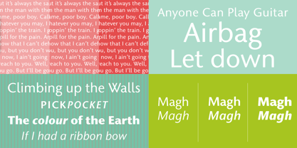
    Type designers have been integrating the design of sans serifs with serifed forms since the 1920s. Early examples are Edward Johnston's design for the London Underground, and Eric Gill's Gill Sans. These were followed by Jan van Krimpen's Romulus Sans, Frederic Goudy's ITC Goudy Sans, Hermann Zapf's Optima, Hans Meier's Syntax and Adrian Frutiger's Frutiger. Now, ITC Stone Humanist joins this tradition. It is a careful blend of traditional sans serif shapes and classical serifed letterforms. ITC Stone Humanist grew out an experiment with the medium weight of ITC Stone Sans, a design that already showed a relationship to these sans serif-serif hybrids. ITC Stone Sans has proportions based on those of ITC Stone Serif, and its thick-and-thin stroke contrast suggests the bloodline of humanistic sans serif typefaces. But other aspects of ITC Stone Sans are more closely aligned to the gothics and grotesques, a tradition that accounts for the largest portion of sans serif designs. Enter ITC Stone Humanist. During his experiments with the earlier design, Sumner Stone recalls, I was actually quite surprised at how seemingly subtle changes transformed the face," moving the design firmly into the humanist tradition. "The form of the 'g,' 'l,' 'M,' 'W,' and more subtly the 'a' and 'e' are part of the restructuring of the family," he explains. The top endings of vertical lower case strokes have been cropped on an angle, as have the ascender and descender stroke endings. ITC Stone Humanist is a full-fledged member of the ITC Stone family. It has been produced with the same complement of weights, and the x-heights, proportions, and underlying character shapes are completely compatible with the three original designs. The original ITC Stone Sans is a popular typeface, in part because of its notable versatility. ITC Stone Humanist shares this virtue, and can be used successfully at very small sizes, in long passages of text copy, and even as billboard-sized display type."
  36. Hwaiting Sans by Konstantine Studio, $20.00
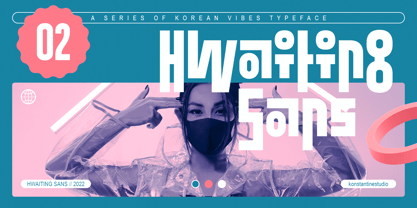
    Inspired by the emerging Korean culture that grabbing the worldwide actuation in so many realms of the industry. To bridge the vibes and to make it easier to consume, we found the gap to fill with simple things in life that are useful for it, and yes, it’s a new day it’s a new font. So without any further ado, please welcome Hwaiting Sans. 2/3 series of Korean vibes typefaces. It’s a sans-serif font with bold and strong vibes to catch up with today’s graphic design trends. Crafted with deep research about Korean traditional letters, shaped up with the approach of universal Latin letters. This is the second drop of 3 series from the Hwaiting family. So stay tuned for the upcoming release.
  37. Decora Two by Naghi Naghachian, $82.00
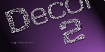
    “Innovation” best describes Naghi Naghashian’s new Decora Two font. It is a “Liaison amoureuse” between the Sans Serif typeface and English manuscript style. Decora Two is the second of a series of typeface that enables graphic arts professionals the flexibility to use modern initials. It enables, moreover, the use of this typeface for decorative headlines and is a boon for manipulations of both vector-based and pixel-based graphic programs. Typographers worldwide, whose alphabets derive from the Roman one, depend on such innovations in order to meet increased demands of modern communication. This typeface enriches the possibilities for typographical design, which in turn increases the delight in such design. It gives me great pleasure to present this series of new typefaces to my creative colleagues worldwide!
  38. Fondly Yourz by Outside the Line, $19.00
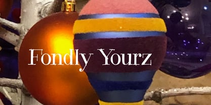
    Fondly Yourz is a less than serious, hand drawn serif font. This headline font has nice thick and thin lines. Pair it with a sans serif font for body copy for a fresh contemporary look. Fondly Yourz can be seen in the 2012 Typodarium Page-A-Day Calendar on 8-13-2012.
Looking for more fonts? Check out our New, Sans, Script, Handwriting fonts or Categories
abstract fontscontact usprivacy policyweb font generator
Processing