10,000 search results (0.028 seconds)
  1. PiS Coffins and Ghosts - Unknown license
  2. Cone Of Silence - Unknown license
  3. WC Rhesus A Bta - Unknown license
  4. Florentine SwashCaps - Unknown license
  5. Folk Solid - 100% free
  6. Marta - 100% free
  7. Corps-Script-Shadow - Unknown license
  8. CuprumFFU - Personal use only
  9. Dead Plants - Unknown license
  10. Stahlbeton - Unknown license
  11. A bite - Personal use only
  12. MyBlueRoom - Unknown license
  13. Circularis by JAF 34, $12.00
    The Circularis family includes 8 styles and weights - eight uprights with eight italics. Circularis is characterized by the nice and smooth unordinary circle geometric contruction inspired at last century, nice readability, low price and finaly many variation of useful.
  14. D3 Euronism - Unknown license
  15. D3 DigiBitMapism Katakana - Unknown license
  16. D3 Globalism - Unknown license
  17. D3 Groovitmapism - Unknown license
  18. D3 Roadsterism - Unknown license
  19. D3 Superstructurism Kat_In - Unknown license
  20. D3 Superstructurism Kat_Out - Unknown license
  21. D3 Skullism Katakana - Unknown license
  22. D3 Craftism - Unknown license
  23. D3 LiteBitMapism - Unknown license
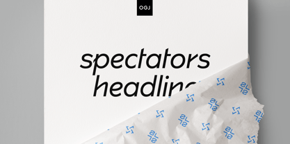
  24. Spectators Headline by OGJ Type Design, $35.00
    Spectators Headline is a typeface with eight fonts.
  25. Krul by Re-Type, $99.00
    ‘Krul’ is a typographic interpretation of the lettering style created by Dutch letter painter Jan Willem Joseph Visser at the end of the 1940s, which decorated the traditional brown bars of Amsterdam. In the beginning, these letters were strongly associated with the pubs connected to the Amstel brewery, given that Visser was the company’s official painter. As the years passed, the style became increasingly popular, and various business owners in Amsterdam and other Dutch and Belgian cities also commissioned its use. In the 1970s and 1980s, Leo Beukeboom, another talented letter painter, continued and expanded this lettering tradition while employed under the Heineken brand. Much of his work can still be found in the Jordaan and De Pijp neighborhoods in Amsterdam. The Amsterdamse Krulletter, or Amsterdam’s curly letter, is strongly inspired by the calligraphic works of the 17th century Dutch writing masters, of which Jan van den Velde was a central figure. However, distinct characteristics of this style, for example, its unusual and beautiful ‘g’, originate from a model that was published by Johannes Heuvelman in 1659, which J. W. J. Visser referenced. Typographic circles have somehow overlooked the Amsterdamse Krulletter and its heritage. The Dutch calligraphic hands preceded and influenced the formal English penmanship which has inspired numerous typefaces in the Copperplate style. In contrast, the models from van den Velde, Heuvelman, and Jean de la Chambre, among others, are a missing chapter in Dutch typographic history, and had never been turned into typefaces until now. Conscious of the cultural and identity issues that arise in reviving a unique style, and concerned about the speed with which the lettering style was disappearing, Ramiro Espinoza focused the project of designing ‘Krul’ on digitally recreating the calligraphic complexity of these beautiful letters. Created through several years of research, ‘Krul’ is not a direct digitization of the Amsterdamse Krulletter, but instead, an interpretation that incorporates numerous alternative characters absent in the original model, and improves upon details where necessary, resulting in an optimal performance on the printed page. The typeface is presented in Open Type format, with an abundance of intricate ligatures, fleurons, and swashes, which permit the creation of numerous calligraphic effects. The very high contrast and rhythm of the strokes in this typeface make it especially suited for media applications conveying a sense of elegance and sophistication. Designers of feminine magazines, advertisements, and corporate identities within the fragrance and fashion industries will find in this typeface to be an extremely useful and appropriate resource.The great Amsterdamse Krulletter is finally back, and we are proud to make it available to you.
  26. As of my last update in 2023, "Blue Jeans" by Bradford Cox is not widely recognized as a specific font in mainstream typographic resources or font directories. It's essential to clarify that Bradford...
  27. Signatria - Personal use only
  28. Movement - Personal use only
  29. Annabel Script - Unknown license
  30. PLASTIC PILL - Personal use only
  31. Crimson Petal - Personal use only
  32. the DEEPER - Personal use only
  33. Giant Head OT - Unknown license
  34. Bifurk - Unknown license
  35. Covington - Unknown license
  36. T-Air - Unknown license
  37. rokasfreestyle1 - Personal use only
  38. Plasmatica - Unknown license
  39. Avondale - Unknown license
  40. Fugue - Unknown license
Looking for more fonts? Check out our New, Sans, Script, Handwriting fonts or Categories
abstract fontscontact usprivacy policyweb font generator
Processing