The "Octin College Free" font, designed by the prolific type designer Ray Larabie, is part of the Octin series of fonts, which includes various styles catering to different themes and requirements. T...
The Fmiring Campotype One font, designed by Andi Aw. Masry, is a distinctive typeface that breathes life into the essence of organic and outdoor aesthetics. This font draws its inspiration from the n...
If you're looking for something that oozes charm, character, and a touch of whimsy, then the Jack Fancy font is a delightful choice that could add a unique flair to your designs. Imagine the playful ...
OldSansBlack is a distinctive font that traces its roots back to the creative endeavors of Manfred Klein, a prolific typographer known for his wide range of fonts that vary from whimsical to seriousl...
The Diner font, created by Brøderbund Software, is a captivating display typeface that harks back to the mid-20th century American diner culture. Its design embodies the spirit of the era, characteri...
Art-Decoretta, conceived by Gophmann A.L., is an exquisite blend of creativity and elegance, a font that encapsulates the art deco spirit with a contemporary twist. This font is characterized by its ...
The "VTKS Distress" font is a creation by Douglas Vitkauskas that stands out for its unique essence of roughness and wear-and-tear. This font encapsulates the visual aesthetics of something that has ...
PT Banana Split, though not a real font in widespread use as of my last update, conjures up whimsical and delightful imagery with its vivid name alone. Let's imagine it as a font that captures the es...
Wacamóler Caps by deFharo is a distinctive typeface that transports you to the heart of a Western adventure with its bold and dynamic design. This captivating display font is remarkable for its playf...
Nasalization Free is an intriguing typeface designed by the prolific Canadian type designer Ray Larabie. It belongs to a category of fonts inspired by the mid-20th-century fascination with space expl...
The DisneyPark font by Nikolay Dubina is an enchanting typeface designed to evoke the delightful and whimsical ambiance of Disney theme parks. This font embodies the magical essence associated with D...
The VTCSuperMarketSaleDisplayWired font, crafted by the imaginative minds at Vigilante Typeface Corporation, is a striking display font that captures the essence of high-energy retail environments an...
Sucaba, crafted by the innovative minds at WhoAmI Design, stands out as a unique addition to the world of typography. It is a font that embodies a blend of modernity and creativity, making it an exce...
Big Blocko, created by OMEGA Font Labs, is a striking display font characterized by its bold and blocky design. The font's aesthetics lean heavily towards a solid, rectangular block-like form, giving...
The font named "LED" draws inspiration from the segmented, luminous displays we often see in digital clocks, calculators, and public signage. Designed to mimic the look and feel of light-emitting dio...
DepotTrapharet is a unique and captivating font that merges the essence of modernity with a touch of industrial flair. Its design is a blend of sharp and rounded elements, which create a dynamic visu...
As of my last update in April 2023, the font named "Dollar" evokes a sense of nostalgia and playfulness, reflecting characteristics reminiscent of wild west typography and early 20th-century show pos...
EURONEW, created by the talented designer Pedro Pan, is a modern and versatile font that seamlessly blends contemporary aesthetics with functional design principles. At its core, EURONEW is a sans-se...
Exotica, created by West Wind Fonts, is a distinctly stylized font that stands out for its unique character and flair. At a glance, Exotica exudes an air of mystery and adventure, reminiscent of dist...
The Metro font, created by Jovanny Lemonad, presents a unique blend of modernity and functionality, encapsulating the essence of urban dynamics and contemporary design. Its name, "Metro," immediately...
VegasTWENTYTWO, crafted by Altsys Metamorphosis, is an emblem of the vibrant energy and perpetual dazzle that is reminiscent of the iconic city it's named after. This typeface radiates an exuberance ...
"Notice" is a font that truly lives up to its name, designed to capture attention while maintaining readability and clarity across various applications. It is conceived with a distinct purpose: to ma...
Externa™ is inspired by science fiction culture. A typeface to be used in the outer space, outside the atmosphere of our planet. Perfect for logos, film, video games, packaging, signs, album covers and more. Included in Externa™: Support for over 94 languages. Over 400 glyphs. Take your designs to the future with Externa™. Please note: artwork is not included with font purchase. The images above are intended as Externa™ examples of use only. Externa™ was designed and created by Franz Noise. Designer: Franz Noise Publisher: Typenemy Format: OpenType OTF Release date: 2020/2021
When the air becomes crisply chilly and we start thinking of festive projects in time for Christmas, it's time to celebrate. Christmas Cove, A classic Christmas typeface for sleigh rides and carol singing. Included are all of the necessary elements, such as numbers, punctuation, and multilingual letters. These ligatures will come in useful no matter what your imagination conjures up. 10 Styles Basic Latin A-Z and a-z Numerals & Punctuation Stylistic Ligatures Multilingual Support for ä ö ü Ä Ö Ü ... Free updates and feature additions Thanks for looking, and I hope you enjoy it.
Cervino by Typoforge Studio, $29.00 Did you know that Cervino is the Italian name for one of the highest and most beautiful mountain in Europe - Matterhorn? Just like this majestic peak, our new family is HUGE. Cervino family consist of three width masters, with nine weights in each of them, giving the total amount of 54 instances. It is full of different features - from the wide set of numerals and math signs, by small caps to subscript and superscript. It covers full latin and Cyrillic script. Cervino would be a perfect choice for headlines, newspapers and for the longer texts as well.
Torbjörn Olsson's Interrupt is a salty dog of a sanserif, harboring memories of freighters unloading their cargo in a run-down port. Interrupt works great for signs, and looks just fine painted on the side of a wooden crate or stencilled on an old tarpaulin. Interrupt is recommended for use over 36 points. You have run out of packing crates and would like to use it on paper? Sure, Interrupt can add its sturdy sailor's gait to any medium... just don't set any novel in Interrupt. Not even Melville. Interrupt is an OpenType typeface for both PC and Mac.
3 robbers is not a typeface family, only a collective name for three typefaces with the looks of handtexted characters: Kasper, Jesper and Jonatan. There are some common traits between them, but they are three individuals. As the three terrible" robbers in the Swedish writer Lennart Hellsing's Kamomillastad - the ones who borrowed their names to the typefaces - are three individuals. They always appear in the same order: first Kasper, then Jesper and last Jonatan. Swedish children love to sing about them and are not at all scared of them. All three robbers were released in 1995.
Mirai by GT&CANARY, $34.00 Mirai, a new geometric sans font family, is clean, strong and composed yet effortlessly contemporary. Mirai is a Japanese word meaning “the future”. While inspired by iconic fonts throughout history, Mirai has its own unique character with a Zen-like neutral tone. Mirai’s geometric shapes, mono-line and especially its high X-height make it legible and easily recognizable. The Mirai font family is comprised of 12 styles with 6 different weights from Thin to black, along with matching italics. Each weight has been specifically designed to contrast with other weights offering countless possibilities for use in web, print, package and sign design.
Randolph is a popular font family from Jukebox done in an old fashioned copperplate etching style that harkens back to the days of old leather-bound shop ledgers and hand painted window signs. The large and wide letterforms of Randolph make a bold statement that will add solidity and impact to any design. Jukebox fonts are available in OpenType format and downloadable packages contain both .otf and .ttf versions of the font. They are compatible on both Mac and Windows. All fonts contain basic OpenType features as well as support for Latin-based and most Eastern European languages.
The basic letterforms of this typeface were found in a lettering book, Rotalución Decorativa, published in Barcelona in the 1940s. Add a lowercase and a few flourishes suggested by a hand-painted sign seen at a neighborhood tavern on Staten Island, and you have a seriously fun face. To add even more spice, the font also contains alternate characters in the Logical Not, ASCII circumflex and tilde positions. It also contains a few alternate characters in the ASCII circumflex and tilde positions to perk things up. Both versions of the font contain characters to support all major European languages.
Juno by W Type Foundry, $20.00 JUNO is a soft & friendly script font for display use. Inspired by latin American vernacular signs, defined by the freshness of the freehand strokes, and mixed with the rigor of typography. Juno is well suited for packaging, headlines, advertising and any handmade feels graphic. Designed with a wide range of options, its variables move between tow poles; regular to black & condensed to expanded, plus true italics. This 40 font family sums up to 5 weight subfamilies: Regular, Semi Condensed, Condensed, Semi Expanded, Expanded. Designed with powerful opentype features, alternate characters and extended language support. We’re proud to introduce: Juno.
Introducing QEDYSANS Typeface 💚💚QEDYSANS💚💚is a sans serif font that has an elegant romantic concept, supported by 813 glyphs. The QEDYSANS font has a lot of alternative characters, from swash, ligature and of course it is also supported by multilingualism. In addition, QEDYSANS also has 14 families from Thin to Heavy. So it can be used for body text and header text. Qedysans is very suitable for design concepts that are elegant, simple, minimalist and romantic. Can be used for wedding card designs, shop signs, logotypes, promotions on Instagram and so on.
Cigar by Durotype, $22.00 Cigar is a revival of a 1970s and 1980s typeface called Cucumber or Nassel Black or Scanner. It has been carefully redrawn and expanded into a full-featured OpenType font. Cigar Octo and Cigar Quarto are new angular reinterpretations of Cigar. In Cigar Octo, most round shapes have been replaced by octagonal shapes. In Cigar Quarto, most round shapes have been replaced by rectangular shapes. Use Cigar to get attention. Use it for headlines, advertisements, magazines, brochures, book covers, corporate design, presentations, websites, signs, event announcements, and for other things that need attention. For more information about Cigar, download the PDF Specimen Manual.
Bandalero is a witty display font from British designer Richard Yeend. The letterforms in this poster/display typeface are quite square-ish and geometric. The lowercase letters have short x-heights, and the uppercase letters look dressed for a showdown, with bandoleer-like elements strapped across their tops. Because of this, Bandalero should only be used in large sizes, where it can really stare down its opponent, or reader. This might be the best font yet for a keep out sign! Bandalero was designed in 2003, and is part of the Take Type 5 collection, from Linotype GmbH."
Better Valentina Font Duo is a hand brush font created with brush and ink. Better Valentina Font Duo This typeface is ideal for use in bold watercolor designs or handwritten styles, such as blog titles, posters, wedding elements, t-shirts, clothing, book covers, business cards, greeting cards, branding, cafe / restaurant signs. merchandise, etc. Contains the complete set: - Uppercase - Lowercase - alternative - fasteners - Punctuation - number - Multilingual support. How to access all alternative characters, using the Windows Character Map with Photoshop: - https://www.youtube.com/watch?v=Go9vacoYmBw How to access all alternative characters using Adobe Illustrator: - https://www.youtube.com/watch?v=XzwjMkbB-wQ Thank you!
Hoodie was born out of a love for retro Americana and vintage signs but designed with a contemporary fresh twist that makes the font a true attention seeker. The font is made up of 7 weights, plus 3 fun specials (dots, lines and shade) that create a multitude of uses and options. From logos to packaging and everything in between, Hoodie will be an attention grabber in all types of layouts and placements. Hoodie has features such as extensive language support, case sensitive characters, ligatures and number options (Denominator, Numerator, Superior and Inferiors), making it a truly versatile font.
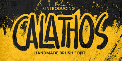
Introducing Calathos– Handmade Brush Font is a Signature Style and classy style, this font is great for your creative projects such as watermark on photography, and perfect for logos & branding, photography, invitation, watermark,advertisements,product designs, stationery, wedding designs,label ,product packaging, special events or anything that need handwritting taste. Calathos a natural handwritten feel. This handmade font will make your design has a beautiful natural touch for each details. It is perfect for any design project as Invitation,logo, book cover, craft or any design purposes. photos, photography overlays, signs, window art, scrapbooking, tags and so much more!
Gloding Sophia Script is a hand brushed font created with brush and ink. Gloding Sophia Script This typeface is ideal for use in bold watercolor designs or handwritten styles, such as blog titles, posters, wedding elements, t-shirts, clothing, covers books, business cards, greeting cards, brands, cafe/restaurant signs. merchandising, etc. Contains full set: - Uppercase - Lowercase - alternative - fasteners - Punctuation - number - Multilingual support. How to access all alternative characters, using the Windows Character Map with Photoshop: - https://www.youtube.com/watch?v=Go9vacoYmBw How to access all alternative characters using Adobe Illustrator: - https://www.youtube.com/watch?v=XzwjMkbB-wQ Thank you!
3 robbers is not a typeface family, only a collective name for three typefaces with the looks of handtexted characters: Kasper, Jesper and Jonatan. There are some common traits between them, but they are three individuals. As the three terrible" robbers in the Swedish writer Lennart Hellsing's Kamomillastad - the ones who borrowed their names to the typefaces - are three individuals. They always appear in the same order: first Kasper, then Jesper and last Jonatan. Swedish children love to sing about them and are not at all scared of them. All three robbers were released in 1995.
Squickt was the first script I designed. The name is an atrocity, I don't remember what was on my mind, when I decided on that name, but after 25 years it is to late to change, so I have to stick with it. I have recently gone over the script and changed a little stroke here, a curve there and I added Small-Caps. The font is very useful for all kinds of signs, that have to look spontaneous. You can even condense or extend it without me going berserk; Squickt is very robust. Your scribe Gert Wiescher