Sackers Roman is an engraver, all-capitals family for invitations and stationery. The letters have strong contrast between thin and thick strokes. See also Sackers Gothic, Sackers Square Gothic, Sackers Script, and Sackers Classic Roman.
Within the pages of “The Essentials of Lettering” by Thomas E. French and Robert Meiklejohn (circa 1912) is an example for creating a sans serif alphabet and numerals. The lesson plate is entitled “Upright Single-Stroke Gothic”; a basic monoline font most useful for architectural and drafting plans because of its easy-to-read properties. This type design is now available as Drafting Class JNL, in both regular and oblique versions.
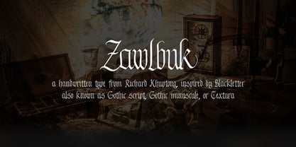
Zawlbuk is a type inspired by Blackletter (sometimes black letter), also known as Gothic script, Gothic minuscule, or Textura. The Letters are drawn using a flat nib pen on a paper, scanned and drawn into a vector format.
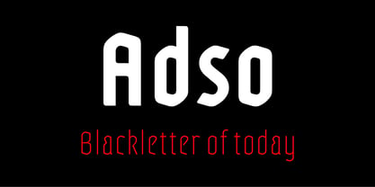
Adso was born out of a research that studied the possibility of reintroducing Gothic writing in our contemporary world. Inspired by Textura, Adso was decidedly freed of all those little details that make Blackletter faces appear foreign or even displeasing to the contemporary reader’s eyes. Nevertheless, the basic features of Gothic color were preserved: verticality, modularity, and darkness. Adso is a gothic font for today’s age, highly readable and open to all fields of expression.
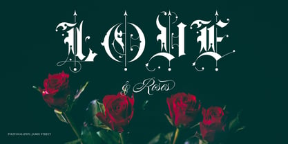
Inspired by Henry W. Troy, BLAQ is a new version of Trojan Text not available as font. Is an ornamental blackletter alphabet. Works great in headlines and other ‘masculine’ like design settings. The Victorian Gothic or Neo-Gothic is an architectural movement that began in the 1740s in England. Its popularity grew rapidly in the early nineteenth century. The revived Gothic style was not limited to architecture. We recommend to combine Blaq with: Turquoise Nautica
A redesign of drawings of News Gothic from the Smithsonian, Cyrus Highsmith and the Font Bureau studio created Benton Sans, one the most popular and versatile families in this genre. This version of the family is part of the Reading Edge series of fonts specifically designed for small text onscreen, having been adjusted to provide more generous proportions and roomier spacing, and having been hinted in TrueType for optimal rendering in low resolution environments.
Vestigio m. Ing. & Fr. vestige: a trace, mark or visible sign left by something as an ancient city in a condition or practice vanished or lost. Vestigia is born by lost pieces of other typography, being then, Garbancera's descendant. It evolved to be seen in big point sizes and compete with other fierce competitors, while retaining some features of it ancient predecessor, navigates a gothic fraktur experimental style, existing between legible and illegible reading.
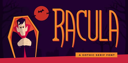
Racula is an fun, scary, and amazing gothic serif. It will add a unique and stunning look to your designs. It is perfect for fun scary games, children horror story book, logos, branding, advertising, Halloween projects, gothic designs, apparel, tattoos, and more!
Latimer is one of a series exploring a fusion of Roman and Gothic forms. Characteristics of each genre can be seen: the fluid tapering serifs and rounded shapes of the Roman form, contrasted with the angular diamond and hexagonal shapes of Gothic.
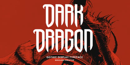
Dark Dragon gothic display typeface. Bold stroke, fun character with a bit of ligatures and alternates. To give you an extra creative work. Dark Dragon gothic display typeface support multilingual more than 100+ language. This font is good for logo design, Social media, Movie Titles, Books Titles, a short text even a long text letter and good for your secondary text font with script or serif. Make a stunning work with Dark Dragon gothic display typeface. Cheers, Maulana Creative
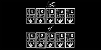
The House Of Usher is a beautiful set of decorative initials, mixing Victorian style in the boxes with gothics capitals. Perfect for beginning of paragraphs in artistic publications, storybooks and several texts conveying the feel of the Art Nouveau period with the gothic writing.
The typeface was designed after seeing a photocopy of some News Gothic text where the ink had faded on the bottom of each character. As character recognition is generally based on the top half of a character, readability was never compromised. Rather like Antique Olive the characters have a top heavy look when viewed straight on, however, as most type is read at an angle with the top further away than the bottom this top heavy look is diminished.
Melusine is based on an ornate style of gothic calligraphy used primarily in decorative signs and advertising in Germany around the turn of the century. It has many of the characteristics of a true medieval gothic hand, but is a more elaborate, extreme variaton on the style.
A heavy unnamed Gothic typeface from the 1890 William H. Page Foundry woodtype specimen book provided the template for this bold, brash, no-nonsense face. It's designed to set tight, so your headlines will definitely get noticed. Named for a town in West Central Texas which is noted for being the home of the Buffalo Soliders in the late 1800s. Both versions of this font contain the Unicode 1252 (Latin) and Unicode 1250 (Central European) character sets, with localization for Romanian and Moldovan.