10,000 search results
(0.111 seconds)
- ZARAUTZ - Unknown license

- Complete - Unknown license

- New Alphabet - Unknown license

- SF Orson Casual Heavy - Unknown license

- WinterthurCondensed - 100% free

- DIN 1451 fette Breitschrift 1936 - 100% free

- Fabrica - Unknown license

- Yanone Kaffeesatz - Unknown license

- Dustismo - Unknown license

- Arctic - Unknown license

- Exo - 100% free

- Rational Integer - Unknown license

- CorpusCare - Unknown license

- Ptarmigan - Unknown license

- EURONEW - Unknown license

- GOST type A - Unknown license

- Thiamine - Unknown license

- Hall Fetica Wide - Unknown license

- lelim 200 - Personal use only

- MDRS-FD01 - Unknown license

- Kelan - Unknown license

- The Thief Bird by Lemur,
$14.00 The Thief Bird is an informal grotesque font. Although informal and grotesque may seem to be two quite different ideas, we have to dig into the origin of this typeface in order to understand the matter. The concept behind The Thief Bird was inspired by the adaptation that the vintage sign painters made when they took the grotesque style characters they saw in newspapers and magazines and reproduced them using a brush, aiming to make the prices of the products displayed on wooden boards stand out, as opposed to highlighting large headlines (such as the idea behind fonts like Franklin Gothic). The Thief Bird takes the language from sign painters and turns it into a font --this time around not aiming to set prices but to bring children stories to life. Thus, some legibility features from grotesque fonts were mixed with the brush calligraphy to add grace and zest to a font intended for children. The Thief Bird is a playful display font, with cheerful ligatures and alternate characters. It is really attractive for setting short paragraphs that tell stories for little people. The Thief Bird has one single weight and it’s ideal to be used in storybooks, candy packaging, films, toys, logos, labels, etc. The font has an extended set of 643 characters supporting 219 Latin languages. It has a complete set of small caps, sensitive cases, more than 30 pairs of ligatures, alternate characters and much more. This cool, informal and laid back typeface will be the perfect match for illustrations of fairy tales, comics for children and any product or publishing for the little ones. The Thief Bird supports this languages: Abenaki, Afaan Oromo, Afar, Afrikaans, Albanian, Alsatian, Amis, Anuta, Aragonese, Aranese, Aromanian, Arrernte, Arvanitic (Latin), Asturian, Atayal, Aymara, Bashkir (Latin), Basque, Bemba, Bikol, Bislama, Bosnian, Breton, Cape Verdean Creole, Catalan, Cebuano, Chamorro, Chavacano, Chichewa, Chickasaw, Cimbrian, Cofán, Corsican Creek,Crimean Tatar (Latin),Croatian, Czech, Dawan, Delaware, Dholuo, Drehu, Dutch, English, Estonian, Faroese, Fijian Filipino, Finnish, Folkspraak, French, Frisian, Friulian, Gagauz (Latin), Galician, Ganda, Genoese, German, Gikuyu, Gooniyandi, Greenlandic (Kalaallisut)Guadeloupean, Creole, Gwich’in, Haitian, Creole, Hän, Hawaiian, Hiligaynon, Hopi, Hotcąk (Latin), Hungarian, Icelandic, Ido, IgboI, locano, Indonesian, Interglossa, Interlingua, Irish, Istro-Romanian, Italian, Jamaican, Javanese (Latin), Jèrriais, Kala Lagaw Ya, Kapampangan (Latin), Kaqchikel, Karakalpak (Latin), Karelian (Latin), Kashubian, Kikongo, Kinyarwanda, Kiribati, Kirundi, Klingon, Ladin, Latin, Latino sine Flexione, Latvian, Lithuanian, Lojban, Lombard, Low Saxon, Luxembourgish, Maasai, Makhuwa, Malay, Maltese, Manx, Māori, Marquesan, Megleno-Romanian, Meriam Mir, Mirandese, Mohawk, Moldovan, Montagnais, Montenegrin, Murrinh-Patha, Nagamese Creole, Ndebele, Neapolitan, Ngiyambaa, Niuean, Noongar, Norwegian, Novial, Occidental, Occitan, Old Icelandic, Old Norse, Oshiwambo, Ossetian (Latin), Palauan, Papiamento, Piedmontese, Polish, Portuguese, Potawatomi, Q’eqchi’, Quechua, Rarotongan, Romanian, Romansh, Rotokas, Sami (Inari Sami), Sami (Lule Sami), Sami (Northern Sami), Sami (Southern Sami), Samoan, Sango, Saramaccan, Sardinian, Scottish Gaelic, Serbian (Latin), Seri, Seychellois Creole, Shawnee, Shona, Sicilian, Silesian, Slovak, Slovenian, Slovio (Latin), Somali, Sorbian (Lower Sorbian), Sorbian (Upper Sorbian), Sotho (Northern), Sotho (Southern), Spanish, Sranan, Sundanese (Latin), Swahili, Swazi, Swedish, Tagalog, Tahitian, Tetum, Tok Pisin, Tokelauan, Tongan, Tshiluba, Tsonga, Tswana, Tumbuka, Turkish, Turkmen (Latin), Tuvaluan, Tzotzil, Uzbek (Latin), Venetian, Vepsian, Volapük, Võro, Wallisian, Walloon, Waray-Waray, Warlpiri, Wayuu, Welsh, Wik-Mungkan, Wiradjuri, Wolof, Xavante, Xhosa, Yapese, Yindjibarndi, Zapotec, Zulu, Zuni.
 - Banknote 1948 by Ingo,
$39.00 A very expanded sans serif font in capital letters inspired by the inscription on a bank note Old bank notes tend to have a very typical typography. Usually they carry decorative and elaborately designed markings. For one thing, they must be practically impossible to forge and for another, they should make a respectable and legitimate impression. And in the days of copper and steel engravings, that meant nothing less than creating ornate, shaded or otherwise complicated scripts. Designing the appropriate script was literally in the hands of the engraver. That’s why I noticed this bank note from 1948. It is the first 20 mark bill in the then newly created currency ”Deutsche Mark.“ All other bank notes of the 1948 series show daintier forms of typography with an obvious tendency toward modern face. The 1949 series which followed shortly thereafter reveals the more complicated script as well. For whatever reason, only this 20 mark bill displays this extremely expanded sans serif variation of the otherwise Roman form applied. This peculiarity led me in the year 2010 to create a complete font from the single word ”Banknote.“ Back to those days in the 40’s, the initial edition of DM bank notes was carried out by a special US-American printer who was under pressure of completing on time and whose engravers not only engraved but also designed. So that’s why the bank notes resemble dollars and don’t even look like European currency. That also explains some of the uniquely designed characters when looked at in detail. Especially the almost serif type form on the letters C, G, S and Z, but also L and T owe their look to the ”American touch.“ The ingoFont Banknote 1948 comprises all characters of the Latin typeface according to ISO 8859 for all European languages including Turkish and Baltic languages. In order to maintain the character of the original, the ”creation“ of lower case letters was waived. This factor doesn’t contribute to legibility, but this kind of type is not intended for long texts anyway; rather, it unfolds its entire attraction when used as a display font, for example on posters. Banknote 1948 is also very suitable for distortion and other alien techniques, without too much harm being done to the characteristic forms. With Banknote 1948 ingoFonts discloses a font like scripts which were used in advertising of the 1940’s and 50’s and were popular around the world. But even today the use of this kind of font can be expedient, especially considering how Banknote 1948, for its time of origin, impresses with amazingly modern detail.
 - Squalo by Letritas,
$30.00 Squalo, the genesis The idea of this project called Squalo popped into my mind while I was working with excitement on some sketches. I was chasing after a strong typographical character, something that for me has to be crystallized in form which is always legible and functional. The concept The concept of Squalo arises from the observation of an athlete’s body: you notice that even if most are lean, they are also strong, cut and chiselled. The sport they play molds and modify their bodies. Just think, for instance, on a professional swimmer: during the competition every single muscle, tendon, tissue, cell is working to swim faster. Every single part is there to give strength and speed like in a “squalo” (shark in italian). Not as an eel, nor as a mermaid, nor as a hake. Just like a shark. If you take a quick look, you will notice that the width of the typeface is slightly more condensed than that of a standard sans serif. We designed Squalo this way specifically to assist and strengthen your concepts through stylized typography. We designed the joins and terminals (tip ends) of the characters A, V, W, Z, v, w, z, to create a feeling of “tension”, reinforcing the concept of shark, danger, caution, as well explicit, intentional movement. Pure strength. We wanted to recall the exact moment of the start of the 100 meters race: when the sprinter initially spreads all of his powerful energy. The italic version, starting with the former two typographical concepts of width and tension, emphasizes them. First of all, we compressed the characters 10 percent more, and slanted it 10 degrees to the right. With this movement I intended to convey the gorgeous feeling of tension in power and rapidity. The typeface has 9 weights, from “hair” to “black”, and two versions, “regular” and “italic”. All 18 fonts include small caps, unicase, tabular and oldstyle numbers, numerators and denominators, and much more. Squalo is an ideal typeface that I recommend for use in marketing campaigns, design of packaging, magazines, branding for tv programs, films, book texts, editorial, publications, logos, corporate projects, web texts, and graphic design in motion. Squalo supports the following languages: Abenaki, Afaan Oromo, Afar, Afrikaans, Albanian, Alsatian, Amis, Anuta, Aragonese, Aranese, Aromanian, Arrernte, Arvanitic (Latin), Asturian, Atayal, Aymara, Bashkir (Latin), Basque, Bemba, Bikol, Bislama, Bosnian, Breton, Cape Verdean Creole, Catalan, Cebuano, Chamorro, Chavacano, Chichewa, Chickasaw, Cimbrian, Cofán, Corsican Creek,Crimean Tatar (Latin),Croatian, Czech, Dawan, Delaware, Dholuo, Drehu, Dutch, English, Estonian, Faroese, Fijian Filipino, Finnish, Folkspraak, French, Frisian, Friulian, Gagauz (Latin), Galician, Ganda, Genoese, German, Gikuyu, Gooniyandi, Greenlandic (Kalaallisut)Guadeloupean, Creole, Gwich’in, Haitian, Creole, Hän, Hawaiian, Hiligaynon, Hopi, Hotcąk (Latin), Hungarian, Icelandic, Ido, IgboI, locano, Indonesian, Interglossa, Interlingua, Irish, Istro-Romanian, Italian, Jamaican, Javanese (Latin), Jèrriais, Kala Lagaw Ya, Kapampangan (Latin), Kaqchikel, Karakalpak (Latin), Karelian (Latin), Kashubian, Kikongo, Kinyarwanda, Kiribati, Kirundi, Klingon, Ladin, Latin, Latino sine Flexione, Latvian, Lithuanian, Lojban, Lombard, Low Saxon, Luxembourgish, Maasai, Makhuwa, Malay, Maltese, Manx, Māori, Marquesan, Megleno-Romanian, Meriam Mir, Mirandese, Mohawk, Moldovan, Montagnais, Montenegrin, Murrinh-Patha, Nagamese Creole, Ndebele, Neapolitan, Ngiyambaa, Niuean, Noongar, Norwegian, Novial, Occidental, Occitan, Old Icelandic, Old Norse, Oshiwambo, Ossetian (Latin), Palauan, Papiamento, Piedmontese, Polish, Portuguese, Potawatomi, Q’eqchi’, Quechua, Rarotongan, Romanian, Romansh, Rotokas, Sami (Inari Sami), Sami (Lule Sami), Sami (Northern Sami), Sami (Southern Sami), Samoan, Sango, Saramaccan, Sardinian, Scottish Gaelic, Serbian (Latin), Seri, Seychellois Creole, Shawnee, Shona, Sicilian, Silesian, Slovak, Slovenian, Slovio (Latin), Somali, Sorbian (Lower Sorbian), Sorbian (Upper Sorbian), Sotho (Northern), Sotho (Southern), Spanish, Sranan, Sundanese (Latin), Swahili, Swazi, Swedish, Tagalog, Tahitian, Tetum, Tok Pisin, Tokelauan, Tongan, Tshiluba, Tsonga, Tswana, Tumbuka, Turkish, Turkmen (Latin), Tuvaluan, Tzotzil, Uzbek (Latin), Venetian, Vepsian, Volapük, Võro, Wallisian, Walloon, Waray-Waray, Warlpiri, Wayuu, Welsh, Wik-Mungkan, Wiradjuri, Wolof, Xavante, Xhosa, Yapese, Yindjibarndi, Zapotec, Zulu, Zuni
 - African Jungle by Scholtz Fonts,
$19.00Dominated by a vigorous, african-inspired, jungle-like pattern, this contemporary, 21st century, sans serif font - African Jungle - contains an eclectic mix of elements from the 20th century. It combines gentle curves with base and caps-line transgressions but is substantially more rounded than in most commercial-style sans serif faces. Terminal strokes are slightly rounded and occasional elements are strongly rounded. The African-inspired pattern fill is suggestive of dense vegetation without being too literal. African Jungle is readable and can be successfully used for headers in presentations, magazines etc, and for display use in newspapers, advertising and promotions. Professionally kerned and spaced with 256 characters. - Logotype Style by Sensatype Studio,
$15.00 Logotype is Modern Logo Font is a well-balanced modern font with a minimalist, unique, and iconic sans serif, font that you can combine to get any variations and unique shapes easily just in seconds with choose ligatures of them. It is a sans serif font with minimalist style that perfect for branding projects, logo, poster designs, social media posts, advertisements, product packaging, product designs, label, photography, watermark, invitation, stationery, and any projects, it makes with a high level of legibility. What's Included: Character set A-Z Numerals & Punctuation Accented Characters (West Europe) Works on PC & Mac Recommended using Adobe Illustrator or Adobe Photoshop. Wish you enjoy our font. :)
 - Silky by Sensatype Studio,
$15.00 A Sans serif that we created special for elegant branding needs, with extra ligatures in unique shape will be ready to add value of your brand. It so nice to leverage designer or product owner that need solutions to make their design look more classy and modern. And specially for this font, We prepared any ligatures characters to help you create unlimited variations for your creative needs. Silky Sans serif font ready with: Any options to get creative variations (combination of Ligatures) Preview as a inspirations that you can do with Silky font Ready with Lowercase and Uppercase characters Wish you enjoy our font. :)
 - Parisine Office Std by Typofonderie,
$59.00 Humanistic sanserif in 4 fonts The Parisine Office typeface family can be considered as the text version of the Parisine. When Parisine xheight fit Helvetica large xheight, Parisine Office is more close to Gill Sans in term of proportion, as it was developed for Ratp, the public transport in Paris to allow compatibility with documents set in Gill Sans without changing the length of text. Parisine Office by default is a humanistic sanserif available in 4 fonts perfect for text setting. The design of the italic lowercases is more cursive than in Parisine. About Parisine Parisine helps Parisians catch the right bus Observateur du design star of 2007
 - Jerosta by Keristyper Studio,
$14.00 Jerosta is a modern Sans Serif font with a dynamic and elegant style. Its clean and geometric lines give it a contemporary look while its unique letterforms add a touch of sophistication. With its versatile design, Jerosta can be used for a wide range of applications, from branding to editorial design and beyond. Featured: Standard Uppercase & Lowercase Numeral & Punctuation Multilingual : ä ö ü Ä Ö Ü ß ¿ ¡ Alternate & Ligature PUA encoded We recommend programs that support the Open Type feature and the Glyphs panel such as Adobe applications or Corel Draw, so you can use all the variations of the glyphs. Hope you enjoy our fonts!
 - Conso by Larin Type Co,
$15.00 CONSO is an elegant, modern and contrast sans-serif font family. It includes upright and Italic style, each of them has seven weights from thin to bold. This is a multi-purpose font that is perfect for any project, it is contrasted, modern and easy to read. With it, you can create logos, use in advertising, packaging, book covers and magazines, headings, descriptions and much more. CONSO includes stylistic alternates with a teardrop-shaped tail for uppercase and lowercase, with them, you can change the style of your project and add personality to it and make it more stylized. This font is easy to use has OpenType features.
 - James Harden by Lucky Type,
$15.00 hello designers, meet my newest font James Harden Script. This is a classic thin font in italic style. This font comes with modern ligatures that can make your work look elegant, sweet, and perfect. With this style, this font will be suitable for logos, branding projects, product packaging, mugs, quotes, posters, shopping bags, logos, t-shirts, book covers, business cards, invitation cards, greeting cards and all your other projects. The James Harden Script font includes multiple language support. You can use this font for your work very easily because it contains many features. Contains a full set of uppercase and lowercase letters, punctuation, numbers, and multilingual support.
 - Mercado by MADType,
$24.00 Mercado is a versatile stencil font family with 3 styles and 3 weights of each style. I was inspired by local boutique supermarkets to create a stencil font family with both upper and lowercase as well as a large international characterset. Mercado Regular can be used at small point sizes without the stencil gaps filling in. It also makes a bold statement when used large. Mercado Display with it's precision slices is best used large, or in any design solution where the tight gaps will not become filled in. Mercado Sans is a quirky and strong sans serif based on the bones of the stencil version.
 - Olivany by Sensatype Studio,
$15.00 A new Sans serif that we created special for branding needs, with extra ligature in unique shape add value of your brand. It so nice to leverage designer or product owner that need solutions to make their design look more stylish and modern. And specially for Young font, We prepared any ligatures, and any alternate characters to help you create unlimited variations for your creative needs. Olivany Modern Beauty sans serif font ready with: Any options to get creative variations (combination of Alternate and Ligatures) Preview as a inspirations that you can do with Olivany font Ready with Lowercase and Uppercase characters Wish you enjoy our font!
 - Cynosure by Device,
$39.00Cynosure is a humanist sans with a subtle thick/thin stress. This gives it a clean, sharp elegance and precision that can be missing in some more familiar monoline sans faces. The wide range of weights and the matching reweighed italics make it a versatile solution where a consistent appearance across a broad range of applications is required. Its clear and inarguable design make it suitable for a wide variety of uses, from corporate to entertainment, text to headline, signage, logotypes, magazines and reports. The italics retain the design of the upright across all characters, again ensuring consistency. Includes tabular, lining and old-style numerals. - Bridge Style by Sensatype Studio,
$15.00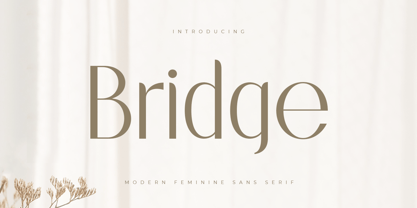 A Sans serif that we created special for elegant branding needs, with extra ligatures in unique shape will be ready to add value of your brand. It so nice to leverage designer or product owner that need solutions to make their design look more classy and modern. And specially for this font, We prepared any ligatures characters to help you create unlimited variations for your creative needs. Bridge Sans serif font ready with: Any options to get creative variations (combination of Ligatures) Preview as a inspirations that you can do with Bridge font Ready with Lowercase and Uppercase characters Wish you enjoy our font. :)
 - Magic Growing by Sensatype Studio,
$15.00 A Sans serif that we created special for elegant branding needs, with extra style will be ready to add value of your brand. It so nice to leverage designer or product owner that need solutions to make their design look more elegant and modern. And specially for this font, We prepared any Styles to help you create unlimited variations for your creative needs. Magic Growing Elegant Sans Serif Font ready with: Any styles to get creative variations (regular, bold, italic, bold italic) Preview as a inspirations that you can do with Magic Growing font Ready with Lowercase and Uppercase characters Wish you enjoy our font. :)
 - Steamtown by Melvastype,
$16.00 Steamtown is a sans serif type family of three weights and four styles. It is based on geometric forms, so it is a clear and straightforward typeface. It has an industrial feel and also resembles street signage. It has four styles; Clean, Rough, Print and Press. The Rough style has rough edges, Print has a subtle texture and Press has a heavy letter-press texture. Rough, Print and Press styles have two sets of upper- and lowercases. You can manually alternate the two sets of upper- and lowercases or you can enable the Contextual Alternates OpenType feature to automatically cycle these two sets of letters.
 - Grillith by Keristyper Studio,
$14.00 Presenting Grillith fonts. This font is created with a unique combination of each character. looks real and can be used for all your project needs. This font is good for logo design, Social media, Movie Titles, Books Titles, short text even long text letters, and good for your secondary text font with sans or serif. Featured: Standard Uppercase & Lowercase Numeral & Punctuation Multilingual : ä ö ü Ä Ö Ü ß ¿ ¡ Alternate & Ligature PUA encoded We recommend programs that support the OpenType feature and the Glyphs panel such as Adobe applications or Corel Draw. so you can use all the variations of the glyphs. Hope you enjoy our fonts!
 - Qatana by Ixipcalli,
$20.00 La tipografía Qátana es una tipografía inspirada en el estilo románico serif y sans serif. Su estilo elegante y de fácil lectura ha logrado ser una tipografía esencial para redacciones de documentos, textos o libros. Cuenta con tres pesos bien marcados que dan un juego visual de resaltados y tenues. Además de las formas itálicas. The Qátana typeface is a typeface inspired by the Romanesque serif and sans serif style. Its elegant and easy-to-read style has become an essential typeface for writing documents, texts, or books. It features three well-marked weights that give a visual play of highlights and lows. In addition to the italic forms.
 - Masiva by Graviton,
$24.00 Masiva font family has been designed for Graviton Font Foundry by Pablo Balcells in 2018. It is a geometric sans serif typeface with carefully crafted curves that provide a soft and pleasant appearance. Its universal shapes make it suitable for any kind of project, text length and size. It can be used as a powerful display typeface in big sizes. Also, thanks to its legibility, it can be used in long body texts in very small sizes and everything in between. It performs just as well in classic style projects as in contemporary or modern ones. Masiva consists of 12 styles, each containing small caps and glyph coverage for several languages.


