10,000 search results (0.021 seconds)
  1. Estilographica - Personal use only
  2. Chave - Personal use only
  3. Uecker - 100% free
  4. Subito - Personal use only
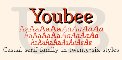
  5. Youbee by Ingrimayne Type, $9.95
    Youbee is a casual serifed font that is highly legible. It has a bit of contrast, but not much. It could be used as book text, but is better suited for less formal uses such as newsletters and pamphlets. Youbee gets its name from it origin, the Ultimate Blend (UB) of four very different typefaces: Euroika, Ingriana, BetterTypeRight, and KampFriendship. The earliest members of the family were constructed in 1996, with a shadow version added in 2011, extra weights in 1999, and two different widths in 2022.
  6. La chata - 100% free
  7. Narnfont - Personal use only
  8. Janda As Long As You Love Me - Personal use only
  9. LBC Cool 2 - Unknown license
  10. Cemi-Taino - Unknown license
  11. BlamDude BB - Personal use only
  12. PetalGlyph - Unknown license
  13. Janda Flower Doodles - Personal use only
  14. Xéfora - Personal use only
  15. Cabaret - Personal use only
  16. Fraktura - Personal use only
  17. Compostable - Personal use only
  18. Janda Everyday Casual - Personal use only
  19. COWABUNGA - Personal use only
  20. Ambicase Fatface by Teeline Fonts, $48.00
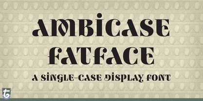
    Most fonts include uppercase and lowercase letters. Some experimentally-minded designers have proposed unicase typefaces as well: rather than having two different forms for a given letter, unicase fonts have one, chosen from the upper- or lowercase forms. Ambicase Fatface takes the next step, offering not "either/or", but rather "both/and". Each letter in Ambicase Fatface is a combination of its traditional upper- and lowercase forms, in an extra-bold style. Its inventive, hybrid forms are a bolder take on those of its 2010 sibling typeface, Ambicase Modern. Ambicase Fatface stands out as a carefully crafted experimental font: its eccentric forms do not hinder its readability. It is suitable for high-style display settings. Ambicase Fatface offers a large character set and extensive OpenType features. Most notably, in modern OpenType-aware applications, Ambicase Fatface can be set in swash mode, which features sophisticated decorative flourishes that differ depending on whether the letter is at the beginning, middle, or end of a word. Ambicase Fatface is available in two optical sizes: Regular and Poster. At very large sizes, the Poster cut, with its finer details, is recommended.
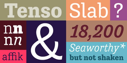
  21. Tenso Slab by exljbris, $-
    Tenso Slab is a versatile and playful Slab Serif based on the -in 2013 released- Tenso, which is a an economic running sans serif with a lot of character.
  22. Zone - 100% free
  23. Blockletter - Personal use only
  24. DINk - 100% free
  25. Denne Angel - Personal use only
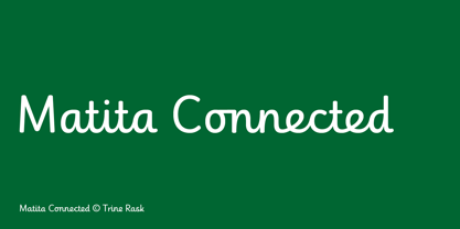
  26. Matita Connected by Trine Rask, $12.00
    Warning: works with contextual alternate-feature, which is not showing here. Matita Connected is part of a larger type family developed from 2005-2019 with handwriting in mind. A solid script face in two weights and a dotted instructional version. With alternative glyphs based on different writing habits. For teaching, teaching material or just typography. An unchildish handwritten type family for many purposes.
  27. GEOspeed - Personal use only
  28. GEOspeed SC - Personal use only
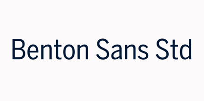
  29. Benton Sans Std by Font Bureau, $40.00
    In 1903, faced with the welter of sanserif typefaces offered by ATF, Morris Fuller Benton designed News Gothic, which became a 20th-century standard. In 1995 Tobias Frere-Jones studied drawings in the Smithsonian and started a redesign. Cyrus Highsmith reviewed News Gothic, and with the Font Bureau studio expanded it into Benton Sans, a far-reaching new series, with matched weights and widths, offering performance well beyond the limits of the original; FB 1995-2012
  30. Maple Street by Okaycat, $29.00
    Maple Street is a great looking traditional serif font composed by the Okaycat design team, Luke Turvey & Natsuko Hayashida, in 2014. Bold didone forms with structural seriffed detail combine at Maple Street to offer a cozy familiar style, without looking dated. This nicely balanced serif is designed to look outstanding for display or printed publication.
  31. Bellino by Mans Greback, $59.00
    Bellino is a well-crafted script typeface. Drawn by Måns Grebäck during 2018, this high-quality font has beautiful letter shapes and swashy capitals. Use one or more underscores after any word to underline. Example: Bellino___ The font contains stylistic, initial and final alternates, as well as ligatures. It also has extensive language support.
  32. Kyrial Display Pro by Mostardesign, $29.00
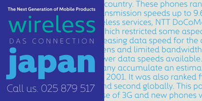
    Designed in 2011 by Olivier Gourvat, this font family has generous proportions with a range of weights make it a versatile family for print and web design work. Kyrial Display Pro is also a practical typographic choice to express strength, elegance, and conceptual clarity. Kyrial offers lots of OpenType goodness and broad language support.
  33. FiftyTwoLetters - 100% free
  34. Squitcher - Unknown license
  35. MoneyGoRound - Personal use only
  36. Lobster 1.3 - 100% free
  37. De Rotterdam by Roland Hüse Design, $20.00
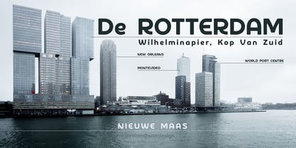
    This font is a clean, modern sans serif bold. Named after “De Rotterdam”* this huge and super cool building (read the story below). Great for headlines, Posters, Flyers but also well legible at small size in large texts. Contains All European language accents and characters. --- The Story --- *This complex is located in the Kop Van Zuid district of Rotterdam, on Wilhelminapier. I was lucky to see this building from the beginning (2009) growing up (2013) That time when I was working and living here. I was always amazed by the design and how huge it is every time I took a look at it while driving or walking on the Erasmus Bridge. When I was going to work or just hiking around the city. It has a special meaning and message for me: I started creating fonts in my free time in 2010 when I came to this city to work. I was factory worker, dishwasher etc. I grew together with this amazing construction from brick to brick, step by step. By the time its construction finished, I was able to quit my day job and become a full time freelance designer.
  38. Colville by Canada Type, $29.95
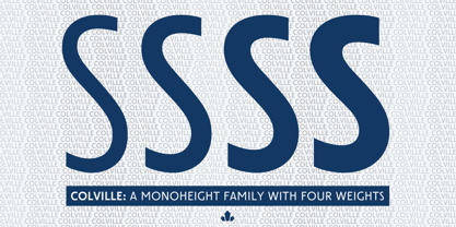
    The Colville fonts began their existence in 2015 as a project-specific typeface, made to be used on a custom-made headstone commemorating Canadian artist Alex Colville (1920-2013) and his wife Rhoda Wright. For that purpose, some initial shapes were modelled after letters Colville himself had used on a Governor General gold medal he designed in the mid-1970s. From there started a year-long project that culminated in a set of four comprehensive fonts ranging in weight from Light to Bold, each containing over 750 glyphs to cover Pan European language support, stylistic alternates, five sets of figures, automatic fractions, and some ornaments rooted in Alex Colville’s art. These fonts exhibit a strong art deco aesthetic that has always been a favourite of architects, metal casters, and sign makers. This is a very humanist geometry alternating from the precisely calculated to the curvy and lithe, subtle contrast, flat stroke stops, and airy proportions that make for a counterspace built for accommodation and comfort. The breadth and timeless humanism of the Colville set makes fit in a variety of applications, from straightforward headlines, titles, and emphasis captions, to branding and packaging.
  39. NaNa Arabic by Naghi Naghachian, $75.00
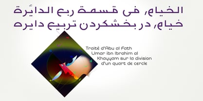
    NaNa Arabic is a new creation of Naghi Naghashian. It was developed in 2012/2013 on the basis of specific research and analysis of Arabic characters and definition of their structure. This innovation is a contribution to the modernisation of Arabic typography, giving the font design of Arabic letters real typographic arrangement and providing greater typographic flexibility. This step was necessary after more than two hundred years of relative stagnation in Arabic font design. NaNa Arabic supports Arabic, Persian and Urdu. It also includes proportional and tabular numerals for the supported languages. The NaNa Arabic Font Family is available in four weights: Thin, Light, Regular and Bold. The design of this font family is inspired by two classic scripts: Kufic and Naskh. The quasi-geometric character of Kofic melds with the calligraphic grace of Naskh, which was invented by Iben Moghleh, an Iranian savant of the ninth century. He lived in Baghdad and was assassinated at the instigation of an Abbasid caliph. He was a polymath and a renowned scholar. I dedicate the design of this font family to the memory of this great man.
Looking for more fonts? Check out our New, Sans, Script, Handwriting fonts or Categories
abstract fontscontact usprivacy policyweb font generator
Processing