6,074 search results
(0.03 seconds)
- CASU Aérospatiale by Okaycat,
$24.50
- Roadblock JNL by Jeff Levine,
$29.00
- Linem Up JNL by Jeff Levine,
$29.00 - Foundry Journal by The Foundry,
$90.00
- Iwan Reschniev by FDI,
$29.00
- Geometra Rounded by Wiescher Design,
$39.50
- Okay Cotton by Okaycat,
$29.95
- Habana Vieja by Letters&Numbers,
$16.00
- Azsion by Okaycat,
$24.50
- Cycles by Stone Type Foundry,
$49.00
- Trade Paper JNL by Jeff Levine,
$29.00
- Latos Vocos by James White,
$12.00
- Wordwalker by Cititype,
$16.50
- Sapeca by Just in Type,
$35.00
- Nightspot JNL by Jeff Levine,
$29.00
- Movie Palace JNL by Jeff Levine,
$29.10
- Poster Chamfer JNL by Jeff Levine,
$29.00
- Florentine by SoftMaker,
$9.99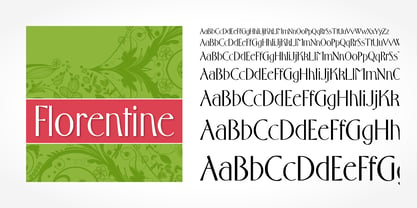
- Estelle by SoftMaker,
$9.99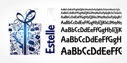
- Cavalier by SoftMaker,
$9.99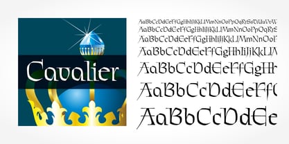
- Entebbe by SoftMaker,
$9.99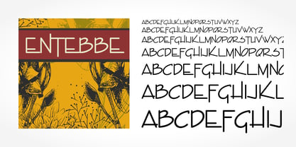
- Messing by SoftMaker,
$9.99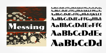
- Frenzy by SoftMaker,
$9.99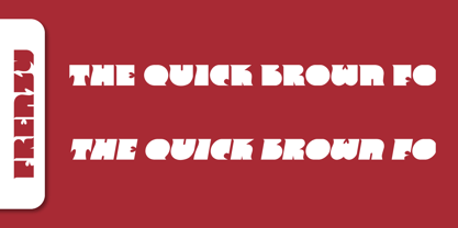
- Boss by SoftMaker,
$9.99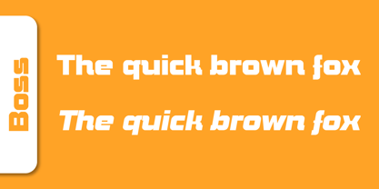
- Elektronik - Personal use only

- Future Earth - 100% free

- Compact - 100% free

- MINECRAFT PE - Personal use only

- Teio - Personal use only

- Obti Sans Neue - 100% free

- Freshman - 100% free

- f2 Tecnocratica - Personal use only

- Faltura - Personal use only

- NovaMono - Personal use only

- Zyphyte - Personal use only

- Fear Factor - Unknown license

- Cable - Personal use only

- El Pececito - Personal use only

- Radio 187.5 - Personal use only

- Octin College Free - 100% free


