10,000 search results
(0.025 seconds)
- Zacatecas 1914 - Personal use only

- Syntha Nova - Personal use only

- HEX Font - Personal use only

- Plakative Grotesk - 100% free

- Gemina - Personal use only

- CF Anarchy - Personal use only

- Berlin Graffiti - Personal use only

- 3-DSalter - Unknown license

- Dollar - Unknown license

- BlaxSlabXXL - 100% free

- Reprise Stamp - Unknown license

- Throwupz - Personal use only

- Frankfurt - Unknown license

- Iso - Personal use only

- Thyssen J - Unknown license

- Dark11 - Unknown license

- ThunderCats-Ho! - Personal use only

- PORT118 - Unknown license

- Cienfuegos - Personal use only

- Hard Block - Unknown license

- KlingonBlade - Unknown license

- VAL - Personal use only

- Magnum - Unknown license

- ACID LABEL___ - Personal use only

- Digital Kauno - Unknown license

- Khan - Unknown license

- Wolf's Bane - Unknown license

- Planet Megapolis - Personal use only

- Resurrection hydro.seven.four - Unknown license

- Brushstroke Plain - Unknown license

- Oaxaqueña Tall - Personal use only

- Hitch - Unknown license

- Electrofied - 100% free

- Graffito - Unknown license

- Fontasia V2.0: The Revenge - Unknown license

- War Eagle - Personal use only

- 50's Headline DSG - Unknown license

- Dirty Ames - Unknown license

- Tramuntana 1 Pro by Vanarchiv,
$50.00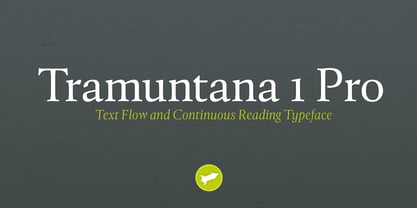
- Liberation Mono - 100% free


